
A truly memorable Christmas tree does more than sparkle—it tells a story. Whether it’s the quiet elegance of a woodland-inspired scheme or the bold joy of a modern jewel-toned display, cohesion is what transforms a collection of ornaments into a unified visual experience. Yet many decorators begin with a favorite ornament or a seasonal sale item, then scramble to “make it work.” That reactive approach often leads to visual fatigue: clashing metallics, competing reds, or a tree that feels busy but not balanced. Creating a cohesive color palette isn’t about limiting creativity—it’s about focusing it. It’s the difference between decoration and design.
Why Cohesion Matters More Than You Think
Cohesion in holiday decor operates on both psychological and practical levels. Psychologically, our brains process harmonious color relationships as calming and intentional. A study published in the Journal of Environmental Psychology found that environments with consistent chromatic harmony reduced perceived visual clutter by up to 42%—a critical factor when decorating a focal point like a Christmas tree surrounded by other seasonal elements (wreaths, mantels, tablescapes). Practically, a defined palette streamlines decision-making: it eliminates last-minute panic over whether a gold ribbon “goes” with burgundy velvet bows, and it prevents costly impulse buys that sit unused in storage come January.
Importantly, cohesion doesn’t mean monotony. A well-constructed palette includes contrast, depth, and hierarchy—light and shadow, matte and shine, dominant and accent tones—all working in concert. The goal isn’t uniformity; it’s resonance.
Step-by-Step: Building Your Palette from the Ground Up
Follow this proven six-step process to develop a palette that feels personal, purposeful, and polished:
- Anchor with Your Space: Stand in front of your tree location—not where you’ll hang lights, but where people will view it. Note the dominant wall color, flooring tone, nearby furniture upholstery, and existing trim finishes. Is your living room warm-toned (cream walls, oak floors) or cool-toned (gray paint, white quartz)? Your tree should complement, not compete with, this context.
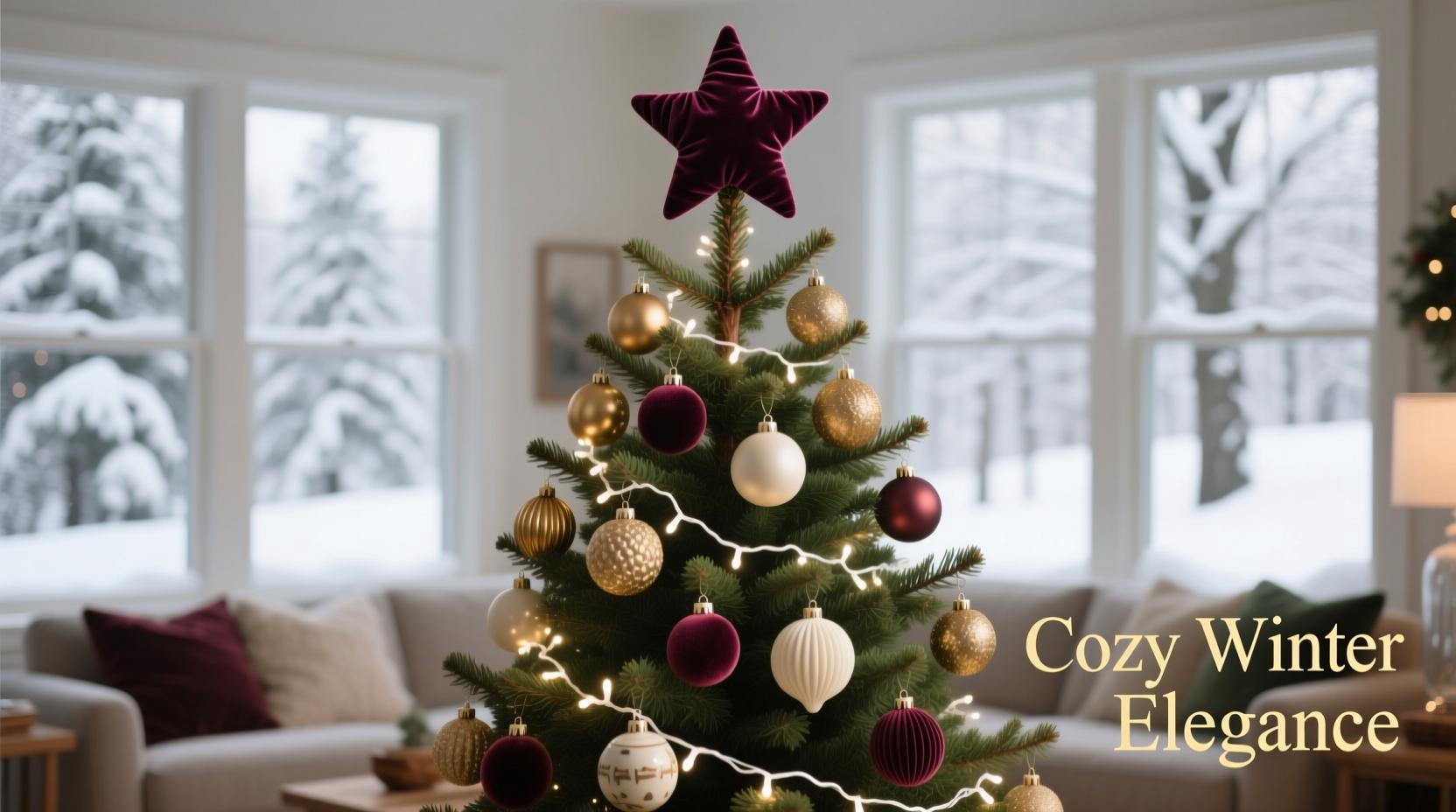
- Select One Dominant Hue: Choose a single base color that will make up 60–70% of your palette. This is your visual anchor—think deep forest green (not bright kelly), muted cranberry (not candy-apple red), or antique gold (not neon yellow). Avoid primary colors unless intentionally retro; opt instead for complex, slightly desaturated versions.
- Add One Supporting Hue: Select a second color that shares undertones with your dominant hue. If your dominant is emerald green, choose burnt sienna—not cobalt blue. If your dominant is navy, pair it with charcoal gray or dusty rose—not electric purple. This supporting hue should constitute 20–30% of your palette.
- Introduce Metallic & Texture Contrast: Choose one primary metallic (e.g., brushed brass, matte black iron, or aged silver) and one complementary texture (e.g., raw linen, cracked ceramic, or frosted glass). These are not “colors” per se—but they carry chromatic weight. A matte black metal reads cooler than polished brass, which reads warmer. Let this choice reinforce your dominant temperature (warm/cool).
- Define Your Neutrals: Identify two neutrals: one light (e.g., oyster white, oat milk, or parchment) and one dark (e.g., slate, charcoal, or espresso). These provide breathing room and prevent saturation overload. They’re essential for ribbons, garlands, and tree skirts—and they make your accent colors sing.
- Reserve One Accent Color (Optional): Only if your space feels visually stable, add a single high-contrast accent (e.g., a pop of terracotta against sage and cream, or a single mercury-glass teal ornament amid navy and brass). Keep this to under 5% of your total palette volume—and use it only in reflective or translucent materials to avoid visual aggression.
Do’s and Don’ts: Common Palette Pitfalls (and How to Avoid Them)
Mistakes in color selection rarely stem from poor taste—they arise from overlooked variables like lighting, material interaction, and scale. Below is a distilled comparison of strategic choices versus common missteps:
| Scenario | Do | Don’t |
|---|---|---|
| Working with Warm Interiors (beige walls, honey-toned wood) | Choose amber-gold metallics, terracotta accents, and olive or rust as dominants | Pair cool-toned silvers or icy blues—they’ll look washed out and disconnected |
| Using Multiple Metallics | Stick to two metals max—and ensure they share finish temperature (e.g., brushed brass + antique copper, both warm) | Mix polished chrome (cool) with rose gold (warm); the clash creates visual dissonance |
| Selecting Red Variants | Use a single red family: all brick-reds, all cherry-reds, or all cranberry-reds—never mix them | Combine fire-engine red bulbs with burgundy velvet bows and candy-cane stripes; they vibrate against each other |
| Adding White Elements | Opt for off-whites: ivory, shell, or bone—never pure white unless your space is starkly modern | Use stark white lights or ornaments in traditional or rustic settings; they read as clinical, not festive |
| Scaling Your Palette | Apply your dominant color across large surfaces first (tree skirt, garland base, ribbon wrap) | Start with small, shiny ornaments—then try to “match” larger elements to them; scale inversion breaks cohesion |
Real Example: The “Midnight Pine” Transformation
Sarah, an interior designer in Portland, faced a recurring challenge: her clients loved deep green trees but consistently ended up with decorations that felt “muddy” and indistinct. For a recent project in a 1920s Craftsman home with stained-oak built-ins and olive-green wallpaper, she committed to a tightly edited palette called “Midnight Pine.”
She began by identifying the wall’s undertone—not forest green, but a gray-leaning pine with subtle blue notes. Her dominant became Midnight Green (a deep, cool green with violet undertones, Pantone 19-0411). Her supporting hue was Charcoal Slate (not black), chosen for its ability to deepen the green without flattening it. For metallic, she selected Brushed Pewter—cooler than silver, warmer than graphite—to echo the home’s original nickel-plated hardware. Her neutrals were Oat Milk (a warm off-white) for the tree skirt and Espresso for the garland base. She added just three hand-blown Amethyst Glass ornaments as her sole accent—placed asymmetrically at eye level.
The result? A tree that looked grounded, sophisticated, and quietly luxurious—without a single traditional red or gold ornament. Clients described it as “feeling like stepping into a snow-dusted evergreen grove at twilight.” Crucially, Sarah reused 80% of the same ornaments the following year in a different home—simply swapping the supporting hue and metallic to adapt to new surroundings. That flexibility is the hallmark of a well-constructed palette.
Expert Insight: The Science Behind Seasonal Harmony
Color theory meets tradition in holiday decorating—and professionals rely on time-tested principles to guide choices. Dr. Lena Torres, a color psychologist and faculty member at the Rhode Island School of Design, explains why intuitive palettes often fail:
“People assume ‘Christmas colors’ are fixed—red, green, gold. But those are cultural shorthand, not design rules. What actually creates emotional resonance is tonal consistency and value contrast. A tree with high-value contrast (deep green + pale cream) feels vibrant and clear. One with low contrast (olive + khaki + tan) feels tired—even if all colors are ‘seasonal.’ Train your eye to see value first, hue second.” — Dr. Lena Torres, Color Psychologist & Author of Seasonal Chroma
Torres emphasizes that the most successful palettes align with natural winter light: cooler tones recede gracefully in low-angle sunlight, while warmer tones hold presence in artificial evening lighting. This duality is why palettes like “Frosted Birch” (ash gray, mist blue, birchwood brown, and pearlized white) thrive in northern climates—and why “Crimson Hearth” (oxblood, toasted almond, hammered copper, and parchment) feels intimate in homes with abundant firelight.
Practical Tools & Quick Reference Checklist
Translating theory into action requires simple, reliable tools. Use these every time you curate or shop for tree elements:
- Print a grayscale version of your palette swatches—does the value hierarchy still read clearly? If not, adjust saturation or lightness.
- Use the “Three-Ornament Rule”: Before buying, hold three ornaments together: one dominant, one supporting, one neutral. If any looks jarringly bright, dull, or mismatched in tone—set it aside.
- Map your tree zones: Top third (lights + finial), middle third (ornaments + garland), bottom third (skirt + presents). Assign palette roles by zone—e.g., dominant + neutral in top/middle, supporting + accent in bottom.
- Test lighting early: LED string lights dramatically alter perceived color. Warm white (2700K) enhances reds and golds; cool white (4000K) lifts blues and grays. Choose first—then select ornaments to match.
☐ Swatches physically placed beside tree stand in natural light
☐ Dominant hue applied to at least two major elements (e.g., garland + ribbon)
☐ Metallic finish tested against existing hardware (door knobs, lamp bases)
☐ Neutral used for at least one textural element (linen skirt, burlap bow)
☐ All ornaments cleaned and inspected for faded or scratched finishes
FAQ: Answering Real Decorator Questions
How many colors should a cohesive tree palette include?
Five is the functional maximum: one dominant, one supporting, one accent (optional), one metallic, and two neutrals (light + dark). More than five introduces visual noise—even if all hues are related. Remember: cohesion lives in restraint, not abundance.
Can I use vintage ornaments with a curated palette?
Absolutely—if you edit ruthlessly. Lay out all vintage pieces, then sort into piles by dominant undertone (warm vs. cool), sheen (matte vs. glossy), and value (light vs. dark). Keep only those that align with your core palette’s temperature and contrast range. A single mismatched piece can destabilize the entire composition.
What if my family insists on keeping “Grandma’s red balls”?
Honor the sentiment—but recontextualize. Group all red ornaments together on one lower quadrant of the tree, wrapped in a ribbon of your dominant hue. Place them against your dark neutral (e.g., charcoal garland) to mute their intensity. Their emotional value remains intact—while your palette stays anchored.
Conclusion: Your Tree, Your Story—Told in Color
A cohesive color palette is never about erasing personality—it’s about giving your vision clarity, confidence, and continuity. When your tree’s colors resonate with your space, your values, and your sense of seasonal joy, it becomes more than decoration. It becomes a quiet act of intention in a hurried season. You don’t need rare ornaments or designer ribbons to achieve this. You need observation, editing discipline, and the courage to say “no” to what doesn’t serve the whole.
Start small this year. Pick just one dominant hue. Source three items in that tone—a garland, a set of bulbs, a tree skirt—and build outward. Notice how much easier shopping becomes. Notice how much calmer your tree feels when lit. And notice how often guests pause, tilt their head, and say, “This feels so *right*.”


 浙公网安备
33010002000092号
浙公网安备
33010002000092号 浙B2-20120091-4
Comments
No comments yet. Why don't you start the discussion?