
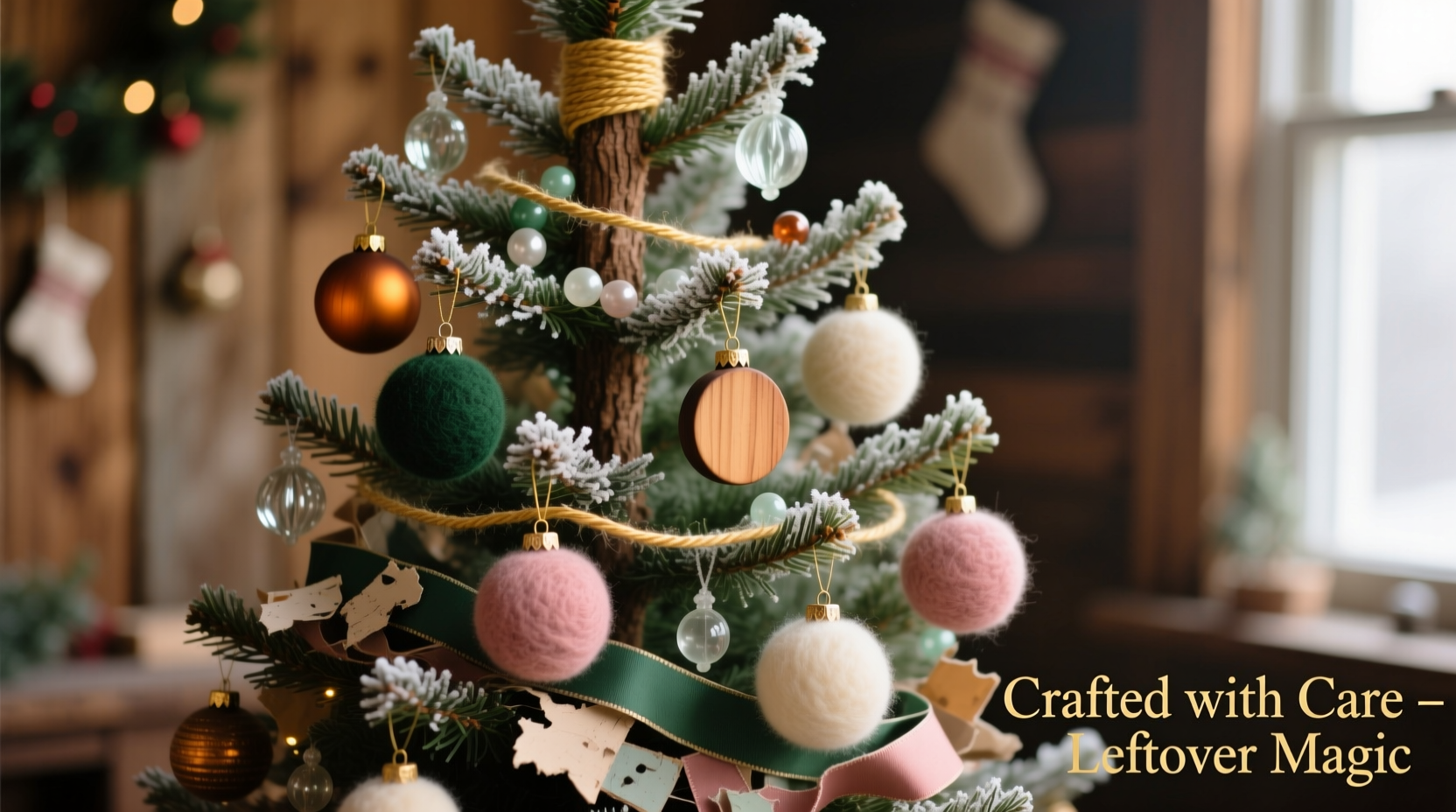
Every year, crafters find themselves staring at drawers overflowing with remnants: half-used spools of ribbon, mismatched pom-poms, faded felt scraps, dried-up glue sticks, and glitter that somehow migrated into every crevice of the supply cabinet. What feels like clutter is, in fact, a treasure trove waiting for intentional curation. Building a cohesive Christmas tree color palette doesn’t require a trip to the craft store—it demands observation, restraint, and thoughtful layering. When you work exclusively with what you already own, you sidestep decision fatigue, reduce waste, and anchor your tree in authenticity. This approach yields something far more meaningful than uniformity: harmony rooted in history, texture, and memory.
Why “Leftover-First” Is the Smartest Starting Point
Most holiday decorating guides begin with shopping lists—“buy 3 yards of velvet ribbon in forest green,” “order matte gold ornaments by October 15.” That model assumes both budget flexibility and time to source. In reality, families juggle school events, travel logistics, and seasonal fatigue. Using existing supplies eliminates friction: no shipping delays, no returns, no guilt over unused purchases. More importantly, it forces intentionality. You can’t default to “more is more” when your inventory is finite. Instead, you ask sharper questions: Which hues appear across multiple materials? Where does warmth naturally gather—and where does coolness balance it? How do textures interact when grouped, not scattered?
This constraint also fosters sustainability. According to the Environmental Protection Agency, holiday-related waste increases by over 25% between Thanksgiving and New Year’s. Much of that comes from single-use decor—plastic ornaments, foil-wrapped picks, and synthetic garlands discarded after one season. Repurposing craft remnants extends their lifecycle meaningfully. A scrap of wool roving becomes a miniature wreath; a bent pipe cleaner transforms into a twisted branch accent; a chipped ceramic bead gains new purpose as part of a hand-strung cluster.
The 5-Step Palette-Building Framework (No Color Theory Degree Required)
Forget Pantone swatches and RGB codes. Real-world palette building starts tactilely—not digitally. Follow this field-tested sequence, designed specifically for repurposed materials:
- Gather & Audit: Pull every craft item you associate with “holiday” or “winter”—even if it’s not traditionally festive (e.g., a dusty lavender yarn ball, a rust-colored paper punch). Lay them on a large neutral surface (a white sheet or light-colored tablecloth works best).
- Isolate Dominants: Identify the 2–3 colors that appear most frequently across materials. These become your anchor tones. For example: deep burgundy (in felt, fabric scraps, and dried cranberries), charcoal gray (in burlap, embroidery floss, and pencil shavings), and cream (in yarn, cotton balls, and unfinished wood slices).
- Identify Accents: Find 1–2 colors that appear only once or twice but carry strong visual weight—a metallic copper wire, a single iridescent feather, or a shard of cobalt-blue glass. These are your spark tones, used sparingly to draw the eye.
- Test Texture Pairings: Group three items—one dominant, one secondary (a supporting hue like olive green or oatmeal), and one spark. Hold them side-by-side at arm’s length. Do they feel visually stable? Or does one item vibrate unnaturally? Trust your gut—if it looks “off,” swap the spark tone or adjust the secondary.
- Assign Roles: Map each material to a specific function on the tree: structure (ribbons, wired stems), volume (pom-poms, tassels, cotton clusters), detail (beads, sequins, stamped tags), and transition (twine, jute, unbleached linen strips that soften edges between colors).
Do’s and Don’ts of Material Mixing (A Practical Table)
| Scenario | Do | Don’t |
|---|---|---|
| Ribbons & Wires | Twist two complementary widths (e.g., ¼” satin + ½” burlap) before wrapping branches. Let frayed edges show—they add organic rhythm. | Mix ribbons with identical sheen (e.g., two high-gloss satins) unless intentionally creating a monochromatic effect. Contrast in finish creates depth. |
| Felt & Fabric Scraps | Cut shapes in graduated sizes (small stars, medium trees, large circles) using the same dominant color—variation in form compensates for limited hue range. | Use more than three distinct fabric types (e.g., flannel, silk, vinyl) in one cluster. Too many weaves compete for attention and dilute cohesion. |
| Natural Elements (pinecones, twigs, dried citrus) | Stain pinecones with diluted coffee or tea to unify warm tones. Brush citrus slices with glycerin to deepen amber hues and prevent brittleness. | Leave natural items raw if their tones clash sharply with anchors (e.g., bright yellow lemon slices against burgundy/charcoal scheme). Tone them first. |
| Glitter & Shimmer | Apply glitter *only* to one material type per cluster—e.g., glittered pom-poms paired with matte felt stars. Creates deliberate focal points. | Sprinkle loose glitter directly onto the tree. It migrates, creates mess, and overwhelms texture-based harmony. |
A Real Example: Sarah’s “Cranberry & Ash” Tree
Sarah, a middle-school art teacher in Portland, opened her craft cabinet last November expecting disappointment. She found: six spools of embroidery floss (cranberry, navy, oat, moss, slate, and gold), a bag of acrylic pom-poms (mostly red, some gray and cream), three bent copper wires, a box of wooden beads (unfinished, stained, and painted), and a half-used jar of iridescent fine glitter. No ornaments. No ribbon. No plan.
She followed the 5-step framework. Her audit revealed cranberry and slate as dominants—appearing in floss, pom-poms, and stained beads. Oat and moss emerged as secondaries. The single jar of glitter became her spark tone. She assigned roles: copper wires formed structural spirals; pom-poms provided volume; wooden beads added detail; and oat-colored floss wrapped branch junctions to soften transitions.
The result wasn’t “matchy-matchy.” It was layered: cranberry pom-poms nestled beside slate-floss-wrapped twigs; moss beads dangled beneath oat-floss bows; a single glitter-dusted pom-pom hung at the tree’s apex. Neighbors commented on its “intentional calm”—a phrase Sarah hadn’t planned but recognized as the essence of cohesion. “I didn’t make it look expensive,” she says. “I made it look *considered*.”
“The strongest palettes aren’t built on color alone—they’re built on relationship. How does this red *speak* to that gray? Does the texture invite touch, or does it recede? Leftovers force those questions because you can’t hide behind quantity.” — Lena Torres, Textile Designer & Sustainable Holiday Educator
Step-by-Step: Transforming Your Inventory Into a Balanced Tree
Follow this timeline over 90 minutes—no prep needed beyond clearing a workspace:
- Minute 0–15: The Spread-Out Audit
Empty all craft containers onto a large surface. Separate items by material type (fabric, paper, natural, metallic). Photograph the spread. Circle three items that “feel like home” together—even if they’re different colors. - Minute 16–30: Dominant Extraction
From your photo, identify the two most recurring colors. Pull every item in those hues—even small ones (a button, a thread tail). Set aside everything else temporarily. - Minute 31–45: Secondary & Spark Sourcing
Scan remaining items for one warm neutral (cream, oat, taupe) and one cool neutral (slate, charcoal, heather). Then locate your single strongest “pop” item—the one that makes you pause. That’s your spark. - Minute 46–70: Cluster Prototyping
Create five mini-clusters on a plate: each must contain one dominant, one secondary, and one spark item. Arrange them vertically (like ornaments on a branch). Step back. Remove any cluster where your eye lingers too long on one element—that’s imbalance. Refine until four feel resolved. - Minute 71–90: Tree Integration
Start at the trunk. Wrap dominant-hue ribbon or floss around the lowest sturdy branch. Add your most resolved cluster. Move upward in 12-inch increments, rotating cluster types so no two identical combinations sit within 18 inches. Finish with spark-only accents at the top third of the tree—never at the base.
FAQ: Troubleshooting Common Leftover Challenges
What if my dominant colors are clashing—not complementing?
Clash often stems from saturation mismatch, not hue incompatibility. Desaturate one: dip a felt scrap in weak black tea (for 30 seconds), then air-dry. Or wrap a shiny ornament in a single layer of sheer organza scrap—this softens intensity and creates visual breathing room. Test first on a small piece.
I only have “kids’ craft” supplies—bright pinks, neon greens, plastic gems. Can I still achieve cohesion?
Absolutely—but shift your strategy from “harmony” to “rhythm.” Use one neon as your sole dominant (e.g., hot pink), then mute all others: spray-paint plastic gems matte white, dye green pipe cleaners in diluted brown ink, cover neon pom-poms with lace scraps. Rhythm emerges from consistent treatment—not matching colors.
How do I keep the palette feeling full without buying new items?
Add dimension through technique, not quantity. Fray burlap strips into wisps. Coil thin wire into tight springs. Stack three identical wooden beads with tiny gaps between. Fold ribbon into origami stars. One transformed item carries more visual weight than five untouched ones.
Conclusion: Your Tree Is Already Complete
You don’t need permission to decorate. You don’t need clearance from Pinterest or validation from Instagram. The supplies you’ve accumulated—the half-forgotten projects, the birthday-party leftovers, the well-intentioned kits abandoned mid-craft—are not failures. They’re raw material for meaning. A cohesive Christmas tree isn’t about perfection. It’s about presence: noticing how light catches the edge of a reused copper wire, how the weight of a dried orange slice grounds a cluster of cranberry pom-poms, how the quiet repetition of oat-colored floss wraps brings calm to chaos.
This year, resist the reflex to acquire. Instead, investigate. Sort not to discard—but to discover relationships you hadn’t seen. Build not to impress—but to settle into your own aesthetic truth. Your tree won’t look like anyone else’s. It will look like yours: layered, resourceful, quietly confident.


 浙公网安备
33010002000092号
浙公网安备
33010002000092号 浙B2-20120091-4
Comments
No comments yet. Why don't you start the discussion?