
In the quiet glow of the holiday season, lighting plays a transformative role. It’s not just about brightness or decoration—it’s about mood, memory, and harmony. While many homeowners reach for an array of colored bulbs, garlands, and themed decor, a more refined approach lies in restraint: using only three carefully chosen Christmas light hues to unify every room in the house. By focusing on warm white, cool white, and amber tones, you can craft a seamless, sophisticated ambiance that flows from entryway to bedroom without visual clutter or dissonance.
This method isn’t about limitation—it’s about intentionality. A minimalist palette of light allows architectural details to shine, fosters emotional warmth, and eliminates the jarring transitions common in over-decorated homes. When done well, the result is a home that feels both festive and serene, where each space belongs to a greater whole.
The Power of Three: Why Limit Yourself to Three Hues?
Limiting your lighting scheme to three hues—specifically warm white, cool white, and amber—is a design strategy rooted in color theory and environmental psychology. The human eye responds best to harmonious gradients rather than abrupt shifts. Introducing too many colors creates cognitive noise; reducing them enhances focus, calm, and aesthetic coherence.
Warm white (2700K–3000K) mimics candlelight and incandescent bulbs, evoking comfort and nostalgia. Cool white (4000K–5000K) offers clarity and modernity, ideal for task-oriented or contemporary spaces. Amber (2200K–2400K) sits below warm white on the Kelvin scale, producing a soft, golden glow reminiscent of sunset or vintage filament bulbs. Together, these three hues span the emotional spectrum—from energizing to tranquil—without introducing chromatic conflict.
“Restriction breeds creativity. When you limit your palette, you’re forced to think deeper about placement, layering, and rhythm.” — Lena Pruitt, Interior Lighting Designer
Mapping Your Home: Assigning Hues by Room Function
A cohesive palette doesn’t mean uniformity. Instead, it means thoughtful distribution. Each room serves a different purpose, and its lighting should reflect that. Begin with a floor plan of your home and assign primary and secondary hues based on activity, architecture, and existing finishes.
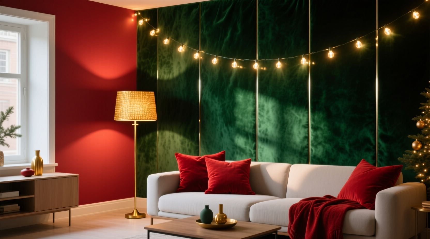
For example, living rooms and dining areas benefit from warm white as the dominant tone, supported by amber accents near seating nooks or artwork. Kitchens and bathrooms, where visibility matters, use cool white as the main source, softened by warm white string lights under cabinets or along mirrors. Bedrooms rely heavily on amber and warm white to promote relaxation, while entryways and hallways act as transitional bridges, blending all three hues subtly.
| Room | Primary Hue | Secondary Hue | Accent Option |
|---|---|---|---|
| Living Room | Warm White | Amber | Cool White (for media wall) |
| Kitchen | Cool White | Warm White | Amber (under cabinets) |
| Bedroom | Amber | Warm White | None |
| Bathroom | Cool White | Warm White | Amber (mirror frame) |
| Hallway / Entry | Warm White | Cool White | Amber (step lights) |
The key is maintaining a consistent ratio. If warm white dominates the first floor, don’t abruptly switch to cool white upstairs unless there’s a deliberate design reason. Transitions should feel like gradual shifts in tone, much like a musical chord progression.
Step-by-Step Guide: Building the Palette Room by Room
Creating cohesion requires planning and precision. Follow this five-step process to implement your three-hue system across the entire home.
- Survey Existing Lighting: Turn off all decorative lights and assess what’s already installed. Note bulb temperatures in overheads, lamps, and built-ins. Replace any mismatched LEDs to align with your target palette.
- Choose Your Base String Lights: Purchase high-quality LED string lights in warm white, cool white, and amber. Opt for dimmable options with copper wire for flexibility and durability.
- Draft a Placement Map: Sketch a simple diagram of each room. Mark where lights will go—mantels, shelves, windows, railings—and assign a hue. Ensure at least two rooms share overlapping combinations to create continuity.
- Install with Layering in Mind: Begin with structural lighting (e.g., ceiling drapes, stair rails), then add accent layers (e.g., behind photos, inside glass cabinets). Avoid clustering all three hues in one spot unless creating a focal point.
- Test and Adjust at Dusk: View your work in low natural light. Walk through the house and note any jarring transitions. Swap out one hue if it disrupts flow—consistency matters more than perfection in individual rooms.
Real Example: A Single-Family Home Transformation
Consider the Miller residence—a two-story suburban home with open-plan living, four bedrooms, and a finished basement. Before the holiday season, their decor was inconsistent: red-and-green lights in the kitchen, multicolored strands on the porch, and leftover icicle lights from 2018 dangling from the eaves.
They committed to the three-hue system. Warm white became the anchor: used on the front porch, wrapped around the staircase banister, and draped across the living room mantel. Amber lights were reserved for bedside tables, bathroom mirrors, and the reading nook. Cool white illuminated the kitchen island, pantry shelves, and basement bar area.
The result? Guests commented on the “calm but festive” atmosphere. The lack of rainbow colors didn’t diminish the holiday spirit—in fact, it enhanced it. The family reported feeling less overwhelmed during gatherings, and the lighting required minimal adjustment year after year. By sticking to the same three hues, they built a repeatable tradition.
Design Do’s and Don’ts: Common Pitfalls to Avoid
Even with a clear plan, mistakes happen. Below is a summary of frequent errors and how to sidestep them.
| Do | Don’t |
|---|---|
| Use dimmers to balance intensity between hues | Mix non-dimmable and dimmable strings on the same circuit |
| Match wire color to surroundings (copper for wood, silver for metal) | Use green-coated wires against white walls |
| Layer lights behind sheer curtains or plants for diffusion | String lights tightly across bare walls like laundry lines |
| Label containers by hue for easy storage and retrieval | Store tangled lights loose in a bin |
| Test all strands before installation | Assume new boxes are identical in color temperature |
One critical oversight is assuming all “warm white” bulbs are the same. Manufacturers vary widely—some lean yellow, others pinkish. Buy test strands first, compare them side by side in your space, and stick to one brand for consistency.
Expert Tips for Long-Term Cohesion
Sustainability isn’t just environmental—it’s aesthetic. A lighting palette that lasts beyond a single season saves money, time, and decision fatigue. To future-proof your system:
- Invest in commercial-grade string lights with replaceable bulbs or sections.
- Keep a small inventory of spare connectors, fuses, and clips.
- Create a digital album showing each room’s setup for reference next year.
- Involve household members in the plan so everyone understands the logic behind the hues.
“A cohesive home isn’t decorated once—it’s designed to evolve. Your lighting should be a foundation, not a temporary overlay.” — Malik Chen, Sustainable Interior Consultant
Frequently Asked Questions
Can I include colored lights elsewhere, like on the tree?
Yes, but sparingly. If your tree uses colored bulbs, keep the surrounding lights in your three-hue range to ground it visually. Alternatively, use a white or silver tree with monochromatic ornaments to stay within the palette.
What if my home has very different room styles—modern kitchen, rustic living room?
The three-hue system actually excels in eclectic homes. Use cool white to modernize rustic spaces and warm white to soften contemporary ones. The shared palette becomes the unifying thread across contrasting aesthetics.
Are flickering or flame-effect bulbs compatible with this approach?
Yes, especially amber flicker lights, which mimic candle movement. Use them selectively—on dining tables or near fireplaces—to add dynamic texture without breaking cohesion.
Final Checklist: Your Three-Hue Implementation Plan
- ☐ Audit current lighting and note existing color temperatures
- ☐ Select and purchase warm white, cool white, and amber string lights (dimmable, same brand)
- ☐ Sketch a room-by-room lighting map with assigned hues
- ☐ Install base layers first, then accents
- ☐ Test at dusk and adjust for flow
- ☐ Label and store properly for reuse next year
Conclusion: Illuminate with Purpose
Creating a cohesive color palette for your entire home using only three Christmas light hues is an exercise in disciplined beauty. It proves that restraint can amplify impact, and that true festivity lies not in excess, but in harmony. By anchoring your holiday lighting in warm white, cool white, and amber, you build a flexible, enduring system that adapts to changing tastes, seasons, and family needs.
This year, resist the impulse to decorate every surface. Instead, choose wisely, place intentionally, and let light do the work of connection. When your hallway glows with the same quiet warmth as your bedroom, and your kitchen hums with a brightness that doesn’t disrupt the peace, you’ll understand: the most memorable holidays aren’t the busiest—they’re the most balanced.


 浙公网安备
33010002000092号
浙公网安备
33010002000092号 浙B2-20120091-4
Comments
No comments yet. Why don't you start the discussion?