
Lighting transforms a holiday space—not just by adding brightness, but by shaping emotion, rhythm, and memory. A single strand of mismatched bulbs can fracture the atmosphere; a thoughtfully coordinated palette, however, invites calm, celebration, or quiet reverence with equal intention. Yet most people approach tree lights and room lighting as separate decisions: “I’ll get warm white for the tree” and “maybe cool white for the mantel,” without considering how those choices interact in three-dimensional space over time. Cohesion isn’t about uniformity—it’s about intentional relationships between hue, temperature, intensity, and placement. This guide distills decades of interior lighting practice, seasonal design principles, and real-world client feedback into a grounded methodology for unifying your holiday lighting from trunk to ceiling.
Understand the Three Layers of Holiday Light
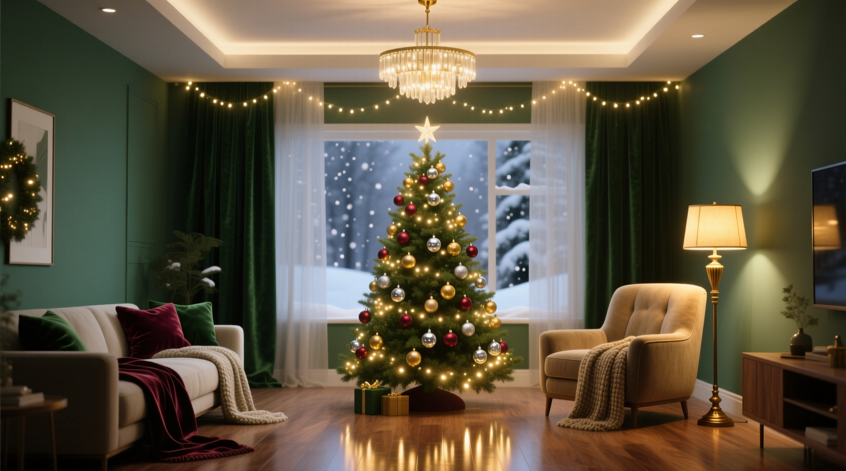
A cohesive scheme begins not with color swatches—but with spatial awareness. Holiday lighting functions across three distinct, overlapping layers:
- The Tree Layer: Lights that wrap branches, define silhouette, and serve as the focal point. These must carry visual weight and emotional resonance.
- The Ambient Layer: Overhead fixtures, floor lamps, sconces, and string lights that shape the room’s baseline mood—softening shadows, highlighting textures, or guiding movement.
- The Accent Layer: Targeted illumination—wreaths, garlands, shelf vignettes, window frames—that adds punctuation, depth, and narrative detail.
Each layer operates at different intensities and distances from the viewer. The tree is viewed head-on, often within 3–6 feet; ambient light fills peripheral vision; accents are discovered in glances or pauses. Ignoring this hierarchy leads to visual competition: a bright, cool-white tree can make warm ambient lighting feel muddy, while overly saturated accent lights can overwhelm a subtle tree palette.
Choose a Dominant Temperature, Not Just a Color
Most consumers fixate on “color”—red, gold, blue—but temperature (measured in Kelvin, K) governs emotional impact more powerfully than hue alone. A 2200K “warm white” bulb emits a candle-like glow rich in amber and red wavelengths, evoking intimacy and tradition. A 4000K “cool white” leans neutral to slightly bluish, suggesting crispness, modernity, or even sterility if overused. And a 5000K+ light mimics midday sun—energetic but rarely appropriate for evening holiday ambiance.
Professional lighting designers consistently recommend anchoring your entire scheme in one dominant temperature. That doesn’t mean every bulb must be identical—but the *majority* of visible light sources should cluster within a 300K range. For example: 2200K–2500K for classic warmth; 2700K–3000K for contemporary elegance; 3200K–3500K only for high-ceilinged, minimalist spaces seeking subtle vibrancy.
“Temperature is the silent conductor of mood. You can change every bulb’s color, but if the temperature jumps from 2200K to 4500K across the room, your eye will register dissonance before it registers red or green.” — Lena Torres, Lighting Designer & Author of Seasonal Light: Designing with Natural Rhythm
Once you’ve selected your dominant temperature, introduce color deliberately—not randomly. Warm whites (2200K–2700K) pair elegantly with deep jewel tones: burgundy, forest green, charcoal, antique gold. Cool whites (3200K–3500K) support icy palettes: silver, frosted blue, pearl white, pale lavender. Avoid mixing warm and cool temperatures on the same visual plane—e.g., warm-white tree lights next to cool-white sconces flanking the fireplace.
Build Your Palette Using the 60-30-10 Rule
This interior design principle applies with precision to lighting cohesion. Allocate your visual weight across three tiers:
- 60% Dominant Tone: Your base temperature + primary accent color (e.g., warm white + deep green glass bulbs).
- 30% Secondary Tone: Complementary hue or metallic finish that supports but doesn’t compete (e.g., brushed brass ornaments, copper wire-wrapped candles, amber-tinted glass votives).
- 10% Accent Tone: A deliberate pop—used sparingly and intentionally (e.g., one small cluster of cobalt-blue fairy lights inside a clear glass cloche, or a single vintage mercury-glass bauble reflecting a specific wall color).
This ratio prevents saturation fatigue and gives the eye resting points. It also allows flexibility: you might use warm-white LED string lights for 60% of your tree coverage, add 30% copper-colored bead garlands and brass star toppers, then place exactly ten matte-black velvet bows spaced evenly for contrast and texture.
| Layer | 60% Role | 30% Role | 10% Role |
|---|---|---|---|
| Tree | Base string lights (e.g., warm white micro-LEDs) | Ornament bodies (e.g., matte green ceramic, textured red glass) | Finial or top ornament (e.g., single hand-blown cobalt glass star) |
| Ambient | Dimmable overhead fixture (2700K) | Floor lamp with amber linen shade | Single brass table lamp with parchment shade on sideboard |
| Accent | Warm-white garland along staircase railing | Copper-wire-wrapped pinecones on mantel | One vintage mercury-glass bell hanging above entry mirror |
A Step-by-Step Integration Process
Follow this sequence—not as rigid steps, but as a disciplined workflow that prevents reactive decisions:
- Assess Your Space’s Existing Light Signature: Turn off all artificial lights at twilight. Note the color and direction of remaining natural light. Then switch on your current overhead, lamps, and task lighting. Does your living room read as golden, neutral, or cool? Write down the Kelvin rating of your main bulbs (often printed on the base or packaging). If unknown, use a free smartphone app like “Lux Light Meter” to estimate.
- Select Your Dominant Temperature: Choose one value within ±300K of your existing ambient light. If your ceiling fixture is 2700K, aim for 2400K–3000K across all new lighting purchases. This creates continuity, not contrast.
- Define Your Primary Color Anchor: Pick one non-white hue that appears in your furniture, rug, artwork, or architectural details (e.g., the deep teal in your sofa pillows, the rust tone in your brick fireplace). This becomes your 60% color anchor.
- Map Light Placement by Layer: Sketch a simple floor plan. Mark where tree lights will sit (height, density), where ambient sources fall (ceiling, floor, wall), and where accents will appear (mantel, windows, shelves). Ask: “Which layer is closest to the viewer in my primary sightline?” That layer dictates the strongest color statement.
- Test Before Committing: Purchase one string of your intended tree lights and one set of your planned accent bulbs. Install them together in the space for 48 hours. Observe at dawn, noon, dusk, and night. Adjust before scaling up.
Real-World Example: The Urban Apartment Balcony Tree
Maria lives in a 650-square-foot downtown loft with floor-to-ceiling windows facing north. Her existing overhead fixture emits 3000K light, and her wool rug features slate gray, ivory, and faint charcoal stripes. She wanted a “cozy but not cluttered” Christmas presence—no traditional tree due to space, but a 4-foot potted Norway spruce on her balcony, visible through the glass.
She began by measuring her ambient light: 3000K confirmed. Rather than default to warm white (which would clash with her cool daylight views), she chose 3200K micro-LEDs for the tree—bright enough to glow against winter dusk but soft enough to avoid glare on the glass. For the 60% layer, she wrapped the tree in 3200K lights. For 30%, she added matte charcoal-gray felt ornaments and brushed nickel wire spirals. For the 10%, she hung three hand-blown opal glass spheres—each subtly shifting from ivory to palest rose depending on the angle of light.
Inside, she replaced her dining pendant’s bulbs with 3200K LEDs and added a single 3200K string light draped in loose loops over her bookshelf, echoing the tree’s rhythm. No other colors entered the scheme—yet the result felt rich, intentional, and deeply personal. Neighbors commented on how “calm” her space looked—even though it contained more light than last year.
Common Pitfalls—and How to Avoid Them
Even experienced decorators stumble here. These five missteps undermine cohesion most frequently:
- Mixing non-dimmable and dimmable LEDs on the same circuit: Causes flicker, inconsistent color rendering, and premature burnout. Always verify compatibility with your dimmer switch—or install smart bulbs with unified dimming protocols (e.g., Matter-over-Thread).
- Using colored bulbs without controlling their CRI (Color Rendering Index): Low-CRI bulbs (below 90) distort surrounding colors. A red bulb with CRI 75 makes greenery look brownish; one with CRI 95 renders true emerald. Prioritize CRI 90+ for all colored lighting.
- Overloading the tree with multiple bulb types: Combining warm white, cool white, and multicolor strings creates visual noise. Choose one base light type, then layer texture and material (e.g., matte vs. glossy ornaments) for dimension.
- Ignoring light decay over time: LED color temperature shifts subtly after 5,000+ hours. Buy all bulbs from the same batch/manufacturer for long-term consistency—even if storing spares for next year.
- Forgetting vertical rhythm: Lights placed only on horizontal planes (tree, mantel, shelf) flatten a room. Introduce vertical accents: a single column of warm-white lights behind sheer curtains, or a narrow LED strip running up a door frame.
FAQ
Can I use smart lights to unify my scheme—and is it worth the investment?
Yes—if used intentionally. Smart bulbs excel at synchronizing temperature and intensity across layers, but they falter when used for chaotic color cycling. Instead of “rainbow mode,” program all bulbs to hold one precise Kelvin value (e.g., 2700K) with gentle, slow dimming from 80% to 40% brightness between 6–10 p.m. That subtle shift mimics natural circadian rhythm and reinforces cohesion far more effectively than static brightness or random hues.
My tree is artificial and looks plasticky—will better lighting fix that?
Lighting won’t erase material limitations—but it can redirect attention. Use directional, warm-white accent lights (like small track heads or adjustable picture lights) aimed at the tree’s upper third to highlight branch texture and create depth. Pair with matte-finish ornaments in organic shapes (wood, felt, ceramic) to counteract shine. Avoid cool white or blue-tinged lights, which amplify plastic’s artificiality.
How do I handle mixed-metal decor (brass, nickel, black iron) without clashing with my lighting?
Metal finishes respond strongly to light temperature. Warm-white lighting (2200K–2700K) enhances brass and copper while softening black iron. Cool-white lighting (3200K+) lifts nickel and chrome but can make brass look brassy or dated. Match your dominant lighting temperature to your *most prevalent* metal. If you have equal parts, lean warm: warmth is more forgiving and universally flattering in residential settings.
Conclusion
A cohesive Christmas lighting scheme is less about perfection and more about presence—about making conscious choices that honor your space, your habits, and the quiet significance of this season. It asks you to slow down: to measure before buying, to test before committing, to notice how light falls on your favorite chair at 4:37 p.m. on a December afternoon. When your tree’s glow harmonizes with the soft wash on your bookshelf, when your mantel lights don’t fight your overhead fixture but instead deepen its warmth, you’re no longer decorating—you’re curating atmosphere. That atmosphere becomes the container for everything else: laughter, quiet reflection, shared meals, the turning of the year.
You don’t need a designer, a budget overhaul, or dozens of light strands. Start with one decision: choose your dominant temperature. Then apply the 60-30-10 rule to your tree alone. Watch how that small act changes the feeling of the whole room. Build outward—not upward, not faster, but deeper.


 浙公网安备
33010002000092号
浙公网安备
33010002000092号 浙B2-20120091-4
Comments
No comments yet. Why don't you start the discussion?