
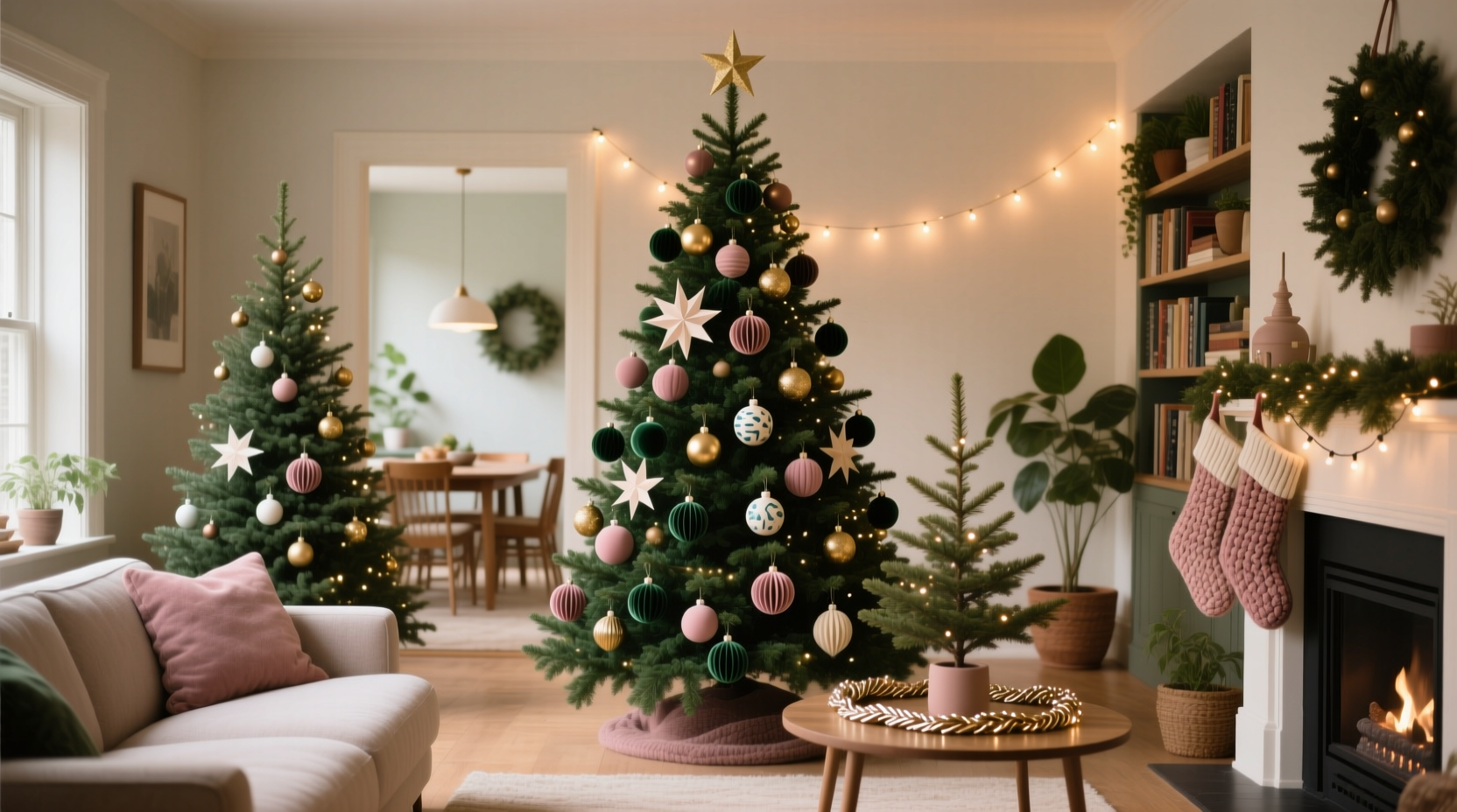
In homes with more than one Christmas tree, the opportunity for creative expression multiplies—but so does the risk of visual chaos. A living room tree in deep jewel tones, a dining room tree in icy silver, and a child’s bedroom tree in neon pink can feel jarring if not thoughtfully connected. Creating a cohesive color story across multiple trees isn’t about uniformity; it’s about intentionality. It’s the art of weaving threads of color, texture, and theme through each space to produce a unified yet varied holiday atmosphere. When done well, multiple trees become a narrative journey through your home, each chapter distinct but part of the same story.
This guide explores how to design a harmonious holiday display that respects individual spaces while maintaining a consistent aesthetic. From selecting a master palette to balancing repetition and contrast, you’ll learn practical strategies used by professional interior stylists and holiday designers.
Define Your Master Color Palette
The foundation of any cohesive design is a clear, intentional color scheme. Start by choosing a primary palette of three to five colors that will serve as the backbone across all trees. This doesn’t mean every tree must use all five colors equally—rather, each tree should draw from the shared pool in a way that feels deliberate.
Consider the architecture and existing décor of your home. A farmhouse kitchen may lend itself to sage green, cream, and terracotta, while a modern living room might call for charcoal, emerald, and gold. The key is to anchor your palette in hues already present in your walls, furniture, or textiles. This ensures the trees feel like natural extensions of their environments rather than standalone installations.
Limit dominant colors to two or three per tree. For example, Tree 1 (living room) uses emerald and gold as primaries with cream as an accent. Tree 2 (dining room) features cream and gold with emerald as a secondary. Tree 3 (entryway) leans into cream and terracotta with subtle gold accents. The repetition of at least one shared color between adjacent trees creates visual continuity.
Assign Each Tree a Role in the Story
Think of your trees as characters in a seasonal play—each has a personality, but they belong to the same production. Assigning roles helps prevent duplication and strengthens cohesion. Consider these common archetypes:
- The Anchor Tree: Usually the largest, placed in a central gathering space. It carries the full weight of the main palette and sets the tone.
- The Accent Tree: Smaller, often in a secondary room. It echoes one or two elements from the anchor but introduces a twist—like swapping out one color for a complementary alternative.
- The Thematic Tree: Tied to a specific idea—a winter forest, vintage nostalgia, or children’s toys. Still bound by the master palette, but expresses it through curated motifs.
- The Minimalist Tree: In hallways or bathrooms, this tree uses restraint—perhaps just one color and natural textures—to provide breathing room.
“Cohesion isn’t sameness. It’s recognition. When someone walks through a home with multiple trees, they should feel a sense of ‘I’ve seen this thread before’—not ‘This looks exactly the same.’” — Lila Montgomery, Interior Stylist & Holiday Design Consultant
For instance, in a recent project, Montgomery styled a 4,000-square-foot home with four trees. The living room featured a full emerald-gold-cream palette with velvet ribbons and antique glass bulbs. The study had a “library tree” in deep burgundy and cream with miniature books as ornaments—burgundy being a new addition, but cream maintained the link. A guest room held a tiny silver-frosted pinecone tree, echoing metallic sheen without competing. The result was layered, personal, and unmistakably unified.
Create Visual Bridges Between Trees
Even when trees are in separate rooms, transitional spaces—hallways, staircases, doorways—can reinforce cohesion. These areas act as connective tissue, carrying color cues from one zone to the next.
Use small-scale interventions: a garland strung along a banister using ribbon from Tree 1, a vase of faux evergreen sprigs on a console table tinted with the accent color from Tree 2, or a set of monogrammed stockings in the shared palette hung in a hallway. Even something as subtle as coordinated tree skirts in varying shades of the same base color can tie the look together.
| Element | Use Across Trees | Avoid |
|---|---|---|
| Ornament Style | Mix of matte, glossy, and textured finishes in shared colors | Completely different styles (e.g., rustic wood on one, glitter bombs on another) |
| Lighting | Consistent bulb tone (warm white recommended) | Mixing warm and cool white LEDs |
| Natural Elements | Pinecones, dried citrus, cinnamon sticks in recurring hues | One tree with eucalyptus, another with holly, no overlap |
| Tree Skirts | Variations of the same fabric (linen, velvet) in palette colors | Clashing patterns or unrelated textures |
Lighting consistency is especially crucial. Warm white lights create a soft, inviting glow that unifies disparate color schemes. Cool white or multicolored lights can fragment the experience, making one tree feel like a department store display and another like a cozy cabin.
Step-by-Step Guide to Building Your Color Story
Follow this timeline to plan and execute a seamless multi-tree display over the course of two to three weeks before decorating day:
- Week 3: Audit Your Space and Inventory
Walk through each room where a tree will go. Note wall colors, furniture, lighting, and existing décor. Take photos. Pull out last year’s ornaments and sort by color and condition. - Week 2: Define Your Palette and Roles
Choose 3–5 core colors. Assign each tree a role (anchor, accent, thematic, etc.). Sketch a simple map of your home with tree locations and intended color distribution. - Week 1: Shop Strategically
Purchase only what fills gaps—ornaments in missing colors, consistent string lights, coordinating tree skirts. Prioritize versatile pieces like neutral-toned shatterproof bulbs or textured ribbon that can be reused across themes. - Decorating Week: Style with Intention
Start with the anchor tree. Once complete, move to adjacent trees, ensuring at least one visual echo (a shared ornament type, ribbon color, or lighting style). Step back frequently to assess flow. - Final Touch: Add Transitional Elements
Install garlands, vignettes, or tabletop displays that carry color between rooms. Test sightlines—can you see hints of one tree’s palette from another?
Case Study: The Three-Tree Home in Portland
A client in Portland, Oregon, wanted three trees: a 7-foot Fraser fir in the living room, a 4-foot pre-lit tree in the sunroom, and a 2-foot tabletop tree in the child’s nursery. The challenge was avoiding clutter while honoring each space’s function.
The designer began with a master palette of forest green, cream, and brushed brass. The living room tree served as the anchor, fully dressed in green velvet bows, cream glass balls, and brass stars. Lighting was warm white with a gentle twinkle.
The sunroom tree, visible from both inside and outside, leaned into nature: real pine branches woven through the branches, handmade paper snowflakes in cream, and green-dipped pinecones. The brass star topper echoed the main tree, creating a clear connection.
The nursery tree took a softer approach—miniature plush animals in green and cream, hand-knit garlands, and a tiny brass bell. Though playful, it adhered strictly to the shared palette and finish language.
Between the rooms, the designer added continuity: a runner on the staircase dyed in ombre forest green, matching throw pillows on adjacent sofas, and a single strand of warm white lights draped over a hallway mirror. Visitors consistently remarked on the “calm elegance” of the home, noting that the trees felt “related, not repeated.”
Checklist: Pre-Decorating Cohesion Review
Before hanging the first ornament, run through this checklist to ensure alignment:
- ☐ All trees use at least one shared color from the master palette
- ☐ Lighting is the same temperature (warm white preferred)
- ☐ At least one decorative element (ribbon, topper, or ornament style) repeats across two or more trees
- ☐ No tree introduces a completely foreign material (e.g., tinsel on one, burlap on another)
- ☐ Transitional spaces include subtle nods to the color story (garlands, wreaths, tabletop decor)
- ☐ Storage bins are labeled by tree and color for future ease
Frequently Asked Questions
Can I use different tree types (real vs. artificial) and still maintain cohesion?
Yes, but balance is key. If one tree is a lush real fir and another is a slim artificial spruce, unify them through décor. Use the same ornament density, color placement, and lighting style. Avoid letting one tree feel sparse while another is overloaded.
What if one room has strong existing colors, like a red sofa?
Work with it, don’t fight it. Incorporate that red as an accent in other trees rather than ignoring it. For example, add a few red glass balls to the anchor tree or use red-tinted pinecones in a garland. Acknowledging dominant room colors prevents visual dissonance.
How do I keep kids’ trees fun but still part of the story?
Let children choose ornaments, but within boundaries. Offer a selection of handmade or themed decorations in the master palette—wooden reindeer in stained green, handprint snowmen on cream cardstock, or DIY popcorn strings. Their tree becomes personal yet integrated.
Final Thoughts: Harmony Through Intention
A home with multiple Christmas trees has the potential to feel either magical or mismatched. The difference lies in planning. By establishing a master color story, assigning purpose to each tree, and building visual bridges throughout the space, you create an environment that feels curated, calm, and celebratory.
Cohesion doesn’t require perfection. It requires awareness. It’s noticing that the brass star on the dining room tree catches the same light as the one in the living room. It’s the quiet satisfaction of walking from room to room and feeling the season unfold like pages in a well-loved book.
Your holiday home should reflect both joy and thoughtfulness. With these principles, you’re not just decorating—you’re storytelling.


 浙公网安备
33010002000092号
浙公网安备
33010002000092号 浙B2-20120091-4
Comments
No comments yet. Why don't you start the discussion?