
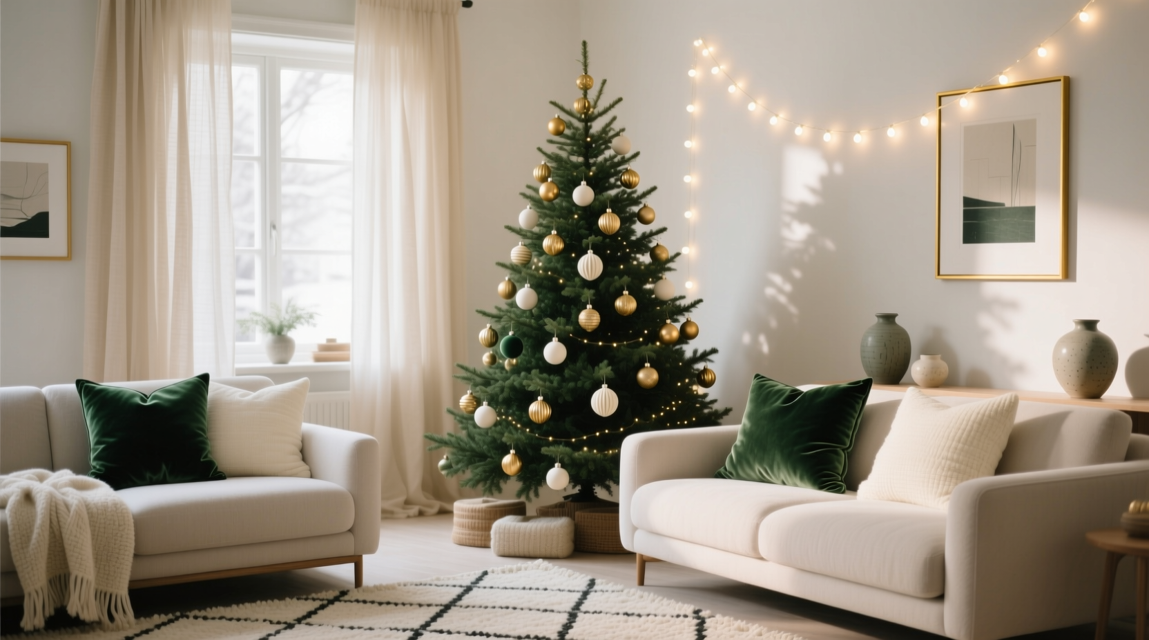
Christmas decor often begins with enthusiasm—and ends with visual clutter. A tree draped in gold ornaments, red ribbons, silver tinsel, green garlands, and blue glass baubles may feel festive in isolation, but without intentional color strategy, it can read as chaotic rather than celebratory. Cohesion isn’t about monotony; it’s about resonance—the quiet confidence that every element belongs, from the front door wreath to the mantel candle holders. This harmony extends beyond aesthetics: studies in environmental psychology show that visually unified spaces reduce cognitive load and elevate mood during high-stimulus seasons like December. Creating a cohesive color theme is less about rigid rules and more about thoughtful curation—choosing a palette with intention, applying it across layers, and editing with discipline.
Start with Your Home’s Existing Color Foundation
Before buying a single ornament, step back and observe your living space—not as a blank canvas, but as a living context. Your walls, flooring, upholstery, and window treatments already establish a dominant chromatic language. A north-facing room with cool gray walls and white oak floors will absorb warm golds differently than a sun-drenched living room with terracotta tile and sage-green linen sofas. Pull three to five dominant colors from your permanent furnishings—not just the obvious ones (e.g., “the sofa is navy”), but also subtle undertones (“the rug has a faint charcoal stripe,” “the wood grain reads warm amber”). These become your anchor palette.
This approach prevents seasonal decor from clashing with year-round design. For instance, if your dining room features deep olive walls and brass lighting fixtures, a traditional red-and-green scheme may jar unless green leans into the same botanical depth and red is muted to a brick or cranberry tone. Conversely, a minimalist white-and-wood space offers flexibility—but demands stronger accent control to avoid looking sparse or clinical.
Choose a Strategic Palette Framework (Not Just “Colors”)
Instead of selecting random shades, adopt one of three proven frameworks—each offering built-in harmony and scalability:
- Analogous Harmony: Three to four colors adjacent on the color wheel (e.g., forest green → moss green → sage → ivory). Ideal for serene, organic, or woodland-inspired themes. Soft transitions prevent visual fatigue.
- Triadic Balance: Three colors evenly spaced on the wheel (e.g., burgundy, teal, mustard). Delivers energy and sophistication without chaos—especially effective when one color dominates (70%), a second supports (25%), and the third accents (5%).
- Monochromatic Depth: One base hue layered across light-to-dark values and varying saturations (e.g., dusty rose → blush → rose quartz → pale clay). Adds richness through texture and tonal contrast rather than chromatic variety.
Avoid the “traditional trio” trap—red, green, and gold—unless you intentionally reinterpret them. Modern interpretations include emerald + rust + oatmeal or navy + pewter + cream. As interior designer Lena Torres notes:
“The most memorable holiday interiors don’t shout ‘Christmas’—they whisper ‘home, elevated.’ That happens when your palette honors your space’s soul, not a department store display.”
Build Your Tree in Three Textural Layers
A cohesive tree isn’t achieved by matching ornament colors alone—it’s built through deliberate layering of form, material, and light. Treat your tree like a sculpture with three interdependent strata:
| Layer | Purpose | Material & Color Guidance | Proportion |
|---|---|---|---|
| Base Structure | Defines shape, volume, and tonal foundation | Garland (e.g., eucalyptus, velvet ribbon, birch branches), lights (warm white or colored), tree skirt (linen, wool, or textured fabric) | 30% of visual weight |
| Middle Ornaments | Creates rhythm, scale variation, and mid-tone balance | Hand-blown glass, ceramic, wood, or matte-finish ornaments in your palette’s core 2–3 colors. Vary sizes: 3”, 4”, and 5” diameters | 50% of visual weight |
| Top & Accent Details | Adds focal points, shine, and narrative interest | One statement topper (e.g., brass star, dried citrus wreath), 3–5 “hero” ornaments (larger, unique textures), and delicate accents (dried berries, cinnamon sticks, metallic thread) | 20% of visual weight |
Crucially, maintain consistent material families. If your middle ornaments are matte ceramic, avoid glossy glass in the same layer—even if color-matched. Texture inconsistency undermines color cohesion. Likewise, lights should reinforce—not compete with—your palette: warm white enhances earthy tones; soft amber complements rust and olive; cool white suits slate and silver schemes.
Extend the Theme Beyond the Tree: The “Anchor-and-Ripple” Method
True cohesion emerges when your tree feels like the heart of a larger ecosystem—not an isolated centerpiece. Use the “anchor-and-ripple” method: treat your tree as the primary anchor, then let its colors ripple outward through three controlled zones:
- Zone 1 (Immediate Vicinity): Mantel, side tables, and entry console. Repeat your tree’s top two colors here—but shift materials. Example: If your tree uses matte sage glass and ivory burlap ribbons, your mantel might feature sage velvet stockings, ivory ceramic candle holders, and a dried eucalyptus garland.
- Zone 2 (Architectural Touchpoints): Doorways, stair railings, and windows. Introduce your third palette color here—sparingly—to create visual bridges. A burgundy velvet bow on the front door ties to the tree’s berry accents; a teal glass vase on the windowsill echoes the tree’s triadic accent.
- Zone 3 (Functional Accents): Table linens, napkin rings, and serving pieces. This is where your palette proves its versatility. A table runner in your base color (e.g., olive) grounds the setting; napkins in the secondary (e.g., oatmeal); and flatware wraps or place cards in the accent (e.g., brass foil lettering).
This method prevents “theme fatigue”—where every surface screams the same color—by distributing emphasis intelligently. It also allows for meaningful personalization: family heirloom ornaments stay visible on the tree, while new, coordinated pieces carry the theme elsewhere.
Real-World Application: The Henderson Family’s Sage & Clay Transformation
The Hendersons live in a 1920s Craftsman bungalow with original dark-stained woodwork, sage-painted walls, and unbleached linen curtains. Last year, their tree was a jumble of inherited red glass balls, silver tinsel, and mismatched handmade ornaments—beautiful individually, but visually exhausting as a group. They committed to a sage, clay, and ivory palette rooted in their existing walls and textiles.
They began by removing all non-sage/green ornaments and replacing them with matte ceramic spheres in three clay tones (terracotta, burnt sienna, and dusty rose), plus hand-thrown ivory ornaments with subtle sage glaze drips. Garland was foraged eucalyptus (naturally sage-toned) wrapped with ivory velvet ribbon. Their tree skirt? A heavyweight linen in a custom-dyed clay hue. On the mantel, they placed sage-dyed wool stockings, ivory ceramic bud vases holding dried lavender and pampas grass, and a single brass bell in the center—echoing the warmth of their existing fireplace hardware.
The result wasn’t “less Christmas”—it was *more* intentional. Guests consistently remarked on how “calm” and “grounded” the space felt, even with abundant decor. Crucially, the Hendersons kept their grandmother’s vintage mercury glass ornaments—but only three, clustered low on one side of the tree, where their silvery sheen harmonized with the ivory elements instead of competing.
Step-by-Step: Building Your Cohesive Theme in Under Two Hours
- Assess & Extract (15 min): Photograph your main living space in daylight. Identify 3–5 dominant colors using a digital color picker. Note dominant undertones (cool/warm, muted/vibrant).
- Select Framework (10 min): Choose analogous, triadic, or monochromatic based on your space’s energy. Write down your primary (70%), secondary (25%), and accent (5%) roles.
- Edit Existing Decor (20 min): Lay out all ornaments, ribbons, and garlands. Remove anything outside your chosen palette—or that clashes in saturation/undertone. Keep only pieces that enhance, not dilute.
- Shop Strategically (25 min): Purchase only what fills gaps: 1–2 new garland types, 8–12 middle ornaments in missing tones/textures, 1 topper, and 1–2 functional accents (e.g., matching napkin rings). Prioritize texture over quantity.
- Install with Intention (30 min): Start with lights (even spacing, no clusters). Add garland in loose, organic loops. Hang middle ornaments first—step back every 5 minutes to assess balance. Place hero pieces last, ensuring they’re visible from key sightlines.
FAQ
What if I have kids’ handmade ornaments that don’t match my palette?
Integrate them thoughtfully—not uniformly. Cluster 3–5 in one lower quadrant of the tree, wrapping them with a ribbon in your accent color. Or display them together on a dedicated “memory branch” near the base, using neutral twine and a small tag explaining their origin. Their charm lies in authenticity, not chromatic conformity.
Can I use metallics without breaking cohesion?
Absolutely—metallics are tonal, not chromatic. Brass and copper harmonize with warm palettes (clay, rust, ochre); nickel and chrome suit cool schemes (slate, charcoal, seafoam); antique gold works universally. Limit to one metal type per zone to avoid visual noise.
How do I handle multiple rooms with different color schemes?
Anchor your entire home with one unifying element: your tree’s base color (e.g., sage) or a neutral (ivory, charcoal, natural wood). Then let each room interpret the secondary and accent colors uniquely—e.g., the den uses sage + clay, the dining room uses sage + brass, the entry uses sage + black iron. The shared base creates continuity without rigidity.
Conclusion
A cohesive Christmas color theme isn’t about perfection—it’s about presence. It’s choosing a palette that breathes with your home instead of fighting it. It’s editing with courage so the pieces you keep carry deeper meaning. It’s understanding that harmony isn’t found in sameness, but in resonance: the way a clay ornament echoes the warmth of your floor tile, how ivory ribbon mirrors the grain of your coffee table, why the scent of dried citrus on your mantel feels like the same story your tree tells in color and light.
You don’t need a decorator’s budget or a design degree. You need observation, intention, and permission to simplify. Start with one room. Pull three colors from what’s already there. Let your tree be the first note in a quiet, confident chord—not a solo shout in a crowded room. This season, create a home that doesn’t just look festive, but feels like a deep, collective exhale.


 浙公网安备
33010002000092号
浙公网安备
33010002000092号 浙B2-20120091-4
Comments
No comments yet. Why don't you start the discussion?