
A Christmas tree is more than a centerpiece—it’s a statement of warmth, tradition, and personal style. Yet too often, even the most enthusiastic decorators end up with a tree that feels chaotic rather than charming. The culprit? A lack of cohesive color planning. When ornaments clash in tone, saturation, or finish, the result can be visually overwhelming instead of inviting.
Creating a unified color theme doesn’t mean sacrificing creativity. On the contrary, it enhances it by providing structure within which individual pieces shine. Whether you're drawn to classic red and green, modern metallics, or a serene winter palette, a thoughtful approach to color ensures your tree looks intentional, balanced, and stunning from every angle.
Understand the Psychology of Holiday Colors
Colors evoke emotion. Red stirs excitement and passion, green symbolizes renewal and peace, gold radiates luxury, and silver suggests elegance and reflection. Before selecting a palette, consider the mood you want your tree to convey. Is it joyful and festive? Calm and contemplative? Luxurious and glamorous?
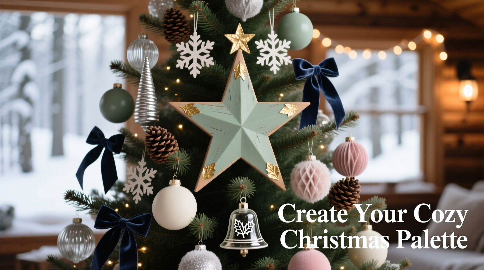
Traditional palettes like red, green, and gold tap into nostalgia and cultural symbolism, making them ideal for family-centered homes. Monochromatic schemes—such as all-white or icy blue-silver—create a serene, snow-globe effect perfect for minimalist or Scandinavian-inspired interiors. Unexpected combinations, like navy and copper or blush and eucalyptus, offer sophistication and contemporary flair.
The key is consistency in emotional tone. A tree shouldn’t feel like a jumble of conflicting messages. If your living space leans modern and neutral, a bold candy-cane red-and-white scheme might feel out of place. Conversely, a moody charcoal-and-bronze tree may feel too somber in a bright, playful home.
“Color harmony starts with intention. Know the story you want your tree to tell before you buy a single ornament.” — Clara Mendez, Interior Stylist & Seasonal Design Consultant
Build a Balanced Color Palette in Three Steps
A cohesive tree relies on a well-structured color ratio. Think of your palette in terms of dominant, secondary, and accent colors—just like in fashion or interior design. This framework prevents overcrowding and maintains visual hierarchy.
- Dominant Color (60%): This forms the foundation. It could be your tree’s base color (like white-tipped flocked trees) or your primary ornament shade. For example, deep emerald green balls on a natural fir tree.
- Secondary Color (30%): Complements the dominant hue. In a classic scheme, this might be cream or burgundy; in a modern one, it could be matte black or soft gray.
- Accent Color (10%): Adds sparkle and contrast. Metallics like antique gold, rose gold, or mercury glass are common here, but so are pops of unexpected color like coral or plum.
This 60-30-10 rule creates rhythm without rigidity. It allows variety while ensuring no single element overwhelms the whole.
Select Ornaments with Intentional Variety
Cohesion doesn’t mean uniformity. A tree that’s too matchy can look sterile. The secret lies in variation within unity—using different textures, shapes, and finishes that still belong to the same color family.
For instance, if your dominant color is forest green, mix in:
- Matt ceramic bulbs for depth
- Translucent glass drops for light play
- Felted wool ornaments for texture
- Metallic-dipped pinecones for organic interest
Varying finishes keep the eye moving. Glossy ornaments catch light dramatically; matte ones absorb it softly. Combine both for dynamic contrast. Similarly, blend round bulbs with geometric shapes, stars, and figurines—but ensure they share the same tonal language.
Consider layering: larger ornaments toward the trunk, smaller ones toward the tips. This mimics natural depth and prevents a “flat” appearance. Cluster similar items sparingly—three velvet baubles grouped together make a statement; scattering them evenly creates rhythm.
Do’s and Don’ts of Ornament Selection
| Do | Don’t |
|---|---|
| Choose 3–4 core colors max | Use more than five main colors |
| Mix at least three textures (glass, fabric, wood) | Stick only to shiny or only to matte finishes |
| Incorporate natural elements (pine, cinnamon, dried citrus) | Overload with plastic or mass-produced decor |
| Include heirloom pieces for sentimental value | Let sentiment override aesthetic balance |
| Use ribbon or garland in your palette | Add contrasting ribbons that clash |
Create Visual Flow with Lighting and Placement
Lights are not just illumination—they’re part of the color story. Warm white bulbs (2700K–3000K) enhance creamy, vintage, or rustic themes. Cool white (4000K+) suits modern, icy, or monochrome trees. Colored lights should be used sparingly and only if they align with your palette—e.g., amber string lights on a copper-and-cream tree.
Proper light distribution matters. Weave strands evenly from trunk to tip, wrapping around major branches. Use 100 lights per vertical foot of tree as a baseline. Too few, and the tree looks sparse; too many, and it becomes a glowing blob that drowns out ornaments.
When placing ornaments, follow an inward-to-outward strategy:
- Start with large, heavy pieces near the trunk for structural weight.
- Add medium-sized ornaments along branch midpoints.
- Finish with delicate items (tinsel, miniatures) at the tips.
- Step back frequently to check balance—avoid clustering on one side.
Rotate the tree as you work. What looks balanced from the front may be lopsided from the dining room doorway. Hang heavier ornaments on sturdier branches to prevent sagging.
Mini Case Study: The Navy & Copper Tree Transformation
Sophie, a graphic designer in Portland, wanted a non-traditional tree that matched her coastal-modern living room. Her space featured navy upholstery, brushed brass fixtures, and natural wood floors. She initially started with silver and blue ornaments but found the result cold and clinical.
After consulting a color wheel, she switched to a navy, copper, and ivory palette. She replaced silver with hammered copper orbs, added ivory felt stars, and wrapped copper wire around pine sprigs. She strung warm Edison-style bulbs and finished with ivory ribbon.
The result was transformative: rich and inviting, yet undeniably modern. Neighbors remarked it looked “expensive and curated,” when in fact, most pieces were repurposed or handmade. The shift wasn’t in budget—it was in color discipline.
Preserve Your Theme Year After Year
A cohesive color theme pays long-term dividends. Once established, it simplifies future decorating. Each year, you’ll know exactly which new ornaments will complement—not compete with—your collection.
Storage is critical. Keep ornaments sorted by color and type in compartmentalized boxes. Label clearly: “Copper Medium Balls,” “Navy Felt Stars,” etc. Wrap delicate items in tissue. Store ribbon flat or rolled to prevent creasing.
Take inventory annually. Note what’s missing, damaged, or overrepresented. This helps guide purchases—maybe you need more accent pieces, or perhaps you’ve accumulated too many large red balls. Resist the urge to buy impulsively during sales unless the item fits your palette.
Checklist: Building a Cohesive Christmas Tree Theme
- Define the mood (festive, serene, luxurious, whimsical)
- Choose a dominant color (60% of palette)
- Select a secondary color (30%)
- Pick one accent color or metallic (10%)
- Gather sample ornaments and test on a neutral surface
- Ensure all pieces share tonal harmony—even if styles differ
- Choose lighting temperature that matches the palette
- Layer ornaments by size and placement (inward to outward)
- Step back often to assess balance from multiple angles
- Store components by category for easy retrieval next year
Frequently Asked Questions
Can I mix metallics like gold and silver on the same tree?
Yes, but do so intentionally. Mixing metals works best when they share a unifying tone—e.g., antique gold and oxidized silver in a vintage scheme. Avoid pairing shiny silver with bright yellow gold unless your theme is retro or eclectic. A better approach is to designate one as primary (e.g., 80% gold, 20% silver) to maintain dominance.
What if I already have a lot of mismatched ornaments?
Start by editing. Set aside pieces that don’t fit your desired mood or palette. You can display these on a secondary tree or donate them. Focus on building cohesion around your favorite few. Gradually phase in new ornaments that align with your theme. Spray-painting old ornaments in a unifying color (like matte black or sage) is a low-cost way to integrate them.
How do I incorporate sentimental or handmade ornaments without breaking the theme?
Honor their importance by giving them focal placement—eye level, near the front—but limit quantity. One or two standout pieces add character; ten competing heirlooms create clutter. Frame them within your color story: if your tree is blush and gold, tie a blush ribbon around a vintage glass ball to help it blend.
Conclusion: Make This Holiday Season Visually Unforgettable
A beautifully decorated Christmas tree isn’t the result of random charm—it’s the product of thoughtful design. By anchoring your decorations in a cohesive color theme, you transform decoration from chaos into curation. Every ornament earns its place. Every light contributes to the atmosphere. And every glance at your tree becomes a moment of delight.
Start small if needed. Even a simple two-color scheme with varied textures can outshine a rainbow of disorganized glitter. Commit to a vision, refine it over time, and let your tree reflect not just the season, but your unique sense of beauty.


 浙公网安备
33010002000092号
浙公网安备
33010002000092号 浙B2-20120091-4
Comments
No comments yet. Why don't you start the discussion?