
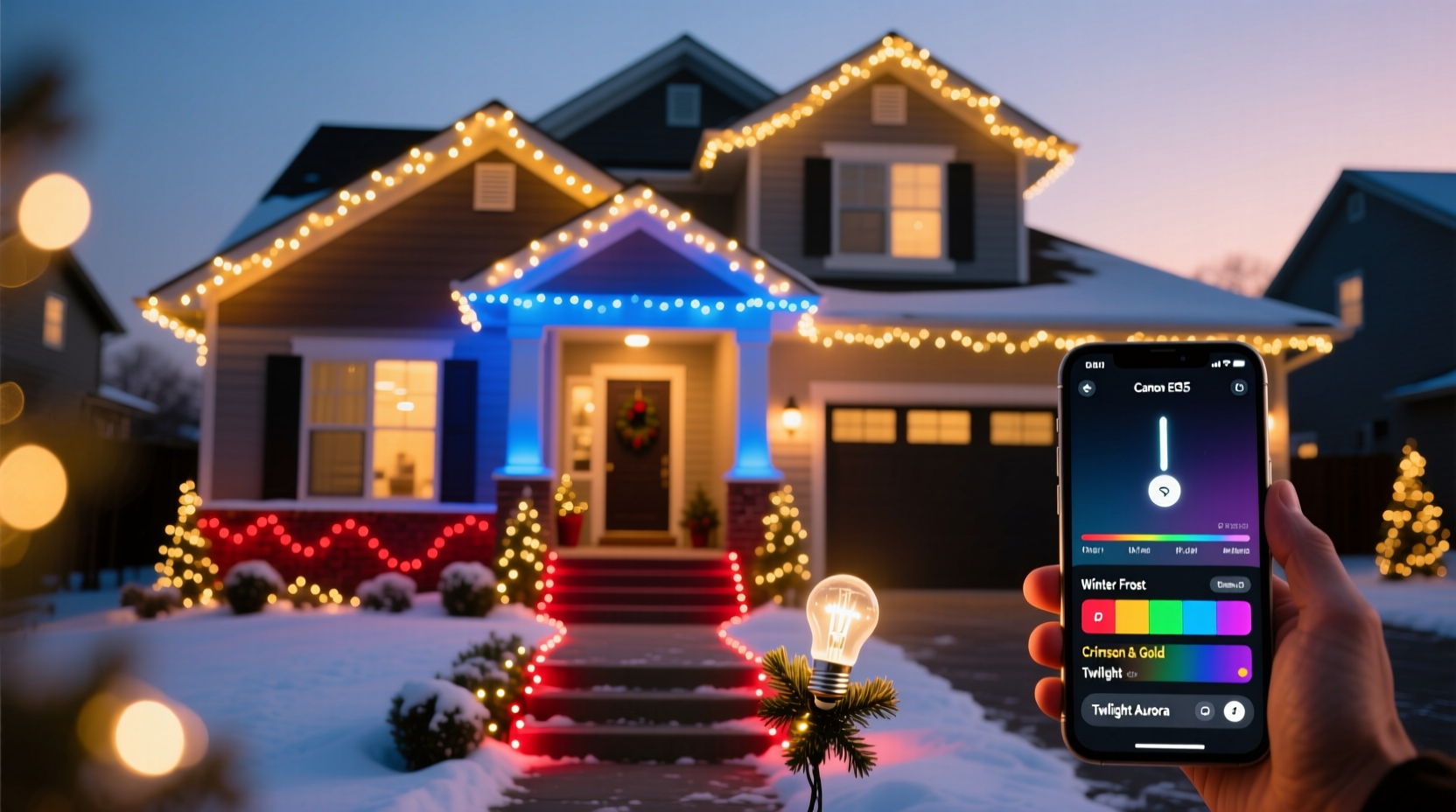
RGB smart bulbs have transformed holiday lighting from static strings of white or multicolor lights into immersive, programmable experiences. But many homeowners invest in smart bulbs only to end up with chaotic, clashing sequences—red blinking next to neon green, cool whites washing out warm golds, or transitions that feel jarring rather than joyful. True color coordination goes beyond matching hues; it’s about intentionality, rhythm, contrast, and context. It requires understanding how light behaves on architecture, how human perception interprets color temperature and saturation, and how smart ecosystems translate creative vision into synchronized execution. This guide distills field-tested practices from professional lighting designers, smart-home integrators, and award-winning residential displays—offering not just instructions, but principles you can adapt year after year.
1. Plan Your Palette Using Holiday Color Psychology & Architecture
Before purchasing a single bulb, step outside at dusk and observe your home’s surfaces, materials, and surrounding environment. A brick façade absorbs cool tones but reflects warm ambers beautifully. White vinyl siding amplifies brightness but can wash out low-saturation pastels. Evergreen trees absorb red wavelengths more than blue—making deep forest greens appear richer when lit with complementary magentas or violets. These physical realities shape what works—not just what looks good on a screen.
Holiday color psychology matters too. Traditional red and green evoke warmth and tradition—but used without variation, they fatigue the eye. Modern displays often lean into analogous schemes: amber-to-crimson gradients for porch columns, or icy blue-to-silver fades along rooflines. Monochromatic palettes (e.g., varying intensities of cobalt blue) project elegance and calm; triadic combinations (turquoise, tangerine, violet) deliver energy and playfulness—if balanced carefully.
Sketch a simple elevation drawing of your home’s front. Label zones: roofline, eaves, porch columns, tree trunks, shrubs, pathway. Assign each zone a role: “anchor” (stable, low-motion base color), “transition” (gradual hue shifts), or “accent” (pulsing, spotlighted moments). This prevents over-programming—where every surface competes for attention.
2. Choose Hardware That Supports Precision & Scale
Not all RGB smart bulbs are built for outdoor holiday use. Consumer-grade A19 bulbs may lack IP65+ weather resistance, while cheaper strip lights often suffer from inconsistent color rendering across reels. Prioritize hardware validated for continuous outdoor operation and calibrated color output.
| Hardware Type | Best For | Key Considerations |
|---|---|---|
| IP65-rated RGBW LED string lights (with built-in controllers) | Rooflines, eaves, railings | Ensure “W” (white) channel is tunable (2700K–6500K), not fixed. Avoid non-dimmable models—they limit fade depth. |
| Addressable pixel strips (WS2812B or SK6812) | Trees, custom shapes, animated paths | Require a microcontroller (e.g., WLED-compatible ESP32) and power injection every 5m to prevent voltage drop and color shift. |
| Smart landscape spotlights (RGB+CCT) | Uplighting trees, architectural features | CCT (Correlated Color Temperature) control lets you blend RGB hues with warm/cool white—critical for natural-looking foliage washes. |
| Centralized hub systems (e.g., Nanoleaf + Matter bridge) | Whole-yard synchronization | Matter 1.2 support ensures reliable multi-vendor interoperability—avoid proprietary apps that lock you in. |
Calibration is non-negotiable. Most RGB devices render “#FF0000” (pure red) differently due to LED binning and driver variance. Use a spectrometer app (like SpectroCam) or compare bulbs side-by-side under identical conditions before installing. If two strings show visibly different reds, group them in separate zones—not mixed on one roofline.
3. Build Sequences Using Light Choreography Principles
A color-coordinated display isn’t defined by static hues—it’s elevated by how colors move, breathe, and relate over time. Professional lighting designers apply choreographic concepts: tempo (speed of change), phrasing (groupings of motion), and counterpoint (contrasting rhythms between zones).
- Tempo Mapping: Slow, smooth fades (8–12 seconds) suit anchor zones like house corners. Faster pulses (1.5–3 seconds) energize accents like wreaths or mailbox wraps.
- Phrasing: Group lights in rhythmic clusters—e.g., 5 bulbs per “phrase” on a 30-bulb string. Sequence each phrase with staggered timing so movement ripples like waves, not a uniform sweep.
- Counterpoint: While roofline lights perform a slow amber-to-gold gradient, porch columns pulse gently in deep evergreen—creating layered interest without visual noise.
Start sequences from structural anchors: top-down for rooflines, base-up for trees, left-to-right for horizontal runs. This aligns with natural eye movement and reinforces architectural lines. Avoid random “sparkle” modes—they undermine coordination by introducing uncontrolled chaos.
4. Real-World Implementation: The Henderson Family Display
The Hendersons—a family of four in Portland, Oregon—transformed their modest Craftsman bungalow from a generic string-light setup into a nationally recognized display featured in Lighting Design & Application’s 2023 Holiday Showcase. Their home has cedar shingle siding, a covered front porch with tapered columns, and two mature Douglas firs.
They began by rejecting “Christmas red/green” as default. Instead, they analyzed their environment: the cedar’s natural rust undertones, the firs’ bluish-green needles, and Portland’s frequent overcast skies—which mute saturated colors. Their palette became: Spiced Amber (dominant, #CC6600), Fir Bough Green (secondary, #2E5D44), and Winter Sky Blue (accent, #5A7FA5). All were selected at 70% saturation to retain richness in diffused light.
Hardware included: 120 ft of IP65 RGBW string lights (roofline/eaves), two 5m addressable strips wound around fir trunks (with power injection at 2.5m), and four tunable CCT spotlights aimed at the porch ceiling beams. They used WLED firmware on ESP32 controllers, synced via Home Assistant with custom time-based automations.
The result? At 5 p.m., the roofline glows steady Spiced Amber. At 6 p.m., Fir Bough Green begins a slow upward crawl on the left fir trunk, while Winter Sky Blue pulses softly in the spotlights—every 7 seconds, timed to coincide with passing trains (a local touch). By 7 p.m., all zones transition into a unified, breathing fade between the three hues—never fully monochrome, always harmonious. Neighbors report it feels “intentional, not intrusive”—a testament to restraint and rhythm.
“Color coordination in architectural lighting isn’t about matching paint chips. It’s about respecting materiality, honoring context, and guiding attention—not commanding it.” — Lena Torres, Lighting Designer & Founder of Lumina Collective, quoted in Architectural Lighting Magazine, November 2022
5. Troubleshooting Common Coordination Failures
Even with careful planning, real-world variables intervene: Wi-Fi congestion, voltage sag, firmware bugs, or seasonal humidity affecting signal integrity. Here’s how seasoned users resolve the most frequent issues:
- “My colors look washed out at night.” → Check ambient light pollution. Streetlights or neighbor displays add unwanted cyan or yellow cast. Use a physical gel filter (Lee Filters #201 Full CTB) over spotlights to neutralize spill, or shift your palette toward higher saturation (85–90%) to cut through haze.
- “One section lags or desyncs.” → Addressable strips need consistent 5V ±0.25V. Measure voltage at the farthest pixel—if below 4.75V, add power injection. For Wi-Fi bulbs, assign static IPs and reserve bandwidth on your router (QoS settings) for lighting traffic.
- “The ‘white’ looks blue or pink.” → RGBW bulbs often render “white” poorly because the white LED chip differs in color temperature from the RGB mix. Always use the dedicated white channel for white light—and tune its CCT separately. Never rely on “RGB white” (#FFFFFF) for clean whites.
- “Transitions feel jarring, not smooth.” → Most apps default to linear interpolation. Switch to “ease-in-out” or “sine wave” easing curves in your controller software. Human vision perceives acceleration/deceleration as more natural than constant speed.
FAQ
Can I mix brands of RGB smart bulbs in one coordinated display?
Yes—but only if they support Matter 1.2 or a common open protocol like Tuya or WLED. Proprietary ecosystems (e.g., Philips Hue + LIFX) rarely sync timing or color accuracy. Even with Matter, calibrate each brand’s “#FF0000” against a reference swatch. Expect to adjust saturation or gamma per brand to achieve visual consistency.
How do I maintain color accuracy over multiple seasons?
LEDs degrade unevenly: blue diodes dim faster than red, shifting white balance over time. Every spring, re-calibrate using a colorimeter app and update your controller’s gamma curve. Store bulbs in climate-controlled spaces—avoid garages where temperatures swing from −10°C to 40°C. Heat accelerates phosphor degradation in white LEDs and causes RGB channel imbalance.
Is it possible to coordinate lights with music without expensive controllers?
Absolutely. Free, open-source tools like xLights (desktop) or WLED’s audio reactive mode (on ESP32) analyze microphone input or system audio. Key insight: map musical elements to light behavior—not volume to brightness. For example, assign bass frequencies to slow amber pulses on rooflines, midrange to green sweeps on trees, and treble to crisp blue accents. This creates emotional resonance, not just visual noise.
Conclusion
A color-coordinated Christmas light display does more than decorate—it communicates care, creativity, and quiet confidence. It tells visitors that this home was thoughtfully lit, not hastily strung. You don’t need a $5,000 budget or a degree in electrical engineering. You need observation, intention, and the willingness to treat light as a design material—not just illumination. Start small: pick one zone, choose three intentional colors, and program one graceful transition. Watch how neighbors pause longer on the sidewalk. Notice how your own mood lifts walking up that amber-lit path. Then expand—not with more lights, but with deeper coherence. Your display won’t just shine brighter this season. It will mean more.


 浙公网安备
33010002000092号
浙公网安备
33010002000092号 浙B2-20120091-4
Comments
No comments yet. Why don't you start the discussion?