
Christmas lighting has evolved far beyond strings of warm-white bulbs and static red-and-green sequences. Today’s smart RGB LED systems—paired with intuitive mobile applications—empower homeowners, small business owners, and holiday enthusiasts to craft displays that feel intentional, artistic, and emotionally resonant. A truly color-coordinated display isn’t just about matching hues; it’s about rhythm, contrast, spatial harmony, and narrative flow across your property. It’s the difference between “festive clutter” and a curated visual experience guests remember long after New Year’s Eve. This guide distills field-tested techniques used by professional installers and advanced hobbyists—applied practically for DIY execution. No assumptions about prior tech experience. Just clarity, specificity, and actionable insight.
Understanding RGB Light Capabilities—and What Apps Actually Control
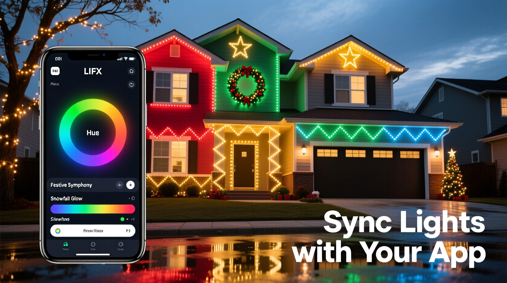
Before selecting colors or sequencing effects, understand the technical foundation. RGB (Red-Green-Blue) LEDs mix light at the pixel level. True RGBW (adding a dedicated white diode) or RGBCCT (adding tunable cool/warm white) lights offer broader, more natural palettes—especially critical for coordinating with architectural elements like brick, stucco, or window trim. Most consumer-grade smart lights use either Wi-Fi (for direct app control) or Bluetooth (shorter range, lower latency). Mesh-networked systems (like Nanoleaf or Philips Hue with a bridge) scale better across large properties but require initial setup discipline.
The app is not merely a remote—it’s your design studio. Leading apps like Twinkly, Lumenplay, Govee Home, and Nanoleaf Essential provide: real-time preview on a digital floorplan, frame-by-frame animation editing, beat-syncing to music, scene grouping (e.g., “eaves,” “garland,” “front door”), and palette-locking tools that restrict selections to harmonizing hues. Crucially, they allow you to assign *different* color schemes to different zones—so your roofline can pulse in deep sapphire while your porch columns glow in complementary amber—without visual conflict.
A Step-by-Step Design Process: From Vision to Illuminated Reality
- Define Your Color Narrative (5–10 minutes): Ask: Is this display elegant (navy + silver + ivory), nostalgic (vintage red + mustard + charcoal), modern (teal + coral + slate), or serene (lavender + seafoam + mist gray)? Avoid starting with “red and green”—instead, choose one dominant hue (e.g., “deep emerald”) and build outward using color theory principles.
- Map Your Zones Physically & Digitally (15 minutes): Walk your property with a notebook. Label each lighting area: “north eaves,” “west window frames,” “front steps,” “porch railing.” Then open your app and assign each physical zone to a corresponding digital group. This prevents accidental cross-zone effects later.
- Select a Base Palette Using the App’s Built-in Tools (10 minutes): In Twinkly, tap “Palette” > “Create Harmony.” Input your dominant hue. The app generates 5–7 scientifically balanced variants (e.g., emerald → teal → aqua → silver → dove gray). Save this as “Front Yard Winter.” Repeat for other areas if desired (e.g., “Porch Warmth” = burnt sienna → terracotta → cream → walnut).
- Assign Motion & Timing Strategically (20 minutes): Static color is powerful—but coordination requires movement hierarchy. Use slow, gentle fades (3–5 sec) for architectural outlines (roofline, windows). Reserve faster pulses (0.5–1.2 sec) for focal points (wreaths, tree tops). Avoid syncing all zones to the same beat unless intentionally creating a unified “breathing” effect.
- Test, Refine, and Document (15 minutes): Run the full sequence at dusk—not midday. Observe how colors interact with ambient light (e.g., warm streetlights wash out cool tones). Adjust brightness per zone: eaves often need 70–80% intensity; delicate garlands only 30–40%. Take screenshots of your final palette and settings—label them clearly for next year.
Color Theory Made Practical: Which Schemes Work Best Outdoors?
Outdoor lighting faces unique challenges: distance, weather-refracted glare, and competing light sources (streetlamps, neighbor displays). Not all color theory works equally well at 30 feet. Here’s what professionals rely on—and why:
| Scheme Type | Best For | Outdoor Considerations | App Implementation Tip |
|---|---|---|---|
| Analogous (e.g., cobalt → indigo → violet) |
Creating depth and calm flow along linear features (gutters, fences) | Highly legible at distance; minimal chromatic vibration | Use app’s “gradient sweep” effect—assign sequential zones to adjacent palette positions |
| Monochromatic (e.g., charcoal → slate → steel → ice blue) |
Elegant, minimalist homes; modern architecture | Minimizes visual noise; emphasizes texture over color | Lock palette to single hue + 4 brightness/tint variants—avoid saturation shifts |
| Split-Complementary (e.g., rust + mint + lavender) |
Eclectic homes; gardens with varied foliage | Offers contrast without clashing; mint reads as “cool green” even under yellow sodium lamps | Create three separate scene groups; assign each color to a distinct zone type (e.g., rust = entryway, mint = shrubs, lavender = upper eaves) |
| Triadic (Desaturated) (e.g., muted teal + dusty rose + soft gold) |
Historic homes; porches with painted wood or stone | Full-saturation triads vibrate outdoors; desaturation (lowering vibrancy 20–30%) adds sophistication | In Govee Home, reduce “Saturation” slider globally after selecting triadic base colors |
Remember: Your home’s existing colors are part of the palette. If your front door is navy, let that anchor your scheme—don’t fight it with clashing reds. Pull accent tones from your shutters, brick mortar, or garden stones. As lighting designer Lena Torres notes in her 2023 *Outdoor Illumination Handbook*: “The most memorable displays don’t impose color—they converse with it. Your lights should echo the warmth of aged cedar shingles or the coolness of limestone steps—not override them.”
“The most memorable displays don’t impose color—they converse with it. Your lights should echo the warmth of aged cedar shingles or the coolness of limestone steps—not override them.” — Lena Torres, Lighting Designer & Author, Outdoor Illumination Handbook
Real-World Example: The Henderson Family’s Coordinated Front Yard Transformation
The Hendersons live in a 1920s Craftsman bungalow with dark-stained wood beams, sage-green shutters, and a flagstone walkway. Last year, their display used random red/green strings—bright but visually exhausting. This year, they committed to coordination:
- Step 1: They photographed their home at dusk, isolating dominant colors: “weathered cedar brown,” “sage green,” “flagstone gray.”
- Step 2: In the Twinkly app, they uploaded the photo and used “Color Picker” to extract a base hex (#3A5F3B, a deep forest green). The app generated an analogous palette: #2E4C2F (darker), #4A7D5A (medium), #7AB594 (lighter), #B8D9C7 (palest).
- Step 3: They assigned zones: roofline = darkest shade (slow fade), window frames = medium green (gentle pulse), porch rail = palest (static glow), wreath = lightest (subtle shimmer).
- Step 4: To honor the flagstone, they added a narrow string of warm-white (2700K) lights beneath the rail—controlled separately, set to 10% brightness, never changing color.
Result: Neighbors commented on the “calm elegance” and “cohesive feel.” The display felt intentional, not decorative. Crucially, it required *less* total light output—only 320 LEDs versus last year’s 840—proving coordination enhances impact more than quantity.
Essential Checklist: Before You Power On Your First Sequence
- ✅ Verify all lights are on the same firmware version (check app notifications)
- ✅ Confirm Wi-Fi signal strength at your farthest light location (use phone’s Wi-Fi analyzer app)
- ✅ Group lights by physical zone—not by color or purchase date—in the app
- ✅ Set all zones to the same white-point baseline (e.g., 4000K) before applying color palettes
- ✅ Test brightness balance: stand at curb and adjust until no single zone dominates visually
- ✅ Disable “auto-brightness” or “ambient light sensing” features—they disrupt color consistency
- ✅ Export and save your final scene file to cloud storage (Twinkly/Govee support this)
Frequently Asked Questions
Can I mix different brands of RGB lights in one coordinated display?
Technically possible but strongly discouraged. Brands use proprietary protocols, color-rendering engines, and gamma curves. A “true red” from Govee may appear orange next to a Nanoleaf red—even with identical hex codes. For true coordination, stick to one ecosystem. If expanding, replace older strings incrementally rather than mixing.
My app shows beautiful colors on-screen, but they look washed out outside. Why?
This is almost always due to ambient light interference. Sodium-vapor streetlights add intense yellow-orange spill; nearby security lights add harsh white glare. Solutions: (1) Lower overall brightness 15–20%, (2) shift your palette toward higher-contrast combinations (e.g., navy + bright gold instead of navy + royal blue), and (3) physically shield lights facing direct ambient sources with black foam tape or 3D-printed diffuser hoods.
How do I keep my color scheme consistent year after year?
Document rigorously: Save your app’s exported scene file, take annotated screenshots showing palette hex codes and zone assignments, and store them in a dedicated “Holiday Lights” folder. Note physical details too: “South eaves = 2nd string from left, clipped to gutter at 3rd bracket.” One hour of documentation saves five hours of re-learning next November.
Conclusion: Your Home Deserves Intentional Light
A color-coordinated Christmas light display does more than attract attention—it communicates care, creativity, and quiet confidence. It transforms seasonal decoration into personal expression. You don’t need a degree in lighting design or a contractor’s license to achieve this. You need a clear process, respect for color relationships, and the willingness to treat your app not as a toy, but as a precision tool. Start small: coordinate just your front window frames this year. Observe how a single thoughtful choice—like shifting from saturated crimson to a desaturated brick red—changes the entire mood. Refine next year. Build your palette library. Share your hex codes and zone maps with neighbors. Because the most beautiful light displays aren’t just seen—they’re felt, remembered, and quietly admired from the sidewalk at 7:13 p.m. on a cold December evening.


 浙公网安备
33010002000092号
浙公网安备
33010002000092号 浙B2-20120091-4
Comments
No comments yet. Why don't you start the discussion?