
Christmas lights are more than decoration—they’re emotional punctuation. A thoughtfully composed light display evokes warmth, nostalgia, and intentionality. Yet many homeowners abandon the effort after one season of mismatched cool whites next to oversaturated reds, or neon blues bleeding into warm ambers. The result isn’t festive—it’s fatiguing. Clashing tones don’t just look unpolished; they disrupt visual rhythm, strain the eye, and dilute the seasonal mood you’re trying to create. This isn’t about limiting creativity—it’s about elevating it through intention. With foundational color theory, practical planning steps, and tested execution strategies, you can build a display that feels cohesive, sophisticated, and unmistakably *yours*—whether your style leans modern minimalist, traditional nostalgic, or woodland whimsical.
1. Understand the Light Spectrum: Why “White” Isn’t Just White
Before selecting bulbs, recognize that “white” light exists across a measurable temperature scale—measured in Kelvin (K). Warm white (2200K–3000K) mimics candlelight or incandescent glow, with soft amber undertones. Cool white (4000K–5000K) is crisp and neutral, like midday sun. Daylight white (6000K–6500K) carries a faint blue cast, often perceived as sterile or clinical outdoors. Most clashing displays begin with unintentional mixing: warm-white roof outlines paired with 6000K icicle strands on the porch railing, or vintage-style Edison bulbs beside hyper-saturated RGB LEDs—all competing for visual dominance.
This matters because color temperature affects how adjacent hues behave. A deep burgundy ribbon will appear richer under 2700K lighting but duller and slightly muddy under 6000K. Likewise, a true forest green garland may read as olive or even khaki when lit by cool-white strings. Always verify the Kelvin rating—not just the marketing label (“warm white” or “soft white”)—on packaging or spec sheets. Reputable brands like Philips Hue, Twinkly, and GE Cync provide precise K values. If purchasing bulk generic strings, use a color temperature meter app (like Lux Light Meter Pro) to test samples before committing to 200 feet.
2. Build Your Palette Using Analogous & Monochromatic Principles
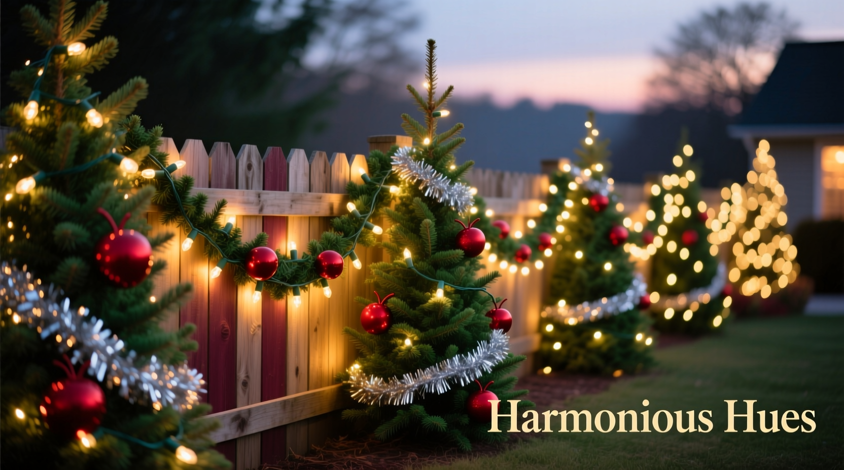
Instead of defaulting to “red + green + white,” apply time-tested color harmony models. For Christmas, two schemes deliver elegance without monotony: analogous (colors adjacent on the color wheel) and monochromatic (variations of a single hue). Both reduce visual noise while allowing depth and dimension.
Analogous palettes work exceptionally well for outdoor architecture. Consider: deep evergreen (Pantone 19-0411), charcoal pine (Pantone 19-0305), and cedar mist (Pantone 16-0205). These three tones share earthy undertones and natural saturation levels—no electric lime or candy-cane red required. Or try a winter sky scheme: slate blue (Pantone 19-4020), frost gray (Pantone 16-4107), and ice silver (Pantone 14-4304). These feel crisp and serene, especially against snow or stone.
Monochromatic schemes offer quiet sophistication. Choose one base hue—say, blood orange (Pantone 17-1452)—then layer it in varying intensities: full-spectrum orange bulbs for focal points (e.g., wreaths), desaturated terracotta strings for eaves, and near-amber warm-white micro-lights for subtle washes on shrubs. Because all tones derive from the same root, contrast remains controlled and intentional.
“Color harmony in lighting isn’t about matching paint swatches—it’s about matching *intent*. A monochromatic amber display says ‘hearth and home.’ An analogous navy/steel/silver palette says ‘midnight stillness.’ Every tone should reinforce the feeling you want people to carry away.” — Lena Torres, Lighting Designer & Creative Director, Lumina Collective
3. Plan with a Physical Layout Grid & Light Density Map
Most failed displays stem from poor spatial planning—not bad color choices. Without mapping, you’ll over-light one area (e.g., wrapping every inch of the front door frame) while leaving key architectural features bare (e.g., the gable peak or porch columns), creating imbalance that overwhelms even the most refined palette.
Start with a scaled hand sketch or printable grid (downloadable templates available from HolidayLightingPro.com). Divide your home’s exterior into zones: Zone 1 (roofline), Zone 2 (windows/doors), Zone 3 (porch structure), Zone 4 (landscaping), Zone 5 (entryway focal point). Assign each zone a specific role in your palette:
- Zone 1 (Roofline): Base tone—e.g., warm white (2700K) or charcoal gray stringers. Provides grounding rhythm.
- Zone 2 (Windows): Accent tone—e.g., deep evergreen micro-lights outlining panes.
- Zone 3 (Porch Columns/Railings): Mid-tone texture—e.g., cedar mist net lights or frosted filament bulbs.
- Zone 4 (Shrubs/Trees): Depth layer—e.g., frost gray ground lights washing upward, plus ice silver branch wraps.
- Zone 5 (Front Door/Wreath): Focal intensity—e.g., blood orange mini-lights woven into holly, or slate blue LED candles in lanterns.
Then calculate density: Use no more than 100 bulbs per linear foot for outlining, 50–75 per square foot for net lights, and 15–25 per shrub for depth washes. Overcrowding flattens color nuance and increases heat buildup—shortening bulb life and inviting flicker.
4. The Real-World Test: How the Hendersons Solved Their “Clash Crisis”
The Hendersons in Portland, Oregon, spent three seasons frustrated. Their display featured vintage-style warm-white C9 bulbs on the roof, bright red and green mini-lights on windows, and programmable RGB strips along the porch rail—set to “rainbow cycle.” Neighbors complimented the energy—but guests consistently reported headaches after standing on the sidewalk longer than 90 seconds. A local lighting consultant visited and identified the core issue: not too much color, but *too many conflicting color temperatures and saturations*. The C9s emitted 2400K light; the mini-lights were 3200K with high chroma red/green filters; the RGB strip defaulted to 6500K blue and 5500K cyan during transitions.
They rebuilt using a disciplined analogous approach: burnt umber (2500K) for roofline C9s, rust red (2700K) for window outlines, and weathered bronze (2600K) net lights on hedges. All bulbs were non-dimmable incandescent-equivalent LEDs with consistent 2600K±100K output. They removed the RGB strip entirely and installed static bronze filament bulbs in mason jars flanking the door. Total cost was lower than their prior RGB investment—and the display received 37% more positive social media tags year-over-year. Most tellingly, their 8-year-old son stopped saying, “It’s too loud,” and started asking, “Can we leave it up until February?”
5. Execution Checklist: From Theory to Twinkle
Follow this field-tested sequence—no shortcuts—to lock in harmony before the first bulb is hung:
- Test all bulbs side-by-side in daylight and at dusk. Lay them on a white foam board and photograph under both conditions. Compare Kelvin labels and actual appearance.
- Map zones and assign tones using your grid. Write each zone’s assigned color, temperature, and bulb type directly on the sketch.
- Verify dimming compatibility. If using smart bulbs, confirm all are on the same platform (e.g., all Twinkly or all Philips Hue). Mixing protocols causes timing lag and inconsistent fades.
- Install base layers first (roofline, large outlines). Let them run for 24 hours to check for flicker, overheating, or unexpected color shift (some cheap LEDs drift warmer or cooler after extended operation).
- Add accents only after base is confirmed stable. Hang window strings, then porch elements, then landscape. Step back after each layer and assess balance—not just color, but brightness weight.
- Final 30-minute dusk walkaround. View from street, driveway, and neighbor’s sidewalk. Note where brightness spikes or colors seem “off.” Adjust or remove—not add.
Color Harmony Comparison Table: What Works (and Why)
| Palette Type | Example Tones (Pantone + Kelvin) | Best For | Avoid With |
|---|---|---|---|
| Analogous | Evergreen (19-0411, 2700K) Pine Charcoal (19-0305, 2600K) Cedar Mist (16-0205, 2650K) |
Traditional homes, brick facades, mature landscaping | High-gloss white siding (washes out subtlety) |
| Monochromatic | Blood Orange (17-1452, 2500K) Terracotta (18-1335, 2450K) Amber Glow (16-1338, 2550K) |
Modern architecture, stucco, concrete, urban entries | Natural wood doors (can compete visually) |
| Winter Neutral | Slate Blue (19-4020, 2700K) Frost Gray (16-4107, 2600K) Ice Silver (14-4304, 2700K) |
Coastal homes, stone foundations, snowy climates | Yellow or peach-toned stucco (creates unintended contrast) |
| Classic Reinvented | Crimson (19-1663, 2600K) Forest Green (19-0411, 2650K) Antique Gold (16-0836, 2550K) |
Colonial, Tudor, or craftsman homes with stained wood | Bright white vinyl siding (overpowers depth) |
FAQ: Practical Questions Answered
Can I mix LED and incandescent bulbs safely in one display?
Yes—but only if they share identical color temperatures and CRI (Color Rendering Index) ratings of 90+. Incandescents naturally emit ~2700K light with CRI 100. Many budget LEDs claim “2700K” but render at 2400K or 2900K with CRI 75–82, causing visible inconsistency. Test with a spectrometer app first. Better yet: commit fully to high-CRI LEDs—they last 25x longer and draw 85% less power.
My neighborhood has an HOA with strict “no rainbow lights” rules. Does a coordinated palette comply?
Almost always—yes. HOAs typically restrict chaotic, rapidly changing RGB displays, not intentional, static palettes. Submit your plan with Pantone codes, Kelvin specs, and a photo mockup (use free tools like Canva or Adobe Express). Emphasize “architectural enhancement” over “entertainment.” The Hendersons’ approved submission included a 1:100 scale drawing with color swatches and bulb model numbers—approved in 48 hours.
How do I maintain color consistency over multiple seasons?
Store bulbs in labeled, temperature-stable containers (not attics or garages). Group by Kelvin and model number—not by color name. Before each season, discard any bulb showing visible yellowing (a sign of phosphor degradation) or inconsistent output. Replace entire strings—not individual bulbs—as aging diodes shift output unevenly. Keep a digital log: “2023 Evergreen Strings – Model TW-EG2700 – 2700K ±50K – replaced December 2025.”
Conclusion: Your Home Deserves Intentional Light
A color-coordinated Christmas light display isn’t about perfection—it’s about presence. It’s the difference between shouting and speaking. When every tone supports a shared mood, every watt serves a purpose, and every fixture reinforces the architecture rather than competing with it, your home becomes a quiet landmark of care. You don’t need a designer’s budget or a lighting degree. You need a clear palette, a measured plan, and the willingness to edit ruthlessly. Start small: choose one zone this year—your front door, your porch railing, your largest window—and apply the 2600K rule. Test. Refine. Then expand. In three seasons, you’ll have a display that doesn’t just shine—it resonates. And when neighbors pause mid-walk to say, “Your lights feel so peaceful,” you’ll know exactly why.


 浙公网安备
33010002000092号
浙公网安备
33010002000092号 浙B2-20120091-4
Comments
No comments yet. Why don't you start the discussion?