
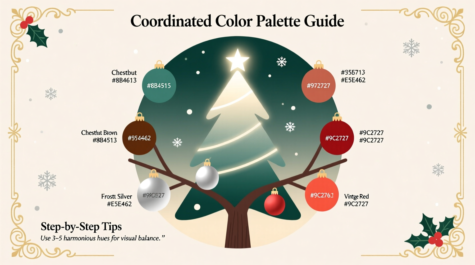
Choosing ornaments isn’t just about aesthetics—it’s about intention. A thoughtfully coordinated color palette transforms your tree from a festive clutter into a cohesive focal point that reflects personality, seasonality, and even emotional resonance. Yet most people begin with a single bauble they love, then accumulate pieces haphazardly until the tree feels disjointed or visually exhausting. The solution lies not in buying more, but in designing less—strategically. This guide distills decades of professional holiday styling experience, color psychology research, and real-world trial-and-error into an actionable framework. You’ll learn how to build a palette that feels intentional, timeless, and deeply personal—whether you’re working with heirloom glass, modern acrylics, or handmade clay ornaments.
Why Palette Coordination Matters More Than You Think
A Christmas tree is one of the few interior elements viewed holistically: from floor to ceiling, front to back, at multiple distances and lighting conditions. Without coordination, ornament colors compete rather than complement—creating visual fatigue instead of joy. Research in environmental psychology shows that environments with consistent chromatic harmony reduce cognitive load and increase perceived warmth and safety. In practice, this means guests don’t just say, “Your tree looks nice.” They pause. They lean in. They feel invited—not overwhelmed.
Coordination also extends longevity. A well-defined palette allows for gradual, meaningful additions over years. Instead of replacing everything when trends shift, you refine within boundaries—adding deeper burgundies, richer golds, or matte blacks while preserving core relationships. This approach honors both sustainability and sentimentality: your 2015 mercury glass ball still sings alongside your 2024 hand-blown cobalt sphere because their hues speak the same language.
The Four-Step Palette Framework (With Real Application)
Forget arbitrary “color schemes.” Effective ornament palettes follow a functional hierarchy rooted in visual weight, light interaction, and spatial layering. Use this sequence—not as rigid rules, but as a diagnostic checklist:
- Anchor Color (60% of visible surface area): Choose one dominant hue that grounds the entire composition. This is rarely red or green—the classics often lack tonal nuance. Instead, select a rich, complex base: forest green with blue undertones, charcoal gray with violet depth, or deep oxblood. Anchor colors absorb ambient light and provide contrast for brighter accents.
- Support Color (25%): A secondary hue that shares undertones with the anchor but offers clear distinction—e.g., burnt sienna alongside oxblood, or slate blue beside forest green. Support colors add dimension without competing; they’re often found in ribbons, picks, or matte-finish ornaments.
- Accent Color (10%): A high-chroma, reflective, or textural element that draws the eye: antique brass, frosted white, or cobalt glass. Accents should appear in small-scale items (berries, tiny bells, metallic sprays) and be distributed evenly—not clustered.
- Neutral Connector (5%): Not “no color,” but unifying agents: natural wood tones, raw linen-wrapped spheres, or clear crystal drops. These bridge chromatic gaps and prevent saturation overload. They’re the silent glue.
Color Theory Made Practical: What Works—and Why
Traditional advice (“red and green are classic”) ignores how pigments behave in three-dimensional space under mixed lighting. Real ornament coordination depends on three measurable properties: value (lightness/darkness), chroma (intensity), and temperature (warm/cool bias). Here’s what holds up in practice:
| Palette Type | Best For | Key Considerations | Real-World Risk |
|---|---|---|---|
| Monochromatic Depth (e.g., charcoal → slate → dove → ivory) |
Modern homes, minimalist spaces, rental apartments | Relies entirely on texture (matte velvet, hammered metal, crackled glass) for visual interest | Can feel flat if all ornaments share identical sheen or scale |
| Analogous Harmony (e.g., emerald → teal → navy) |
Traditional rooms, libraries, studies, spaces with wood paneling | Requires careful value separation—avoid stacking three mid-tones without a dark anchor or light accent | May read as “cold” without warm metallic connectors (antique brass, copper) |
| Split-Complementary Focus (e.g., burgundy anchor + olive + mustard accents) |
Eclectic interiors, farmhouse kitchens, creative studios | Must mute one complement (e.g., use olive as support, mustard only as 3–4 tiny accents) | Overuse of mustard or rust creates visual “buzz”—limit to 7 total pieces per 6-foot tree |
| Neutral-Forward (e.g., natural wood + cream + black + brushed nickel) |
Scandinavian, Japandi, or neutral-dominated interiors | Depends on material diversity—wood grain, ceramic glaze, metal finish must vary significantly | Becomes boring if all neutrals share the same reflectivity (e.g., all glossy) |
Crucially, avoid “Christmas color traps”: pure kelly green (too electric against pine), candy-cane red (lacks sophistication next to aged wood), and fluorescent silver (creates glare under LED lights). Instead, opt for pigments with inherent complexity—verdigris, tarnished copper, aged brass, or duck-egg blue.
A Mini Case Study: Transforming a “Too-Much” Tree
Sarah, a graphic designer in Portland, inherited her grandmother’s collection: 87 ornaments spanning 1948–2002. Her tree looked like a rainbow explosion—“joyful but exhausting,” she said. She tried sorting by era, then by material, then by size. Nothing worked. Working with stylist Maya Chen (founder of Evergreen Atelier), Sarah applied the Four-Step Framework:
- Anchor: Selected her grandmother’s 1952 mercury glass ball—not for its age, but for its deep, smoky gray-blue base tone. All other colors were evaluated against it.
- Support: Pulled six matte-finish ornaments in charcoal and slate—previously hidden in storage—because their undertones matched the mercury glass’s cool depth.
- Accent: Kept only four pieces with high reflectivity: two antique brass bells (1930s), one frosted white star (1960s), and one hand-blown cobalt glass teardrop (2018). All were under 1.5 inches.
- Neutral Connector: Added twelve raw walnut slices (sanded, untreated) drilled with twine holes—placed at vertical intervals to break color bands.
The result? A tree that felt heirloom-rich yet serene. Guests commented on its “calm luxury.” Sarah kept 32 ornaments—less than 40% of her collection—but every piece now served the palette. As Maya notes: “Coordination isn’t reduction. It’s curation with purpose.”
Expert Insight: Beyond Aesthetics
“The most powerful ornament palettes tell a story about where someone lives, not just what they own. A coastal home thrives with sea-glass greens and driftwood neutrals; a mountain cabin breathes with pine-needle browns and iron-oxide reds. Your palette should echo your environment’s natural light, architecture, and textures—not Pinterest trends.” — Maya Chen, Holiday Stylist & Author of *The Intentional Tree*
Chen emphasizes that successful palettes evolve. Her studio tracks client trees over five-year cycles: “We rarely change anchors. But we deepen supports—swapping slate for graphite, adding a new accent every third year. Consistency builds recognition. Variation keeps it alive.”
Your Actionable Palette-Building Checklist
Complete these steps before purchasing or unpacking ornaments. Do them in order—each informs the next:
- ✅ Assess your tree’s context: Note wall color, flooring material, nearby furniture upholstery, and primary lighting type (warm LED, cool daylight, incandescent). Write down three adjectives describing your space’s current mood (e.g., “cozy, grounded, quiet”).
- ✅ Identify your anchor: Choose one existing ornament or decor item (a throw pillow, vase, or framed print) with a rich, complex hue. Use a free app like Adobe Color to extract its HEX code and note its undertone (cool/warm/neutral).
- ✅ Test support candidates: Gather 3–5 potential support items. Hold each beside your anchor under your tree’s lighting. Eliminate any that “disappear” or “shout.” Keep only those with clear distinction but shared temperature.
- ✅ Define accent limits: Decide on maximum quantity (e.g., “no more than 5 metallic accents per foot of tree height”) and minimum size (e.g., “all accents under 1.75 inches”).
- ✅ Source connectors first: Buy or make 8–12 neutral connectors *before* selecting additional ornaments. Their presence will reveal which colors truly harmonize.
FAQ: Solving Common Palette Dilemmas
What if I already have ornaments in clashing colors?
Don’t discard—recontextualize. Group conflicting pieces by value (lightness), not hue. A bright red ball and pale yellow one may clash as colors but harmonize as “light-value accents” when paired with deep-navy supports. Use matte spray paint (tested on scrap first) to unify finishes—e.g., dulling a shiny red to match matte burgundy.
How do I incorporate sentimental ornaments that don’t fit the palette?
Give them narrative priority—not visual priority. Place one or two on lower branches where they’re touched and admired closely, then surround them with palette-aligned neutrals (wood slices, burlap bows, linen stars). Their emotional weight remains intact; their visual impact is softened.
Do lighting types affect my palette choices?
Significantly. Warm-white LEDs (2700K–3000K) enhance reds, golds, and creams but mute blues and purples. Cool-white LEDs (4000K+) make blues pop but wash out warm tones. If using cool lighting, choose anchors with violet or teal undertones; with warm lighting, lean into terracotta, ochre, or olive bases. Always test swatches under your actual bulbs—not daylight.
Conclusion: Your Palette Is a Living Invitation
A coordinated ornament palette does more than please the eye—it extends hospitality. It tells guests, “This space was prepared with care, not haste. You are seen, not just accommodated.” It transforms decoration into dialogue: between past and present, tradition and individuality, abundance and restraint. Building yours requires no special tools—just observation, honesty about your space, and willingness to edit. Start small: pull one anchor piece from storage. Hold it beside your sofa pillow. Then your rug. Then your favorite mug. Notice what resonates. That resonance is your starting point—not a trend, not a rule, but your authentic visual voice.
This season, resist the urge to fill every branch. Instead, ask: What feeling do I want this tree to evoke? Calm? Nostalgia? Playfulness? Reverence? Let that feeling guide your palette—not the latest influencer post. Because the most memorable trees aren’t the fullest. They’re the truest.


 浙公网安备
33010002000092号
浙公网安备
33010002000092号 浙B2-20120091-4
Comments
No comments yet. Why don't you start the discussion?