
A gallery wall can transform a blank space into a personal statement. When done well, it becomes the focal point of a room—curated, expressive, and balanced. But when approached without a plan, it risks looking like a haphazard collection of frames tossed on the wall. The key difference between a striking gallery wall and a chaotic one lies in intentionality. With thoughtful planning, consistent design choices, and attention to layout, you can create a display that feels cohesive, artistic, and polished.
This guide walks through the essential principles and practical steps to build a gallery wall that enhances your space rather than overwhelms it. From selecting a unifying theme to mastering spacing and alignment, every detail contributes to a clean, intentional aesthetic.
Start with a Clear Vision and Theme
The most successful gallery walls share a common thread—whether it’s color, subject matter, frame style, or era. Without a central concept, even beautiful pieces can clash and confuse the eye. Begin by asking: What story do I want this wall to tell? Is it a celebration of travel memories, a tribute to black-and-white photography, or a mix of family heirlooms and modern art?
Defining a theme helps narrow down your selection and ensures visual harmony. For example, a wall featuring only landscape photography in earth-toned frames will feel more cohesive than a mix of bright abstract paintings, vintage posters, and colorful children’s drawings unless those elements are intentionally curated together.
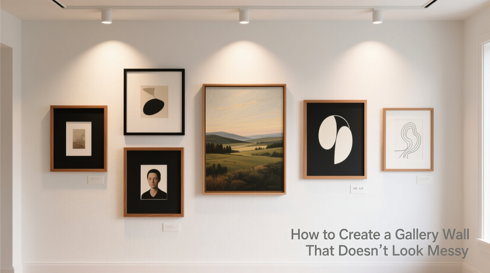
Choose Artwork and Frames Strategically
It’s tempting to include every piece you love, but overcrowding is a common cause of visual chaos. Instead, select 5–9 pieces for a standard-sized wall (larger walls may accommodate more). Prioritize quality over quantity. Each piece should earn its place—not just fit into available space.
Consider these factors when choosing content:
- Size variation: Mix large anchor pieces with smaller works to create rhythm.
- Subject balance: Alternate portrait and landscape orientations for dynamic flow.
- Frame uniformity: Use matching or tonally similar frames to unify diverse artworks.
- Matting: Consistent mat width (e.g., 2 inches) adds professionalism and breathing room.
Frames act as visual borders that tie everything together. While mixing metals or wood finishes can work, doing so without restraint often leads to disarray. A safer approach is to stick to one frame finish—such as matte black, natural wood, or brushed brass—and vary only the size and orientation of the artwork within.
“Cohesion doesn’t mean monotony. You can have variety in content if the presentation—frames, spacing, alignment—remains consistent.” — Lena Torres, Interior Stylist & Gallery Curator
Plan the Layout Before Hanging Anything
One of the biggest mistakes people make is hanging frames directly on the wall without testing the arrangement first. This trial-and-error method often results in uneven spacing, misaligned centers, or awkward gaps.
Instead, lay out your entire gallery on the floor or use paper templates on the wall. Here’s how:
- Gather kraft paper or newspaper and trace each frame onto it.
- Cut out the paper templates and label them with corresponding artwork details (e.g., “Photo – 8x10”, “Art Print – 11x14”).
- Tape the templates to the wall using painter’s tape, starting from the center point.
- Adjust spacing and alignment until the composition feels balanced.
Use a level and measuring tape to ensure horizontal and vertical alignment. A consistent gap of 2–3 inches between frames is ideal. Too little space creates crowding; too much breaks cohesion.
Follow a Structured Layout Pattern
There are several proven gallery wall layouts that help prevent randomness. Choose one based on your space and aesthetic preference:
| Layout Style | Description | Best For |
|---|---|---|
| Symmetrical Grid | Even rows and columns with identical spacing. All frames same size or paired in symmetry. | Modern, minimalist spaces; formal living rooms |
| Salon-Style Cluster | Mix of sizes and orientations arranged organically around a central piece. | Eclectic interiors; entryways and stairwells |
| Linear Row | Framed pieces aligned horizontally or vertically, often above furniture. | Narrow walls; hallways; bedrooms |
| Asymmetrical Balance | Different sized pieces balanced visually—larger on one side, grouped smaller on the other. | Contemporary homes; accent walls |
| Shape-Based Outline | Frames arranged to form a shape (rectangle, circle, diamond). | Statement walls; creative spaces |
The salon-style cluster is popular for its organic feel, but it requires careful balancing. Avoid clustering all small pieces in one corner or letting larger frames dominate one side. Step back frequently during layout to assess visual weight.
Ensure Proper Spacing and Alignment
Spacing is as important as the artwork itself. Inconsistent gaps between frames are one of the most noticeable signs of a poorly planned gallery wall. Stick to a uniform distance—typically 2 to 3 inches—between all adjacent frames.
When aligning frames:
- Align top edges for a clean, modern look—especially effective above furniture like sofas or consoles.
- Center-align vertically for a floating effect, ideal in stairwells or large open walls.
- Avoid mixing alignment styles unless part of a deliberate design choice.
For walls above furniture, position the bottom edge of the lowest frame 6–8 inches above the top of the furniture. This creates a visual connection without appearing disconnected or floating too high.
Mini Case Study: Transforming a Living Room Accent Wall
Sarah, a graphic designer in Portland, wanted to turn her blank living room wall into a meaningful display. She had collected photos, prints, and postcards from her travels but felt overwhelmed trying to arrange them. Her initial attempt resulted in a lopsided cluster with mismatched frames and inconsistent spacing.
She revised her approach by first selecting only eight pieces that shared a neutral color palette—black-and-white photos, sepia sketches, and muted watercolors. She ordered custom white mats and identical black metal frames for all. Using paper templates, she laid out a salon-style cluster centered over her sofa, maintaining 2.5-inch gaps throughout.
The result was a cohesive, gallery-like installation that guests consistently complimented. By prioritizing consistency in framing and spacing, Sarah turned a random assortment into a curated narrative of her journeys.
Checklist: Steps to a Clean, Non-Random Gallery Wall
Follow this checklist to ensure your gallery wall stays organized and intentional:
- ✅ Define a clear theme (color, subject, style)
- ✅ Select 5–9 complementary pieces—edit ruthlessly
- ✅ Choose uniform or harmonized frames and mats
- ✅ Measure your wall and mark the center point
- ✅ Create paper templates of each frame
- ✅ Arrange templates on the wall with consistent spacing (2–3\")
- ✅ Align tops or centers based on layout style
- ✅ Use a level and measuring tape for precision
- ✅ Hang from the center outward
- ✅ Step back and assess from multiple distances
Common Mistakes That Make Gallery Walls Look Messy
Avoid these pitfalls to maintain a polished appearance:
- No focal point: Without a central anchor, the eye has nowhere to rest.
- Inconsistent spacing: Gaps that vary widely disrupt rhythm.
- Too many frame styles: Mixing gold, wood, plastic, and black frames often looks disjointed.
- Ignoring wall proportions: A tiny cluster on a large wall feels lost; an oversized group on a small wall feels cramped.
- Hanging too high: Eye-level centering is crucial—don’t float the entire wall near the ceiling.
Remember: editing is part of the process. If a piece doesn’t contribute to the overall harmony, set it aside—even if you love it individually.
FAQ
How high should I hang my gallery wall?
The center of the gallery should be at eye level, typically 57–60 inches from the floor. If placing above furniture, leave 6–8 inches between the furniture and the bottom of the lowest frame.
Can I mix different art styles successfully?
Yes, but only if other elements—like frame style, color palette, or matting—are kept consistent. Variety in content works best when presentation is unified.
What if my wall isn’t perfectly square or has outlets?
Work around architectural quirks by adjusting your layout slightly. Use outlet covers in a matching frame color if needed, or shift the entire composition to avoid cutting through key pieces.
Final Thoughts: Intentionality Over Impulse
A gallery wall should reflect your personality, but not at the expense of design principles. The most memorable displays aren’t those with the most pieces, but those where every element feels purposeful. Cohesion comes from repetition—of color, frame, spacing, and alignment. Variation comes from content, size, and orientation, adding interest without sacrificing order.
Taking the time to plan, measure, and edit ensures your gallery wall elevates your space instead of overwhelming it. Whether you’re showcasing family memories, fine art, or a mix of both, a structured approach turns personal expression into polished interior design.


 浙公网安备
33010002000092号
浙公网安备
33010002000092号 浙B2-20120091-4
Comments
No comments yet. Why don't you start the discussion?