
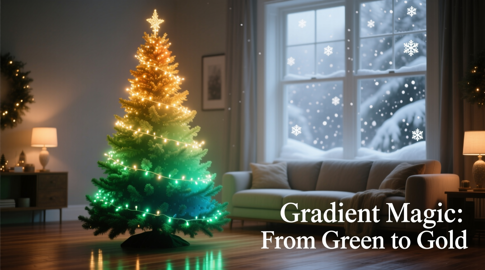
A gradient Christmas tree transforms a seasonal tradition into a curated design moment. Unlike monochromatic or high-contrast schemes, a gradient evokes depth, movement, and intention—like light filtering through frosted glass or the soft transition of twilight sky. It’s not about random color layering; it’s about visual rhythm: warm to cool, light to dark, matte to shimmer, sparse to dense. Achieving this requires thoughtful planning—not just aesthetics, but spatial awareness, material literacy, and an understanding of how light interacts with texture and hue. This guide distills decades of professional holiday styling experience into actionable, tested methods. Whether you’re decorating a 4-foot tabletop tree or a 12-foot living room centerpiece, these principles scale reliably. No special tools are needed—just observation, intention, and consistency.
Why Gradient Schemes Work Better Than Random Color Mixing
Most trees fail not from poor taste, but from visual noise. When ornaments in clashing intensities, saturations, and finishes are distributed without hierarchy, the eye has no resting point. A gradient solves this by establishing a clear chromatic arc—typically moving vertically (top to bottom) or radially (center outward). Research in environmental psychology confirms that gradual transitions reduce cognitive load and increase perceived harmony in interior spaces. In holiday contexts, this translates to longer dwell time, stronger emotional resonance, and greater perceived effort—even when fewer ornaments are used.
The most effective gradients follow one of three structural logics:
- Tonal gradient: Same base hue at varying lightness (e.g., ivory → cream → butter → gold)
- Temperature gradient: Shift across the warm-cool spectrum (e.g., terracotta → rust → brick → plum → slate)
- Saturation gradient: Fixed hue and value, increasing or decreasing intensity (e.g., dusty rose → rose → fuchsia → magenta)
Professionals rarely combine more than two of these axes—adding saturation shifts to a temperature gradient, for example, often creates unintended visual vibration. Simplicity anchors elegance.
The 5-Step Ornament Placement Framework
Gradient success hinges less on what you buy and more on where—and in what order—you place each piece. Follow this sequence rigorously, even if it feels counterintuitive at first.
- Anchor the apex: Place 3–5 ornaments in your lightest, most desaturated tone at the very top 6 inches. These should be small (1.5–2 inches), matte-finish, and identical in shape (e.g., all wooden spheres or frosted glass teardrops). Their purpose is to establish the “light source” of the gradient.
- Define the mid-canopy transition zone: Working downward in 8-inch bands, introduce progressively deeper tones. Use medium-sized ornaments (2.5–3 inches) with subtle texture—ribbed glass, brushed metal, or linen-wrapped wood. Avoid shine here; this zone is the gradient’s neutral corridor.
- Introduce contrast at the visual midpoint: At roughly 60% down the tree’s height, insert your boldest hue or highest-saturation piece—but only one per 12-inch radius. This is not the “pop” color; it’s the chromatic pivot point. Example: In a sage-to-charcoal gradient, place a single deep emerald glass ball here.
- Build density and dimension in the lower third: Use larger ornaments (3.5–4.5 inches) in your deepest, richest tones. Mix matte and low-luster finishes (e.g., velvet ribbon-wrapped balls alongside hammered brass). Vary shapes deliberately—avoid repeating the same silhouette within 18 inches.
- Ground with texture, not color: The bottom 12 inches should contain zero new hues. Instead, use natural elements—dried orange slices, cinnamon sticks, pinecones, or unbleached burlap bows—in tones already present. This visually “roots” the gradient and prevents the eye from dropping off the tree.
This framework works because it mirrors how human vision processes layered space: we register highlights first (top), then midtones (center), then grounding elements (bottom). Deviating from this sequence fractures the gradient illusion—even with perfect colors.
Material & Finish Pairing Guide
Color alone doesn’t create gradient depth—finish does. Two ornaments in identical RGB values will read as different tones depending on surface treatment. Below is a field-tested pairing matrix used by top-tier holiday stylists for residential and commercial installations.
| Base Hue | Top Third Finish | Middle Third Finish | Lower Third Finish | Avoid Together |
|---|---|---|---|---|
| Cream / Oat | Matte ceramic | Brushed brass | Velvet-wrapped wood | Glossy white plastic + satin ribbon |
| Teal / Slate | Frosted glass | Hammered copper | Unbleached linen | High-gloss enamel + mirrored acrylic |
| Burgundy / Plum | Waxed paper | Antiqued silver | Wool felt | Chrome + patent leather |
| Gold / Brass | Matte gold leaf | Brushed bronze | Raw brass (unlacquered) | Polished gold + yellow plastic |
Note the progression: top = diffuse light reflection, middle = directional reflection, bottom = absorption or soft diffusion. This finish gradient reinforces the color gradient without competing with it. Never mix high-gloss and matte finishes within the same vertical band—the resulting light scatter disrupts tonal continuity.
Real-World Application: The Maple Street Tree (2023)
In December 2023, stylist Lena Ruiz transformed a client’s 7.5-foot Fraser fir in Portland, Oregon, using a strict charcoal-to-cranberry gradient. The client had inherited 42 mismatched ornaments spanning five decades—many faded, chipped, or tarnished. Rather than discarding them, Ruiz audited each piece by CIELAB color space values (measured with a handheld spectrophotometer), grouping them into seven tonal bands. She then applied the 5-step placement framework—but with a critical adaptation: she reserved the top 10 inches exclusively for newly acquired matte black wooden beads (to ensure clean tonal anchoring), while repurposing all inherited pieces from the mid-canopy downward.
The result? A cohesive gradient perceived as “deliberately modern” by guests—despite containing ornaments ranging from 1952 hand-blown glass to 2018 resin berries. Key insight: gradient integrity depends more on placement discipline and tonal sequencing than on ornament age or uniformity. As Ruiz notes in her studio journal: “The gradient isn’t in the objects—it’s in the space between them.”
“People assume gradient trees require buying new ornaments every year. In truth, the most powerful gradients emerge from editing—not acquiring. It’s about revealing the latent tonal relationships already present in your collection.” — Lena Ruiz, Certified Holiday Stylist & Author of *Chromatic Trees: Designing Light Through Color*
Lighting Strategy: The Invisible Gradient Enhancer
String lights are not background—they’re active gradient components. Warm white LEDs (2200K–2700K) behave like pigment; cool white (4000K+) act like bleach. For gradient integrity, use only one correlated color temperature (CCT) across the entire tree—and never mix warm and cool bulbs. Then apply strategic dimming:
- Top third: Lights at 100% brightness—reinforces the lightest tonal anchor
- Middle third: Dimmed to 65–70%—creates the transitional “soft focus” zone
- Lower third: Dimmed to 40–45%—deepens the visual weight without adding new color
Use a smart plug or manual dimmer switch with three independent channels—or wrap lights in layers: inner string (full brightness), middle string (medium dim), outer string (low dim). This layered lighting mimics atmospheric perspective: distant objects appear lighter and sharper; near objects, darker and softer. It also reduces glare on reflective ornaments, preventing hot spots that fracture the gradient flow.
FAQ: Practical Gradient Questions Answered
Can I create a gradient on a pre-lit tree?
Yes—but only if its built-in lights are warm white (2700K or lower) and dimmable. Most pre-lit trees use non-dimmable, fixed-brightness LEDs. In those cases, avoid adding extra strings; instead, rely entirely on ornament finish and placement to carry the gradient. If lights are cool white, accept that your gradient will read cooler overall—compensate by selecting warmer base hues (e.g., amber instead of gray).
How many ornaments do I need for a convincing gradient?
Not quantity—distribution. A 6-foot tree needs minimum 72 ornaments for visual fullness, but a gradient can succeed with as few as 48 if placed using the 5-step framework. The critical ratio is: 15% top, 35% middle, 50% lower third. For a 60-ornament tree: 9 top, 21 middle, 30 lower. Underfilling any zone collapses the gradient arc.
What if my tree is artificial and very green?
Deep forest green absorbs light and competes with cool-toned gradients (blues, purples). Opt for warm gradients instead—rust to burnt sienna, or olive to moss. Use ornaments with high-value contrast (e.g., cream on dark green reads clearly; pale blue fades). Avoid mint, lavender, or ice blue—they recede against green foliage and appear washed out.
Conclusion: Your Gradient Starts Now
A gradient Christmas tree isn’t a decoration—it’s a statement of attention. It says you notice how light falls, how texture breathes, how color settles in space. You don’t need a design degree or a limitless budget. You need only commit to one principle: intention over accumulation. Choose your base hue. Audit what you already own—not for “what matches,” but for “where it belongs in the tonal sequence.” Place deliberately. Edit ruthlessly. Let the tree breathe between ornaments. Trust the physics of light and perception—they’ve guided gradients for centuries, from Renaissance frescoes to modern data visualizations.
This year, resist the urge to fill every branch. Instead, let the gradient unfold—slowly, surely, beautifully—from tip to trunk. Your tree won’t just glow. It will resonate.


 浙公网安备
33010002000092号
浙公网安备
33010002000092号 浙B2-20120091-4
Comments
No comments yet. Why don't you start the discussion?