
Gradient effects are among the most visually compelling tools in modern design. When applied thoughtfully, they transform static layouts into dynamic experiences. Nowhere is this more evident than in the use of ornament colors—rich, decorative hues often found in cultural patterns, architectural details, and artistic motifs. Applying a vertical gradient that transitions these colors smoothly from top to bottom can elevate digital interfaces, print media, textiles, and even interior spaces. This guide explores not only the technical execution but also the aesthetic considerations behind crafting such gradients with intention and precision.
Understanding Ornament Colors and Their Role in Gradients
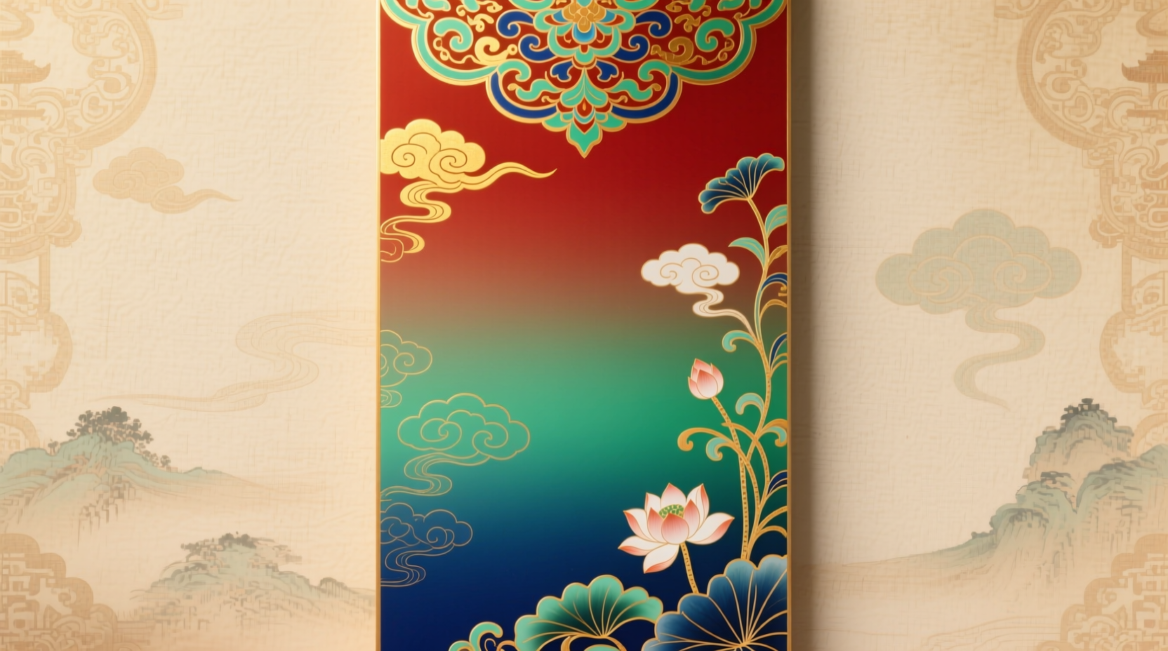
Ornament colors are not just decorative—they carry cultural weight, emotional resonance, and historical context. Think of the deep cobalt blues and emerald greens in Islamic tilework, the golds and crimson reds in Baroque interiors, or the earthy ochres and indigos in indigenous textile art. These colors are rarely used in isolation; instead, they interact in layered, rhythmic ways. A gradient that moves through such tones vertically mimics natural phenomena like sunrise, ocean depth, or forest canopy transitions, making it inherently intuitive to the human eye.
The key to success lies in selecting colors that belong to a coherent palette. Randomly chosen brights may clash, breaking the illusion of flow. Instead, consider:
- Hue families: Stick to analogous or triadic color schemes derived from traditional ornamentation.
- Saturation shifts: Gradually increase or decrease intensity from top to bottom for dramatic effect.
- Cultural authenticity: Respect the origins of the colors—avoid misappropriating sacred combinations without understanding their significance.
Step-by-Step Guide to Creating a Top-to-Bottom Gradient
Whether you're working in web design, graphic software, or physical media, the process follows a consistent logic. Below is a universal framework adaptable across mediums.
- Define the purpose and context
Selecting the right gradient depends on where it will be used. Is it a website background? A fabric dye transition? A mural? Each medium imposes constraints on color fidelity, blending capability, and durability. - Choose your base ornament palette
Pick 3–5 colors from a single ornamental tradition. For example, Mughal architecture offers saffron, turquoise, rose madder, and charcoal gray. Limiting the range ensures harmony. - Arrange colors by value and temperature
Sort them from light to dark or cool to warm. Typically, lighter/warmer tones work well at the top (evoking sky or light source), while deeper/cooler ones anchor the bottom (suggesting depth or shadow). - Create the gradient stop sequence
In digital tools, define percentage-based stops. For a five-color gradient:- 0% – Light gold
- 25% – Coral pink
- 50% – Deep teal
- 75% – Indigo
- 100% – Charcoal with metallic sheen
- Test for perceptual smoothness
View the gradient at full size and distance. Does any banding occur? Adjust midpoints slightly to eliminate harsh jumps. Sometimes adding a subtle neutral (e.g., soft beige) between two strong tones helps blend them. - Apply texture or pattern overlay (optional)
To enhance the ornamental feel, superimpose a faint geometric or floral motif using opacity masks. Ensure the pattern aligns with the cultural origin of the colors.
Digital Implementation: CSS and Design Tools
For web and UI designers, implementing a vertical ornament color gradient is straightforward with modern CSS. Here’s how to do it properly:
background: linear-gradient(
  to bottom,
  #f9c846 0%,     /* Saffron */
  #e67e80 25%,    /* Coral */
  #4db6ac 50%,    /* Teal */
  #264b4f 75%,    /* Forest Indigo */
  #1a1a1a 100%     /* Blackened Charcoal */
);
height: 100vh;
background-size: cover;
This code creates a seamless top-to-bottom transition. Note that using hex codes ensures consistency across devices. However, for accessibility, always test contrast ratios—especially if text overlays the gradient.
In design applications like Figma, Illustrator, or Photoshop:
- Select the Gradient Tool (G).
- Draw a vertical line from top to bottom of your canvas.
- Open the Gradient Editor and input your chosen ornament colors at precise stops.
- Adjust midpoint sliders to control how quickly one color blends into the next.
“Color gradients rooted in cultural ornamentation aren’t just beautiful—they’re storytelling devices. They connect users to heritage, memory, and place.” — Dr. Lena Moreau, Visual Anthropologist & Digital Experience Researcher
Physical Applications: From Textiles to Architecture
The same principles apply beyond screens. In textile dyeing, achieving a vertical gradient requires careful timing and immersion techniques. One real-world example illustrates this well:
Mini Case Study: Hand-Dyed Silk Scarves in Oaxaca
A collective of artisans in Oaxaca, Mexico, produces silk scarves using natural dyes derived from cochineal, indigo, and pomegranate. To create a top-to-bottom gradient inspired by local Zapotec weaving patterns, they developed a staged dip method:
- The top edge of the fabric is first dipped in a weak cochineal solution (pink).
- After drying, the lower half enters a stronger indigo vat, creating a blue-to-purple transition.
- Finally, the entire piece is mordanted with tannin and briefly submerged in iron water, darkening the bottom third to near-black.
The result? A wearable gradient that tells a story of land and labor. The visual flow mirrors the region’s mountain-to-valley geography. Customers report feeling an emotional connection simply by wearing the scarf.
Similarly, in architectural finishes, vertical gradients painted on walls or ceilings can alter spatial perception. A ceiling fading from pale sky-blue at the crown to warm terracotta at the base makes a room feel taller and more grounded simultaneously.
Checklist: Creating a Successful Ornament Gradient
Checklist: Follow these steps before finalizing your gradient:
- ✅ Selected culturally appropriate ornament colors
- ✅ Arranged hues in logical value/temperature order
- ✅ Tested for smooth transitions (no visible banding)
- ✅ Ensured sufficient contrast for readability (if text is involved)
- ✅ Verified color accuracy across devices or materials
- ✅ Added subtle texture or pattern if needed for authenticity
- ✅ Respected intellectual property and cultural context
Common Pitfalls and How to Avoid Them
Even experienced designers stumble when handling complex color transitions. Below is a summary of frequent mistakes and solutions:
| Do | Don’t | Why |
|---|---|---|
| Use HSL or LAB color space for smoother transitions | Rely solely on RGB values | HSL allows independent control of hue, saturation, and lightness—critical for avoiding muddy mid-tones. |
| Limit the palette to 3–5 core colors | Include too many colors in one gradient | Excessive hues cause visual noise and lose the sense of direction. |
| Preview on multiple screens or under different lighting | Judge colors on a single calibrated monitor | Colors shift under sunlight, LED, or incandescent bulbs—especially metallics and deep tones. |
| Respect cultural origins and symbolism | Mix sacred colors from unrelated traditions | Avoid appropriation; some combinations are spiritually significant and should not be used decoratively. |
Frequently Asked Questions
Can I use gradients with metallic ornament colors?
Yes, but with caution. Metallics like gold, silver, or copper don’t blend optically like flat colors. In digital formats, simulate sheen using gradients with varying brightness and overlay textures. In physical media, consider layering foil stamping or embroidery over a base gradient.
How do I prevent color banding in long gradients?
Banding occurs when there aren't enough intermediate shades. To reduce it:
- Add a subtle noise layer (1–2% transparency) in design software.
- Use dithering in print outputs.
- In CSS, add a faint transparent noise pseudo-element via `::after` with a background pattern.
Are vertical gradients suitable for mobile interfaces?
Yes, especially in splash screens, app backgrounds, or profile headers. However, ensure the gradient doesn’t interfere with navigation elements. Test usability with real users—some find intense gradients distracting during prolonged use.
Making It Your Own: From Technique to Expression
Mastering the gradient is more than technical proficiency—it’s about intention. A gradient built from ornament colors should reflect meaning, whether it’s honoring ancestry, evoking nature, or expressing personal identity. Consider keeping a color journal where you document traditional palettes, their sources, and emotional associations. Over time, you’ll develop an instinctive sense of which transitions feel authentic and powerful.
When executed with care, a top-to-bottom gradient becomes more than decoration. It guides the eye, sets mood, and connects viewers to something larger than the screen or surface it inhabits. Whether you're designing a website header or hand-painting a ceremonial banner, remember that every shade in the transition carries weight.


 浙公网安备
33010002000092号
浙公网安备
33010002000092号 浙B2-20120091-4
Comments
No comments yet. Why don't you start the discussion?