
A monochromatic Christmas tree is often misunderstood as minimalist by necessity—not by intention. Many assume it means “white only,” “black only,” or “all silver,” resulting in flat, static displays that whisper instead of sing. But true monochrome design isn’t about restriction; it’s about precision, contrast, texture, and rhythm. When executed with intention, a single-hue tree can pulse with energy, depth, and emotional resonance—evoking frost-laced pine boughs at dawn, vintage mercury glass under candlelight, or the quiet drama of charcoal sketches on vellum. This approach rewards attention: it invites the eye to travel, pause, and discover nuance where others see uniformity.
The key lies in rejecting the idea that “monochromatic” equals “monotone.” In design theory, monochrome refers to variations of a single base hue—including its tints (hue + white), tones (hue + gray), and shades (hue + black)—plus deliberate textural and dimensional layering. Applied to a Christmas tree, this framework becomes a powerful tool for creating visual interest without chromatic distraction. Below, we break down exactly how to build one that feels alive—not austere.
1. Choose Your Base Hue with Purpose (Not Just Preference)
Selecting your anchor color is the most consequential decision—and it’s rarely about what’s trending. Instead, consider three interlocking factors: your existing interior palette, the emotional tone you want to evoke, and the natural light in your space.
For example, a cool-toned ivory (not stark white) works beautifully in north-facing rooms with gray-blue walls, lending warmth without clashing. A deep charcoal—almost black but with subtle blue undertones—anchors a modern loft with concrete floors and brass fixtures, offering sophistication rather than severity. Meanwhile, a warm ocher-based beige (think aged parchment or toasted almond) harmonizes with honey-toned wood furniture and soft linen textiles, suggesting heritage and quiet celebration.
Crucially, avoid pure, saturated hues unless they’re deeply intentional. A neon-tinged silver or fluorescent white will read as artificial and flatten dimension. Instead, lean into complex neutrals: oatmeal with faint green undertones, graphite with violet depth, or bone with a whisper of peach. These behave like chameleons—shifting subtly with ambient light and surrounding materials—making your tree feel responsive, not static.
2. Build Dimension Through Texture, Not Color
Texture is the engine of dynamism in monochrome design. Without hue variation to guide the eye, surface quality becomes your primary storytelling device. Think in layers: smooth, rough, matte, glossy, woven, brittle, pliable, reflective. Each adds a distinct sensory signature—and when grouped intentionally, creates rhythm.
Start with your tree itself. A real Nordmann fir offers dense, dark-green needles with a waxy sheen—ideal for charcoal or slate schemes. A frosted artificial tree with matte PVC tips reads softer and more ethereal, perfect for ivory or pearl palettes. For maximum tactility, incorporate branches: birch twigs wrapped in linen ribbon, dried eucalyptus stems (which fade to silvery gray), or even bleached grapevine wreaths nestled into lower boughs.
Ornaments should follow a strict 3:2:1 ratio: three textures per dominant tone, two finishes per texture, one “surprise” material per tier. For instance:
- Ivory scheme: Hand-thrown ceramic baubles (matte), hand-blown glass orbs (glossy), and raw-edge linen pouches (nubby); finishes include satin glaze, cracked ice enamel, and unbleached cotton; surprise: a single antique mother-of-pearl button embedded in a wool felt star.
- Charcoal scheme: Hammered iron stars (brushed), smoked oak slices (sanded), and crushed coal-effect resin spheres (matte); finishes include oxidized patina, natural grain sealant, and velvet-dusted coating; surprise: a single preserved black rose petal sealed inside a clear acrylic orb.
This method ensures every glance reveals new detail—not repetition.
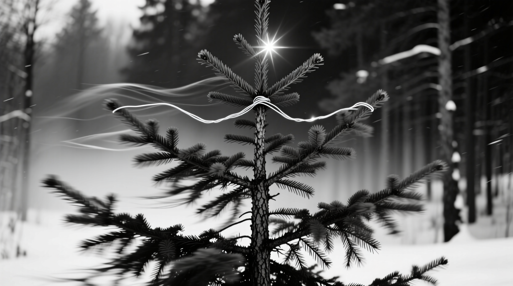
3. Master Light as a Design Element
In monochrome, light doesn’t illuminate—it sculpts. Since there’s no chromatic contrast to define form, brightness, direction, and diffusion become your primary tools for creating volume, shadow, and motion.
Use three distinct lighting tiers:
- Backbone layer: Warm-white (2700K) LED string lights, evenly spaced and hidden *within* the tree’s inner structure—not draped over branches. This creates a gentle, diffused glow from within, mimicking bioluminescence and giving the tree a luminous core.
- Highlight layer: Directional mini-spotlights (30° beam angle) mounted on nearby shelves or mantels, angled upward to graze specific ornaments. Use these to catch the curve of a glass orb or the grain of an oak slice—creating small, intentional hotspots that draw the eye upward and across.
- Ambient layer: One or two low-wattage, frosted-glass table lamps placed near the tree base. Their soft spill reflects off matte ornaments and absorbs into textured ones, reinforcing tonal separation without glare.
Avoid cool-white bulbs (they bleach warmth from neutral palettes) and blinking or color-changing lights (they undermine monochrome integrity). Also skip curtain-style light draping—it flattens form. Instead, weave lights *through* branches, following the natural spiral growth pattern of real trees (or mimicking it artificially). This creates subtle kinetic energy, as if the light itself is spiraling upward.
4. Introduce Rhythm Through Scale, Shape, and Placement
Monochrome trees thrive on deliberate asymmetry and rhythmic repetition—not symmetry. Visual rhythm emerges when elements repeat with variation: same shape, different scale; same material, different orientation; same tone, different placement density.
Consider this proven placement strategy, applied vertically across three zones (base, mid, crown):
| Zone | Ornament Scale Ratio | Shape Distribution | Placement Logic |
|---|---|---|---|
| Base (25% height) | Large : Medium = 3 : 5 | Organic (spheres, pods, irregular stones) | Clustered in uneven groups of 3–5; some resting on floor beneath tree skirt |
| Mid (50% height) | Medium : Small = 4 : 7 | Geometric (cubes, tetrahedrons, cylinders) | Alternating vertical rhythm—e.g., cube → sphere → cylinder → sphere—repeating every 18 inches |
| Crown (25% height) | Small : Tiny = 2 : 1 | Linear (sticks, rods, slender cones) | Sparse, directional—pointing outward or upward; no clusters; maximum 1 ornament per 6-inch branch span |
This structure prevents visual fatigue. The eye moves naturally: grounded by weight at the base, engaged by pattern in the midsection, then released upward by lightness and line at the top. It feels intentional, not random—and never “matchy.”
5. Real-World Application: The Oslo Apartment Tree
In a compact 1930s Oslo apartment with pale ash floors, dove-gray plaster walls, and north-facing windows, interior stylist Lena Voss faced a challenge: her client wanted “a Christmas tree that felt like winter air—clear, still, but full of life.” She rejected white-on-white as too sterile and opted for a nuanced charcoal monochrome.
Lena began with a real Norway spruce (its deep green needles provided natural tonal depth against charcoal decor). She strung 200 warm-white micro-LEDs *inside* the tree, then added three custom-made lighting accents: a brushed-steel ring suspended above the tree (emitting a downward wash), two wall-mounted brass sconces angled to graze the midsection, and a single floor lamp behind the tree casting long, soft shadows.
Ornaments were sourced exclusively from Nordic craft studios: smoked oak discs (various diameters), hand-forged iron snowflakes (some polished, some deliberately rusted), and matte ceramic cones glazed in five charcoal variants—from slate to ink. She hung them using undyed hemp cord of three thicknesses (1mm, 2mm, 4mm), tying each with a distinct knot: clove hitch for large pieces, bowline for medium, and surgeon’s loop for tiny cones. No two ornaments shared the same suspension method.
The result? A tree that shifted with the hour: cool and misty at noon, glowing amber at dusk, and deeply sculptural under candlelight. Visitors consistently described it as “breathing”—a testament to how texture, light, and rhythm can generate vitality without a single drop of color.
“Monochrome isn’t absence—it’s amplification. When you remove hue, you force attention onto proportion, surface, light, and sequence. That’s where true dynamism lives.” — Elias Thorne, Lighting Designer & Author of Chroma and Shadow
6. Essential Monochrome Tree Checklist
Before hanging a single ornament, verify these seven non-negotiables:
- ✅ Your base hue has been tested in both daylight and artificial light against key room surfaces
- ✅ You’ve selected at least three distinct textures (e.g., ceramic + wood + linen) and two finishes per texture (e.g., matte + glossy ceramic)
- ✅ All lighting is warm-white (2700K–3000K), with at least one internal light source and one directional accent
- ✅ Ornament scale follows the 3:2:1 ratio per zone (large/medium/small) and avoids uniform spacing
- ✅ At least 30% of ornaments are handmade, artisan-crafted, or naturally aged (no mass-produced plastic)
- ✅ Your tree topper is structural—not decorative—e.g., a bent-wood ring, forged iron spiral, or oversized linen bow with raw edges
- ✅ Your tree skirt is texturally contrasting (e.g., nubby wool rug for a smooth ceramic scheme; cracked-leather hide for a rough-hewn wood theme)
7. FAQ: Monochrome Tree Questions Answered
Can I use metallics in a monochromatic tree?
Yes—but only if they reinforce your base hue’s temperature and depth. Warm metallics (antique brass, hammered copper, gold leaf) belong exclusively in warm monochromes (ivory, oat, caramel). Cool metallics (brushed nickel, pewter, gunmetal) serve cool schemes (charcoal, slate, ash). Never mix warm and cool metals on the same tree—they fracture tonal unity. And avoid high-shine chrome or mirror finishes unless your entire aesthetic is industrial; they reflect too much and flatten texture.
Won’t a monochrome tree look boring in photos?
Quite the opposite—if lit well. Monochrome compositions translate exceptionally well to photography because they eliminate chromatic noise, allowing composition, light play, and texture to dominate the frame. Use a shallow depth of field (f/2.8 or wider) to blur background clutter and focus sharply on one textured ornament. Shoot during the “blue hour” (just after sunset) when ambient light is soft and even—your warm-white lights will glow against the cool twilight, adding natural contrast without breaking monochrome integrity.
How do I keep it from feeling “cold” or “clinical”?
Introduce organic imperfection. Include at least five natural elements: dried citrus wheels (they fade to parchment), cinnamon sticks, pinecones (lightly dusted with matte white clay slip, not glitter), birch bark shards, or pressed fern fronds. Their irregular shapes, subtle scent, and inherent variability counterbalance any perceived sterility. Also, vary ornament suspension heights—even within the same branch—to create gentle visual vibration, like leaves trembling in a breeze.
Conclusion
A monochromatic Christmas tree is not a compromise. It’s a declaration: that beauty resides in subtlety, that richness lives in restraint, and that true dynamism emerges not from abundance—but from intelligent orchestration. Every choice you make—the whisper of a ceramic glaze, the angle of a spotlight, the weight of a hemp cord—adds a note to a composition that feels both timeless and intimately personal. This isn’t decoration. It’s curation. It’s patience. It’s seeing the extraordinary in the seemingly uniform.
Your tree won’t shout. But those who pause beside it will feel its quiet pulse—the slow, steady rhythm of thoughtfully layered light, texture, and form. Start small: choose one hue. Source one hand-thrown ornament. String one warm-white light strand *inside* your tree. Notice how the shadows fall. Watch how the light catches a curve. Then build from there—not toward more, but toward truer.


 浙公网安备
33010002000092号
浙公网安备
33010002000092号 浙B2-20120091-4
Comments
No comments yet. Why don't you start the discussion?