
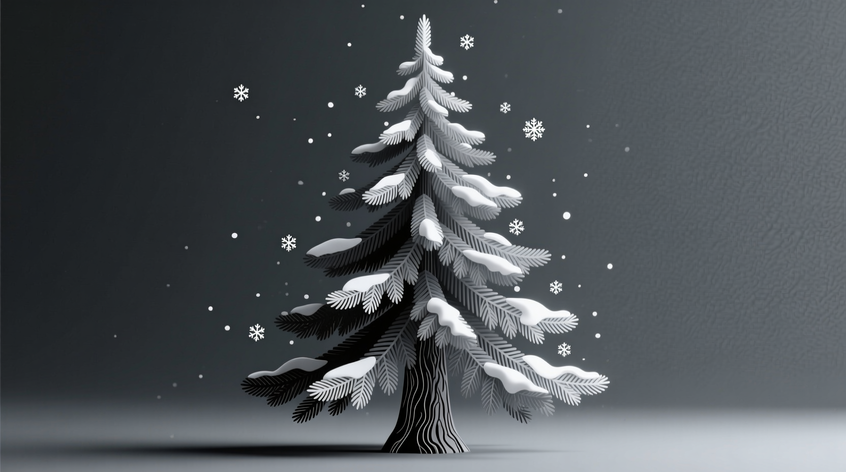
A monochromatic Christmas tree offers a refined alternative to the traditional multicolored evergreen. By focusing on a single color family—such as white, silver, gold, green, or even deep burgundy—you can craft a cohesive, elegant centerpiece that radiates calm sophistication. The key to success lies not in adding more colors, but in layering depth through texture, shade variation, and thoughtful ornamentation. When executed well, a monochrome tree becomes a statement of intentionality, where subtle differences in finish, material, and tone elevate the design from flat to fascinating.
This approach appeals especially to those who appreciate minimalist aesthetics, modern interiors, or seasonal displays that complement rather than compete with their home decor. Whether you're aiming for a frost-kissed winter wonderland or a richly layered forest green tableau, mastering contrast within a single hue is both an art and a science. Below, we explore how to build visual interest without relying on chromatic variety.
Select Your Base Color with Intention
The first decision shapes everything that follows: choosing your primary color. While red and green dominate most holiday imagery, monochromatic trees thrive on less expected choices. Popular options include:
- White or ivory – evokes snow-covered branches and Scandinavian minimalism.
- Silver or gray – suggests moonlight on frost, ideal for modern or industrial spaces.
- Gold or amber – brings warmth and opulence, perfect for vintage-inspired interiors.
- Emerald or forest green – deepens the natural essence of the tree itself.
- Burgundy or charcoal – adds drama and luxury for contemporary homes.
Consider your room’s existing palette. A white tree will glow in a dark living room, while a gold scheme may feel overwhelming in a space already rich with warm tones. Test paint swatches or fabric samples near your intended tree location at different times of day to see how light affects perception.
Build Depth Through Shade Variation
Monochrome doesn’t mean monotone. The secret to a dynamic display is working across a spectrum of lightness and darkness within your chosen color family. For example, a white-themed tree might incorporate:
- Ivory baubles
- Frosted clear glass ornaments
- Pure white faux fur ribbon
- Champagne-toned pinecones
- Glazed porcelain pieces with soft gray undertones
Similarly, a green tree could blend sage, moss, hunter, and eucalyptus accents to mimic the natural gradations found in forests. Use a value scale (a gradient from light to dark) as a guide when selecting decorations. Aim for at least five distinct tones to avoid visual flatness.
“Even in a single-color scheme, the eye craves contrast. Without it, the tree recedes into the background instead of commanding attention.” — Lila Montgomery, Interior Stylist & Holiday Design Consultant
Creating a Value Scale for Your Tree
To ensure proper tonal range, sketch out or lay down your planned ornaments from lightest to darkest before hanging them. This preview allows you to spot gaps—like too many mid-tones and not enough highlights or shadows—and correct them early.
Layer Textures for Visual Interest
If shade provides dimension, texture delivers tactile intrigue. In a monochromatic setting, surface finishes become the primary source of contrast. Combine glossy, matte, rough, smooth, shiny, and fibrous elements to keep the eye engaged.
For instance, on a silver-themed tree:
- Glossy mercury glass balls catch and scatter light dramatically.
- Matt silver orbs absorb light, creating pockets of quiet elegance.
- Frosted twig-like branches add organic roughness.
- Satin ribbons drape softly, introducing fluidity.
- Feathered or velvet-covered ornaments contribute plushness.
Texture also influences mood. Smooth, reflective surfaces feel sleek and modern; handcrafted paper, burlap, or wood evoke rustic charm. Balance high-gloss items with softer counterparts so the tree doesn’t feel overly polished or cold.
| Texture Type | Effect on Monochrome Tree | Best Paired With |
|---|---|---|
| Glossy | Adds sparkle and draws attention; best used sparingly as accent | Matte finishes, woven materials |
| Matte | Provides grounding and softness; excellent for base coverage | Metallic trims, textured fabrics |
| Frosted | Suggests ice or snow; enhances wintry themes | Clear lights, white garlands |
| Fabric (velvet, linen) | Introduces warmth and coziness | Natural wood ornaments, paper stars |
| Metallic (brushed, hammered) | Offers sheen without glare; feels artisanal | Textured backdrops, dimmable lighting |
Step-by-Step Guide to Assembling Your Monochrome Tree
Building a visually compelling monochromatic tree requires planning and patience. Follow this timeline to achieve professional results:
- Week Before: Gather Supplies
Select all decorations within your chosen color family. Include at least three types of ornaments (round, elongated, novelty), two textures, and a mix of sizes. Purchase string lights that match your theme—warm white for cream/gold schemes, cool white for silver/white trees. - Day 1: Prep the Tree
Fluff artificial branches thoroughly to maximize fullness. Rotate each tip outward to mimic natural growth. If using a real tree, allow it to acclimate indoors for several hours to reduce needle drop. - Step 1: Install Lighting First
Weave lights evenly from trunk to tips, maintaining consistent spacing. For monochrome trees, use more bulbs than usual—up to 100 per foot of height—to enhance luminosity and highlight texture. - Step 2: Apply Larger Ornaments Deep Within
Place 30% of your largest baubles toward the interior of the tree, nestling them close to the trunk. This creates depth and prevents a hollow appearance from certain angles. - Step 3: Build Mid-Layer Coverage
Add medium-sized ornaments across outer branches, varying placement so no two are directly aligned vertically. Cluster similar textures together slightly for cohesion, but alternate finishes (glossy next to matte) for contrast. - Step 4: Finish with Accents and Focal Points
Incorporate specialty items—ribbon bows, feather picks, fabric flowers, or handmade stars—at strategic intervals. Place one standout piece at the top, one near the base, and one off-center for asymmetrical balance. - Final Touch: Adjust and Evaluate
View the tree from multiple distances and angles. Step back ten feet—does any area feel too dense or sparse? Rotate the tree if possible to ensure even appeal from all sides.
Real Example: A Winter White Tree Transformation
Sophie R., a graphic designer in Portland, wanted a serene holiday aesthetic that matched her all-white living room. She began with a pre-lit white flocked tree but found it looked flat and artificial. After researching monochromatic styling, she revised her approach:
- Replaced basic white bulbs with warm LED string lights (500 total for a 7-foot tree).
- Added ornaments in ivory, eggshell, pearlized clear, and pale gray.
- Incorporated textured elements: faux fur pom-poms, knitted wool balls, birch slice cutouts, and lace-detailed glass drops.
- Wove a wide satin-organza ribbon in champagne around the trunk in a cascading spiral.
- Placed feathered white peacock plumes deep in the branches to mimic falling snow when viewed from below.
The result was a multidimensional, inviting tree that felt both festive and harmonious with her space. “It doesn’t scream ‘Christmas’,” she said, “but people always notice it. They come closer, touch the textures, and say, ‘This is so peaceful.’”
Essential Checklist for a Successful Monochrome Tree
- ✅ Choose a dominant color with complementary undertones
- ✅ Collect at least five shades within that color family
- ✅ Include a minimum of four distinct textures (e.g., glossy, matte, fabric, metallic)
- ✅ Use ample lighting—prioritize brightness and even distribution
- ✅ Plan ornament placement from inside out, large to small
- ✅ Add focal points at top, middle, and base
- ✅ View from multiple angles before finalizing
Common Pitfalls to Avoid
Even experienced decorators can misstep when designing monochrome trees. Watch for these issues:
- Over-relying on one shade: Using only pure white or flat silver leads to a flat, lifeless appearance.
- Neglecting lighting: Without sufficient illumination, textures disappear and shadows dominate.
- Crowding the surface: Too many ornaments block light and hide textural details. Allow breathing room between pieces.
- Ignoring scale: All small ornaments make a tree look busy; all large ones make it seem sparse. Mix sizes intentionally.
- Skipping the finishing touch: A tree topper and coordinated skirt complete the narrative. Don’t leave them as afterthoughts.
Frequently Asked Questions
Can I use clear ornaments in a monochromatic tree?
Yes—especially in white, silver, or icy themes. Clear glass reflects surrounding hues and acts as a prism for light, subtly picking up nearby tones. Frosted or etched finishes work better than plain transparent ones, which can look empty.
How do I prevent my monochrome tree from looking boring?
Focus on contrast. Vary not just color intensity but also shape, size, and surface quality. Incorporate movement—like dangling tassels or swaying picks—and consider scent (pine-scented sprays or cinnamon sticks) to engage additional senses.
Is it okay to mix metals in a single-color scheme?
Yes, as long as they belong to the same temperature family. Pair silver, platinum, and gray tones together; combine gold, brass, and copper in warmer schemes. Avoid mixing warm and cool metals unless intentionally creating contrast, which can disrupt monochrome harmony.
Final Thoughts: Elevate Tradition with Intentional Design
A monochromatic Christmas tree is more than a decorative choice—it’s a declaration of mindful curation. It challenges the assumption that holidays must be loud, bright, and crowded with color. Instead, it embraces restraint, subtlety, and sensory richness through texture and tonal nuance.
By carefully selecting shades, layering finishes, and placing each element with purpose, you create not just a tree, but an experience—one that invites closer inspection, evokes calm, and lingers in memory. Whether your goal is modern elegance, nostalgic charm, or tranquil simplicity, the monochrome approach offers endless creative potential within disciplined boundaries.


 浙公网安备
33010002000092号
浙公网安备
33010002000092号 浙B2-20120091-4
Comments
No comments yet. Why don't you start the discussion?