
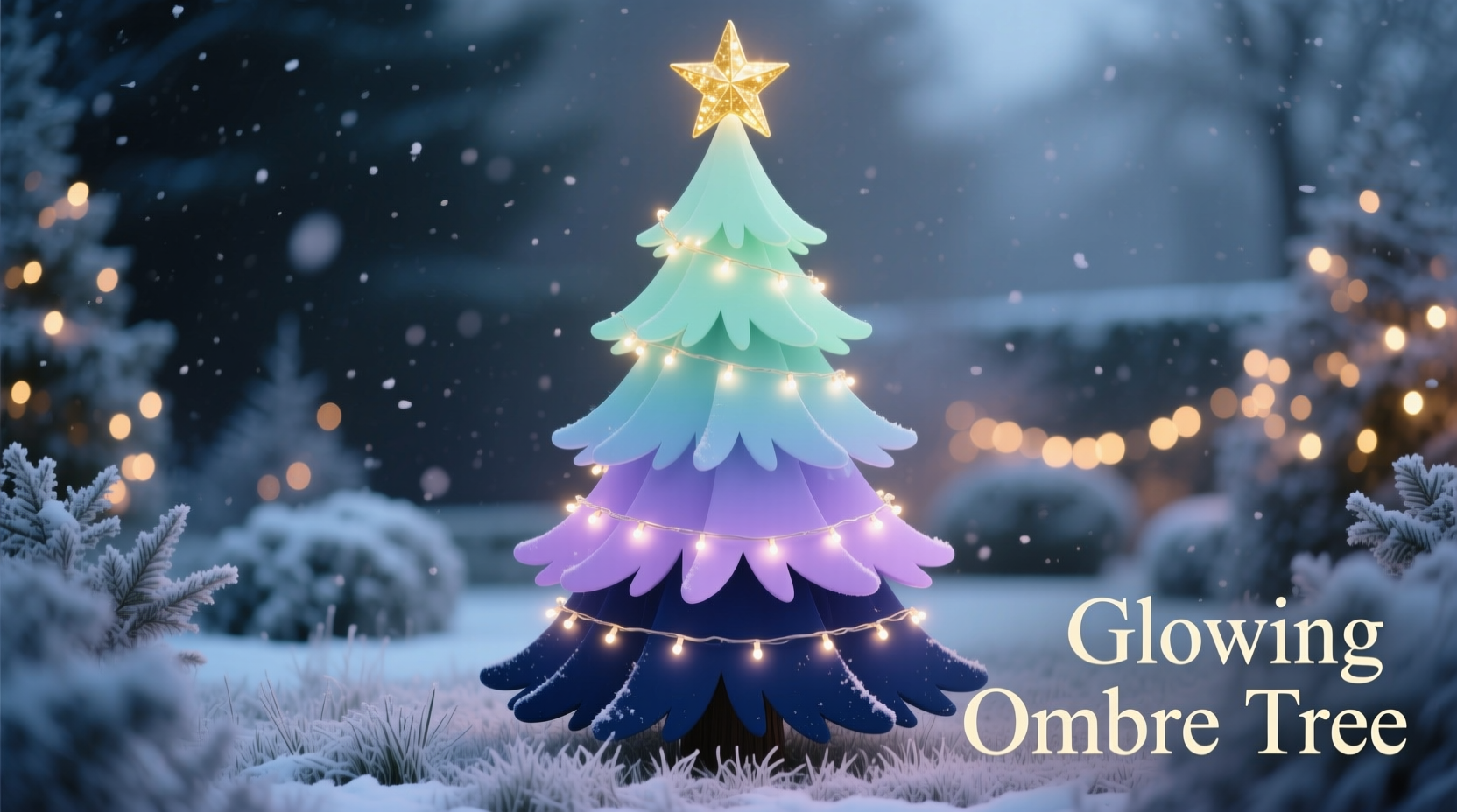
An ombre Christmas tree is more than a trend—it’s a design statement rooted in visual rhythm and intentional contrast. Unlike monochromatic schemes or random color mixing, a true dark-to-light ombre tree guides the eye upward with purpose: grounding the composition in richness at the base, then releasing tension through gradual lightening toward the apex. This technique adds dimension, elegance, and architectural presence—even on modest-sized trees. Achieving it requires thoughtful planning, not just stacking ornaments by shade. Below is a field-tested methodology developed through years of residential styling, holiday showhouse installations, and collaboration with professional floral and lighting designers.
Understanding Ombre Beyond “Gradient”
Ombre (from the French *ombrer*, meaning “to shade”) is often misapplied as simple color blending. In tree styling, it demands three interlocking principles: chromatic progression, textural modulation, and spatial intentionality. A successful dark-to-light ombre doesn’t rely solely on hue shifts—black to white, forest green to sage—but integrates depth through material weight, surface reflectivity, and ornament density. For example, matte black velvet bows anchor the lower third; mid-level branches carry brushed brass and frosted glass with subtle translucency; the uppermost tiers feature iridescent pearls, spun-glass stars, and sheer organza ribbons that catch ambient light without competing for dominance.
This layered approach prevents visual fatigue. Without textural variation, a strict value gradient can appear flat or overly digital—like a Photoshop fill rather than a hand-curated experience. Professional stylist Lena Torres, who has designed trees for The Plaza Hotel’s Grand Ballroom for 14 seasons, confirms this nuance:
“Clients ask for ‘ombre,’ but what they truly want is emotional movement—calm at the base, uplifted at the top. That only happens when color, texture, and placement work as one system.” — Lena Torres, Interior Stylist & Holiday Design Director
Pre-Tree Preparation: The Foundation of Flow
Before hanging a single ornament, assess your tree’s structure—not just height, but silhouette, branch density, and natural taper. A full, conical real or high-quality PVC tree offers ideal geometry for vertical progression. Slim or pencil trees require adaptation: shorten the ombre range (e.g., dark-to-medium instead of dark-to-light) and emphasize horizontal banding at key intervals.
Begin with a neutral, matte base layer: wrap the entire tree in unbleached muslin ribbon, ivory burlap garland, or thin natural jute twine. Avoid shiny white lights or silver tinsel at this stage—they introduce premature brightness and fracture the tonal journey. Instead, use warm-white LED string lights with a 2200K–2400K color temperature. Space them evenly, but concentrate 60% of the total strand count in the lower two-thirds—this reinforces visual weight where darkness resides.
Step-by-Step Ombre Layering System
Follow this precise sequence—not chronologically, but spatially—to build cohesion and avoid backtracking:
- Anchor the Base (Bottom 30%): Start with large-scale, low-luster elements—matte black ceramic balls (2.5–4 inches), deep emerald velvet pomegranates, charcoal wool felt pinecones, and heavy iron starfish. Hang these deeply into the interior branches, not just on tips. Density here is essential: aim for 3–4 substantial pieces per square foot.
- Define the Transition Zone (Middle 40%): Introduce medium-value, semi-reflective materials: antique gold mercury glass orbs, brushed copper bells, frosted sea-glass teardrops, and heather-gray linen-wrapped ornaments. Vary size deliberately—mix 1.75-inch miniatures with 3-inch mid-sizers—to disrupt repetition and encourage eye travel. Place 70% of these items on outer branches, 30% nestled inward.
- Lighten the Crown (Top 30%): Shift to lightweight, luminous, and airy forms: hand-blown opal glass stars, ivory silk rosettes, raw-edge bleached birch slices, and delicate capiz shell spirals. Use clear fishing line for near-invisible suspension. Avoid anything heavier than 1.25 ounces per piece. Keep spacing open—no more than 1 ornament per 9 inches of branch tip length.
- Integrate Light Strategically: After all ornaments are placed, add secondary lighting: battery-operated fairy lights wrapped around top-tier branches only, or small LED twig lights inserted vertically into upper foliage. These act as “light accents,” not primary illumination—think of them as punctuation marks in a sentence, not the sentence itself.
- Final Texture Pass: With all structural layers complete, walk around slowly and add tactile contrast: drape ivory angora yarn in loose loops across the upper third; tuck dried white teasel heads or bleached wheat stalks into mid-level junctions; secure tiny sprigs of silver brunia at branch tips. These micro-textures prevent the lightest zone from feeling sterile.
Color Palette & Material Selection Guide
Choosing the right dark-to-light spectrum prevents unintended clashes or washed-out results. Avoid jumping across color families (e.g., navy → lemon yellow). Stick to one chromatic family with consistent undertones. The table below outlines four proven palettes—including recommended materials and common pitfalls:
| Palette Name | Dark Base (Bottom) | Light Finish (Top) | Avoid |
|---|---|---|---|
| Forest Whisper | Matte charcoal + deep forest green velvet | Unbleached linen + pale eucalyptus gray | Olive green (too yellow), stark white (breaks warmth) |
| Midnight Pearl | Blackened steel + gunmetal mercury glass | Mother-of-pearl + antique ivory silk | Silver foil (too cold), bright white plastic (cheapens) |
| Desert Dawn | Burnt umber clay + rust-dyed wool | Blush quartz + bleached sand dollar | Coral (too saturated), beige plastic (dull) |
| Winter Fog | Slate blue wool + graphite felt | Frosted quartz + cloud-white mohair | Royal blue (clashes cool/warm), pure white acrylic (harsh) |
Real-World Case Study: The 7-Foot Faux Spruce Transformation
In December 2023, designer Marco Chen restyled a client’s 7-foot pre-lit Noble Fir faux tree in a downtown Chicago loft. The original tree was overloaded with red-and-gold ornaments—visually loud but spatially disorganized. The client requested “something serene, like walking into a snow-dusted pine forest at dusk.”
Marco began by removing all existing decor and restringing with 300 warm-white micro-LEDs, concentrating 180 in the bottom two feet. He then applied the ombre layering system over two days:
- Day 1, Morning: Anchored the base with 42 matte charcoal ceramic spheres (3 inches) and 18 hand-sewn forest-green velvet acorns filled with cedar shavings for subtle scent.
- Day 1, Afternoon: Added 64 transitional pieces: brushed brass pinecones, frosted amber glass icicles, and heather-gray wool pom-poms—strategically clustered near branch junctions to enhance perceived fullness.
- Day 2: Completed the crown with 36 opal glass stars (1.5 inches), 22 ivory silk rosettes with raw edges, and 14 slender birch branches wired upright into the topmost tier. Final touch: 8 battery-powered twig lights inserted vertically into the apex, emitting a soft, directional glow downward.
The result? A tree that read as cohesive from 20 feet away yet revealed nuanced texture up close. Most notably, the client reported guests consistently describing it as “calming”—a testament to how intentional ombre supports psychological comfort, not just aesthetics.
Common Pitfalls & How to Correct Them
Even experienced decorators misstep with ombre trees. Here’s what to watch for—and how to fix it fast:
- Pitfall: “Banding” instead of blending. When dark and light zones feel like stacked horizontal stripes, the eye stops moving. Solution: Introduce 3–5 “bridge ornaments” in the transition zone that share qualities of both ends—e.g., a charcoal ornament with a faint pearlescent sheen, or an ivory ball with subtle gray marbling.
- Pitfall: Over-lighting the top. Too many bright ornaments or cool-toned lights at the crown creates visual “float”—the tree feels ungrounded. Solution: Replace 30% of top-tier lights with warm-white micro-LEDs on dimmer mode, or swap 2–3 glossy ornaments for matte ones (e.g., raw ceramic over glazed).
- Pitfall: Ignoring scale hierarchy. Using uniformly sized ornaments—even in perfect color order—flattens dimension. Solution: Enforce a strict size ratio: bottom ornaments ≥2.5 inches, mid-tier 1.5–2.5 inches, top tier ≤1.75 inches. No exceptions.
Frequently Asked Questions
Can I achieve ombre on a real tree with natural needle variation?
Absolutely—and it’s often easier. Real firs and spruces have naturally denser, darker foliage at the base and lighter, airier growth at the top. Lean into this: use matte, earthy materials at the bottom (burlap, wood, dried citrus), then elevate to translucent and reflective elements above. Avoid covering the tree’s natural gradation with heavy garlands.
What if my space has cool-toned lighting (e.g., recessed LEDs at 4000K)?
Cool lighting will mute warm-based palettes (like Desert Dawn) and exaggerate cool ones (like Winter Fog). Compensate by increasing material reflectivity in the mid and upper zones—add brushed brass, mother-of-pearl, or frosted glass to bounce available light without introducing harshness. Never try to “warm up” cool lights with gels; it reduces output and looks artificial.
How do I store ombre ornaments for next year without losing the system?
Don’t store by color alone. Use compartmentalized storage boxes labeled “Base | Transition | Crown” with fabric dividers. Include a printed palette reference card inside each box showing exact RGB/HEX values and material notes (e.g., “Forest Whisper Base: Charcoal ceramic, 3″, matte finish”). Reassemble using the same layering sequence—consistency compounds over time.
Conclusion: Your Tree as a Living Composition
An ombre tree is never finished—it evolves with light, perspective, and presence. It asks you to slow down, to place each element with awareness of how it converses with what lies beneath and above it. This isn’t decoration as afterthought; it’s curation as ritual. You’re not just hanging ornaments—you’re choreographing light, guiding attention, and honoring the quiet power of gradual change. Whether your palette leans into forest depth or winter stillness, the discipline of dark-to-light progression cultivates patience, intention, and visual literacy far beyond the holiday season.
Start small this year: commit to anchoring just the bottom third with rich, grounded pieces. Notice how the rest of the tree responds. Then next year, extend the transition. And the year after, refine the crown until it breathes light without shouting. That’s where mastery lives—not in perfection, but in the thoughtful, repeatable practice of making space for both weight and lift, shadow and gleam, earth and air.


 浙公网安备
33010002000092号
浙公网安备
33010002000092号 浙B2-20120091-4
Comments
No comments yet. Why don't you start the discussion?