
A beautifully decorated Christmas tree can become the centerpiece of your holiday home. But achieving that polished, professional look isn’t just about adding more ornaments—it’s about thoughtful placement. One of the most effective ways to elevate your tree’s appearance is through symmetry: a balanced arrangement that guides the eye and creates harmony. While many focus on lights or tinsel, the real artistry lies in how you hang your ornaments—particularly when organizing them by size and color. This guide walks you through practical strategies to achieve visual balance, using structure, proportion, and design principles tailored for both traditional and modern trees.
Understanding Visual Symmetry in Holiday Decor
Symmetry in decoration doesn’t mean perfect mirror imaging—it means creating equilibrium. In interior design, symmetry is often categorized into three types: formal (bilateral), radial, and informal. For Christmas trees, formal symmetry works best when aiming for elegance and cohesion. This involves distributing elements so that the left and right sides of the tree feel equally weighted, even if not identical.
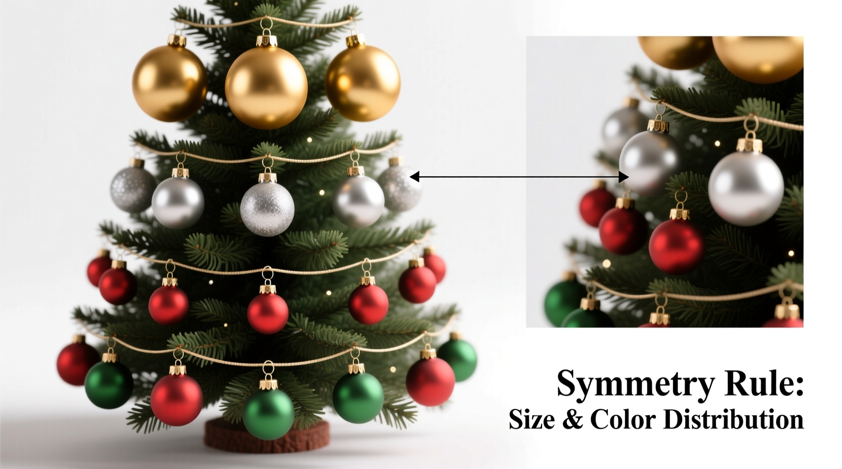
Ornament size and color are two of the most influential variables in visual weight. A large red ball carries more attention than a small silver one. Placing all the large red ornaments on one side of the tree will make it appear lopsided, even if the total number of ornaments is evenly distributed. The goal is to balance these weights across quadrants—top-left, top-right, bottom-left, bottom-right—so no single area dominates.
Color psychology also plays a role. Warm colors like red, gold, and orange naturally draw the eye more than cool tones like silver, blue, or white. To maintain balance, you may need fewer warm-colored ornaments to achieve equal visual impact. Similarly, metallic finishes reflect light and increase perceived prominence, so they should be spaced intentionally.
Step-by-Step Guide to Balanced Ornament Placement
Creating symmetry starts long before the first ornament hits the branch. It requires planning, sorting, and a methodical approach. Follow this timeline to ensure a cohesive result:
- Sort ornaments by size and color. Use separate containers or trays to group items: small (under 2\"), medium (2–3.5\"), large (over 3.5\"), and specialty (shatterproof, heirloom, etc.). Then subdivide each size group by dominant color.
- Determine your tree’s focal point. Most rooms have a primary viewing angle—near the fireplace, living room entry, or window. Face this side during decorating to prioritize balance from that perspective.
- Begin with lights and garland. A uniform base ensures ornaments won’t compete with uneven lighting. Use warm white or soft ivory for a timeless backdrop.
- Place largest ornaments first. Distribute 3–5 large statement pieces evenly around the tree, spacing them at least 12 inches apart vertically and horizontally. Avoid clustering.
- Add medium-sized ornaments in a spiral pattern. Starting from the top, work downward in a clockwise or counterclockwise motion, alternating colors as you go. This creates rhythm without rigidity.
- Fill gaps with smaller ornaments. Use these to soften transitions between larger pieces and add depth. Place them closer to the trunk on outer branches to create dimension.
- Finalize with accents. Tuck in specialty ornaments—family heirlooms, themed picks, or glittered shapes—at intervals that don’t disrupt the flow.
This sequence prevents overcrowding and allows you to adjust spacing as you go. Remember, negative space is part of design; a tree that feels “full” but not cluttered appears more intentional.
Color Distribution Strategies for Cohesive Appeal
Color sets the tone of your tree—whether classic (red/green/gold), wintry (silver/blue/white), or eclectic (rainbow metallics). But even within a palette, imbalance occurs when one shade dominates a section. The key is rhythmic repetition.
Think of your tree as a canvas divided into zones. Imagine drawing an invisible grid: upper third, middle third, lower third. Within each, aim to place at least one representative from your main color groups. For example, if using red, gold, and white, ensure each zone has roughly equal presence of all three.
To avoid accidental clustering, use the “one-of-each” rule: after placing a red ornament, choose a different color next. Rotate until all colors are represented, then repeat. This method works especially well with round or geometrically similar ornaments where shape doesn’t distract from hue.
| Color Group | Visual Weight | Recommended Distribution |
|---|---|---|
| Red / Burgundy | High | Evenly spaced; limit to 3 per vertical tier |
| Gold / Copper | Medium-High (reflective) | Alternate with matte tones to reduce glare |
| Silver / White | Medium | Use as neutral fillers between bold colors |
| Green / Natural Tones | Low-Medium | Pair with lights to enhance blending |
For monochromatic trees—such as all-white or navy-gold schemes—vary texture instead. Mix matte, glitter, frosted, and mirrored finishes to create interest without introducing competing colors.
“A balanced tree tells a story through repetition and contrast. You shouldn’t notice the system—but you’ll feel its harmony.” — Lydia Chen, Interior Stylist & Holiday Design Consultant
Size Layering for Depth and Dimension
Just as artists use foreground, midground, and background, ornament size can create spatial illusion. Large ornaments act as anchors, medium ones build rhythm, and small ones provide detail. When layered correctly, they give the tree volume and movement.
Start by placing the largest ornaments toward the outer edges of sturdy lower branches. These serve as visual anchors and prevent the tree from feeling top-heavy. Medium ornaments go slightly inward and higher up, forming the bulk of the display. Smaller decorations nestle deeper into the foliage, catching light from within and making the tree appear fuller.
Avoid the common mistake of placing all large ornaments at the bottom. While this seems logical for stability, it drains energy from the upper half. Instead, include at least one large piece in the top third—preferably near the front—to draw the eye upward.
For trees with limited height (under 7 feet), limit large ornaments to no more than 8 total. Overuse overwhelms proportion. On taller trees (8+ feet), scale up quantity but maintain spacing—never place two large ornaments on adjacent branches.
Checklist: Achieving Symmetrical Ornament Arrangement
Use this checklist during your decorating process to stay on track:
- ✅ Sorted ornaments by size and color before starting
- ✅ Identified primary viewing angle and oriented tree accordingly
- ✅ Applied lights evenly (at least 100 bulbs per foot of tree height)
- ✅ Placed 3–5 large ornaments in balanced positions (not clustered)
- ✅ Distributed medium ornaments in a spiral or alternating pattern
- ✅ Used small ornaments to fill visual gaps and add texture
- ✅ Maintained consistent color distribution across all tree zones
- ✅ Stepped back frequently to assess balance from multiple distances
- ✅ Reserved 10–15% of ornaments for final adjustments
- ✅ Avoided overloading any single branch or quadrant
Print this list or keep it open on your phone as you decorate. Checking off each item ensures you don’t skip foundational steps in pursuit of speed.
Real Example: Transforming a Lopsided Tree
Sarah, a homeowner in Portland, struggled for years with her family tree looking “off,” despite using the same ornaments annually. She loved bold red balls and had accumulated over 20 of them in various sizes. Every year, she’d start hanging from the front, placing reds wherever they “looked nice,” often filling one side completely before moving to the other.
After learning about visual weight, she re-sorted her collection: 8 large reds, 12 mediums, and 6 smalls. She also had 14 gold and 10 white ornaments. Her breakthrough came when she laid everything out on a table and assigned zones. She placed one large red in the top-front, another in the lower-back left, and a third on the upper-right. The remaining large reds went to opposite quadrants, never within two branches of each other.
She then wove in gold and white medium ornaments in a rotating sequence. By the time she added smaller pieces, the tree already felt balanced. The result? A magazine-worthy display that drew compliments from guests—and, more importantly, felt satisfying to her. “I finally understand why my old method failed,” she said. “I was decorating for memory, not for sight.”
Frequently Asked Questions
Do I need identical ornaments on each side for symmetry?
No. Perfect mirroring isn’t necessary or always desirable. Symmetry in decor is about balance, not duplication. You can achieve visual equilibrium with different shapes and styles as long as their size, color intensity, and placement distribute weight evenly.
How many ornaments do I need for a balanced look?
A general guideline is 10–15 standard-sized (2.5\") ornaments per foot of tree height. For a 7-foot tree, that’s 70–105 ornaments. Adjust based on fullness: sparser trees may need fewer, while dense firs can handle more. Always prioritize spacing over quantity.
What if I only have one large statement ornament?
That’s perfectly fine. Place it prominently—ideally front-center in the upper third—and balance its visual weight with a cluster of 3–4 medium ornaments on the opposite side. You can also offset with reflective garland or metallic ribbon nearby to create counterbalance.
Maintaining Balance Throughout the Season
Symmetry isn’t a one-time achievement—it needs maintenance. Over the holidays, ornaments may shift due to handling, pets, or settling branches. Schedule a quick “refresh” midway through the season: fluff drooping branches, reposition tilted ornaments, and replace any that fall.
If children or guests frequently interact with the tree, consider shatterproof versions for lower levels. Reserve delicate or heirloom pieces for higher, less accessible areas. This protects sentimental value while preserving aesthetic control.
Also, remember that lighting changes perception. View your tree at night under holiday lighting and during daylight. Some color combinations appear balanced in natural light but clash under warm bulbs. Make minor tweaks as needed.
Conclusion
Creating symmetry when hanging Christmas ornaments by size and color transforms a festive gesture into an art form. It’s not about rigid rules, but about cultivating awareness—of weight, space, light, and emotion. A balanced tree doesn’t shout for attention; it invites quiet admiration. By sorting thoughtfully, placing intentionally, and adjusting mindfully, you craft a display that reflects care, creativity, and seasonal joy.


 浙公网安备
33010002000092号
浙公网安备
33010002000092号 浙B2-20120091-4
Comments
No comments yet. Why don't you start the discussion?