
Symmetry on a Christmas tree isn’t about rigid uniformity—it’s about visual balance, rhythm, and intentionality. A tree that feels cohesive, grounded, and effortlessly elegant doesn’t happen by accident. It results from thoughtful placement: considering weight, scale, color temperature, spacing, and sightlines—not just hanging ornaments wherever space remains. Whether you’re working with heirloom glass baubles, hand-painted wooden stars, or modern metallic spheres, symmetry transforms decoration into design. This guide distills decades of professional holiday styling experience—including insights from set designers, florists, and interior stylists—into actionable principles you can apply immediately, regardless of tree size, shape, or ornament collection.
Why Symmetry Matters (Beyond Aesthetics)
Human eyes are wired to seek order. When ornaments cluster haphazardly on one side, drift downward in density, or repeat the same color only in the lower third, the brain registers subtle tension—even if the viewer can’t articulate why. True symmetry creates psychological comfort: it signals care, stability, and celebration. In retail environments and photo studios, symmetrically styled trees consistently score higher in perceived “festivity” and “inviting warmth” in consumer surveys. But more importantly, symmetry makes your tree *easier* to decorate. With a clear framework, decisions become intuitive—not exhausting.
Crucially, symmetry here does not mean mirror-image duplication. A perfectly mirrored left-right arrangement on a natural evergreen often looks stiff or artificial. Instead, we pursue *approximate symmetry*: balanced distribution of visual weight across vertical thirds and horizontal zones, respecting the tree’s organic conical form.
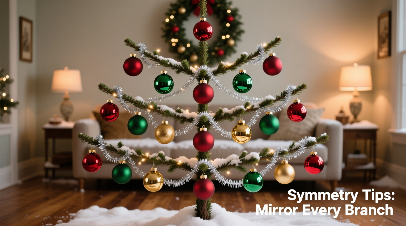
The 5-Zone Framework for Balanced Placement
Before hanging a single ornament, mentally divide your tree into five distinct spatial zones:
- Apex (Top 10%): The tip and immediate crown—reserved for one focal piece (e.g., a star, angel, or sculptural topper) and 2–3 delicate accents (tiny bells, crystal drops) placed at equal radial intervals.
- Upper Canopy (Next 20%): Where branches are shortest and sturdiest. Ideal for medium-weight ornaments (2.5–3.5 inches) in your dominant color family.
- Mid-Canopy (40%): The visual “heart” of the tree—widest branch spread, most visible from eye level. Use this zone for your largest ornaments (4–5 inches), textural variety (velvet, matte ceramic, frosted glass), and strategic color anchors.
- Lower Canopy (20%): Longer, heavier branches that naturally droop. Prioritize weight distribution here: place heavier ornaments (wood, metal, large glass) low and near the trunk—not at the tips—to prevent sagging. Use this zone for grounding elements: deep tones, natural textures (pinecones, dried oranges), or heirloom pieces with sentimental weight.
- Trunk & Base (10%): Not for ornaments—but for anchoring visual flow. Ensure garlands, ribbons, or lights wrap *upward* from base to apex, reinforcing vertical rhythm. Avoid cluttering the lowest 6 inches; let the trunk breathe.
This zoning prevents the all-too-common “lollipop effect”—a dense top with sparse, bare lower branches—or the “bottom-heavy slump,” where ornaments overwhelm the lower third and visually sink the entire tree.
Step-by-Step Ornament Placement Protocol
Follow this sequence—not chronologically, but hierarchically—to build symmetry from structure outward:
- Secure lighting first: Weave lights evenly *before* any ornaments. Use warm-white LEDs (2200K–2700K) for depth. Wrap spirally from base to apex, maintaining consistent spacing (approx. 4–6 inches between wraps). Lights establish the foundational rhythm—ornaments must complement, not compete with, this pattern.
- Anchor with large-scale pieces: Place your 3–5 largest ornaments first—two in mid-canopy (left/right), one centered high, one centered low, and one off-center low (e.g., 7 o’clock position). These act as visual “bookends” and weight anchors.
- Distribute by color family—not individual hue: Group ornaments into tonal families (e.g., “cool golds + ivory + slate blue” or “crimson + charcoal + blackened brass”). Place at least one piece from each family in upper, mid, and lower canopy zones. This ensures color balance without monotony.
- Apply the “Rule of Threes” vertically: On any single branch, avoid placing more than three ornaments. Instead, use clusters of three at varying depths: one near the trunk, one mid-branch, one at the tip. Rotate cluster orientation (e.g., triangle pointing up on left branch, down on right) to imply movement.
- Final sweep for negative space: Step back. Identify areas where branch tips remain fully visible—these are intentional pauses, not gaps. Remove or reposition any ornament that isolates itself or creates a “hole” larger than a softball. Symmetry thrives on measured breathing room.
Do’s and Don’ts: A Practical Comparison Table
| Action | Do | Don’t |
|---|---|---|
| Ornament Sizing | Use a 3-tier scale: small (1.5–2.5\"), medium (3–4\"), large (4.5–6\"). Distribute proportionally across zones. | Hang all large ornaments in one zone—or mix sizes randomly without regard to branch length or visibility. |
| Color Distribution | Assign each primary color a “zone anchor”: e.g., burgundy appears in upper, mid, and lower canopy—not just clustered at the bottom. | Use one color only on the left half and another only on the right—creating unintentional chromatic division. |
| Texture Balance | Pair glossy with matte, smooth with rough, reflective with absorbent—within 12 inches of each other. | Group all shiny ornaments together (creates glare hotspots) or all matte pieces (flattens dimension). |
| Weight Placement | Place heaviest ornaments within 8 inches of the trunk in lower/mid canopy—never at branch tips unless counterbalanced below. | Hang heavy glass balls at the very end of long lower branches—guaranteeing droop and asymmetry. |
| Visual Flow | Ensure garlands and ribbons ascend diagonally, guiding the eye upward—not wrap horizontally like a cage. | Wrap garlands in tight, level rings around the trunk—visually slicing the tree into stacked, disconnected layers. |
Real-World Case Study: The “Overwhelmed Family Tree” Transformation
When Sarah K., a graphic designer in Portland, emailed for help with her 7.5-foot Fraser fir, she described a tree that “looked lopsided even though I swore I hung things evenly.” Photos revealed the issue: all 12 of her grandmother’s vintage mercury-glass balls were clustered in the lower third; every red ornament was on the left side; and lightweight felt stars dominated the upper canopy, making it look sparse next to the dense, heavy bottom. She’d decorated while multitasking—hanging what was handy, not what was harmonious.
Using the 5-zone framework, we redistributed her ornaments in under 45 minutes:
- Moved 6 mercury-glass balls to upper and mid-canopy—3 on the right, 3 on the left, spaced at consistent heights.
- Swapped 4 red ornaments from left to right, then added 2 deep-green velvet balls to the left mid-canopy to balance the red’s visual weight.
- Replaced 5 felt stars in the apex with a single antique brass star and 3 tiny copper pinecones—adding warmth and scale contrast.
- Added 3 matte-black wooden discs (2\" diameter) low on the right side to counterbalance the weight of the remaining 6 mercury balls on the left.
The result? A tree that read as unified and intentional from across the room—without changing a single ornament. As Sarah noted in her follow-up: “It didn’t look ‘fixed.’ It looked like it had always belonged that way.”
“Symmetry in holiday styling isn’t perfection—it’s perceptual equilibrium. It’s knowing when to repeat, when to contrast, and when to leave space so the eye can rest. A truly balanced tree invites people to linger, not scan.” — Lena Torres, Principal Stylist at Evergreen Collective, 18 years styling commercial and editorial holiday sets
Essential Symmetry Checklist
Before stepping back for the final assessment, verify these seven points:
- ✅ Vertical rhythm check: Are there at least two ornaments aligned along an imaginary vertical line near the trunk (one high, one low)?
- ✅ Horizontal balance: Does the left third of the tree contain roughly the same number of ornaments—and similar visual weight—as the right third?
- ✅ Color dispersion: Is your dominant color present in all three major canopy zones (upper, mid, lower)?
- ✅ Scale gradient: Do larger ornaments sit lower on the tree, with smaller ones ascending toward the apex?
- ✅ Texture pairing: Can you identify at least one spot where a glossy ornament sits within 10 inches of a matte one?
- ✅ Negative space integrity: Are there 3–5 clearly defined “breathing spaces” (unadorned branch tips) visible from your primary viewing angle?
- ✅ Light integration: Do ornaments catch light at multiple angles—not just front-facing—thanks to varied depth placement?
FAQ: Common Symmetry Questions Answered
What if my tree is lopsided or has sparse branches on one side?
Work with the asymmetry—not against it. Place heavier, larger, or more reflective ornaments on the fuller side to draw attention *away* from the sparse area. Then, use lightweight, matte, or monochromatic ornaments on the weaker side, clustered tightly near the trunk to create density without weight. Never try to “fill” a weak branch with oversized ornaments—that amplifies the imbalance.
Can I achieve symmetry with only one color of ornaments?
Absolutely—and often more effectively. Monochromatic schemes rely on texture, scale, and finish for variation. Use at least three distinct finishes (e.g., brushed brass, hammered copper, antiqued gold) and three size tiers. Place the shiniest pieces at eye level (mid-canopy) and matte or textured pieces higher and lower to create tonal rhythm.
How many ornaments do I actually need for symmetry?
It’s not about quantity—it’s about distribution. A 6-foot tree needs roughly 60–90 ornaments for fullness, but symmetry emerges from *where* they go, not how many exist. A 6-foot tree with 45 thoughtfully placed ornaments will feel more balanced than one with 120 haphazardly hung pieces. Prioritize coverage of all five zones over sheer count.
Conclusion: Your Tree, Intentionally Illuminated
Symmetry on a Christmas tree is quiet confidence made visible. It’s the difference between decoration and curation—the shift from “I put things on the tree” to “this tree holds space for celebration.” You don’t need identical ornaments, a measuring tape, or professional training. You need awareness of zones, respect for weight and light, and the willingness to step back, observe, and adjust. Every tree has its own architecture; your role is not to override it, but to honor its shape with deliberate, graceful placement. Start small: next time you hang an ornament, ask yourself—not “Where does this fit?” but “Where does this *belong* in the whole?” That single question changes everything.


 浙公网安备
33010002000092号
浙公网安备
33010002000092号 浙B2-20120091-4
Comments
No comments yet. Why don't you start the discussion?