
Blue-green is one of the most evocative and versatile colors in visual art and design. Found in nature—from tropical waters to forest canopies—this hue strikes a balance between calm and vibrancy. Whether you're working with paint, digital media, or fabric dyes, mastering the creation of a harmonious blue-green requires more than just combining two primary colors. It demands an understanding of undertones, ratios, and environmental influences on perception. This guide walks through the science and artistry behind crafting the ideal blue-green shade, tailored to your medium and intent.
Understanding the Color Wheel and Blue-Green Foundations
Blue-green sits between blue and green on the color wheel, typically classified as a tertiary color formed by mixing a primary (blue) with a secondary (green). However, not all blues and greens are created equal. The outcome depends heavily on the specific pigments used. For example, phthalocyanine blue has a slight green bias, making it ideal for vibrant teal-like results, while ultramarine blue leans toward red, producing a duller or more muted mix when combined with green.
Similarly, yellower greens like sap green will shift the mixture toward aqua, whereas cooler greens such as phthalo green push the blend into deeper, jewel-toned territory. Recognizing these subtleties allows for precise control over the final tone.
“Color mixing isn’t just about formulas—it’s about observing relationships. A single pigment can behave differently depending on what it’s paired with.” — Dr. Lena Torres, Color Theory Researcher, Royal College of Art
The Role of Pigment Temperature and Bias
Cool blues and cool greens produce crisp, refreshing blue-greens suitable for oceanic or icy themes. Warm-leaning pigments introduce subtle earthiness, useful in natural landscapes or vintage palettes. Always test your base colors separately before mixing: place small swatches side by side to assess their inherent warmth or coolness under your working light.
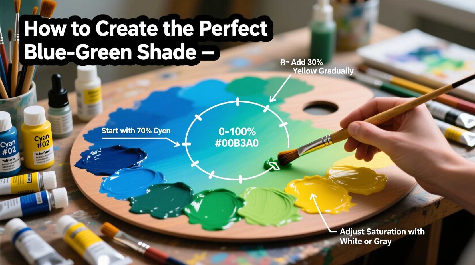
Step-by-Step Guide to Mixing the Perfect Blue-Green
Follow this structured process to achieve consistent, intentional results regardless of your medium.
- Select Your Base Colors: Choose a blue and a green that align with your desired outcome. For bright teal, use phthalo blue and phthalo green. For softer seafoam, try cerulean blue and sap green.
- Prepare a Clean Workspace: Ensure tools and containers are free of residue to prevent unintended contamination.
- Start with Blue as the Dominant Base: Blue generally has stronger tinting strength. Begin with two parts blue to one part green to maintain control.
- Add Green Gradually: Introduce green in small increments, mixing thoroughly after each addition. Observe shifts in hue and saturation.
- Evaluate Under Natural Light: Artificial lighting can distort perception. Check your mix near a window during midday.
- Adjust Saturation with White, Black, or Neutral Gray: To soften intensity, add a touch of gray or complementary red-orange. Avoid black if possible; it can muddy the color.
- Test on Final Surface: Paint behaves differently on canvas, paper, or primed wood. Always apply a swatch to your intended surface and let it dry before final judgment.
Refining the Hue: Cool vs. Warm Blue-Greens
If your mix appears too harsh, consider toning it down with a minute amount of its complement—red-orange. Just a speck can reduce vibrancy without graying the color entirely. For warmth, add a hint of yellow ochre rather than pure yellow to avoid shifting into turquoise. For depth, a whisper of burnt umber can simulate shadowed water or aged patina.
Medium-Specific Considerations
Different materials respond uniquely to color mixing. Understanding these differences ensures consistency across applications.
| Medium | Recommended Pigments | Mixing Tip |
|---|---|---|
| Acrylic Paint | Phthalo Blue + Phthalo Green | Mix quickly—acrylics dry fast; keep water nearby to adjust consistency. |
| Watercolor | Cerulean Blue + Viridian Green | Layer glazes for luminosity; avoid overworking wet areas. |
| Oil Paint | Prussian Blue + Emerald Green | Use linseed oil to extend drying time and enhance blending. |
| Digital Design (RGB) | R: 0–100, G: 150–200, B: 150–200 | Aim for balanced green and blue values; reduce red for cooler tones. |
| Fabric Dye | Procion MX Blue & Green | Pre-soak fabric in soda ash; mix dyes in separate jars before combining. |
Common Pitfalls and How to Avoid Them
- Overmixing with black: Leads to flat, lifeless tones. Instead, use complementary hues to mute.
- Ignoring drying shifts: Some paints darken or lighten as they dry. Always wait 10–15 minutes before final assessment.
- Using dirty brushes: Residual pigments skew new mixes. Rinse thoroughly between tests.
- Skipping the grayscale check: View your mix in black-and-white mode (on phone or app) to assess value contrast independently of hue.
Mini Case Study: Restoring a Coastal Mural
An artist commissioned to repaint a seaside café mural struggled to match the original blue-green wave accents. Initial attempts using standard cobalt blue and lemon yellow produced a lifeless result. After analyzing a preserved fragment under daylight, she realized the original used a rare mix of turquoise blue and a trace of cadmium yellow medium. By adjusting her ratio to 3:1 blue-to-yellow and adding a drop of transparent oxide red to deepen shadows, she replicated the authentic coastal shimmer. The lesson? Context and observation trump generic formulas.
Essential Checklist for Perfect Blue-Green Mixing
- ☑ Choose clean, compatible pigments
- Verify lightfastness and mixing behavior from manufacturer data.
- ☑ Work in incremental ratios
- Begin with 2:1 blue-to-green; adjust gradually.
- ☑ Mix under consistent lighting
- Natural daylight or full-spectrum bulbs are ideal.
- ☑ Test on final substrate
- Account for absorption, texture, and finish.
- ☑ Document your formula
- Note brands, quantities, and drying results.
- ☑ Adjust value and chroma thoughtfully
- Use gray or complements instead of black for sophistication.
FAQ
Why does my blue-green turn muddy?
Muddiness occurs when complementary colors (like red and green) are unintentionally combined. This often happens due to impure pigments or leftover residue on brushes. Use high-quality, single-pigment paints and clean tools meticulously between uses.
Can I make blue-green without green paint?
Yes. Combine blue with yellow, but be cautious—this creates a range from teal to lime depending on the yellow’s warmth. For a truer blue-green, use a green-leaning blue (e.g., phthalo blue) with a minimal amount of lemon yellow.
How do I make a pastel blue-green?
Add titanium white gradually to your base mix. For better clarity, consider using a transparent white like zinc if available. Avoid over-diluting, which can weaken adhesion in physical media.
Final Thoughts and Call to Action
Creating the perfect blue-green is both a technical skill and an artistic intuition. With deliberate practice, attention to detail, and respect for material properties, you can consistently produce shades that resonate emotionally and visually. Whether capturing the serenity of a mountain lake or designing a calming interior palette, mastery of this transitional hue expands your creative potential.


 浙公网安备
33010002000092号
浙公网安备
33010002000092号 浙B2-20120091-4
Comments
No comments yet. Why don't you start the discussion?