
A logo is more than just a visual mark—it’s the cornerstone of your brand’s identity. It’s often the first impression customers have of your business and can influence perception, trust, and recognition for years. Yet, many entrepreneurs rush this process, opting for trendy designs or low-cost options without considering long-term alignment with their brand values. Choosing the right logo isn’t about aesthetics alone; it’s about strategy, clarity, and consistency. This guide walks you through a structured approach to ensure your logo not only looks good but works hard for your brand.
Understand Your Brand’s Core Identity
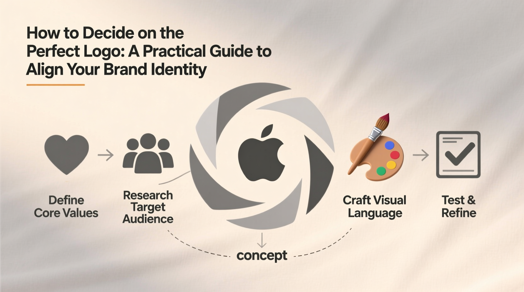
Before sketching or hiring a designer, take time to define what your brand stands for. A successful logo emerges from a deep understanding of your mission, audience, tone, and differentiators. Ask yourself: Who are we? Who do we serve? What makes us unique? The answers shape every design decision—from color to typography.
For example, a luxury skincare brand will aim for elegance, simplicity, and sophistication, while a children’s toy company might embrace bright colors and playful shapes. Misalignment here leads to confusion. A minimalist monochrome logo may look sleek, but if your brand thrives on energy and fun, it could feel cold and disconnected.
Conduct a Brand Audit
Review existing materials—website, packaging, social media—to identify current visual themes. Even if you’re rebranding, understanding past choices reveals what resonates (or doesn’t). Look for patterns in fonts, colors, imagery, and messaging. This audit helps avoid abrupt disconnects and ensures evolution rather than reinvention unless necessary.
Define Key Design Principles
Once your brand identity is clear, establish design guidelines that reflect it. These aren’t final rules but guardrails to keep creative exploration focused.
- Simplicity: The most memorable logos are often the simplest. Think Apple, Nike, or FedEx—clean, recognizable, and scalable.
- Scalability: Your logo should be legible on a business card and a billboard. Avoid intricate details that vanish at small sizes.
- Timelessness: Trends fade. Aim for a design that won’t need updating in two years.
- Versatility: It must work across mediums—digital screens, print, embroidery, dark and light backgrounds.
“Design is not just what it looks like. Design is how it works.” — Steve Jobs
Choose Colors and Typography Strategically
Color psychology plays a powerful role in branding. Blue conveys trust (used by banks and tech companies), red evokes energy and urgency (Coca-Cola, Target), and green suggests growth or sustainability (Starbucks, Whole Foods). Choose hues that mirror your brand personality.
Typography matters just as much. Serif fonts (e.g., Times New Roman) suggest tradition and reliability, while sans-serif (e.g., Helvetica) feel modern and clean. Script fonts add elegance but can sacrifice readability. Limit your logo to one typeface—two at most—and test legibility across sizes.
| Brand Personality | Recommended Colors | Suitable Font Styles |
|---|---|---|
| Innovative & Tech-Savvy | Blue, Black, White | Sans-serif, geometric |
| Luxurious & Elegant | Black, Gold, Deep Purple | Serif, script (minimal) |
| Friendly & Approachable | Yellow, Orange, Soft Green | Rounded sans-serif, hand-drawn |
| Eco-Conscious & Natural | Green, Brown, Earth Tones | Organic shapes, serif or handwritten |
Follow a Step-by-Step Logo Development Process
Creating a logo shouldn’t be left to chance or impulse. A methodical approach increases the likelihood of a meaningful, effective result.
- Research competitors: Analyze logos in your industry. Identify common patterns and opportunities to stand out.
- Gather inspiration: Use platforms like Dribbble or Behance to collect visuals that resonate—not to copy, but to understand styles and moods.
- Sketch concepts: Begin with pen and paper. Explore abstract symbols, lettermarks, wordmarks, or combination marks.
- Select top 3–5 directions: Refine promising sketches into digital drafts using vector software (e.g., Adobe Illustrator).
- Test with stakeholders: Share drafts with team members, trusted clients, or advisors. Focus feedback on alignment with brand values, not personal taste.
- Refine and finalize: Iterate based on constructive input. Lock in primary and secondary versions (horizontal, vertical, icon-only).
- Create brand guidelines: Document approved color codes (CMYK, RGB, HEX), font usage, spacing rules, and clear space requirements.
Mini Case Study: BrewHaven Coffee Co.
BrewHaven, a new artisan coffee shop, initially leaned toward a complex logo featuring a detailed steam swirl and cursive script. After customer testing, they realized the design was hard to read on takeaway cups and felt outdated. Revisiting their brand essence—“warm, community-driven, modern craft”—they pivoted to a clean wordmark in warm terracotta with a subtle circular badge. The new logo scaled well, stood out on Instagram, and conveyed both craftsmanship and approachability. Within three months, local recognition increased significantly.
Common Pitfalls to Avoid
Even with good intentions, businesses make costly mistakes during logo development. Awareness helps prevent them.
- Overcomplicating the design: Too many elements reduce memorability and reproduction quality.
- Following trends too closely: Skeuomorphic effects, gradients, or ultra-thin fonts may look dated quickly.
- Neglecting versatility: A logo that only works in color fails when printed in black and white or embroidered on uniforms.
- Ignoring legal checks: Ensure your logo doesn’t infringe on existing trademarks. Search USPTO or your country’s IP database.
- Skipping brand guidelines: Without documentation, inconsistent use erodes professionalism over time.
Checklist: Is Your Logo Ready?
Use this checklist before launching your logo publicly:
- ✅ Reflects core brand values and personality
- ✅ Works in black and white
- ✅ Legible at small sizes (e.g., favicon, app icon)
- ✅ Looks professional on both light and dark backgrounds
- ✅ Available in multiple formats (PNG, JPG, SVG, EPS)
- ✅ Accompanied by documented brand guidelines
- ✅ Legally cleared for use (trademark search completed)
FAQ
How much should I budget for a professional logo?
Costs vary widely. Freelancers may charge $200–$800, while agencies range from $2,000 to $10,000+. Invest based on your brand’s stage and goals. A strong logo pays dividends in credibility and recognition.
Should I design my own logo using free tools?
You can, but beware of generic templates. DIY logos often lack originality and strategic depth. If budget is tight, hire a skilled freelancer rather than relying solely on AI generators or stock icons.
When should I consider rebranding my logo?
Rebrand when your business evolves significantly—new audience, expanded services, or outdated image. Avoid frequent changes; consistency builds recognition. Most brands refresh their logo every 7–10 years.
Conclusion: Make Your Logo Work for You
The perfect logo isn’t the flashiest or most artistic—it’s the one that clearly communicates who you are and why you matter. It grows with your business, earns recognition, and becomes synonymous with your promise to customers. By grounding your design in strategy, testing thoughtfully, and planning for long-term use, you create more than a symbol—you build equity.


 浙公网安备
33010002000092号
浙公网安备
33010002000092号 浙B2-20120091-4
Comments
No comments yet. Why don't you start the discussion?