
In compact living areas, every design decision carries weight. Bold wallpaper can transform a dull corner into a statement zone, but in tight quarters, it risks making a space feel cramped or chaotic. The key lies not in avoiding bold patterns, but in applying them with intention. When used thoughtfully, dramatic prints enhance character rather than dominate it. This guide explores practical strategies for integrating vibrant, eye-catching wallpaper into small rooms—without sacrificing comfort or cohesion.
Understanding Scale and Proportion
The relationship between pattern size and room dimensions is critical. Large-scale designs—think oversized florals, geometric motifs, or abstract swirls—can appear overpowering in confined spaces if applied wall-to-wall. However, that doesn’t mean they should be ruled out entirely. Instead, consider the visual weight of the pattern relative to the room’s footprint.
Smaller rooms benefit from wallpapers where the repeat distance (the span before the pattern repeats) is proportionate to the wall size. A pattern that repeats too frequently can create a dizzying effect, while one that's too large may make walls feel like they’re closing in. Opt for mid-scale patterns with balanced negative space to maintain rhythm and breathing room.
Vertical stripes can heighten ceilings, while horizontal ones widen the perception of space. Diagonal or irregular patterns introduce movement but require careful framing to avoid visual clutter.
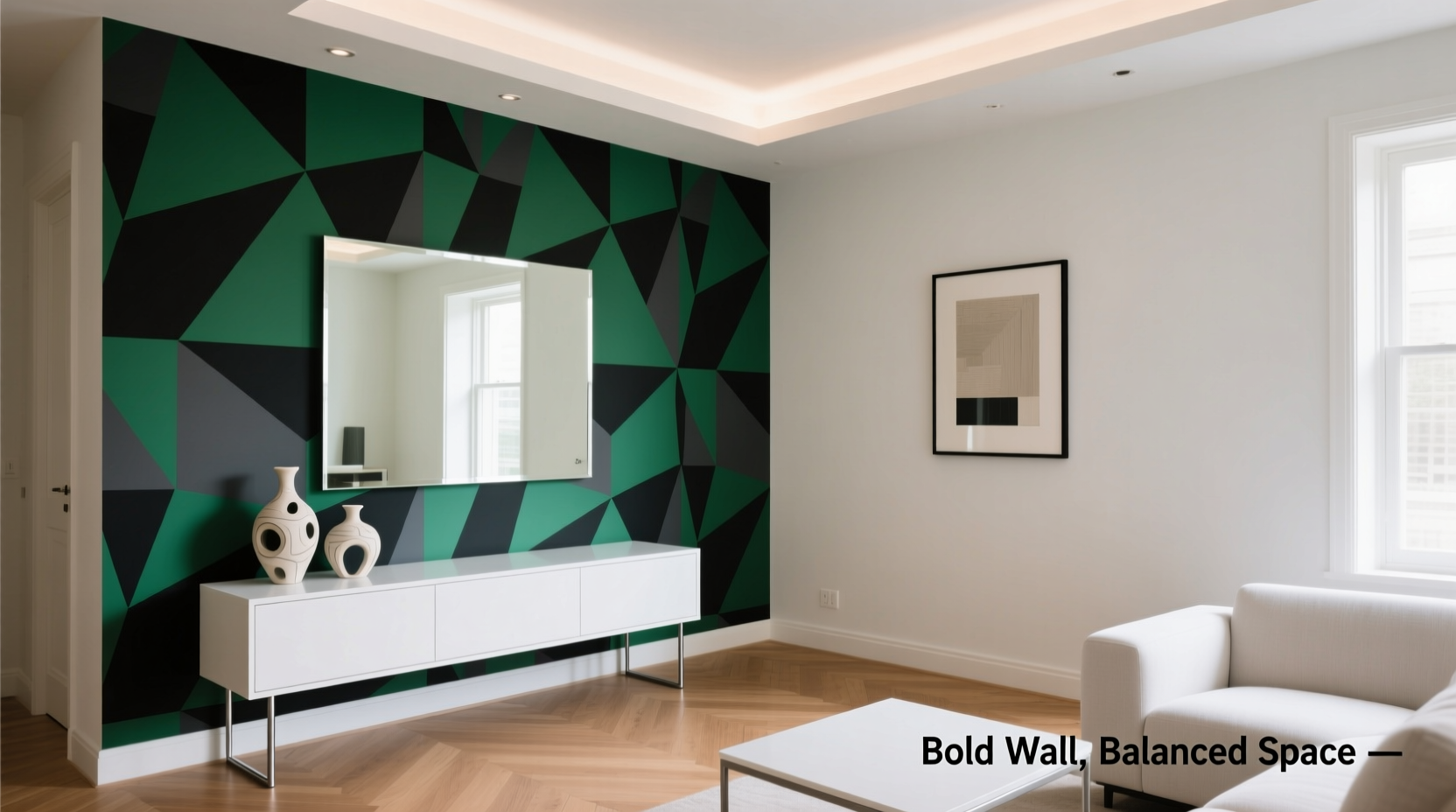
Selective Application: Less Is More
One of the most effective techniques for using bold wallpaper in small spaces is strategic placement. Rather than covering all four walls, focus on a single accent wall or even a smaller architectural feature.
- Accent walls: Choose the wall most visible upon entry or behind a focal point like a bed or sofa.
- Niches and alcoves: Lining a recessed shelf or window nook with bold paper adds depth without dominating.
- Ceilings: An unexpected splash of pattern overhead draws the eye upward, creating an illusion of volume.
- Furniture backing: Use wallpaper inside glass-front cabinets or as a backdrop for open shelving for a subtle yet striking detail.
This targeted approach allows the wallpaper to serve as art rather than environment, preserving openness while delivering visual interest.
“Bold wallpaper isn’t about covering more surface—it’s about concentrating impact where it matters.” — Lena Torres, Interior Stylist & Textile Designer
Color Psychology and Light Interaction
Color plays a dual role in small spaces: influencing mood and altering spatial perception. Darker hues absorb light, which can make a room feel cozier—but also potentially cave-like. Conversely, lighter backgrounds with bold patterns offer contrast without heaviness.
Consider wallpapers that use a light base with saturated accents—such as white with emerald vines or blush pink with black Art Deco lines. These combinations deliver drama while maintaining airiness. Matte finishes diffuse light gently, reducing glare and enhancing depth, whereas glossier papers can bounce light around, amplifying brightness in dim areas.
Natural light changes throughout the day, so observe how your chosen wallpaper appears at different times. A print that looks vibrant at noon might appear flat under evening lamplight. Always test a large sample (at least 2x2 feet) taped to the wall for 48 hours before committing.
Do’s and Don’ts of Color and Pattern in Small Rooms
| Do | Don't |
|---|---|
| Use high-contrast patterns on a single wall | Cover every wall with busy, dark prints |
| Pair bold paper with neutral furnishings | Combine multiple bold patterns in one room |
| Choose reflective or semi-matte finishes in low-light spaces | Ignore how artificial lighting affects color tone |
| Balance scale with minimalist decor | Overcrowd the space with textured accessories |
A Step-by-Step Guide to Installing Bold Wallpaper Thoughtfully
Applying bold wallpaper in a small space requires precision and planning. Follow this sequence to ensure professional results:
- Measure and map: Sketch your room layout, noting doors, windows, and outlets. Identify the best wall for emphasis—usually the one opposite the entrance or behind a primary furniture piece.
- Order samples: Request physical swatches from manufacturers. Digital images often misrepresent color and texture.
- Test lighting: Tape samples to different walls and observe over two days. Note shifts in hue under natural and artificial light.
- Prepare the surface: Clean walls thoroughly, repair imperfections, and apply primer. Smooth surfaces ensure clean adhesion and prevent bubbling.
- Calculate roll needs: Account for pattern repeat and waste. It’s better to have one extra roll than fall short mid-wall.
- Hang with care: Start from a plumb line (use a level), align carefully at seams, and smooth outward with a wallpaper brush. Trim edges precisely with a utility knife.
- Style mindfully: Furnish after installation. Let the wallpaper breathe by pairing it with simple, streamlined pieces in complementary tones.
Real Example: Transforming a City Studio Apartment
Maria, a graphic designer in Brooklyn, wanted to inject personality into her 280-square-foot studio without making it feel cluttered. The main challenge was a narrow living-sleeping area with limited natural light.
She selected a deep navy botanical print with gold leaf accents—visually rich but not overly large in scale. Instead of covering all walls, she applied it only behind the bed, creating a luxurious headboard effect. The adjacent walls were painted in warm white, and sheer linen curtains allowed diffused daylight to soften the contrast.
To balance the intensity, she chose minimalist oak furniture and added brass sconces that echoed the gold in the paper. A full-length mirror on the opposite wall doubled the sense of space and reflected both light and pattern.
The result? A cozy, expressive retreat that felt curated, not chaotic. Visitors consistently remarked on the “designer touch” of the accent wall—proof that restraint amplifies impact.
Expert Pairing Strategies for Furniture and Decor
Bold wallpaper demands a supporting cast that enhances, not competes. The goal is harmony through contrast in texture, form, and color saturation.
- Neutral upholstery: Sofas and chairs in beige, gray, or soft white ground the space and provide visual rest points.
- Textural simplicity: Introduce woven baskets, wool throws, or ceramic vases to add warmth without competing visually.
- Reflective surfaces: Mirrors, glass tables, and metallic finishes help distribute light and reduce visual density.
- Plants: Greenery softens hard lines and introduces organic contrast to structured patterns.
Avoid matching the wallpaper’s colors exactly in furnishings. Instead, pull one secondary hue—like a rust orange from a floral motif—and use it sparingly in cushions or artwork. This creates cohesion without repetition.
“When you go bold on the walls, let everything else whisper.” — Julian Park, Sustainable Interior Architect
Checklist: Preparing to Use Bold Wallpaper in a Small Room
Before purchasing or installing, run through this essential checklist:
- ☐ Measured the room and identified the focal wall
- ☐ Ordered physical wallpaper samples
- ☐ Tested samples under different lighting conditions
- ☐ Selected neutral or complementary paint colors for remaining walls
- ☐ Planned furniture layout to complement, not block, the wallpaper
- ☐ Chosen simple window treatments to maximize light
- ☐ Reserved budget for professional hanging (if needed)
- ☐ Confirmed removal method (especially for rentals)
Frequently Asked Questions
Can I use bold wallpaper in a bathroom or kitchen?
Yes, provided you choose a moisture-resistant or vinyl-coated paper designed for high-humidity areas. Ensure proper ventilation to prevent peeling. In kitchens, limit application to a backsplash or pantry interior rather than full walls near cooking zones.
What if I change my mind later?
Peel-and-stick wallpapers are ideal for renters or those uncertain about permanence. Even traditional papers can be layered over with paint-friendly primers for easier future updates. Always document your installation with photos for reference during removal.
How do I keep a bold wallpaper from making the room feel smaller?
Balance is key. Pair it with light-colored floors, ample lighting (especially overhead and task lights), and minimal clutter. Use mirrors strategically to reflect the pattern and expand perceived space. Avoid heavy drapes or oversized furniture that crowd the floor plan.
Conclusion: Embrace Boldness with Confidence
Small spaces don’t need to play it safe. With thoughtful selection and precise application, bold wallpaper becomes a tool for expression, not excess. By anchoring vibrant patterns in smart design principles—scale, lighting, selective placement, and balanced decor—you create interiors that feel dynamic and intentional.
The fear of “too much” often holds people back from truly personalizing their homes. But when done right, a daring print in a compact room doesn’t overwhelm—it elevates. It tells a story, sets a mood, and transforms limitations into opportunities for creativity.


 浙公网安备
33010002000092号
浙公网安备
33010002000092号 浙B2-20120091-4
Comments
No comments yet. Why don't you start the discussion?