
A Christmas tree is more than a centerpiece—it’s an expression of mood, memory, and design intention. While tradition often leans toward red, green, and gold, modern holiday styling embraces intentional color palettes that reflect personal aesthetics, home décor, or even seasonal emotions. Designing a tree around a specific color scheme transforms it from generic decoration into curated artistry. Whether you're drawn to icy monochromes, rustic earth tones, or bold jewel hues, a disciplined approach to color can elevate your tree from festive to unforgettable.
Why Choose a Color Palette First?
Selecting a color palette before purchasing ornaments or lights ensures visual harmony. Without a plan, trees risk becoming cluttered with mismatched elements that compete rather than complement. A defined palette acts as a creative constraint—limiting choices but enhancing impact. It also streamlines shopping, reduces impulse buys, and aligns the tree with your existing interior style.
“Color is the keyboard, the eyes are the harmonies, the soul is the piano with many strings. The artist is the hand that plays.” — Wassily Kandinsky
Kandinsky’s insight applies beautifully to holiday design. Your tree should evoke feeling through coordinated color, not overwhelm with randomness. A thoughtfully chosen palette creates rhythm, balance, and emotional resonance.
Step-by-Step: Building Your Tree Around a Color Scheme
Designing with intention means moving beyond ornament accumulation. Follow this structured process to create a tree that feels both cohesive and celebratory.
- Define Your Inspiration: Begin by identifying what inspires you—winter landscapes, vintage postcards, family heirlooms, or even fabric swatches from your living room. Pinpoint colors that appear repeatedly in these sources.
- Choose a Dominant Hue: Select one primary color to anchor the design. This will make up about 50% of your visible elements (ornaments, ribbon, tree skirt).
- Add Supporting Shades: Introduce 1–2 complementary or analogous colors. These should enhance, not distract from, the dominant tone.
- Incorporate Neutrals and Metallics: Use white, cream, black, gray, or natural wood tones to balance intensity. Metallic accents (gold, silver, copper) add luminosity without disrupting the palette.
- Test Before Committing: Lay out sample ornaments, lights, and ribbon on a table. Step back and assess cohesion under natural and evening lighting.
- Layer During Decoration: Start with lights, then garland or ribbon, followed by larger ornaments, and finish with smaller details and focal pieces.
Popular Color Palettes and How to Execute Them
Different palettes evoke distinct atmospheres. Below are four widely admired schemes with practical execution tips.
1. Frost & Flax: Cool Monochrome (White, Silver, Ice Blue)
This elegant palette mimics a snow-covered forest at dawn. Ideal for modern, minimalist, or Scandinavian interiors.
- Use clear or cool-white LED lights to preserve the icy tone.
- Ornaments: Glass balls in matte white, frosted silver, and pale blue; snowflake motifs; crystal prisms.
- Ribbon: Silver wired ribbon or sheer ivory organza.
- Tree Topper: A geometric star in brushed metal or a cluster of white feathers.
- Skirt: Faux fur in white or a linen wrap with subtle embroidery.
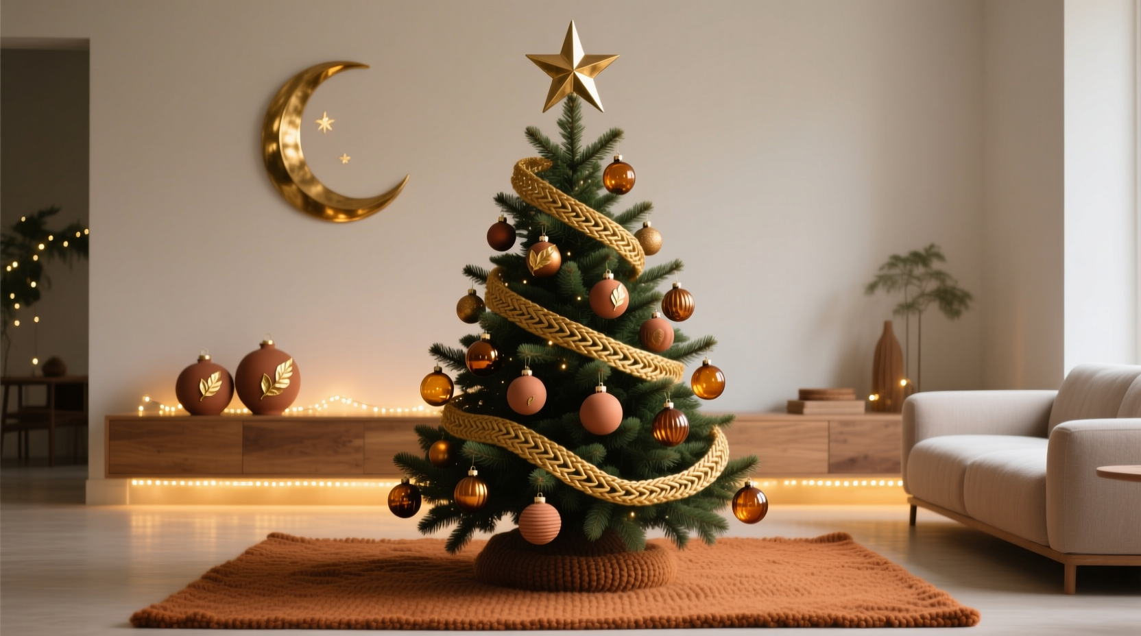
2. Crimson & Candlelight: Classic Warm (Red, Gold, Cream)
A timeless combination evoking vintage glamour and traditional cheer. Works especially well in homes with warm wood tones or deep wall colors.
- Lights: Warm white LEDs or soft-glow incandescent bulbs.
- Ornaments: Deep red glass balls, mercury glass accents, antique-style finials, hand-blown baubles with gold luster.
- Ribbon: Velvet or satin in burgundy or gold; consider a bow at each major branch intersection.
- Tree Topper: A large gold star or angel with fabric wings.
- Skirt: Red velvet or brocade with tassels.
3. Forest & Ember: Earthy Modern (Emerald, Terracotta, Mustard)
This rich, grounded palette blends nature with warmth. Perfect for boho, farmhouse, or organic modern spaces.
- Lights: Warm white or amber-tinted LEDs to enhance warmth.
- Ornaments: Hand-dipped ceramic shapes, dried citrus slices, wooden animals, moss-covered balls.
- Ribbon: Linen tape or braided jute with terracotta beads.
- Tree Topper: A dried floral wreath or a handmade paper sun.
- Skirt: Woven seagrass or a kilim textile.
4. Amethyst & Smoke: Moody Jewel (Purple, Navy, Copper)
Dramatic and sophisticated, this palette stands out in contemporary homes. It’s bold without being gaudy when balanced correctly.
- Lights: Dimmable warm white or soft purple string lights for ambiance.
- Ornaments: Deep plum glass, navy mercury glass, copper leafed spheres, faceted crystals.
- Ribbon: Satin in eggplant or metallic copper twist.
- Tree Topper: A hammered copper star or a cluster of amethyst geodes.
- Skirt: Velvet in navy or a metallic weave.
“A cohesive color story turns a Christmas tree into a statement piece, not just seasonal decor.” — Lila Monroe, Interior Stylist & Holiday Designer
Do’s and Don’ts: Common Pitfalls to Avoid
Even with a strong concept, small missteps can undermine your vision. Refer to this table to stay on track.
| Do | Don’t |
|---|---|
| Stick to a 3-color maximum (including neutrals) | Introduce too many bright accent colors |
| Use different textures within the same hue | Repeat the exact same ornament type throughout |
| Balance shiny and matte finishes | Cover every inch with glitter |
| Vary ornament sizes (large, medium, small) | Use only one size of ball ornament |
| Step back frequently while decorating to assess balance | Work from one side only, leading to visual imbalance |
Real Example: The Coastal Blue Tree That Stopped the Scroll
Sarah Kim, a graphic designer in Portland, wanted her 7-foot Fraser fir to reflect her beachside childhood memories. She chose a palette of seafoam green, driftwood gray, and nautical navy, accented with rope-wrapped ornaments and sand-dollar replicas.
She began by wrapping the tree in warm white lights, then added a garland made of braided jute. Ornaments included hand-painted ceramic fish, glass buoys, and textured orbs resembling wet stones. She topped the tree with a weathered wooden sailboat instead of a star.
The result was so striking that neighbors began stopping by just to see it. “People assumed I’d hired a decorator,” she said. “But it was just planning. I knew the colors I loved and stuck to them.” Her tree wasn’t flashy—but it was memorable because every element served the story.
Checklist: Designing Your Palette-Based Tree
Before you begin decorating, run through this checklist to ensure success.
- ☐ Selected a dominant color and 1–2 supporting shades
- ☐ Chosen appropriate lighting (warm vs. cool white)
- ☐ Gathered ornaments in varied sizes, textures, and finishes
- ☐ Picked a ribbon or garland that complements the palette
- ☐ Designed a tree topper that aligns with the theme
- ☐ Selected a tree skirt that enhances, not clashes with, the colors
- ☐ Tested the full look on a table or tray before installation
- ☐ Reserved 20% of decorations for final adjustments and balance
Frequently Asked Questions
Can I include sentimental ornaments that don’t match my palette?
Yes—but be selective. Incorporate 2–3 meaningful mismatched pieces as “storytelling accents” rather than core elements. Place them deeper in the branches so they surprise rather than dominate. Alternatively, repaint or spray-finish old ornaments to align with your scheme.
How do I keep a monochromatic tree from looking flat?
Variety in texture and reflectivity is key. Combine matte, glossy, glittered, ribbed, and transparent finishes within the same color family. Add dimension with 3D elements like pinecones, fabric flowers, or sculptural shapes. Layer lighting intensity where possible.
What if my family prefers traditional red and green?
You can honor tradition while staying on-theme. For example, in a navy-and-copper tree, use a single red ornament as a nod to heritage, or incorporate green through eucalyptus sprigs rather than classic tinsel. Communicate your vision early and invite others to contribute within the palette.
Final Touches: Lighting, Placement, and Longevity
Your tree’s impact depends not just on color but on context. Position it where it can be seen from multiple angles and where ambient light enhances its hues. Rotate spotlight direction during the season to highlight different sections.
To maintain freshness and appearance, mist real trees lightly every few days. For artificial ones, dust ornaments gently with a microfiber cloth before storage. Store components by color group in labeled bins to simplify next year’s setup.
Remember: a color-coordinated tree isn’t about perfection. It’s about intention. When every choice supports a unified vision, the result feels authentic, calm, and deeply personal.
Conclusion: Make This Your Most Beautiful Tree Yet
Designing a Christmas tree around a specific color palette transforms holiday decorating from routine to ritual. It invites mindfulness, creativity, and continuity with your everyday aesthetic. Whether you choose serene frost tones or passionate jewel hues, the discipline of a defined palette brings clarity and elegance to your celebration.


 浙公网安备
33010002000092号
浙公网安备
33010002000092号 浙B2-20120091-4
Comments
No comments yet. Why don't you start the discussion?