
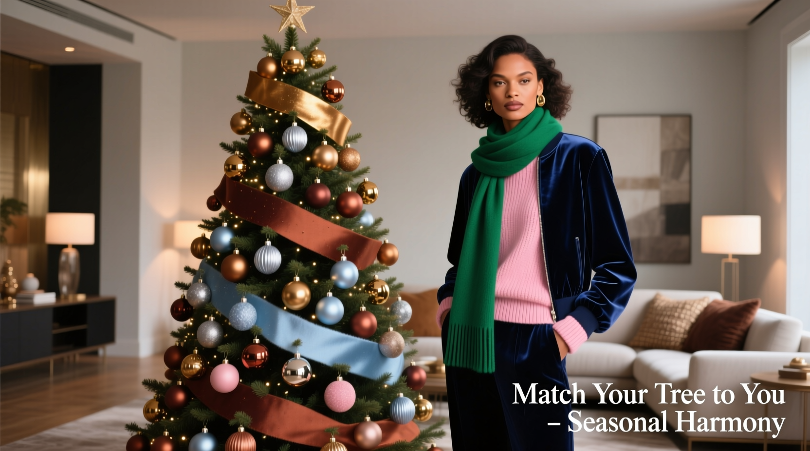
Most holiday decorating advice treats the Christmas tree as a standalone statement—something to “go bold” or “stick with tradition.” But when your tree stands in the same living space where you host gatherings, take video calls, and relax in your favorite sweater, its colors interact with *you*. A tree saturated in icy silver and frosty blue may make warm-toned skin appear sallow; deep burgundy ornaments can clash with olive undertones if not balanced intentionally. This isn’t about arbitrary “rules”—it’s about visual harmony rooted in color science, personal aesthetics, and practical wardrobe integration. The goal isn’t to match your scarf to every bauble, but to create a cohesive environment where your presence feels intentional, radiant, and at ease.
Why Skin Tone & Wardrobe Matter More Than Tradition
Traditional red-and-green schemes assume universal flattery—and they don’t deliver. Color perception is physiological: light reflects off your skin, interacts with nearby surfaces, and enters the eye as a combined signal. A cool-toned person surrounded by warm golds and terracottas experiences visual vibration—a subtle tension that fatigues the eye over time. Conversely, a warm-toned person next to a tree heavy in jewel-toned emeralds and amethysts may find their complexion muted, their favorite rust turtleneck visually competing rather than complementing.
This extends to wardrobe integration. If your go-to holiday outfit is a camel cashmere turtleneck, charcoal wool trousers, and cognac boots, a tree loaded with electric lime and neon pink will fracture the room’s cohesion. But the same tree, reimagined with amber glass, toasted walnut beads, and parchment paper stars, becomes an extension of your personal palette—not a contrast to it.
Color theorist and interior stylist Lena Voss notes:
“Your tree isn’t décor—it’s ambient lighting for your face. When its dominant hues align with your natural chromatic range, it doesn’t just look better—it makes *you* look more rested, more present, more like yourself.”
Step-by-Step: Identify Your Dominant Undertone (No Guesswork)
Forget “cool vs. warm” binaries. Undertone is best determined through objective observation—not jewelry tests or vein checks, which are unreliable under artificial light. Follow this sequence:
- Observe your skin in north-facing natural light (not direct sun). Look at the undereye area and jawline—where makeup doesn’t settle and pigment is most neutral.
- Compare against two swatches: a true ivory (with yellow/cream base) and a true platinum (with gray/blue base). Which disappears into your skin? Ivory = warm/neutral-warm. Platinum = cool/neutral-cool.
- Check your most-worn neutrals: Do black, navy, or charcoal feel grounding—or do they wash you out unless paired with warmth (e.g., rust scarf)? If black feels harsh alone but softens with caramel tones, you’re likely warm-neutral. If charcoal reads crisp and clean while beige looks dull, you’re likely cool-neutral.
- Assess your hair’s base tone: Not highlights or grays—but the root color. Golden, strawberry, or auburn bases signal warmth. Ash, slate, or blue-black bases signal coolness. True brunettes often fall in the neutral spectrum.
Once identified, categorize using this refined system—not seasonal archetypes, but functional ranges:
| Undertone Category | Key Visual Cues | Wardrobe Neutrals You Likely Own | Common Mismatch Triggers |
|---|---|---|---|
| Warm | Golden or peachy cast; freckles with yellow/red base; veins appear olive-green | Cream, camel, terracotta, olive, mustard, burnt sienna | Icy pastels, true magenta, fluorescent teal, stark white |
| Cool | Pink, rosy, or bluish cast; veins appear blue-purple; silver jewelry enhances skin | Charcoal, heather gray, dusty rose, navy, plum, icy lavender | Yellow-based beiges, orange-red, copper, honey gold |
| Neutral-Warm | Minimal obvious cast; adapts well to both gold and silver; olive or beige base | Greige, taupe, soft khaki, warm gray, brick red | High-contrast combinations (e.g., electric blue + tangerine), overly saturated neons |
| Neutral-Cool | Even, balanced tone; neither golden nor pink dominates; medium-depth veins | Stone gray, dove gray, soft navy, mauve, steel blue | Deep earth tones without blue bias (e.g., raw umber), warm metallics without polish (e.g., uncoated brass) |
Your Tree Palette Framework: From Theory to Tinsel
A successful tree scheme uses three functional layers—not just “colors,” but roles:
- Base (40%): The structural foundation—usually lights and larger ornaments. Determines overall temperature (warm/cool) and value (light/dark).
- Mid-Tone (35%): Textural anchors—wood, ceramic, matte glass, woven fiber. Adds depth and prevents flatness.
- Accent (25%): Focal points—metallics, reflective elements, or small pops. Should echo a hue already present in your wardrobe or skin’s natural flush.
Here’s how each undertone translates into actionable palettes:
For Warm Undertones
Embrace golden-hour warmth—not fire-engine red. Prioritize amber, cognac, and spiced honey over cherry red. Avoid anything with blue bias (e.g., ruby red, emerald green). Instead, choose:
• Lights: Warm white (2700K–3000K), not daylight white
• Base Ornaments: Burnt orange glass, aged brass, cinnamon-dyed wood, rust velvet balls
• Mid-Tone Texture: Woven rattan stars, leather-wrapped pinecones, dried orange slices
• Accents: Copper wire birds, amber resin icicles, gold-leafed cinnamon sticks
For Cool Undertones
Lean into winter forest clarity—not candy-cane brightness. Choose deep sapphire over robin’s egg, plum over fuchsia. Avoid yellow-based golds or terra cottas.
• Lights: Soft white (3500K) or pale blue-white (4000K)—never yellow-tinted
• Base Ornaments: Slate-blue ceramic, pewter, frosted glass in storm-gray, deep violet velvet
• Mid-Tone Texture: Smooth river stones wrapped in linen, pressed eucalyptus, matte ceramic snowflakes
• Accents: Brushed nickel bells, amethyst geodes, silver-dusted pine boughs
For Neutral Undertones (Warm or Cool)
Your strength is versatility—but only if you avoid visual noise. Stick to *one* dominant temperature per layer. Don’t mix warm gold lights with cool silver accents.
• Neutral-Warm: Greige lights + oatmeal felt balls + matte brass + chestnut wood slices
• Neutral-Cool: Stone-gray lights + dove-gray ceramic + brushed steel + pale blue-dyed feathers
Real-Life Integration: A Mini Case Study
Maria, 38, identifies as neutral-warm. Her signature holiday outfit: a relaxed-fit oatmeal turtleneck, wide-leg charcoal trousers with subtle herringbone, and chocolate-brown loafers. She’d always felt “off” around her family’s traditional red-and-green tree—especially under overhead lighting, where the green looked artificial and the red made her look tired.
She applied the framework: First, she held her oatmeal sweater and charcoal trousers next to her face in morning light. Both enhanced her skin’s evenness. Next, she selected a greige LED string (3200K) for base lighting. For ornaments, she chose matte-finish clay balls in oatmeal, charcoal, and deep cocoa—no shine, no contrast. Mid-tone came from hand-thrown ceramic pinecones in unglazed stoneware. Accents were limited to six pieces: brushed brass star toppers (echoing her belt buckle) and dried pampas grass dyed in soft cocoa.
The result? Guests commented that her living room felt “calm but festive”—and Maria noticed she was photographed more often during gatherings. “It wasn’t about the tree being ‘pretty,’” she shared. “It was about the whole space breathing together. My sweater didn’t fight the backdrop. My skin didn’t compete with the lights. It just… worked.”
Practical Checklist: Build Your Tree in 90 Minutes
Before shopping or unwrapping boxes, run through this focused checklist:
- ☑️ Identify your dominant undertone using the step-by-step method above—not assumptions.
- ☑️ Pull 3–5 key wardrobe items worn frequently during December (top, bottom, outerwear, accessory). Note their dominant hue and finish (matte, metallic, textured).
- ☑️ Choose *one* base light temperature (warm, soft, or cool white) that complements your undertone AND your most-worn neutral.
- ☑️ Select *one* base ornament material and hue (e.g., “matte terracotta ceramic”)—no more than two variations.
- ☑️ Pick *one* mid-tone texture that echoes something in your wardrobe (e.g., “woven jute like my tote bag straps”).
- ☑️ Limit accents to *three* items max—each must mirror a hue or metal already present on your person (e.g., your watch band, necklace clasp, or shoe hardware).
- ☑️ Step back after hanging. Does your face look brighter, more relaxed? If not, remove one accent element and reassess.
FAQ: Addressing Common Concerns
Can I use white ornaments if I have warm skin?
Yes—but avoid stark, blinding white. Opt for antique white, oyster shell, or unbleached linen—hues with subtle yellow or cream undertones. These reflect light warmly without creating contrast fatigue. True white works best for cool and neutral-cool undertones.
What if my wardrobe is mostly black, white, and gray?
That’s a strength—not a limitation. Black and white are achromatic, meaning they carry no inherent temperature. Your undertone still governs how those neutrals *interact* with color. If black feels grounding and crisp, you’re likely cool or neutral-cool: pair it with silver, slate, and pearlized whites. If black feels heavy unless softened with caramel or rust, you’re likely warm or neutral-warm: anchor your tree with charcoal, warm gray, and ivory.
Do metallic finishes really matter that much?
They do—because metal reflects ambient light onto your face. Gold and brass emit warm, yellow-leaning light; silver, nickel, and platinum emit cool, blue-leaning light. Even if your ornaments are the “right” color, mismatched metals disrupt harmony. Stick to one primary metal finish across all accents—then use texture (brushed, hammered, polished) for variation, not temperature shifts.
Conclusion: Your Tree Is an Extension of You—Not a Decoration
A Christmas tree shouldn’t demand attention at your expense. It should frame you—enhancing your presence, supporting your energy, and reflecting the quiet confidence of someone who understands their own palette. Designing a tree that aligns with your skin tone and wardrobe isn’t about rigid rules or sacrificing joy. It’s about intentionality: choosing amber over crimson because it makes your laugh lines glow; selecting slate over kelly green because it lets your eyes hold their sparkle; wrapping twine instead of glitter because texture resonates with the sweater you reach for first.
You don’t need a new set of ornaments every year. Start with what you own. Hold each piece near your face in natural light. Keep what harmonizes. Donate or repurpose what doesn’t. Build slowly—layering texture before color, anchoring with light before adding shine. In doing so, your tree stops being something you *put up*, and becomes something you *live within*.


 浙公网安备
33010002000092号
浙公网安备
33010002000092号 浙B2-20120091-4
Comments
No comments yet. Why don't you start the discussion?