
Christmas lighting has evolved far beyond strings of red-and-green bulbs. Today’s smart lighting ecosystems—powered by Wi-Fi, Bluetooth, and integrated apps—offer unprecedented control over hue, saturation, brightness, timing, and synchronization. Yet with that power comes a new challenge: visual coherence. A living room bathed in pulsing magenta, icy blue, and neon gold may feel festive—but rarely feels *intentional*. Cohesion isn’t about monotony; it’s about harmony. It’s the quiet confidence of a warm amber glow in the hallway complementing a deep forest green accent on the tree, all unified by consistent undertones and thoughtful contrast. This article details how to move from random color selection to deliberate, emotionally resonant Christmas lighting design—using only your smartphone, a compatible smart bulb or strip, and an understanding of color psychology, spatial layering, and app functionality.
The Science Behind Festive Color Harmony
Successful Christmas color schemes rely on three foundational principles: temperature alignment, chromatic balance, and contextual resonance. First, temperature alignment means anchoring your palette around a dominant white point—either warm (2700K–3000K), neutral (3500K–4100K), or cool (5000K+). Most traditional holiday palettes thrive in warm-white territory because candlelight, fireplaces, and vintage incandescent bulbs naturally emit warmth. Introducing a stark 6500K blue without careful modulation creates visual dissonance—not magic.
Second, chromatic balance refers to the ratio of saturated hues to neutrals and tints. A cohesive scheme rarely uses more than two fully saturated colors (e.g., emerald green and burgundy) alongside supporting neutrals (cream, charcoal, natural wood tones) and one accent tint (e.g., misty rose or antique gold). Overloading with high-saturation colors overwhelms the eye and dilutes thematic focus.
Third, contextual resonance acknowledges that color perception shifts with environment. A “crimson” bulb appears deeper beside pine boughs but brighter against white walls. Smart lighting apps let you preview colors in situ—but only if you understand how ambient light, surface reflectivity, and adjacent materials affect output.
“People don’t remember individual colors—they remember the feeling those colors created together. A cohesive scheme doesn’t shout ‘Christmas’; it whispers ‘homecoming.’ That requires restraint, not repetition.” — Lena Torres, Lighting Designer & Co-Author of Emotive Light: Designing for Human Response
Step-by-Step: Building Your Palette in Four Phases
Designing a cohesive Christmas lighting scheme is iterative—not linear. Follow this proven four-phase process to avoid last-minute color clashes and ensure every illuminated surface supports your vision.
- Phase 1: Audit & Anchor (Day 1) – Photograph your space at dusk. Note existing fixed elements: wall paint (swatch the undertone—does beige lean pink or yellow?), furniture fabric (is that navy truly navy or does it shift purple under LED light?), and architectural features (exposed brick, stained glass, metal fixtures). Identify one non-negotiable anchor: the tree’s primary ornament color, your mantel’s stone texture, or your favorite heirloom ribbon. This becomes your dominant hue.
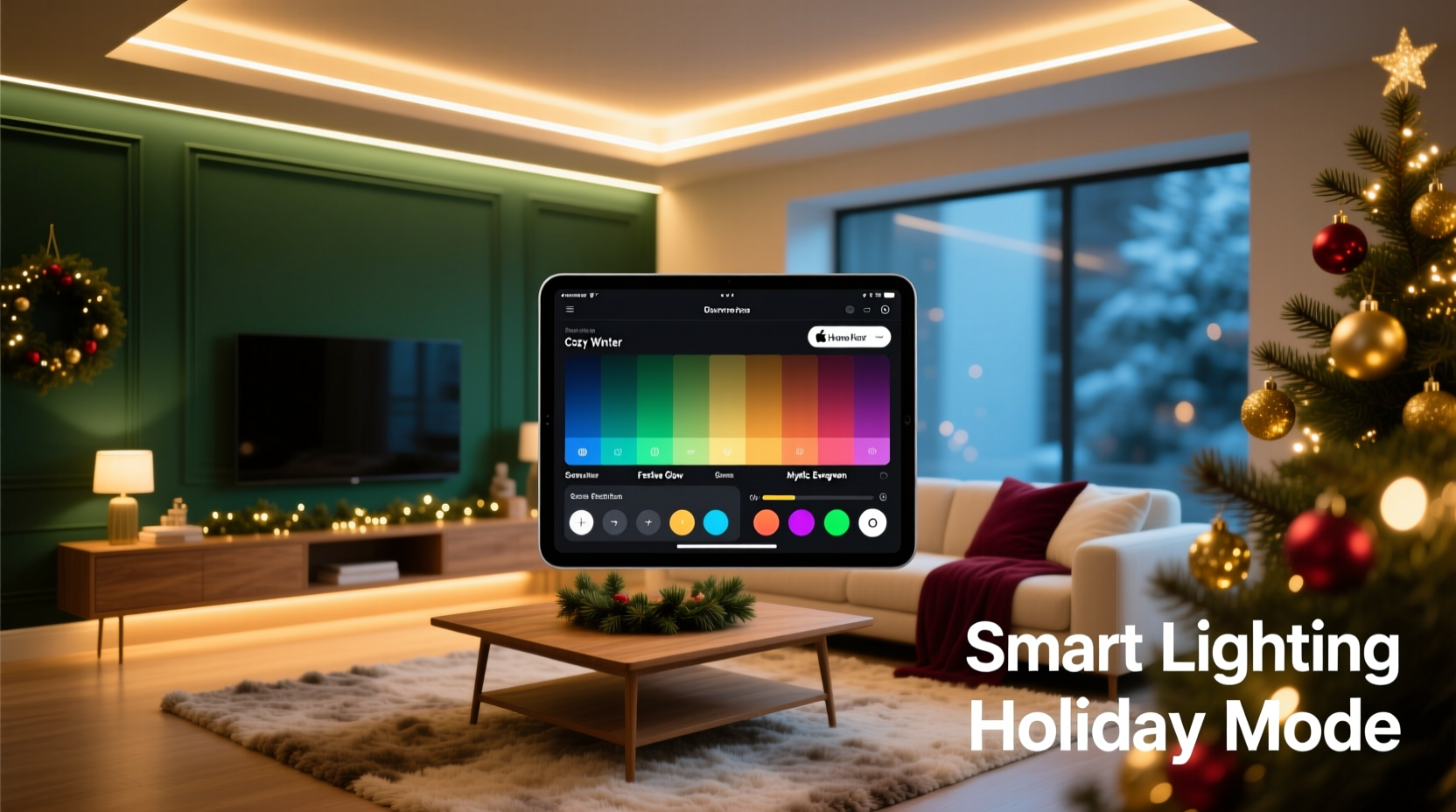
- Phase 2: Palette Generation (Day 2) – Open your smart lighting app (Philips Hue, Nanoleaf, LIFX, or Govee). Use its color wheel, but ignore presets labeled “Christmas.” Instead, manually select your anchor hue, then use the app’s “analogous” or “triadic” mode to generate harmonious options. For example: anchor = #2E5E3A (forest green) → analogous = #1A4A2B (deep pine), #4A7C59 (moss); triadic = #7C3A4A (dusty rose), #3A7C7C (teal).
- Phase 3: Layer & Test (Days 3–4) – Assign colors to lighting zones: ambient (ceiling/floor lamps), focal (tree, fireplace), and accent (shelves, doorways). Run 15-minute tests at different times: early evening (when natural light fades), full dark, and during dinner. Observe how colors interact—not just individually, but as a system. Does the teal accent clash with the warm white overhead? Does the dusty rose wash out under the tree’s spotlight?
- Phase 4: Refine & Automate (Day 5) – Adjust saturation down by 15–20% across all hues (saturation fatigue is real). Set dynamic transitions: slow fade between warm white and amber at sunset, gentle pulse on tree lights during carols. Save final scenes as named routines (“Evening Hearth,” “Midnight Glow,” “Brunch Bright”).
Smart Lighting App Comparison: Features That Matter for Cohesion
Not all smart lighting apps support nuanced color design equally. The table below compares core cohesion-enabling features across five widely used platforms. Focus on capabilities that reduce manual guesswork and reinforce consistency.
| App / Ecosystem | Color Precision Control | Scene Synchronization | White Temperature Lock | Palette Memory & Export | Real-Time Preview Mode |
|---|---|---|---|---|---|
| Philips Hue | RGB + Kelvin slider; CIE xy coordinates for advanced users | Yes—full group syncing across rooms and devices | Yes—separate sliders for color and white temp | No native export; third-party tools required | No—requires physical bulb activation |
| Nanoleaf Desktop App | Advanced color wheel with HSV/RGB/HSL modes; gamut visualization | Yes—Rhythm sync and custom scene triggers | Yes—dedicated warm/cool white toggle | Yes—save palettes as reusable “color sets” | Yes—live preview on desktop before sending to panels |
| LIFX Mobile App | RGB + Kelvin; “Color Match” tool for photo-based palette extraction | Yes—group scenes with independent timing per bulb | Yes—white temp adjustable within any scene | No—palettes saved only as named scenes | No—no true preview; relies on history |
| Govee Home | RGB only (no Kelvin control); limited saturation/brightness granularity | Basic—syncs color but not timing or transitions | No—white is a separate “mode,” not adjustable within color scenes | No—no palette saving; only scene names | No |
| TP-Link Kasa | RGB only; coarse brightness/saturation controls | No—no group scene logic | No—white mode is binary (warm or cool) | No | No |
For serious palette work, Nanoleaf and Philips Hue lead in precision and flexibility. Govee and TP-Link serve well for simple, single-zone setups—but lack the granular control needed for multi-layered cohesion.
Mini Case Study: The Urban Apartment Transformation
Maya, a graphic designer in Chicago, lives in a 650 sq ft apartment with north-facing windows, white oak floors, and a minimalist Scandinavian aesthetic. Her previous Christmas setup—a string of multicolor blinking lights—felt jarring against her muted furniture and concrete walls. She wanted warmth, depth, and sophistication—not cheerfulness.
Using the four-phase method, Maya started by photographing her space at 4:30 PM. She noted her sofa’s oatmeal linen had a subtle greige undertone, her bookshelf wood was warm but low-contrast, and her only existing decoration was a set of matte black ceramic ornaments. Her anchor became “oatmeal”—not as a literal color, but as a tonal reference: soft, earthy, grounded.
In the Nanoleaf app, she selected #D7CEC7 (a warm greige) and generated an analogous palette: #B8AFA3 (stone taupe), #8A7F70 (charcoal brown), and #A79B8E (soft clay). She assigned warm white (2700K) to ceiling lights, clay to recessed shelf lighting, and charcoal brown to her tree base and entryway sconces. Crucially, she avoided pure red or green—instead using the charcoal brown as a rich, sophisticated alternative to traditional evergreen.
After testing, she reduced saturation by 18% and added a 30-second fade transition between “Daytime Neutral” (all warm white) and “Evening Hearth” (taupe + clay). The result? Guests consistently described her space as “calmly festive,” “inviting but not kitschy,” and “the first Christmas décor I’ve seen that doesn’t fight the architecture.”
Do’s and Don’ts of Christmas Lighting Cohesion
These practical guidelines distill common pitfalls into actionable rules—backed by both color theory and real-world smart lighting limitations.
- Do start with your largest surface—the ceiling or main wall—and choose its lighting color first. Everything else should relate to it.
- Do use the same brand and model of bulbs where possible. Mixed brands often render identical RGB values differently due to varying LED phosphor blends.
- Do calibrate your phone’s display brightness before selecting colors. A too-bright screen makes hues appear washed out; too-dim makes them look oversaturated.
- Don’t assume “Christmas preset” scenes are cohesive. They’re optimized for algorithmic appeal—not your specific walls, furniture, or emotional intent.
- Don’t mix warm-white and cool-white bulbs in the same zone unless intentionally creating contrast (e.g., cool white above, warm below for layered depth). Unintended mixing causes visual vibration.
- Don’t overlook timing. A perfectly chosen palette loses cohesion if one zone turns on at 5:00 PM while another activates at 7:30 PM. Sync schedules in your app’s automation tab.
FAQ
Can I create a cohesive scheme with only white smart bulbs?
Absolutely—and often more effectively. White-only systems excel at temperature layering: use 2700K (candlelight) for ambient areas, 3000K (soft white) for task lighting like reading nooks, and 3500K (neutral white) for kitchen or entryway zones. This creates hierarchy and intention without color complexity. Many designers consider monochromatic white schemes the most sophisticated Christmas lighting approach.
My app shows great colors on screen, but they look dull in person. Why?
This is almost always due to one of three issues: (1) Bulb age—LEDs lose luminosity and color accuracy after ~15,000 hours; replace bulbs older than 3 years. (2) Low ambient light—colors need some baseline illumination to appear vibrant; run a dim warm-white channel alongside your accent color. (3) App calibration—many apps default to sRGB color space, but modern displays use DCI-P3. Check your app settings for “wide gamut” or “P3 mode” toggles.
How many colors should I use in one room?
Three is the functional maximum for visual cohesion: one dominant (used on 50–60% of lit surfaces), one secondary (30–40%), and one accent (under 10%). In practice, this might mean warm white on ceiling lights (dominant), forest green on tree lights (secondary), and antique gold on mantle garland (accent). More than three introduces perceptual competition and weakens thematic clarity.
Conclusion: Light With Intention, Not Just Illumination
Cohesive Christmas lighting isn’t about perfection—it’s about presence. It’s choosing a palette that reflects who you are, not what’s trending. It’s understanding that the deep burgundy you select for your staircase railing doesn’t exist in isolation; it gains meaning from the warm white glow spilling onto the hardwood below and the soft charcoal shadow it casts on the wall. Smart lighting apps give us tools once reserved for professional studios—but tools are only as powerful as the intention behind them. You don’t need dozens of bulbs or complex automations. You need one anchor color, two supporting tones, disciplined testing, and the willingness to edit ruthlessly. Start small: pick one room, follow the four-phase process, and observe how a single, intentional hue transforms not just the space—but the feeling in it. Then share what worked. Post your palette hex codes, your app settings, or even a photo of your “Evening Hearth” scene in the comments. Because the most beautiful Christmas lighting isn’t the brightest—it’s the one that makes everyone pause, breathe, and say, “This feels like home.”


 浙公网安备
33010002000092号
浙公网安备
33010002000092号 浙B2-20120091-4
Comments
No comments yet. Why don't you start the discussion?