
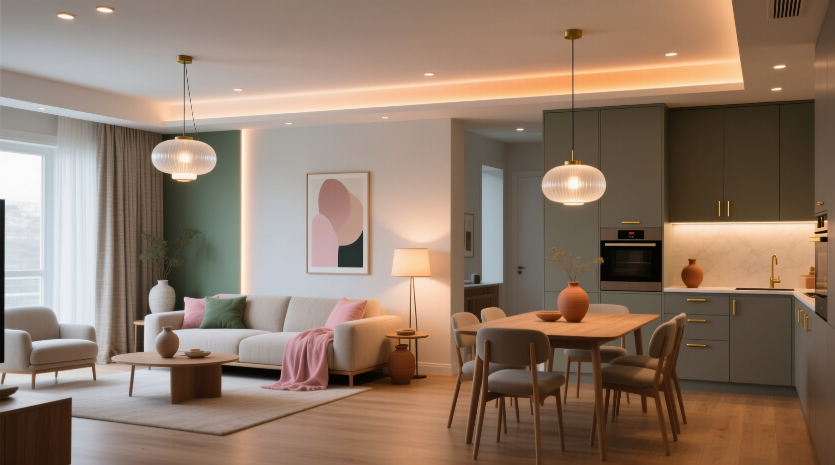
Creating visual harmony across a home isn’t about repeating the same shade in every space—it’s about intentionality. A truly cohesive color scheme for lighting and decor bridges function, mood, and flow while honoring each room’s unique purpose. Too many homes suffer from “color fragmentation”: warm amber pendants in the kitchen, cool white track lights in the hallway, and saturated jewel-toned throw pillows in the living room that clash with the adjacent dining area’s muted sage palette. The result? A disjointed experience that undermines comfort, perceived spaciousness, and even emotional well-being. This guide distills decades of interior design practice, architectural lighting principles, and color psychology research into actionable strategies—not trends—to help you build a unified chromatic narrative across your entire home.
1. Start with Your Home’s Architectural & Environmental DNA
Before selecting a single bulb or pillow, assess immutable conditions: natural light direction, window size, ceiling height, wall finish (matte, eggshell, or gloss), and existing fixed elements like flooring, cabinetry, or brickwork. North-facing rooms receive cool, diffused daylight year-round; south-facing ones flood with warm, intense light. A 7-foot ceiling absorbs more light than a 10-foot one, demanding warmer, more luminous fixtures to avoid a cave-like effect. These factors dictate your tonal foundation—not personal preference alone.
Use a simple diagnostic method: photograph each room at three times of day (9 a.m., 1 p.m., and 5 p.m.) under natural light only. Compare how wall colors shift—does that “greige” lean violet at noon but turn olive at dusk? Does your oak floor appear honey-toned in morning light but ashen in overcast afternoons? Document these shifts. They reveal your home’s true color temperature range—the essential starting point for cohesion.
2. Build a Unified Palette Using the 60-30-10 Rule—Adapted for Light & Texture
The classic 60-30-10 rule (dominant, secondary, accent) applies powerfully to lighting and decor—but must evolve beyond flat paint swatches. In multi-room environments, it becomes a *chromatic rhythm* anchored by three interdependent layers:
- Base Layer (60%): Fixed, non-removable surfaces—walls, floors, countertops, built-in cabinetry. This layer sets the neutral anchor. Choose one dominant undertone (e.g., warm beige, cool gray, or green-gray) and carry it through all primary living zones. Avoid switching base neutrals between connected rooms—even subtle shifts (e.g., SW Repose Gray in the living room vs. SW Agreeable Gray in the dining room) create visual friction.
- Light Layer (30%): Fixtures, lampshades, dimmer switches, and integrated LED strips. This is where cohesion is most often broken. All primary lighting sources across open-plan or sightline-connected areas must share the same CCT range (±100K) and CRI (Color Rendering Index) of 90+. A pendant over the island at 3200K/CRI92 must harmonize with recessed cans in the adjacent living room at 3100K/CRI93—not 2700K/CRI80.
- Decor Layer (10%): Textiles, art, vases, switch plates, and decorative lighting (e.g., table lamps, sconces). Here, introduce controlled variation: analogous hues (e.g., terracotta, rust, burnt sienna) or complementary accents (e.g., deep teal against warm taupe) that reference the base layer’s undertone without competing.
This structure prevents “color whiplash”—the jarring sensation when stepping from one room to another. It also allows flexibility: you can swap accent pillows seasonally or rotate artwork, knowing the foundational light and surface palette holds everything together.
3. Master the Psychology of Light Temperature Across Functional Zones
Human circadian biology responds directly to light spectrum. Ignoring this fractures not just aesthetics—but wellness. A cohesive scheme respects physiological needs per zone, using color temperature as a quiet conductor of daily rhythm:
| Room | Primary Function | Optimal CCT Range | Rationale & Decor Alignment |
|---|---|---|---|
| Kitchen | Task-oriented, social gathering | 3000–3500K | Warm enough for comfort, crisp enough for food prep. Pair with brass or matte black fixtures and wood-toned handles to reinforce warmth without glare. |
| Living Room | Relaxation, conversation, media | 2700–3000K | Soft, enveloping light. Use dimmable layered lighting (ceiling + floor + table). Decor accents should echo the warmth—think ochre linen, caramel leather, clay ceramics. |
| Bedroom | Sleep preparation, intimacy | 2200–2700K | Amber-rich, low-blue light signals melatonin production. Avoid cool-white nightlights. Bedding and wall art should lean into dusty rose, charcoal, or deep navy—not high-contrast brights. |
| Bathroom (Vanity) | Personal grooming, detail work | 3500–4000K | Higher CRI (≥95) is non-negotiable for accurate skin tone rendering. Mirror lighting must match ceiling fixtures’ CCT to prevent disorienting transitions. |
| Home Office | Focused work, screen-based tasks | 3500–4000K | Minimizes eye strain. Balance with warm ambient lighting (e.g., a floor lamp at 3000K) to avoid clinical sterility. Desk accessories and wall art should use muted, non-distracting tones (slate, heather, warm taupe). |
Note: “Cohesion” does not mean uniformity. It means intentional contrast—where cooler light in the bathroom supports alertness, while warmer light in the bedroom supports rest, all within a unified tonal family (e.g., all warm-leaning neutrals, no stark cool grays introduced mid-home).
4. Real-World Execution: A Case Study in a 1920s Brick Rowhouse
Maya, a graphic designer in Philadelphia, owned a narrow three-story rowhouse with original oak floors, exposed brick in the living room, and north-facing windows throughout. Her initial approach—using “cozy” 2700K Edison bulbs everywhere—backfired: the living room felt murky, the kitchen appeared washed out, and the upstairs hallway felt institutional under mismatched cool-white LEDs.
Her solution, guided by a lighting consultant, followed four precise steps:
- Baseline Measurement: She documented natural light shifts and discovered her brick wall shifted from russet at noon to slate-gray at dusk. Her oak floors leaned yellow-gold in morning light but neutralized in afternoon.
- Unified Base Layer: She repainted all main-floor walls with Benjamin Moore HC-103 “Revere Pewter”—a green-gray with subtle warmth that harmonized with both brick and oak, avoiding cool grays that would fight the brick’s undertones.
- Light Layer Calibration: Installed 3000K, CRI95+ LED modules in all recessed and track fixtures. Added dimmable 2700K filament bulbs only in decorative pendants and table lamps for softness. Ensured every switch-controlled light source shared the same CCT.
- Decor Layer Strategy: Chose textiles and art referencing the green-gray base: moss-green velvet sofa, burnt-orange kilim rug (echoing brick’s warmth), and framed botanical prints with sepia-toned greens and creams. No saturated blues or purples were introduced—those would have clashed with the brick’s inherent red undertone.
Result: Seamless flow between kitchen, dining, and living areas. Guests consistently remarked on the “calm, grounded feeling”—not because every room looked identical, but because the light and color language spoke the same dialect.
5. Expert Insight: Why Consistency Trumps Creativity in Multi-Room Schemes
Interior lighting designers emphasize that human vision prioritizes continuity over novelty in domestic spaces. Dr. Lena Torres, Director of the Lighting Research Center at Rensselaer Polytechnic Institute, explains:
“Your peripheral vision constantly scans for chromatic discontinuities—like a CCT shift of 300K between rooms. That micro-jolt registers subconsciously as stress, not style. Cohesion isn’t artistic limitation; it’s cognitive hospitality. When light and color behave predictably across thresholds, the brain relaxes, attention deepens, and spaces feel larger and safer.” — Dr. Lena Torres, Lighting Research Center, RPI
This insight reframes “cohesive” not as boring repetition, but as environmental empathy—designing for how people actually inhabit space, not how it photographs online.
6. Practical Implementation Checklist
Follow this sequence before purchasing a single fixture or pillow:
- ✅ Audit natural light in every room at three times of day; note dominant undertones and shifts.
- ✅ Select one unifying base neutral (paint, tile, or floor finish) for all primary living zones—no exceptions for “transitional” spaces like hallways or stairs.
- ✅ Standardize lighting CCT across all primary fixtures in connected areas (±100K tolerance). Verify CRI ≥90 for all general lighting.
- ✅ Map decor accents using a physical or digital color wheel—ensure all hues are either analogous to your base neutral or complementary in a way that reinforces, not contradicts, its undertone.
- ✅ Test lighting in situ: install one bulb/fixture per zone, live with it for 48 hours, and observe how it interacts with your base layer and decor at dawn, noon, and dusk.
7. FAQ: Addressing Common Cohesion Challenges
What if I have an open-plan layout but want distinct moods in the kitchen versus the living area?
Use lighting layering—not color temperature shifts. Keep all overhead and ambient sources at the same CCT (e.g., 3000K). Then differentiate mood with fixture form (industrial pendants over the island vs. sculptural floor lamps in the lounge), beam angle (focused downlights for task zones vs. wide-flood for seating), and dimming profiles (kitchen lights dim to 30%; living room to 10%). The consistent light temperature binds the space; the controls and forms articulate function.
Can I mix metal finishes (brass, black, nickel) across rooms and still maintain cohesion?
Yes—if metals share the same undertone family. Warm metals (brushed brass, antique copper, oil-rubbed bronze) cohere with warm-light schemes (≤3000K). Cool metals (matte black, polished nickel, stainless steel) align with higher-CCT zones (≥3500K). Mixing warm and cool metals in the same room creates visual noise. But using warm metals in the living room and cool metals in the bathroom is cohesive—because each supports its zone’s functional light temperature.
How do I handle a room with no natural light (e.g., a windowless powder room)?
Treat it as a deliberate punctuation—not an anomaly. Use the same CCT as adjacent zones (e.g., 3000K if connected to a living room), but elevate CRI to 95+ and add a single, bold decorative element (e.g., a hand-thrown ceramic sink, a vintage mirror frame) that references your home’s dominant accent hue. This makes the space feel intentionally curated, not an afterthought.
Conclusion
A cohesive color scheme for lighting and decor across multiple rooms is one of the most impactful yet underutilized tools for transforming a house into a home. It doesn’t require expensive renovations or wholesale replacements—just disciplined observation, calibrated choices, and respect for how light, color, and human perception interact. When your entryway light flows seamlessly into your living room glow, when your kitchen’s warmth feels like a natural extension of your dining room’s ambiance, and when every room supports—not disrupts—your daily rhythms, you’ve achieved something profound: environmental coherence. That quiet harmony doesn’t shout. It settles. It breathes. It belongs.


 浙公网安备
33010002000092号
浙公网安备
33010002000092号 浙B2-20120091-4
Comments
No comments yet. Why don't you start the discussion?