
Christmas lights do more than illuminate—they transform your home into a festive experience. But when colors clash or patterns feel chaotic, the magic fades. A well-designed, color-coordinated lighting display creates harmony, evokes emotion, and turns heads in the neighborhood. Whether you're aiming for classic elegance, modern minimalism, or joyful exuberance, thoughtful coordination is key. This guide walks you through the principles of color theory, strategic placement, and practical execution to help you craft a display that feels intentional, balanced, and beautiful.
Understand Color Theory for Outdoor Lighting
Color isn’t just about preference—it’s about psychology, contrast, and context. When applied to Christmas lights, understanding basic color theory helps you avoid visual noise and instead create a cohesive theme.
The color wheel is your best tool. Primary colors (red, blue, yellow) are bold and traditional. Secondary colors (green, orange, purple) offer variety, while analogous colors (those next to each other on the wheel, like red and orange) create smooth transitions. Complementary colors (opposite on the wheel, like red and green or blue and orange) generate high contrast and energy—perfect for focal points but risky if overused.
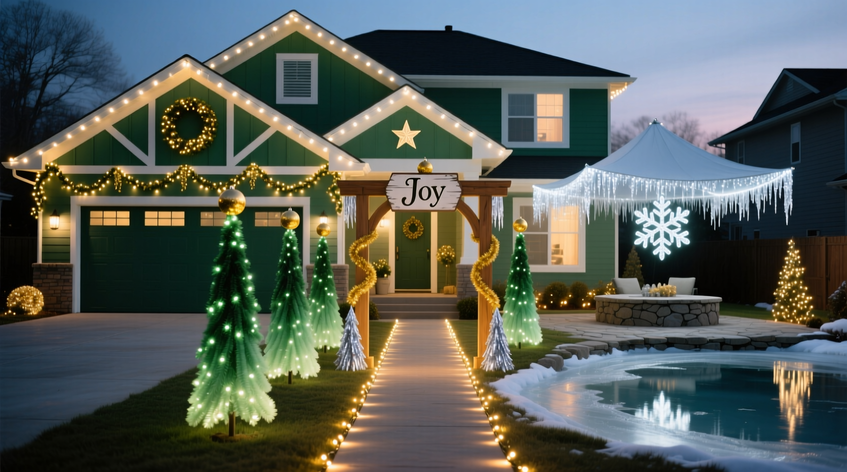
For Christmas, most homeowners lean into traditional palettes: red and green, gold and white, or cool blues and whites. But modern displays often use monochromatic schemes—such as varying shades of warm white or cool white—for a sleek, elegant effect. Consider the mood you want:
- Traditional warmth: Red, green, and gold evoke nostalgia and holiday cheer.
- Festive vibrancy: Multi-color (often called “rainbow”) works well for family homes or playful themes.
- Elegant minimalism: Warm white or cool white alone offers sophistication and blends seamlessly with snow or architectural details.
- Winter wonderland: Blue, silver, and white mimic ice and snow, ideal for colder climates or modern aesthetics.
Plan Your Layout with Purpose
A great display starts with a plan—not just where to hang lights, but why. Begin by walking around your property and noting architectural features: rooflines, eaves, windows, doors, trees, and walkways. These elements serve as natural anchors for your design.
Sketch a rough diagram of your home’s front and side views. Mark where you’ll place lights, and assign colors based on function and emphasis. For example:
- Roofline: Use a single color to frame the house. White or warm white works universally; colored strings can highlight pitch or gables.
- Eaves and soffits: Line these with smaller bulbs or mini-lights to add depth without overwhelming.
- Windows and doors: Frame entries with accent colors—red and green for tradition, gold for luxury.
- Trees and shrubs: Wrap trunks or outline shapes with colored or white lights. Clustered warm white mimics candlelight; multicolor adds playfulness.
- Pathways and railings: Use low-voltage, ground-level lighting in white or soft amber to guide guests safely.
Balance is crucial. Avoid concentrating all color on one side. If your home has an asymmetrical layout, use repetition—such as matching tree wraps on both sides—to create visual symmetry.
“Lighting should enhance architecture, not compete with it. Think of lights as brushstrokes—each one supports the whole picture.” — Marcus Reed, Landscape Lighting Designer
Step-by-Step Guide to Installation
Once your plan is set, follow this sequence for a professional-looking result:
- Assess power sources. Identify outdoor outlets and determine if you need extension cords or a temporary power strip. Keep circuits within safe load limits (usually 80% of capacity).
- Test all lights before hanging. Plug in each string to check for dark bulbs or wiring issues. Replace faulty sets early.
- Start at the outlet and work outward. Run cords along baseboards or under mulch using cord covers. Avoid tripping hazards.
- Install clips or hooks. Use plastic gutter clips, shingle tabs, or adhesive mounts to secure lights without damaging surfaces.
- Hang roofline lights first. Work from left to right, maintaining even spacing (6–8 inches between bulbs is standard).
- Add accent lighting. Highlight windows, doors, and trees with complementary colors or textures (e.g., icicle lights for eaves).
- Incorporate timers or smart controls. Set lights to turn on at dusk and off at bedtime for energy efficiency and convenience.
- Step back and evaluate. View your display from the street at night. Adjust brightness, density, or color balance as needed.
Do’s and Don’ts: Color Coordination Checklist
To ensure your display remains harmonious, follow this checklist during planning and installation:
| Do | Don't |
|---|---|
| Choose a primary color scheme and stick to it. | Mix too many unrelated colors (e.g., pink, green, and orange). |
| Use white lights as a neutral base for color accents. | Overload one area with bright, clashing colors. |
| Match light colors to your home’s exterior (e.g., warm white for brick, cool white for gray siding). | Ignore surrounding environment—like streetlights or neighbor displays. |
| Layer textures: combine steady bulbs with twinkle or chase effects sparingly. | Use blinking or flashing lights across the entire display. |
| Label cords and note circuit layouts for future years. | Forget to consider wind, rain, or snow exposure when mounting. |
Real Example: The Johnson Family’s Coordinated Upgrade
The Johnsons lived in a colonial-style home with white siding and black shutters. For years, they used random strings of multicolor lights—some bright, some dim, all unplanned. Their display was visible from two blocks away, but neighbors described it as “busy” rather than beautiful.
In November, they decided to redesign. They chose a refined palette: warm white along the roofline and eaves, deep red framing the front door and windows, and subtle gold wrapping two mature evergreens in the front yard. They kept the path lit with low-profile amber LEDs.
The result? A balanced, inviting look that felt festive without being overwhelming. By limiting their colors and aligning lights with architectural lines, they created a display that earned compliments—and even inspired two neighbors to reevaluate their own setups.
Their secret? Planning on paper first, buying all lights from the same brand for consistency, and installing over a weekend with labeled zones. They now reuse the same layout every year with minor tweaks.
Smart Tips for Long-Term Success
A great display isn’t just for one season. Design with longevity in mind:
- Invest in commercial-grade lights. LED strings last longer, use less energy, and maintain consistent color over time.
- Use color-safe storage. Store lights on reels or in compartmentalized bins, separated by color and length.
- Document your layout. Take photos or keep a simple map showing which color goes where.
- Seasonally adapt. Some homeowners switch from warm white in December to patriotic red, white, and blue in July—plan for flexibility.
FAQ: Common Questions About Color-Coordinated Lighting
Can I mix warm white and cool white lights?
You can, but do so intentionally. Warm white (2700K–3000K) has a yellowish glow, while cool white (5000K–6500K) appears bluish. Mixing them unintentionally creates a patchy effect. If you want contrast, use warm white on architectural features and cool white on trees for a “frosted” look—but keep the separation clear.
How do I make my display stand out without being tacky?
Focus on restraint and rhythm. Use repetition of color and pattern, avoid overcrowding, and prioritize clean lines. A single, well-lit tree with a spotlight effect often makes a stronger impression than a house covered wall-to-wall in blinking lights.
Are smart lights worth it for color coordination?
Yes, especially for experimentation. RGB smart lights let you change colors via app or voice control. You can test combinations—like purple and white for a winter theme—without buying new strings. However, for permanent installations, dedicated colored LEDs often look more authentic than programmable whites trying to mimic color.
Final Thoughts: Create a Display That Tells a Story
A color-coordinated Christmas light layout is more than decoration—it’s storytelling. It communicates warmth, creativity, and care. By applying color theory, respecting your home’s architecture, and installing with precision, you create more than a light show: you create a memory for your family and a landmark in your community.
Start small if needed. Even coordinating just the front porch or a single tree with a deliberate color choice can elevate your entire presentation. Over time, expand with confidence, knowing each decision contributes to a unified vision.


 浙公网安备
33010002000092号
浙公网安备
33010002000092号 浙B2-20120091-4
Comments
No comments yet. Why don't you start the discussion?