
In a world saturated with visual stimuli, the ability to stop someone in their tracks with a well-designed sign is both an art and a strategic necessity. Whether you're promoting a sale, guiding visitors, or announcing your business, the effectiveness of your message hinges on its visibility and clarity. A poorly designed sign gets ignored. A great one becomes unforgettable. This guide walks through the essential principles and practical steps for creating signs that not only capture attention but hold it—and inspire action.
Understand Your Audience and Environment
The first step in designing a compelling sign isn’t about fonts or colors—it’s about context. Who will see this sign? Where will they encounter it? How much time do they have to process the message?
A roadside billboard viewed at 60 mph demands different treatment than a café menu board read at close range. A sign in a busy urban plaza competes with flashing screens and movement, while one in a quiet park can afford subtlety.
Ask yourself:
- What is the viewer’s speed and distance from the sign?
- Is the lighting natural, artificial, or variable?
- What distractions are present in the environment?
- What language or symbols resonate with the audience?
Define Your Core Message
Clarity beats cleverness every time. The most effective signs deliver one idea—fast. Identify the single most important thing you want people to know or do.
Instead of “We Offer Great Coffee, Pastries, and Free Wi-Fi,” try “Fresh Coffee • $2.” Specificity increases impact. Use active verbs when possible: “Join Now,” “Save Today,” “Enter Here.”
Strip away anything that doesn’t serve the primary goal. Every word, symbol, and color should reinforce the core message.
“Design is not what it looks like. Design is how it works.” — Don Norman, cognitive scientist and design thinker
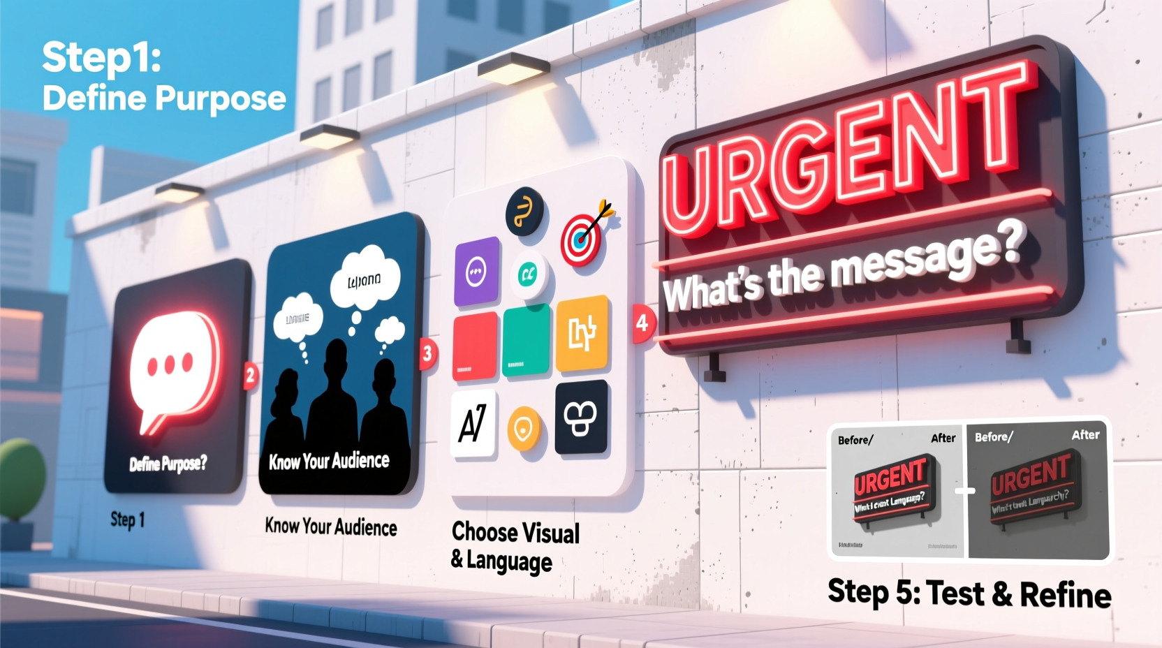
Step-by-Step Guide to Designing an Attention-Grabbing Sign
Follow this seven-step process to create a sign that stands out and delivers results.
- Determine the purpose. Is it informational, directional, promotional, or warning? Each type has different design needs.
- Choose the right size and format. Match the dimensions to the viewing distance and space constraints. Larger signs need bolder elements.
- Pick legible typography. Sans-serif fonts like Helvetica, Open Sans, or Montserrat perform best at a distance. Avoid script or overly decorative fonts for headlines.
- Use high-contrast color combinations. Black on yellow, white on navy, or red on white create strong visual separation. Ensure accessibility for color-blind viewers.
- Leverage negative space. Crowded signs overwhelm the eye. White space around text and graphics improves focus and elegance.
- Incorporate simple visuals. Icons, logos, or illustrations can convey meaning faster than words—but keep them minimal and relevant.
- Test and refine. Show a prototype to a few people unfamiliar with the project. Can they repeat the message? Do they know what to do next?
Do’s and Don’ts of Sign Design
| Do’s | Don’ts |
|---|---|
| Use bold, large fonts for key information | Use more than two font styles |
| Limit text to 7–10 words for outdoor signs | Include full sentences or paragraphs |
| Align elements consistently (left, center, or right) | Mix alignments haphazardly |
| Choose colors that contrast strongly | Use low-contrast combos like gray on blue |
| Place the most important element at eye level | Position critical info too high or too low |
Real-World Example: Revamping a Local Bakery’s Sidewalk Sign
A small bakery in Portland struggled with low foot traffic despite prime street access. Their existing chalkboard sign listed ten items in tiny handwriting, with inconsistent spacing and no clear hierarchy.
A redesign focused on simplicity: “$3 CROISSANTS TODAY” in bold, oversized letters at the top, followed by two other daily specials in smaller print. The background was cleaned, and bright yellow borders were added for contrast against the sidewalk. Within a week, staff reported a noticeable increase in customers stopping to read the sign—and sales of croissants tripled on promotion days.
The change wasn’t in the product, but in the clarity of communication.
Color Psychology and Typography: Strategic Choices
Colors evoke emotions and influence behavior. Red creates urgency—ideal for sales. Blue conveys trust, useful for professional services. Yellow grabs attention but can be hard to read if overused. Green signals nature or permission, often used in eco-brands or “go” instructions.
Pair colors thoughtfully. Use tools like Adobe Color or Coolors to test accessible, high-impact palettes. Always consider cultural context—red means luck in some cultures, danger in others.
Typography affects tone. A sleek sans-serif suggests modernity; a hand-drawn font feels personal but may sacrifice legibility. For maximum impact, use one bold font for headlines and a simpler companion for supporting text.
“The medium is the message.” — Marshall McLuhan, media theorist This reminds us that the form of communication—like a sign’s design—influences how the message is received as much as the words themselves.
Checklist: Pre-Installation Sign Review
Before printing or installing your sign, go through this checklist:
- ✅ Is the main message visible within 3 seconds?
- ✅ Are there no more than two typefaces used?
- ✅ Does the color scheme provide high contrast?
- ✅ Is critical text at least 1 inch tall per 10 feet of viewing distance?
- ✅ Is there enough white space to prevent clutter?
- ✅ Have you tested readability in real-world conditions?
- ✅ Does the sign align with your brand’s voice and identity?
Frequently Asked Questions
How big should the text be on my storefront sign?
A general rule: one inch of letter height for every ten feet of viewing distance. So if customers are 30 feet away, your key text should be at least 3 inches tall. For highways, increase to one inch per 25–30 feet.
Can I use all caps in my sign text?
Yes—for short headlines or emphasis. But avoid long blocks of uppercase text, as they’re harder to read. All caps can also feel like “shouting,” so use judiciously.
What’s the best material for an outdoor sign?
Coroplast (corrugated plastic), aluminum, and ACM (aluminum composite) are durable and weather-resistant. Pair them with UV-protected inks to prevent fading. For temporary use, vinyl banners work well but degrade faster.
Final Thoughts: Make It Impossible to Ignore
A truly effective sign doesn’t just exist in space—it interrupts thought, sparks curiosity, and guides behavior. It combines psychology, design principles, and practical awareness into a single powerful moment of communication.
Great sign design isn’t about decoration. It’s about intention. From the choice of font to the shade of red, every decision should serve the goal of clarity and engagement.


 浙公网安备
33010002000092号
浙公网安备
33010002000092号 浙B2-20120091-4
Comments
No comments yet. Why don't you start the discussion?