
A strong logo is more than just a visual mark—it’s the cornerstone of your brand’s identity. It communicates professionalism, builds recognition, and sets the tone for how customers perceive your business. While hiring a designer is an option, many entrepreneurs, startups, and creatives choose to design their own logos to maintain creative control and reduce costs. With the right approach, you can create a logo that is both unique and professionally compelling.
Understand Your Brand Before You Design
Before sketching or opening design software, take time to define your brand’s core values, mission, and personality. A successful logo reflects not just what your company does, but what it stands for. Ask yourself: Is your brand modern or traditional? Playful or serious? Innovative or reliable?
Consider the emotions you want customers to feel when they see your logo. For example, tech startups often use clean lines and minimalist fonts to convey innovation, while luxury brands lean on elegant typography and metallic tones to suggest exclusivity.
“Your logo isn’t just art—it’s a strategic tool. It should align with your brand voice, audience expectations, and market position.” — Lisa Tran, Brand Identity Consultant
Research Competitors and Industry Trends
Effective logo design doesn’t happen in a vacuum. Study logos in your industry to understand common patterns and identify opportunities to stand out. Are most competitors using blue? Consider a bold color contrast. Do they rely heavily on wordmarks? Explore symbolic marks instead.
Look beyond direct competitors. Analyze top brands across sectors—Apple, Nike, FedEx—for timeless design principles like simplicity, scalability, and memorability.
Compile a mood board of logos you admire, noting what works: typography choices, icon styles, spacing, and color psychology. This research phase prevents accidental imitation and fuels originality.
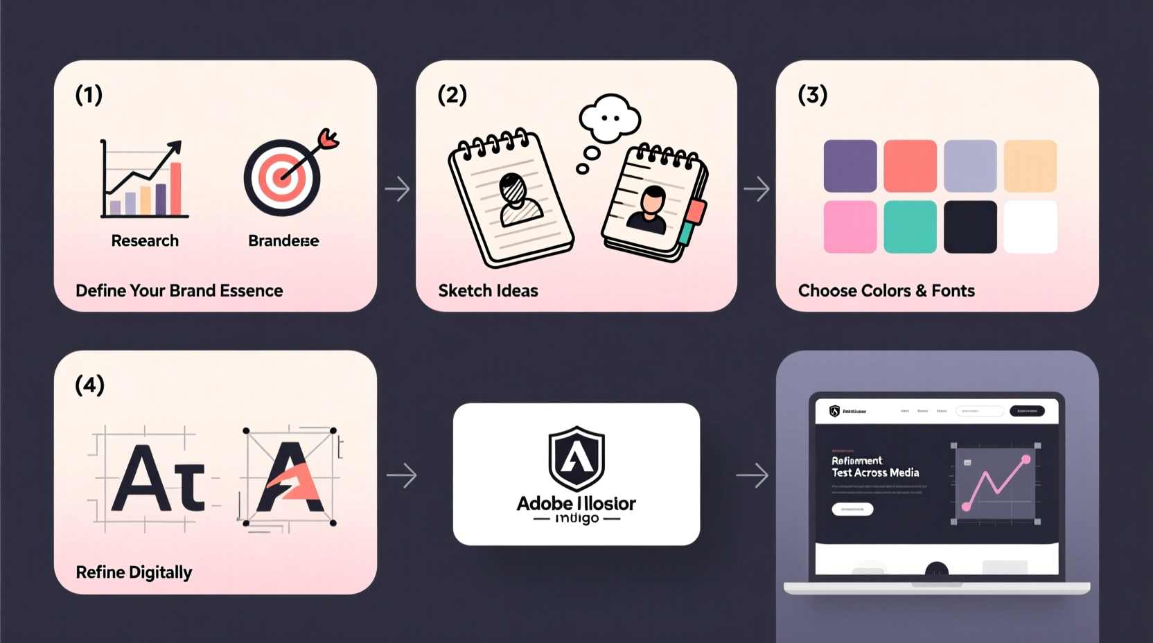
Step-by-Step Guide to Designing Your Logo
Follow this structured process to develop a polished, professional logo from concept to final file.
- Define your goals: What message should your logo communicate? Who is your target audience?
- Choose your logo type: Decide between a wordmark (text-based), lettermark (initials), pictorial mark (icon), abstract mark, mascot, or combination mark.
- Sketch initial ideas: Use pen and paper to brainstorm freely. Don’t overthink—quantity leads to quality.
- Select your typography: If using text, pick fonts that match your brand tone. Avoid overly decorative or generic fonts like Comic Sans.
- Pick a color palette: Colors evoke emotion. Blue suggests trust, red conveys energy, green implies growth. Limit your palette to 1–3 colors.
- Create digital drafts: Use tools like Adobe Illustrator, Figma, or Canva to refine your sketches into vector designs.
- Test for versatility: View your logo in black and white, at small sizes (e.g., favicon), and on different backgrounds.
- Gather feedback: Share drafts with trusted colleagues or target customers. Ask specific questions: “What does this logo say about the brand?”
- Finalize and export: Save your logo in multiple formats: SVG (scalable), PNG (transparent background), and JPG (general use).
Design Principles for a Professional Look
Even without formal training, you can apply foundational design principles to elevate your logo:
- Simplicity: The most memorable logos are simple. Think of Apple’s apple or Twitter’s bird. Avoid clutter.
- Scalability: Your logo should be recognizable on a business card and a billboard.
- Uniqueness: Ensure your design doesn’t resemble existing trademarks. Conduct a reverse image search to check for similarities.
- Timelessness: Trends fade. Aim for a design that will still look relevant in 10 years.
- Relevance: Your logo should make sense for your industry and audience.
| Do | Don't |
|---|---|
| Use vector graphics for crisp scaling | Rely on low-resolution images |
| Limit font styles to one or two | Mix three or more fonts |
| Ensure readability at small sizes | Use tiny details or thin lines |
| Test in grayscale | Assume color is essential for recognition |
| Secure proper licensing for fonts/icons | Use unlicensed assets from Google Images |
Real Example: From Idea to Identity
Sophia launched a sustainable skincare line called “EcoGlow.” She wanted a logo that reflected purity, nature, and elegance. After researching competitors, she noticed many used leaf icons and earthy tones. To differentiate, Sophia combined a stylized dewdrop with a custom serif font to suggest freshness and sophistication.
She started with hand-drawn sketches, then refined the design in Figma. She tested her logo on packaging mockups and found the original green was too bright. She adjusted to a muted sage and added a monochrome version for labeling. Customer feedback confirmed the logo felt premium yet approachable—exactly the impression she wanted.
Essential Checklist Before Finalizing
Run through this checklist to ensure your logo meets professional standards:
- ✅ It represents your brand’s personality and values
- ✅ It’s simple and easy to recognize
- ✅ It works in black and white
- ✅ It scales well from large banners to mobile icons
- ✅ It’s unique and not easily confused with others
- ✅ Fonts and graphics are legally licensed
- ✅ It looks good on both light and dark backgrounds
- ✅ It has been reviewed by at least two objective people
Frequently Asked Questions
Can I design a professional logo without being a graphic designer?
Absolutely. Many successful logos were created by founders with no formal design training. By following design principles, using intuitive tools, and focusing on clarity, you can produce a high-quality logo. Just invest time in learning basics like typography and color theory.
Should my logo include my business name?
In most cases, yes—especially if your brand is new. Name integration improves recognition. Established brands like Nike or Apple can rely on symbols alone because they’re already iconic. For now, combine text with imagery unless you have strong brand awareness.
How much should I spend on a logo?
If designing yourself, costs are minimal—mostly time and possibly software subscriptions. DIY tools like Canva offer free options. Hiring a professional typically ranges from $100 to $1,000+, depending on experience. For startups, investing in a great logo early pays dividends in credibility and consistency.
Final Thoughts: Build a Logo That Lasts
Designing your own logo is a powerful step toward establishing a distinctive brand presence. By grounding your work in strategy, applying sound design principles, and testing thoroughly, you can create a mark that resonates with customers and withstands the test of time. Remember, your logo isn’t just a graphic—it’s the first impression your brand makes.


 浙公网安备
33010002000092号
浙公网安备
33010002000092号 浙B2-20120091-4
Comments
No comments yet. Why don't you start the discussion?