
Christmas lighting has evolved far beyond the nostalgic twinkle of a single-color string. Today’s most compelling displays—whether on residential facades, commercial corridors, or community installations—rely on intentional, layered color schemes that evoke mood, depth, and movement. Yet many homeowners and even seasoned decorators treat multitone lighting as an additive exercise: “I’ll just add some blue here and red there.” That approach rarely delivers cohesion. True dynamism emerges not from variety alone, but from hierarchy, rhythm, contrast, and purposeful placement. This article distills proven layering methodology used by professional lighting designers, municipal display coordinators, and award-winning home decorators—grounded in visual perception science, seasonal psychology, and practical installation constraints.
Why Layering Matters More Than Mixing
Layering is not simply combining colors—it’s constructing visual architecture. A single strand of warm white lights reads as ambient glow; two strands of warm white and cool white create subtle tonal variation; but three layers—warm white (base), deep cobalt blue (mid-depth), and crimson red (accent)—generate spatial illusion: the warm white recedes into the background, the blue defines architectural contours, and the red pulses forward like ornamentation. Human vision interprets layered chromatic cues as depth cues—similar to how painters use atmospheric perspective. Without layering, multitone displays risk visual noise: competing hues cancel each other’s impact, especially at night when rod-dominated vision reduces color discrimination.
Research from the Lighting Research Center at Rensselaer Polytechnic Institute confirms that viewers perceive layered, low-contrast color sequences as “rich” and “intentional,” while high-contrast, unlayered combinations trigger cognitive dissonance—often described subjectively as “busy” or “cheap.” The key lies in controlling three variables simultaneously: luminance (brightness), saturation (intensity), and hue placement (spatial and sequential order).
The Four-Layer Framework: Structure, Depth, Accent, and Movement
Professional multitone displays consistently follow a four-layer hierarchy. Deviating from this structure rarely improves results—though layers may be omitted for simplicity, they are never reordered.
- Base Layer (Structure): Uniform, low-saturation white (2700K–3000K). Installed along rooflines, eaves, window frames, and structural edges. Its purpose is to define form—not draw attention. Use LED mini-lights or net lights with high CRI (>90) for clean, consistent output.
- Mid Layer (Depth): One saturated, cool-toned color (e.g., navy blue, forest green, or violet) placed on recessed surfaces—soffits, porch ceilings, lattice panels, or behind shrubbery. This creates shadow separation and pushes perceived distance.
- Accent Layer (Focus): High-saturation, warm-toned colors (crimson, amber, gold) applied to focal points: wreaths, garlands, doorways, and ornaments. These should occupy ≤15% of total light count to maintain visual priority.
- Dynamic Layer (Movement): Programmable RGB or RGBW lights used exclusively for rhythmic effects—gentle fades, slow chases, or synchronized pulses—on non-structural elements like tree canopies, hanging lanterns, or pathway markers. Never static; always time-based.
This framework works because it mirrors how the human visual system processes space: structure first (edges), then volume (depth), then detail (focus), then motion (change detection). Skipping or reversing layers fractures coherence. For example, placing pulsing red lights on eaves before establishing a warm white base makes the entire display feel unstable—like a photograph taken without proper focus lock.
Color Theory for Nighttime Perception
Daylight color theory fails at night. Under low-light conditions, the eye relies more on rods than cones, reducing saturation sensitivity and shifting hue perception. Reds appear darker and less vibrant; blues and greens retain more relative brightness. This isn’t a flaw—it’s physics. Successful multitone layering accounts for it.
| Hue | Perceived Brightness (Night) | Ideal Layer Role | Practical Notes |
|---|---|---|---|
| Warm White (2700K) | High | Base | Most visible at distance; best for defining large forms |
| Navy Blue (#0A1A3F) | Medium-High | Mid | Reads as rich and dimensional—not “cold”; avoid sky blue (#87CEEB), which washes out |
| Crimson (#DC2F2F) | Low-Medium | Accent | Appears deeper than true red; pairs well with warm white base |
| Amber (#FF9E00) | High | Accent | Strongest night visibility among warm tones; excellent for safety-critical zones (steps, railings) |
| Violet (#5A2D81) | Medium | Mid | Creates sophisticated depth; avoid purple (#B041FF), which appears neon and artificial |
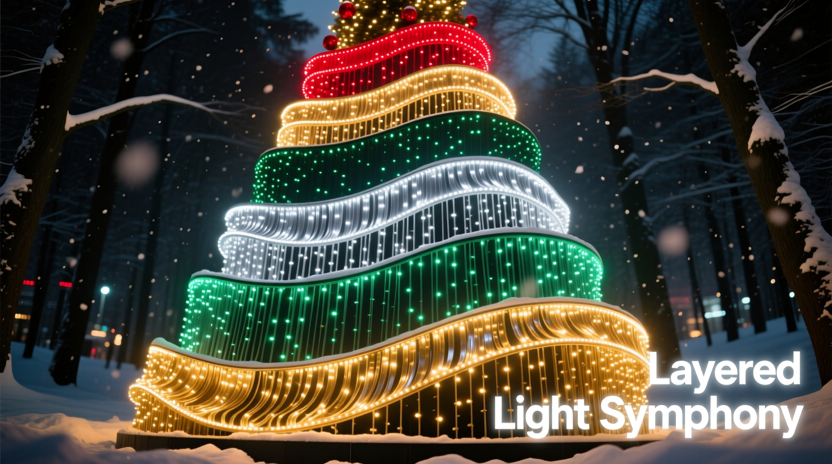
Note the deliberate avoidance of pure red (#FF0000), electric blue (#00BFFF), or lime green (#ADFF2F). These high-chroma, high-luminance hues dominate the visual field and suppress perception of adjacent colors—a phenomenon known as simultaneous contrast. They belong in signage or stage lighting, not layered architectural displays.
Real-World Application: The Oak Street Residence Case Study
In Portland, Oregon, homeowner Maya Chen transformed her 1920s Craftsman bungalow from “festive but forgettable” to neighborhood landmark status using strict layering discipline. Her home featured complex gables, wide eaves, and mature holly hedges—ideal for depth work but prone to visual clutter.
She began by mapping every surface type: structural (roofline, fascia), recessed (soffit, covered porch ceiling), focal (front door, wreath, mailbox), and dynamic (tree canopy, hanging mason jars). Then she applied the four-layer framework:
- Base: 200 ft of 2700K warm white micro-dots along all rooflines and window perimeters—installed with stainless steel clips for clean lines.
- Mid: 120 ft of matte-finish navy blue rope lights recessed into soffit channels and wrapped vertically around porch columns—creating vertical rhythm without glare.
- Accent: 32 hand-wrapped crimson bulbs on the front door wreath and 8 amber LEDs embedded in the holly hedge at eye level—strategically placed where pedestrians pause.
- Dynamic: 50 RGBW pixels inside five birch-bark lanterns hung along the walkway, programmed to fade slowly from amber to warm white over 8 seconds—no strobes, no chases.
The result? Neighbors reported feeling “drawn in” rather than overwhelmed. Local news coverage noted the display’s “calm energy”—a direct outcome of luminance control and tonal restraint. Crucially, Maya spent 70% of her time on placement precision and only 30% on color selection. As lighting designer Rafael Torres observes: “The difference between amateur and professional multitone lighting isn’t the palette—it’s the patience with placement.”
“People don’t remember individual colors—they remember how the light made them feel in space. Layering is emotional choreography, not decoration.” — Rafael Torres, Principal Designer, Lumina Collective (12+ years designing municipal holiday displays)
Step-by-Step: Building Your Layered Display in 7 Phases
Follow this sequence precisely. Skipping steps leads to rework, mismatched voltages, or visual imbalance.
- Map & Measure: Sketch your home’s elevation. Note structural lines (eaves, gutters), recessed zones (soffits, porches), focal points (doors, windows, trees), and dynamic zones (paths, hanging fixtures). Measure linear feet for each zone.
- Select Base First: Choose 2700K warm white lights with CRI ≥90. Calculate 1.5x your linear footage (to allow for spacing adjustments). Use constant-voltage LED strings—not incandescent.
- Choose Mid Color: Select one cool-toned, medium-saturation hue (navy, forest green, or violet). Match its lumen output to your base layer ±10%. Avoid mixing brands—lumen variance causes visible banding.
- Install Base Layer Only: Power it up. Observe at dusk for 3 nights. Adjust spacing until uniformity feels effortless—not perfect, but harmonious.
- Add Mid Layer: Install only in recessed or background zones. Test against base layer. If mid color “disappears,” increase its lumen output slightly—or reduce base brightness via dimmer.
- Place Accent Lights: Use no more than 3 accent colors maximum. Position within 6 inches of architectural features (e.g., wreath center, door handle). Never place accent lights on flat surfaces without texture.
- Introduce Dynamic Layer Last: Program effects to last ≥5 seconds per cycle. Set intensity to 60–70% of base layer. Never synchronize dynamic lights with music or voice—human brains detect timing errors instantly, breaking immersion.
Common Pitfalls and How to Avoid Them
Even experienced decorators stumble on these technical and perceptual traps:
- The “Rainbow Fence” Effect: Running all colors sequentially along one line. This creates optical vibration and distracts from form. Solution: Assign each color to a distinct spatial zone—not a sequence.
- Overloading the Accent Layer: Using 5+ colors on a single wreath. The eye cannot resolve more than 3 chromatic elements simultaneously at night. Solution: Limit accent to 1 dominant + 1 supporting hue (e.g., crimson + amber).
- Ignoring Voltage Drop: Long runs of RGB lights cause color shift (blue dims, red dominates). Solution: Use 12V systems with injectors every 25 ft—or stick to shorter, segmented runs.
- Mismatched CCTs: Pairing 2700K base with 5000K blue creates harsh contrast. Solution: Use blue lights rated at 3000K–3500K correlated color temperature—even if labeled “blue.”
- Forgetting Ambient Light: Streetlights, security floods, or neighbor displays alter your color balance. Solution: Test your display at 7:30 PM and 9:30 PM—the two most common viewing times—and adjust saturation accordingly.
FAQ
Can I layer lights on a single circuit?
Yes—but only if all layers use the same voltage (12V or 120V) and compatible controllers. Mixing constant-voltage and constant-current strings on one circuit risks uneven dimming and premature failure. For reliability, dedicate one circuit per layer type (e.g., base on Circuit A, mid on Circuit B).
What’s the best way to store multitone lights between seasons?
Wind each layer separately on rigid reels labeled by function (Base, Mid, Accent, Dynamic) and color. Store in climate-controlled space—humidity above 60% corrodes copper wires; temperatures below freezing embrittle PVC jackets. Never coil RGB strings tightly; use figure-eight winding to prevent internal wire torsion.
Do smart lights eliminate the need for layering?
No. Smart capability adds control—not design logic. A poorly layered display becomes *more* distracting when animated. Smart lights excel at refining layer behavior (e.g., dimming mid layer 20% at midnight), but they cannot compensate for foundational hierarchy errors.
Conclusion
A dynamic multitone Christmas display isn’t about having more colors—it’s about having clearer intention. When you layer with structure, depth, focus, and movement, you’re not decorating a house; you’re composing light that guides the eye, calms the nervous system, and honors the quiet majesty of winter darkness. The most memorable displays aren’t loud. They’re resonant. They breathe with the architecture. They feel inevitable—not assembled.
You don’t need a professional budget or crew to begin. Start this season with one disciplined layer: a flawless warm white base. Master its placement. Then, next year, add one mid-layer color—applied only where depth is needed. Let your display evolve with patience, not pressure. Authenticity in lighting, like authenticity in life, grows through restraint and repetition.


 浙公网安备
33010002000092号
浙公网安备
33010002000092号 浙B2-20120091-4
Comments
No comments yet. Why don't you start the discussion?