
Most holiday light displays fail not from lack of effort—but from lack of intentionality. Strings are hung haphazardly: white lights on the roofline, red and green on the bushes, multicolor on the porch—and the result is visual noise, not nuance. A flat look emerges when every element competes at the same visual weight, with no hierarchy, no recession, no sense of space. Depth in lighting isn’t achieved by adding more bulbs—it’s created through strategic layering: thoughtful placement, controlled color relationships, intentional intensity variation, and purposeful sequencing. This is how professional designers and award-winning home decorators build displays that draw the eye inward, invite closer inspection, and feel immersive rather than overwhelming.
Why “Flat” Happens—and Why It Matters
A flat light display occurs when all colors operate at equal saturation, brightness, and spatial priority. Think of it like a painting where every brushstroke sits flush on the canvas—no foreground, no background, no atmospheric perspective. In lighting terms, this means:
- All strings use the same bulb type (e.g., all C9s or all mini LEDs), eliminating textural contrast;
- Colors are distributed randomly rather than anchored to architectural zones;
- There’s no variation in intensity—bright white lights compete directly with warm amber ones, canceling each other’s warmth;
- No consideration is given to how light interacts with surfaces: matte brick absorbs differently than glossy siding, and glass windows reflect differently than evergreen foliage.
This flattening effect doesn’t just reduce aesthetic impact—it also dilutes emotional resonance. Warm, receding layers evoke coziness and nostalgia; cool, advancing layers suggest sparkle and celebration. When those cues are muddled, the display feels generic—not personal, not memorable.
The Three-Layer Framework: Anchor, Accent, Atmosphere
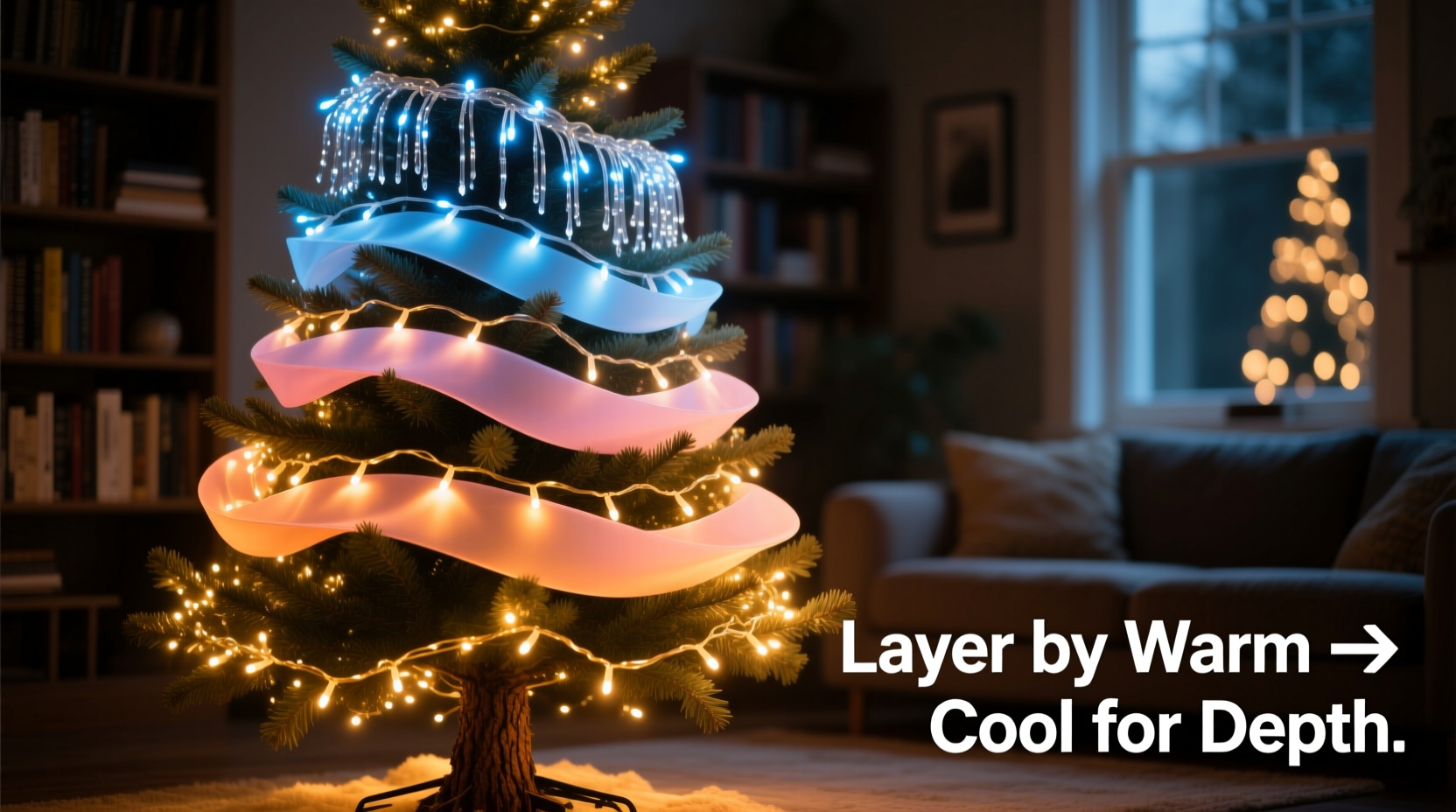
Professional lighting designers rely on a consistent spatial framework: foreground, midground, background. Applied to Christmas lights, this becomes the Anchor–Accent–Atmosphere model—a repeatable system for building dimension without complexity.
- Anchor Layer (Background): These lights define the outermost boundary—the roofline, gable peaks, or top of tall hedges. They should be the most subdued: low-intensity, warm-toned (2200K–2700K), and limited to one or two closely related hues (e.g., amber + soft white, or deep burgundy + charcoal gray). Their job is not to shine, but to frame. Use wider-spaced bulbs (e.g., 6\"–8\" spacing) and dimmable controllers set to 30–50% brightness.
- Accent Layer (Midground): This is the visual heartbeat—the area viewers engage with first: windows, door frames, columns, and porch railings. Here, introduce contrast: cooler whites (3000K–4000K), rich jewel tones (navy, forest green, ruby red), or subtle metallics (copper wire, gold-tipped bulbs). Bulbs should be tighter-spaced (3\"–4\") and moderately bright (60–80%). Crucially, accent colors must complement—not match—the anchor. If your anchor is amber/white, avoid warm reds; choose a true crimson or violet-red instead.
- Atmosphere Layer (Foreground): This layer adds movement, texture, and intimacy: wrapped shrubs, potted evergreens, stair railings, or garlands draped over banisters. Use dynamic elements: twinkle modes (gentle fade, not strobe), micro-lights (1.5mm–2mm), or fiber-optic strands. Colors here should be the most saturated and varied—but still harmonized. A navy-and-silver cluster on a boxwood ball, for example, reads as elegant, not chaotic—because both share a cool undertone and similar value (lightness/darkness).
This framework works because it mirrors how human vision processes space: edges first (anchor), then focal points (accent), then detail and texture (atmosphere). When layered correctly, the eye moves naturally through the display—not bouncing between unrelated splashes of color.
Color Theory for Outdoor Lighting: Beyond Red & Green
Traditional red-and-green pairings often flatten because they sit at opposite ends of the spectrum with equal visual weight and high saturation—creating vibration, not harmony. To build depth, shift from *opposition* to *relationship*. Consider these scientifically grounded principles:
| Principle | How It Creates Depth | Practical Example |
|---|---|---|
| Analogous Harmony (colors adjacent on the wheel) |
Creates smooth transitions and perceived recession—ideal for anchor layers | Amber → Soft White → Pale Gold along roofline; Forest Green → Moss Green → Sage on arbor beams |
| Split-Complementary Contrast (base color + two neighbors of its opposite) |
Delivers focus without jarring tension—perfect for accent zones | Deep Navy (base) + Warm Amber + Soft Rose on window frames |
| Monochromatic Value Shift (same hue, varying lightness) |
Builds dimension through luminance—not hue—making layers read as spatial, not chromatic | Charcoal Gray (anchor eaves) → Slate Gray (midground columns) → Silver-Gray (foreground wreath) |
| Neutral Anchoring (using warm/cool whites as structural base) |
Provides tonal stability so colored lights read as intentional accents, not random bursts | 2700K warm white roofline + 3500K neutral white windows + Ruby Red garland swags |
Remember: outdoor lighting is viewed against changing ambient conditions—dusk, overcast skies, streetlights. A color that looks vibrant at 5 p.m. may wash out by 8 p.m. Test strings at night, not midday. And always prioritize color temperature (measured in Kelvin) over marketing names like “pure white” or “ice blue.” A 5000K string is objectively cooler—and more visually advancing—than a 2200K string, regardless of packaging.
Real-World Application: The Miller Family Porch Transformation
The Miller home in Portland, Oregon, had long struggled with a “flat” front porch display. For years, they’d strung identical red-and-green mini lights along the railing, roofline, and two holly bushes—resulting in a dense, vibrating wall of color that overwhelmed their Craftsman-style entryway. In November 2023, they applied the Anchor–Accent–Atmosphere model with deliberate color theory:
- Anchor: 2200K warm white rope lights (8\" spacing) installed along the upper roofline and gable peak—dimmed to 40%. No color competition; pure framing.
- Accent: Custom-wound 3500K neutral white C7 bulbs (4\" spacing) outlining all four window frames and the front door—set to steady-on (no twinkle) for crisp definition.
- Atmosphere: Hand-wrapped 2mm copper wire lights in deep forest green (not bright green) around the porch railing and two potted yews. Each yew featured a small brass ornament lit by a single 1.5mm amber micro-light at its base—creating pinpoint warmth and scale contrast.
The result? Neighbors reported the porch “looked deeper,” “felt cozier,” and “invited you to step closer.” The Millers didn’t add more lights—they removed 30% of their previous strings and gained visual sophistication. As landscape lighting designer Lena Torres observed during a local holiday tour: “What changed wasn’t the wattage—it was the hierarchy. The eye now travels: up to the warm frame, down to the clean white geometry, then in to the textured green and intimate amber glow. That’s depth.”
“Depth in lighting isn’t about distance—it’s about intention. Every string must answer: ‘What role does this play in the viewer’s journey through the space?’ If it doesn’t serve anchor, accent, or atmosphere, it’s visual static.” — Lena Torres, CLD, Principal Designer at Everglow Studio, 12-year holiday lighting consultant for Pacific Northwest municipalities
Step-by-Step: Building Your Layered Display in 7 Days
Don’t wait until December 20th. Build depth deliberately—and sustainably—with this realistic week-long plan:
- Day 1: Audit & Map
Photograph your exterior from four angles. Print them. On each, label Anchor (background), Accent (midground), and Atmosphere (foreground) zones using colored pencils. Note existing fixtures, outlets, and obstructions. - Day 2: Select & Source
Choose bulbs by temperature first, then hue. Anchor: one warm white (2200K–2700K). Accent: one neutral or cool white (3000K–4000K) plus one complementary color (e.g., navy, burgundy, forest). Atmosphere: one saturated tone (ruby, emerald, sapphire) + one metallic (copper, gold, silver). Prioritize UL-listed, commercial-grade LED strings with replaceable fuses. - Day 3: Test & Tune
Plug in each string separately at night. Observe how colors interact with your siding, brick, and windows. Adjust brightness: Anchor ≤50%, Accent 60–80%, Atmosphere 70–90%. Replace any string whose color shifts noticeably under ambient light. - Day 4: Install Anchor
Mount roofline/gable lights first. Use clips—not staples—to avoid damage. Ensure even spacing and consistent direction (all bulbs facing outward, not downward). Connect to a dedicated GFCI outlet with a timer set for 4:30–10:30 p.m. - Day 5: Install Accent
Outline windows and doors with precision. Use corner brackets for sharp angles. Keep wires tight and hidden behind trim. Group accent strings on a separate circuit with independent dimming capability. - Day 6: Install Atmosphere
Wrap shrubs and railings by hand—don’t rush. Alternate direction every 2–3 wraps for natural texture. Tuck connectors and plugs into weatherproof boxes. Add micro-lights last—place them where they’ll catch the eye: inside wreaths, at base of pots, along stair nosings. - Day 7: Refine & Review
At dusk, view from street, sidewalk, and driveway. Take photos. Ask: Does the eye move smoothly? Does any zone shout louder than intended? Adjust brightness or swap one string if needed. Then—step back and enjoy the dimension you’ve built.
FAQ: Addressing Common Layering Challenges
Can I layer colors on the same string—or do I need separate ones?
Separate strings are non-negotiable for true depth. Mixed-color strings (e.g., red/green/white on one cord) force equal visual weight and eliminate control over brightness, spacing, and timing. You cannot dim the red while keeping the white bright—or twinkle the green while holding the white steady. Layering requires independent circuits and controllers.
My house has lots of dark brick. Won’t warm lights get lost?
Yes—if used alone. Dark, matte surfaces absorb light. Compensate by increasing Anchor layer intensity to 55–60% and selecting bulbs with higher lumen output per foot (e.g., 120+ lumens/ft for warm white). Better yet, add subtle texture: wrap Anchor strings around thin, dark-painted metal rods mounted 1\" away from the brick—creating separation and bounce-back reflection.
How many colors should I use total?
Three is the functional maximum for residential depth: one for Anchor, one for Accent, one for Atmosphere. Adding a fourth introduces visual competition that collapses spatial hierarchy. If you love variety, vary tone within one hue (e.g., charcoal, slate, and silver grays) rather than introducing new hues.
Conclusion: Light With Purpose, Not Just Presence
Layering Christmas light colors for depth is less about decoration and more about spatial storytelling. It’s the difference between shouting and speaking—between filling space and shaping it. When you anchor with warmth, accent with clarity, and animate with texture, you don’t just illuminate your home—you reveal its architecture, honor its character, and extend an invitation written in light. This year, resist the urge to cover every surface. Instead, curate. Edit. Prioritize. Let some areas breathe in shadow so others can glow with meaning. Depth isn’t added—it’s revealed, through restraint, rhythm, and relationship.


 浙公网安备
33010002000092号
浙公网安备
33010002000092号 浙B2-20120091-4
Comments
No comments yet. Why don't you start the discussion?