
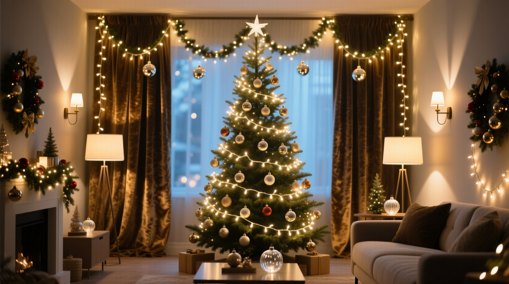
Most people don’t fail at Christmas lighting because they lack lights—they fail because they lack intention. A single strand of warm white LEDs on a bare pine bough feels sparse. Ten strands haphazardly wrapped around the same branch feel like visual static. The difference between “festive” and “fractured” lies not in quantity, but in hierarchy: how light is ordered in space, time, and tone. Layering isn’t about adding more—it’s about assigning purpose. It’s the difference between illuminating a tree and *revealing* it: its silhouette, its texture, its rhythm from trunk to tip. This approach applies equally to porches, mantels, stair railings, and outdoor shrubbery. When done deliberately, layered lighting creates spatial depth that photographs beautifully, invites closer looking, and sustains visual interest long after the first holiday buzz fades.
The Three-Layer Framework: Base, Mid, Accent
Professional lighting designers—from theatrical stagehands to landscape architects—rely on a consistent three-tier structure: base (foundation), mid (body), and accent (focus). Christmas lighting follows the same logic. Each layer serves a distinct spatial and perceptual function, and skipping or conflating layers is the most common cause of chaos.
The base layer establishes scale and anchors the eye. It’s low-contrast, continuous, and often recessed—think cool-white mini lights outlining rooflines, warm-white C7s tracing foundation planters, or soft LED rope lights tucked beneath deck railings. Its job is not to dazzle, but to define boundaries and ground the composition in the architecture.
The mid layer builds volume and rhythm. This is where most people begin—and stop. It includes lights woven through evergreen garlands, wrapped around banisters, or strung across pergolas. But unlike the base layer, the mid layer should vary in density and rhythm: tighter wraps near structural supports (e.g., column bases), looser spirals toward open ends, and intentional gaps to suggest breath and movement. Uniform spacing here flattens depth; strategic variation creates parallax.
The accent layer delivers focal points and emotional punctuation. These are not additional strands—they’re intentional interruptions: a cluster of vintage-style Edison bulbs suspended above a dining table, flickering flame-effect LEDs nestled in a wreath’s center, or programmable RGB pixels highlighting a single architectural detail (a gable peak, a window arch, the curve of a wrought-iron gate). Accents should be sparing—no more than one per 3–4 linear feet of mid-layer coverage—and always visually “heavier” (larger bulb size, warmer color temp, or motion) than surrounding elements.
Color Temperature & Consistency: Why Warm White Wins (and When Not To)
Color temperature—measured in Kelvin (K)—is the silent conductor of layered lighting. Most residential Christmas displays collapse under mismatched whites: 3000K warm white (soft, candle-like), 4000K neutral white (clean, office-bright), and 6500K cool white (icy, clinical). Mixing these within a single layer creates visual vibration; mixing them across layers destroys cohesion.
For depth without chaos, adopt a strict two-temperature palette: one warm white (2700K–3000K) for base and mid layers, and a *slightly warmer* variant (2200K–2500K) exclusively for accent lights. That subtle shift—like moving from a beeswax taper to a flickering hearth flame—creates perceived depth without jarring contrast. Cool white has its place: as a deliberate, monochromatic base layer for modern architectural features (e.g., crisp LED strips under floating shelves or stark white fascia boards), but only when paired with *no other white temperatures* in the same sightline.
This discipline extends to bulb type. Mixing incandescent C7s with LED mini-lights in the same layer causes inconsistent dimming, uneven color rendering, and timing mismatches in animated sequences. Choose one technology per layer—and stick to it. Modern filament-style LEDs now replicate the warmth and glow of vintage bulbs while offering reliability and energy efficiency. They’re the pragmatic choice for all three layers in most residential settings.
| Layer | Recommended Color Temp | Bulb Type Guidance | Why This Works |
|---|---|---|---|
| Base | 2700K–3000K | Uniform mini-lights or rope lights; avoid mixed technologies | Creates a stable, unobtrusive foundation that recedes visually |
| Mid | 2700K–3000K (same as base) | Same tech as base; consider slightly larger bulbs (e.g., 5mm instead of 2.5mm) for gentle visual weight | Maintains harmony while adding tactile presence through scale—not color |
| Accent | 2200K–2500K | Filament LEDs or warm-dimming smart bulbs; avoid standard cool-white accents | The perceptual “warmth gradient” pulls the eye forward, enhancing depth perception |
| Avoid | All cool-white (4000K+) in living areas | Mixing incandescent and LED in same layer | Cool whites compete with natural dusk light; mixed tech creates inconsistent dimming and color shifts |
A Real Example: Transforming a Standard Front Porch
Consider the Miller residence—a typical Colonial-style home with a covered front porch, brick columns, a wooden railing, and two mature boxwood shrubs flanking the steps. Last year, their display used 12 identical strands of multicolor mini-lights: four wrapped haphazardly around columns, six draped over the railing, and two tossed into the boxwoods. Guests described it as “busy” and “hard to look at for long.”
This December, they applied the three-layer framework:
- Base layer: Two 16-foot strands of 2700K LED mini-lights installed along the underside of the porch roofline and the top edge of the brick columns—creating a clean, floating frame.
- Mid layer: Six 25-foot strands of the same 2700K mini-lights, hand-wrapped around the wooden railing with deliberate spacing: tight coils (1-inch gaps) near column connections, loosening to 3-inch gaps toward the open ends, and a 6-inch gap centered on the railing’s longest span to create visual breathing room.
- Accent layer: Four 2200K filament LED bulbs (E12 base) mounted on adjustable brass stems, positioned to highlight: (1) the carved capital of the left column, (2) the grain pattern in the center railing post, (3) the topmost tier of the right boxwood, and (4) the brass door knocker. No animation—just steady, rich warmth.
The result? Depth emerged naturally. The base layer receded, making the porch feel taller. The mid layer’s rhythmic spacing created implied motion, guiding the eye from column to column. The accents didn’t shout—they invited inspection. Neighbors reported the display looked “expensive” and “intentional,” not “overdone.” Crucially, the Millers spent *less* time adjusting lights this year because each strand had a defined role.
Step-by-Step: Installing Your Layers in Order
Sequence matters. Installing layers out of order guarantees rework and visual conflict. Follow this exact progression:
- Map & Measure (Day 1): Sketch your space. Note architectural lines (roof edges, column heights, railing lengths). Measure each zone. Calculate total linear footage needed for base (edges only), mid (volumes only), and accent (3–5 key features max).
- Install Base Layer First (Day 2): Mount clips or staples *only* along hard edges—roof fascia, column tops, planter rims. Use uniform spacing (every 6–8 inches). Test before securing. Ensure no sagging or visible wiring.
- Install Mid Layer Second (Day 3): Work section by section. For railings: start at a support post, wrap tightly for 2 feet, ease spacing gradually, leave a 6-inch gap before the next post. For garlands: weave lights *through* foliage—not just over it—to create internal glow. Avoid overlapping strands.
- Install Accent Layer Last (Day 4): Position each accent light *after* base and mid are lit. Use a ladder and a second person to judge sightlines. Adjust height and angle until the feature “pops” without washing out surrounding layers.
- Final Walkthrough & Refinement (Day 5): View at full darkness. Turn off all lights, then switch on base only. Does it define space? Then add mid layer. Is rhythm clear? Finally, add accents. Dim base/mid by 20% if accents dominate. Remove *any* light that doesn’t serve its layer’s purpose.
“Depth in lighting isn’t achieved by stacking brightness—it’s achieved by controlling where the eye rests, where it travels, and where it pauses. Every light must earn its place in the hierarchy.” — Lena Torres, Lighting Designer, Illumina Studio (15+ years residential holiday design)
Common Pitfalls & How to Avoid Them
Even with sound principles, execution stumbles. Here’s what derails layering—and how to course-correct:
- Pitfall: Overloading the mid layer. Solution: Count strands, not feet. For a standard 30-foot railing, use no more than 3–4 strands of 25-foot lights. More strands force tighter wrapping, eliminating negative space—the very element that creates depth.
- Pitfall: Using animation indiscriminately. Solution: Reserve motion for *one* accent layer only—e.g., gentle pulse on a wreath’s center bulb. Base and mid layers should remain steady. Flicker or chase effects in foundational layers read as instability, not festivity.
- Pitfall: Ignoring power load and circuit limits. Solution: Calculate total wattage (watts = volts × amps). Most household circuits handle 1,800W. A standard 100-light mini-strand draws ~4.8W. 20 strands = ~96W—well within limit. But 20 strands of older incandescent C7s (approx. 120W each) = 2,400W—dangerous overload. Always check manufacturer specs.
- Pitfall: Forgetting maintenance access. Solution: Install base layer clips with removable fasteners (e.g., adhesive hooks instead of staples). Leave 12 inches of slack at each end of mid-layer strands for easy removal. Accents should mount with tool-free hardware. Chaos isn’t just visual—it’s logistical.
FAQ
Can I layer lighting on a small balcony or apartment patio?
Absolutely—and it’s where layering shines brightest. Scale down the framework: base layer = LED strip under railing lip; mid layer = single strand wrapped vertically around a potted evergreen or trellis; accent = one warm filament bulb clipped to the pot’s rim, angled upward. In tight spaces, fewer lights with clearer roles create more impact than crowded abundance.
What if I already have multicolor lights? Can I still layer effectively?
Yes—but reassign their role. Use multicolor strands *only* as a single, intentional accent layer (e.g., a slow-color-shift pixel string highlighting a single architectural curve). Never mix them into base or mid layers. Their inherent visual complexity overwhelms foundational structure. If you love color, commit to one hue per layer: warm white base/mid, deep red or forest green accents.
How do I store layered displays for next year without unraveling the work?
Label every strand by layer and location: “BASE_ROOFLINE,” “MID_RAILING_LEFT,” “ACCENT_COLUMN_CAPITAL.” Coil each separately using the “over-under” method (loop over hand, then under, alternating) to prevent kinks. Store in rigid, labeled bins—not plastic bags—to preserve coil shape. Include a photo of the final setup and a quick sketch of layer placement. Next year’s installation will take half the time.
Conclusion
Layered Christmas lighting is not decoration—it’s spatial storytelling. It transforms static objects into dynamic experiences: a porch becomes a threshold, a tree becomes a cathedral, a wreath becomes a portrait. The tools are simple—lights, clips, patience—but the mindset is precise: every bulb must answer three questions: What layer am I in? What boundary or volume or feature do I define? What would vanish if I were removed? When you install with that clarity, chaos dissolves. What remains is depth—not measured in inches, but in moments of quiet appreciation, in the way light pools on snow, in the warmth that lingers long after the last guest has gone home.


 浙公网安备
33010002000092号
浙公网安备
33010002000092号 浙B2-20120091-4
Comments
No comments yet. Why don't you start the discussion?