
A beautifully decorated Christmas tree is more than a collection of shiny baubles—it’s a statement of style, memory, and seasonal joy. Yet, many well-intentioned decorators fall into the trap of visual clutter when combining velvet ribbons, glittering glass, matte ceramics, and rustic wood ornaments. The result? A tree that feels busy, overwhelming, or disjointed. The secret to avoiding this lies not in limiting texture but in mastering its orchestration. When done thoughtfully, mixing textures adds depth, warmth, and dimension to your holiday display. This guide reveals how to layer diverse ornament materials harmoniously, so your tree feels curated—not chaotic.
Understand the Role of Texture in Holiday Design
In interior design, texture refers to the surface quality of an object—whether smooth, rough, glossy, or soft. On a Christmas tree, texture influences how light reflects, how ornaments catch the eye, and how the overall arrangement feels to the viewer. A tree composed entirely of shiny glass balls may dazzle but lack warmth. One filled only with felted animals may feel cozy but visually flat. Layering textures bridges that gap, creating balance between sparkle and softness, luxury and nostalgia.
The goal isn’t uniformity, but harmony. Think of your tree as a symphony: each ornament type is an instrument. Alone, a brass section (shiny metals) can be loud; strings (matte fabrics) soothing. But together, under careful direction, they create something richer than the sum of their parts.
“Texture is the silent storyteller of holiday decor. It evokes touch, memory, and mood—even from across the room.” — Lila Monroe, Interior Stylist & Author of *Seasonal Spaces*
Establish a Cohesive Color Palette First
Before introducing multiple textures, anchor your design with a consistent color scheme. This acts as the unifying thread that allows varied materials to coexist peacefully. Without color cohesion, even subtle textural differences can clash.
Choose 3–4 primary colors, including one dominant shade, one secondary, and one or two accents. For example:
- Classic Elegance: Ivory (dominant), forest green (secondary), gold (accent), deep burgundy (accent)
- Modern Minimalist: White (dominant), charcoal gray (secondary), silver (accent), blush (accent)
- Rustic Woodland: Cream (dominant), moss green (secondary), copper (accent), walnut brown (accent)
Once your palette is set, ensure every ornament—regardless of material—falls within these hues. A velvet ball in ivory will naturally pair with a frosted glass one in the same tone, even if their finishes differ dramatically.
Create a Textural Hierarchy: The 60-30-10 Rule
Just as fashion stylists use proportions to balance patterns, interior designers apply the 60-30-10 rule to manage texture effectively on a Christmas tree. This principle allocates visual weight across three categories:
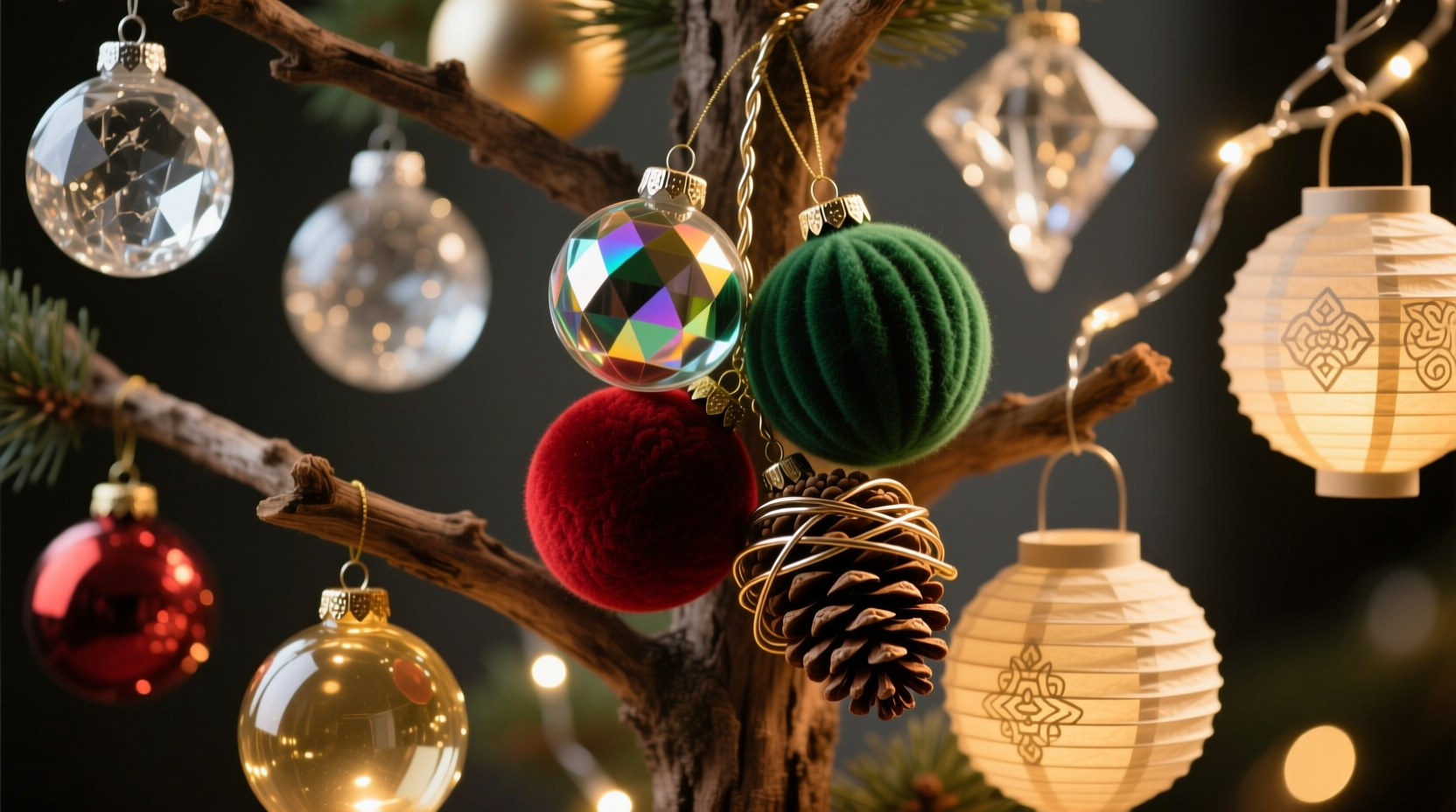
- 60% Dominant Texture: The base layer—usually medium-sheen or matte ornaments like satin-finish glass, ceramic, or painted wood.
- 30% Secondary Texture: Adds contrast—examples include velvet, linen-wrapped balls, or hammered metal.
- 10% Accent Texture: High-impact elements such as mirrored glass, crystal prisms, sequined fabric, or hand-carved antlers.
This distribution ensures no single texture overwhelms the others. The dominant layer provides calm continuity, while accent textures draw the eye without dominating.
| Tree Style | Dominant (60%) | Secondary (30%) | Accent (10%) |
|---|---|---|---|
| Vintage Glamour | Frosted glass | Velvet ribbons | Mirrored baubles |
| Rustic Farmhouse | Unfinished wood | Burlap-wrapped | Antler-shaped metal |
| Modern Chic | Matte ceramic | Brushed brass | Clear acrylic geometric |
| Coastal Holiday | Sea glass tones | Driftwood slices | Seashell clusters |
Sticking to this ratio prevents sensory overload. If you love glitter, for instance, limit it to small accents rather than full coverage. A few shimmering pinecones scattered among matte ornaments create magic without mayhem.
Strategic Placement: How to Hang Ornaments for Balance
Even with the right mix of textures and colors, poor placement can still lead to visual imbalance. Follow these spatial guidelines to distribute ornaments thoughtfully:
Work from Inside Out and Bottom Up
Begin by placing larger, heavier ornaments deep within the branches, near the trunk. This creates depth and prevents the tree from looking like a hollow shell. Use wire hooks to secure them firmly.
Layer mid-sized ornaments outward, spacing them evenly around the tree’s circumference. Avoid clustering similar textures together—alternate a glossy ball with a matte one, or place a textured ribbon bow between two smooth globes.
Use the “Squint Test” for Visual Flow
Periodically step back and squint at your tree. This blurs details and highlights areas of over-concentration or emptiness. If one side looks darker, busier, or shinier, adjust by moving a few ornaments to balance the weight.
Incorporate Linear Elements for Breaks
Strings of popcorn, cinnamon sticks, or delicate bead garlands act as linear textures that break up dense clusters of round ornaments. They guide the eye vertically and horizontally, preventing stagnation.
Real Example: Transforming a Cluttered Tree
Sarah, a homeowner in Portland, loved collecting ornaments from her travels—hand-blown glass from Prague, embroidered fabric balls from Mexico, and wooden stars from a local craft fair. Her tree, however, looked like a museum of souvenirs rather than a unified display. She reached out to a local stylist who applied the following steps:
- Assessed the palette: Most ornaments were red, white, or gold—so those became the anchors.
- Culled aggressively: Removed 40% of the ornaments, keeping only those in the core colors or with exceptional sentimental value.
- Applied the 60-30-10 rule: Frosted glass (60%), velvet poinsettias (30%), and antique mercury glass (10%) formed the new structure.
- Replaced garlands: Swapped tangled tinsel for a handmade paper chain in cream and gold.
- Added breathing room: Left 15–20% of branches bare to let the tree “breathe.”
The result was a tree that felt personal, luxurious, and serene. Guests commented they could finally “see the beauty in each piece” because nothing was competing for attention.
Avoid Common Texture Pitfalls
Even experienced decorators make mistakes when blending textures. Here are frequent missteps and how to correct them:
- Overusing reflective surfaces: Too many mirror-like ornaments scatter light erratically, causing visual fatigue. Limit high-gloss items to focal points.
- Ignoring scale: Large textured ornaments (e.g., oversized knit snowflakes) need space. Pair them with simpler, smaller companions.
- Mixing too many “busy” textures: Combining lace, fringe, glitter, and fur on one tree creates sensory overload. Choose one or two intricate textures max.
- Neglecting lighting interaction: LED lights enhance matte textures less than glossy ones. Consider warmer bulbs to bring out depth in fabric and wood.
“When in doubt, edit. A tree with fewer, well-placed ornaments always reads as more intentional than one crammed with favorites.” — Marcus Reed, Set Designer for Holiday Magazine Features
Step-by-Step Guide: Layering Textures Like a Pro
Follow this sequence to build a balanced, texturally rich tree:
- Start with lights: Weave them through branches from trunk to tip. Test them first and ensure even distribution.
- Add garland or ribbon: Apply in loose spirals. Choose one or two complementary textures (e.g., satin ribbon with woven jute).
- Hang largest ornaments first: Place them deep in the tree, spaced evenly. These form your foundation.
- Introduce secondary textures: Add mid-size ornaments, alternating materials (glass next to fabric, metal next to wood).
- Insert accent pieces: Position high-luster or uniquely shaped ornaments where they’ll catch light—near the front or top.
- Fill gaps mindfully: Use smaller ornaments to fill holes, but leave some negative space for elegance.
- Top the tree: Choose a finial that complements your texture story—a fabric star, brushed metal angel, or knotted ribbon bow.
- Final review: Step back, squint, and walk around the tree. Adjust any overcrowded zones.
Checklist: Texture-Layering Success
Before declaring your tree complete, run through this checklist:
- ✅ I have a defined color palette of 3–4 shades.
- ✅ My ornaments follow the 60-30-10 texture rule.
- ✅ No two high-gloss or highly detailed ornaments are touching.
- ✅ I’ve placed larger ornaments toward the interior and bottom.
- ✅ There are visible gaps—my tree isn’t overcrowded.
- ✅ Lighting enhances, not fights, the textures.
- ✅ I’ve stepped back to check balance from multiple angles.
FAQ
Can I mix vintage and modern ornaments without clashing?
Yes—focus on unifying elements like color or shape. A 1950s silver tinsel ornament can sit beside a modern matte black ball if both are spherical and placed with breathing room. Let the tree’s overall rhythm guide the eye, not individual eras.
How do I incorporate handmade ornaments without disrupting the look?
Treat handmade pieces as accent textures (part of the 10%). Cluster similar styles together—for example, group all children’s crafts on a single lower branch. This honors their charm without fragmenting the design.
Is it okay to have no shiny ornaments at all?
Absolutely. A matte-only tree—using wool, felt, paper, and wood—can be deeply calming and sophisticated. Enhance it with warm white lights to add subtle glow without shine.
Conclusion: Create a Tree That Tells a Calm, Coherent Story
A Christmas tree layered with diverse textures doesn’t have to teeter on the edge of chaos. With a clear color foundation, disciplined proportion, and mindful placement, you can celebrate variety without sacrificing serenity. The most memorable trees aren’t the fullest or shiniest—they’re the ones that invite quiet admiration, where every ornament feels like it belongs. This season, resist the urge to hang every keepsake. Instead, curate with intention. Let texture deepen your story, not drown it out.


 浙公网安备
33010002000092号
浙公网安备
33010002000092号 浙B2-20120091-4
Comments
No comments yet. Why don't you start the discussion?