
A powerful logo is more than just an image—it’s the visual cornerstone of your brand identity. In a crowded marketplace, a distinctive logo can be the difference between being remembered and being overlooked. Creating one doesn’t require expensive tools or a design degree, but it does demand clarity, creativity, and strategy. This guide walks through the essential steps to craft a logo that captures attention, conveys meaning, and endures over time.
Understand Your Brand’s Core Identity
Before sketching or selecting fonts, define what your brand truly represents. A standout logo reflects your company’s values, personality, and mission. Ask yourself: What emotions should your brand evoke? Who is your ideal customer? What makes your business different?
For example, a law firm might aim for trust and professionalism, favoring clean lines and conservative typography. A children’s toy brand, on the other hand, may lean into playful shapes and vibrant colors.
Research Competitors and Industry Trends
Effective differentiation begins with awareness. Study logos in your industry to identify common patterns—whether it’s color schemes, icon styles, or font choices. Note what works and where opportunities exist to stand apart.
Don’t copy, but observe. If every competitor uses blue and serif fonts, consider whether a bold sans-serif or a contrasting color like terracotta could help you break through.
“A great logo doesn’t follow trends—it sets them by reflecting authenticity.” — Lena Torres, Brand Strategist at Studio Nova
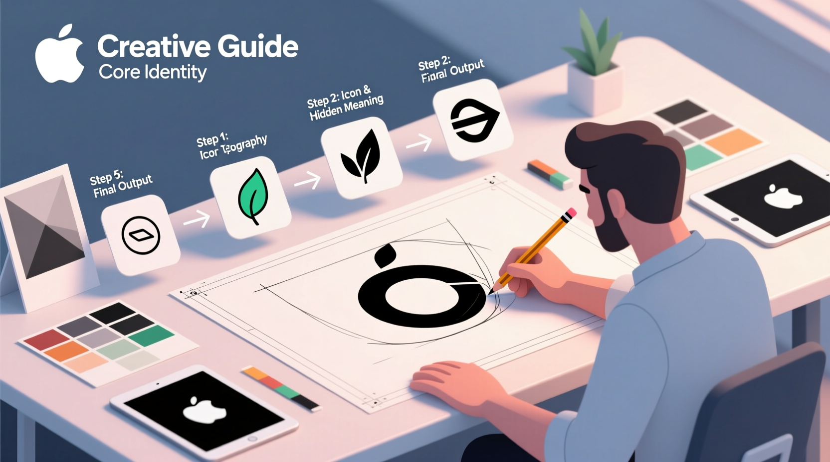
Step-by-Step Logo Creation Process
Follow this structured approach to build a logo that’s both original and effective.
- Define your objectives: What should the logo communicate? Trust? Innovation? Speed? Clarity here guides every decision.
- Choose your logo type: Common formats include wordmarks (e.g., Google), lettermarks (e.g., HBO), pictorial marks (e.g., Apple), abstract symbols (e.g., Nike Swoosh), and combination marks (e.g., Burger King). Select based on memorability and scalability.
- Sketch initial ideas: Use pen and paper to brainstorm freely. Focus on concepts, not perfection. At this stage, quantity fuels quality.
- Select colors wisely: Color psychology plays a major role. Blue suggests trust, red evokes energy, green implies growth. Limit your palette to 1–3 colors for cohesion.
- Pick typography with purpose: Fonts carry tone. Serifs feel traditional; sans-serifs read modern; scripts suggest elegance. Avoid overly decorative fonts that sacrifice legibility.
- Digitalize your top concepts: Use design software like Adobe Illustrator, Figma, or Canva to refine your sketches into scalable vector graphics.
- Test across mediums: View your logo on a business card, website header, and social media avatar. Does it remain clear and recognizable at small sizes?
- Get feedback: Share with trusted team members or target customers. Ask: “What does this logo say about the brand?” without guiding their interpretation.
- Finalize and document: Lock in your primary version, then create variations (horizontal, vertical, monochrome) for different uses. Establish brand guidelines for consistent application.
Design Principles That Make Logos Stand Out
A memorable logo balances simplicity, scalability, and significance. The best designs are instantly recognizable, even when stripped of color or reduced to a favicon.
| Principle | Do | Avoid |
|---|---|---|
| Simplicity | Use minimal elements; focus on one strong idea | Overly detailed illustrations or multiple fonts |
| Scalability | Ensure legibility at all sizes | Fine lines or tiny text that disappear when shrunk |
| Uniqueness | Create a custom mark or unexpected twist | Generic clipart or overused symbols (e.g., globes for “international”) |
| Timelessness | Design for longevity, not fleeting trends | Gradients, skeuomorphism, or trendy fonts that date quickly |
| Versatility | Work in color, black-and-white, and reversed (light/dark backgrounds) | Colors so specific they fail in monochrome contexts |
Real-World Example: From Concept to Recognition
Consider “GreenSprout Organics,” a startup selling eco-friendly meal kits. Initially, their logo used a generic leaf icon with green text—indistinguishable from competitors. After rebranding, they introduced a custom sprout shape integrated into the “G” of their name. The symbol doubled as a checkmark, subtly conveying approval and health.
The new design used a warm olive green and a clean geometric font. It worked equally well on packaging, app icons, and delivery boxes. Within six months, customer recall increased by 40%, and the logo became a talking point in local press features.
Essential Checklist Before Finalizing
- ✅ Does the logo reflect our brand’s personality and values?
- ✅ Is it legible at small sizes (e.g., app icon or social profile)?
- ✅ Does it work in black and white?
- ✅ Is the file saved in vector format (SVG, AI, EPS) for scalability?
- ✅ Have we created variations for light and dark backgrounds?
- ✅ Is there enough spacing around the logo (clear space rule)?
- ✅ Are font licenses cleared if using third-party typefaces?
Frequently Asked Questions
How much should I spend on a logo design?
Costs vary widely—from $50 on freelance platforms to $10,000+ for agency work. For most small businesses, investing $300–$1,500 ensures quality and ownership rights. Consider it a long-term brand asset, not a one-time expense.
Can I design my own logo without experience?
Yes, especially with user-friendly tools like Canva or Looka. However, self-design requires discipline to avoid clichés and maintain professional standards. If branding is central to your business, collaborating with a designer often pays dividends in impact and credibility.
How do I protect my logo legally?
Once finalized, trademark your logo through your national intellectual property office (e.g., USPTO in the U.S.). This prevents others from using a similar mark in your industry. Also, keep design source files and documentation of creation dates.
Conclusion: Turn Vision Into Visual Impact
A standout logo isn’t born from randomness—it emerges from intention. By grounding your design in brand truth, applying timeless principles, and refining through iteration, you create more than a graphic: you forge a symbol of recognition and trust.
Your logo will appear on websites, packaging, uniforms, and ads. Make it count. Start today with a blank page and a clear mind. Sketch boldly, choose deliberately, and test relentlessly. When done right, your logo won’t just stand out—it will speak volumes.


 浙公网安备
33010002000092号
浙公网安备
33010002000092号 浙B2-20120091-4
Comments
No comments yet. Why don't you start the discussion?