
A strong logo is more than just a pretty design—it’s the visual anchor of your brand. For new entrepreneurs, freelancers, or creatives launching a personal brand, creating a standout logo can feel overwhelming. Yet, with the right approach, even someone with no formal design experience can craft a logo that communicates professionalism, clarity, and uniqueness. The key lies in understanding core design principles, knowing your audience, and following a structured process. This guide walks you through each stage, from concept to finalization, with actionable steps that ensure your logo doesn’t just exist—but resonates.
Understand What Makes a Logo Effective
Before sketching or opening a design tool, it’s essential to recognize the qualities of a successful logo. A great logo isn’t judged solely on aesthetics but on its ability to communicate identity, remain recognizable at various sizes, and endure over time. Simplicity, scalability, relevance, and memorability are non-negotiable traits.
Consider some of the most iconic logos—Nike’s swoosh, Apple’s apple, or McDonald’s golden arches. None rely on complex details or color gradients. Instead, they use clean shapes, bold ideas, and strategic minimalism. These logos work because they’re instantly identifiable, even in black and white or when scaled down to favicon size.
“Design is not just what it looks like. Design is how it works.” — Steve Jobs
Your logo should reflect your brand’s personality. Is your business playful or serious? Innovative or traditional? Answering these questions early ensures your design aligns with your message.
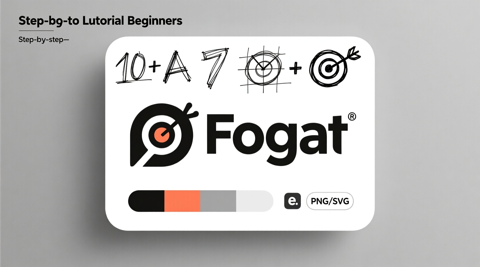
Step-by-Step Guide to Creating Your Logo
Creating a standout logo doesn’t require expensive software or years of training. Follow this clear, seven-step process to build a professional-looking logo from the ground up.
- Define your brand identity: Before designing, clarify your mission, values, target audience, and unique selling proposition. Ask: What emotions should your brand evoke?
- Research competitors and trends: Study logos in your industry. Note common colors, fonts, and symbols. Identify gaps where you can differentiate.
- Sketch initial concepts by hand: Use pen and paper to brainstorm rough ideas. Don’t aim for perfection—focus on exploring shapes, icons, and typography combinations.
- Choose the right type of logo: Decide between wordmarks (text-only), lettermarks (initials), pictorial marks (symbols), abstract marks, or combination marks. Each serves different branding needs.
- Select fonts and colors strategically: Typography conveys tone. Sans-serif fonts suggest modernity; serif fonts imply tradition. Colors trigger psychological responses—blue for trust, red for energy, green for growth.
- Digitalize your best sketches: Use free tools like Canva, Inkscape, or Adobe Express to refine your top 2–3 concepts into digital versions.
- Test and refine: View your logo at different sizes, in grayscale, and on mockups (e.g., business cards, websites). Gather feedback from trusted peers before finalizing.
Common Pitfalls to Avoid
Even well-intentioned designs can fall short due to common mistakes. Recognizing these early helps you create a more polished and effective logo.
| Mistake | Why It Hurts | Better Approach |
|---|---|---|
| Overcomplicating the design | Loses clarity when scaled down; hard to remember | Focus on one central idea or symbol |
| Using trendy fonts or effects | Looks dated quickly; lacks timelessness | Opt for classic, legible typefaces |
| Ignoring versatility | Fails across media (print, web, merchandise) | Ensure it works in black and white and small formats |
| Copying competitors | Blends in instead of standing out | Inspire from others, but innovate uniquely |
Real Example: From Idea to Impact
Sophie, a freelance yoga instructor, wanted a logo for her wellness brand “Breathe With Sophie.” Initially, she considered using a generic lotus icon found online. After researching, she realized dozens of local instructors used the same image. To stand out, she combined a custom-drawn leaf shape with flowing script typography that mirrored the breath-like movement of yoga. She limited her palette to soft sage green and charcoal gray—colors associated with calm and balance.
She tested the logo on her website, class flyers, and Instagram profile. Students consistently commented on how peaceful and professional it felt. Within three months, her client base grew by 40%, and she attributed part of that success to her distinctive, thoughtful branding.
Essential Checklist for Your Final Logo
Before launching your logo, run through this checklist to ensure it meets professional standards:
- ✅ It clearly represents your brand’s essence
- ✅ It’s simple enough to be recognized in 3 seconds
- ✅ It works in black and white (tests for contrast and clarity)
- ✅ It scales well—from a mobile app icon to a billboard
- ✅ It’s original and not derived from copyrighted material
- ✅ It uses no more than two fonts and two to three colors
- ✅ It’s saved in multiple formats (PNG, SVG, JPG) for different uses
“A logo is not art. It’s a corporate identifier. Its job is to be clear, consistent, and memorable.” — Paula Scher, Pentagram Design Partner
Frequently Asked Questions
Do I need to hire a designer to make a good logo?
Not necessarily. Many successful brands started with self-designed logos. However, if budget allows, a professional designer brings expertise in typography, spacing, and brand strategy that can elevate your result. For beginners, user-friendly tools like Canva or Looka offer guided logo creation with customizable templates.
How do I know if my logo is too similar to another brand’s?
Conduct a reverse image search using Google Images. Upload your design or describe key elements and see if anything closely matches. Also, check trademark databases like USPTO.gov (U.S.) or WIPO (international) to avoid legal issues. When in doubt, modify colors, proportions, or add a unique typographic twist.
Can I change my logo later?
Yes—and many brands do as they evolve. However, frequent changes weaken recognition. Aim to create a timeless foundation now, so future updates are refinements, not overhauls. Think of Google or Twitter—they’ve updated their logos subtly over time while maintaining core identity.
Final Thoughts: Build a Logo That Lasts
Creating a standout logo isn’t about chasing trends or mastering advanced software. It’s about clarity of purpose, attention to detail, and consistency. By grounding your design in your brand’s values and following a methodical process, you lay the foundation for long-term recognition and trust.
Remember, your logo is often the first impression people have of your business. Make it count. Start small, test often, and refine with intention. Whether you're launching a side hustle or building a full-fledged company, a strong logo gives you credibility from day one.


 浙公网安备
33010002000092号
浙公网安备
33010002000092号 浙B2-20120091-4
Comments
No comments yet. Why don't you start the discussion?