
A site logo is more than just a visual mark—it’s the cornerstone of your brand’s identity. It communicates professionalism, values, and purpose at a glance. Whether you're launching a startup, rebranding an existing business, or building a personal portfolio, a well-crafted logo sets the tone for how your audience perceives you. Creating one doesn’t require a design degree, but it does demand intention, clarity, and strategy. This guide walks through the essential steps to build a logo that looks polished, conveys meaning, and endures over time.
Understand Your Brand Identity First
Before sketching or opening a design tool, define what your brand represents. A logo should reflect core values, target audience, and industry positioning. Ask yourself: What emotions do you want your brand to evoke? Is it trustworthy and traditional, or bold and innovative? Who are you speaking to—corporate clients, young creatives, or eco-conscious consumers?
Clarity here prevents arbitrary design choices. For instance, a law firm might lean toward serif fonts and deep blue tones to convey authority, while a sustainable skincare brand may use soft greens and organic shapes to suggest nature and wellness.
Research Competitors and Industry Trends
Effective logos stand out while fitting within their category. Study 5–10 competitors’ logos to identify common patterns—color schemes, typography styles, symbol usage—and decide whether to align with or differentiate from them.
For example, tech startups often use minimalist sans-serif fonts and abstract geometric icons. If every competitor uses blue, consider a complementary color like deep purple or warm terracotta to be memorable without clashing.
“Design is not just what it looks like. Design is how it works.” — Steve Jobs
Jobs emphasized functionality and user perception. Apply this mindset: your logo must work across websites, business cards, social media avatars, and merchandise. Simplicity ensures scalability and recognition.
Choose the Right Logo Type
Not all logos are created equal. The structure you choose impacts versatility and memorability. Here are the primary types:
- Wordmark (Logotype): Focuses on stylized text (e.g., Google, Coca-Cola).
- Lettermark: Uses initials (e.g., HBO, CNN).
- Pictorial Mark (Logo Symbol): An icon alone (e.g., Apple’s apple, Twitter’s bird).
- Abstract Mark: Non-representational shape (e.g., Nike Swoosh, Pepsi circle).
- Combination Mark: Icon + text (e.g., Burger King, Adidas).
- Emblem: Text inside a symbol (e.g., Starbucks, BMW).
Startups and personal brands often benefit from combination marks—they’re descriptive and scalable. Established names may opt for symbols alone once brand recognition is strong.
When to Use Each Type
| Logo Type | Best For | Limits |
|---|---|---|
| Wordmark | Brands with unique, short names | Hard to scale down; less visual interest |
| Lettermark | Long company names (e.g., International Business Machines) | Requires initial recognition |
| Pictorial Mark | Strong visual identity goals | Needs high memorability to work alone |
| Combination Mark | New brands building awareness | Can be bulky on small screens |
| Emblem | Traditional or institutional brands | Complex details don’t scale well digitally |
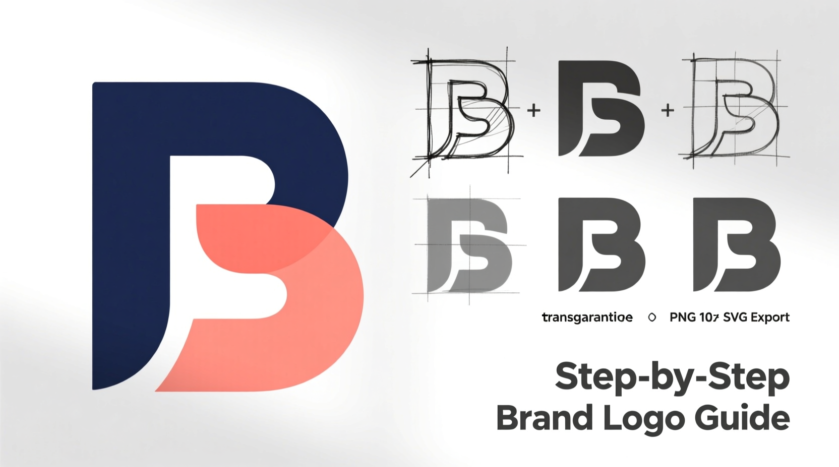
Design Step-by-Step: From Sketch to Final File
Now that you’ve laid the groundwork, follow this practical sequence to create your logo.
- Sketch ideas on paper. Don’t jump into software yet. Doodle 10–20 rough concepts focusing on shapes, letters, and metaphors related to your brand.
- Select top 3 concepts. Choose those that best reflect your brand voice and are simple enough to recognize at small sizes.
- Digitalize using vector software. Use tools like Adobe Illustrator, Figma, or Inkscape. Vector formats (SVG, EPS) ensure crisp scaling.
- Refine typography. Pick one or two complementary fonts. Avoid overly decorative typefaces. Test readability in all caps, lowercase, and at tiny sizes.
- Limit your color palette. Stick to 1–3 colors. Use color psychology: blue for trust, green for growth, red for energy.
- Test in context. Place your logo on mockups: website header, business card, app icon. Does it remain clear and balanced?
- Get feedback. Show it to trusted peers or potential customers. Ask: “What does this say about the brand?” without guiding them.
- Finalize and export. Save in multiple formats: SVG for web, PNG with transparent background, and high-res PDF for print.
Mini Case Study: Launching “EcoBloom” Skincare
EcoBloom began as a home-based organic skincare line. The founder wanted a logo that felt clean, natural, and premium. After researching competitors—all using leaf motifs and earthy tones—she decided to avoid clichés. Instead, she combined a stylized water droplet with a blooming curve, symbolizing hydration and renewal.
The wordmark used a modern sans-serif with slight organic curves in the letterforms. Colors were limited to sage green and off-white. She tested the logo on product labels and Instagram posts, ensuring legibility even as a 32x32 favicon. Within three months, customers recognized the brand solely by its icon—a sign of effective design.
Common Mistakes to Avoid
Even thoughtful efforts can falter due to oversights. Watch for these pitfalls:
- Overcomplicating the design. Too many elements confuse viewers. Aim for instant recognition.
- Using default fonts. Arial or Times New Roman lack distinction. Invest in a licensed font or custom lettering.
- Ignoring scalability. If your logo becomes a blur when shrunk to app size, it won’t work.
- Chasing trends. Gradients, 3D effects, or ultra-thin fonts may look dated in a few years.
- Skipping legal checks. Ensure your logo doesn’t infringe on existing trademarks.
“A great logo is distinctive, appropriate, practical, graphic, and simple.” — Paul Rand, Legendary Graphic Designer
Checklist: Create a Professional Logo in 10 Steps
Use this checklist to stay on track:
- Define your brand mission and personality
- Analyze competitor logos
- Decide on logo type (wordmark, symbol, combo, etc.)
- Brainstorm keywords and visual metaphors
- Sketch at least 10 hand-drawn concepts
- Select 2–3 strongest directions
- Digitalize using vector software
- Choose 1–2 fonts and a 3-color max palette
- Test visibility at various sizes and backgrounds
- Export final files in SVG, PNG, and PDF formats
Frequently Asked Questions
Can I make a good logo without hiring a designer?
Yes, especially with today’s intuitive tools like Canva, Looka, or Adobe Express. However, success depends on research, iteration, and attention to detail. Free tools have limitations in customization and licensing, so review terms carefully.
How much should I spend on a logo?
Prices vary widely. DIY tools cost $0–$50. Freelance designers charge $100–$1,000 depending on experience. Agency-level work can exceed $5,000. For most small businesses, investing $200–$500 balances quality and value. Remember: your logo is a long-term asset.
Should my logo include my business name?
In early stages, yes. Recognition builds trust. As your brand grows, you may phase in a standalone icon. But initially, pairing text with a symbol ensures people know who you are.
Final Thoughts: Build a Logo That Lasts
A professional site logo isn’t created overnight. It emerges from understanding your brand, studying the landscape, and refining ideas with purpose. The most enduring logos—Nike, Apple, FedEx—are simple, meaningful, and consistent. Yours doesn’t need to be flashy; it needs to be authentic.
Start small. Sketch freely. Test relentlessly. And remember: perfection isn’t the goal—clarity is. When someone sees your logo, they should feel something, even if they can’t explain why.


 浙公网安备
33010002000092号
浙公网安备
33010002000092号 浙B2-20120091-4
Comments
No comments yet. Why don't you start the discussion?