
Banner ads remain one of the most accessible forms of digital advertising, but their effectiveness hinges on more than just visibility. A poorly designed banner gets ignored—even if it's in front of the right audience. To generate real results, your ad must cut through noise, communicate value instantly, and prompt action. This guide walks through the essential principles and practical steps for creating banner ads that don’t just look good—they convert.
Understand the Psychology Behind Click-Worthy Banners
The first rule of effective banner design isn’t about aesthetics—it’s about human behavior. Users decide whether to engage with an ad in under half a second. That means every element must serve a purpose: grabbing attention, building relevance, and guiding toward a click.
Research from Nielsen Norman Group shows that users often exhibit “banner blindness,” instinctively ignoring anything that looks like an advertisement. To overcome this, your design must avoid generic patterns while still adhering to platform expectations.
“Great banner ads don’t shout—they speak directly to a specific need at the exact moment it arises.” — Sarah Lin, Digital Advertising Strategist at GrowthLab
To break through, focus on clarity over cleverness. Use language and visuals that reflect the viewer’s current mindset. For example, someone browsing fitness gear is more likely to respond to “Lose 10 lbs in 30 Days” than “Premium Activewear Collection.” Specificity triggers recognition.
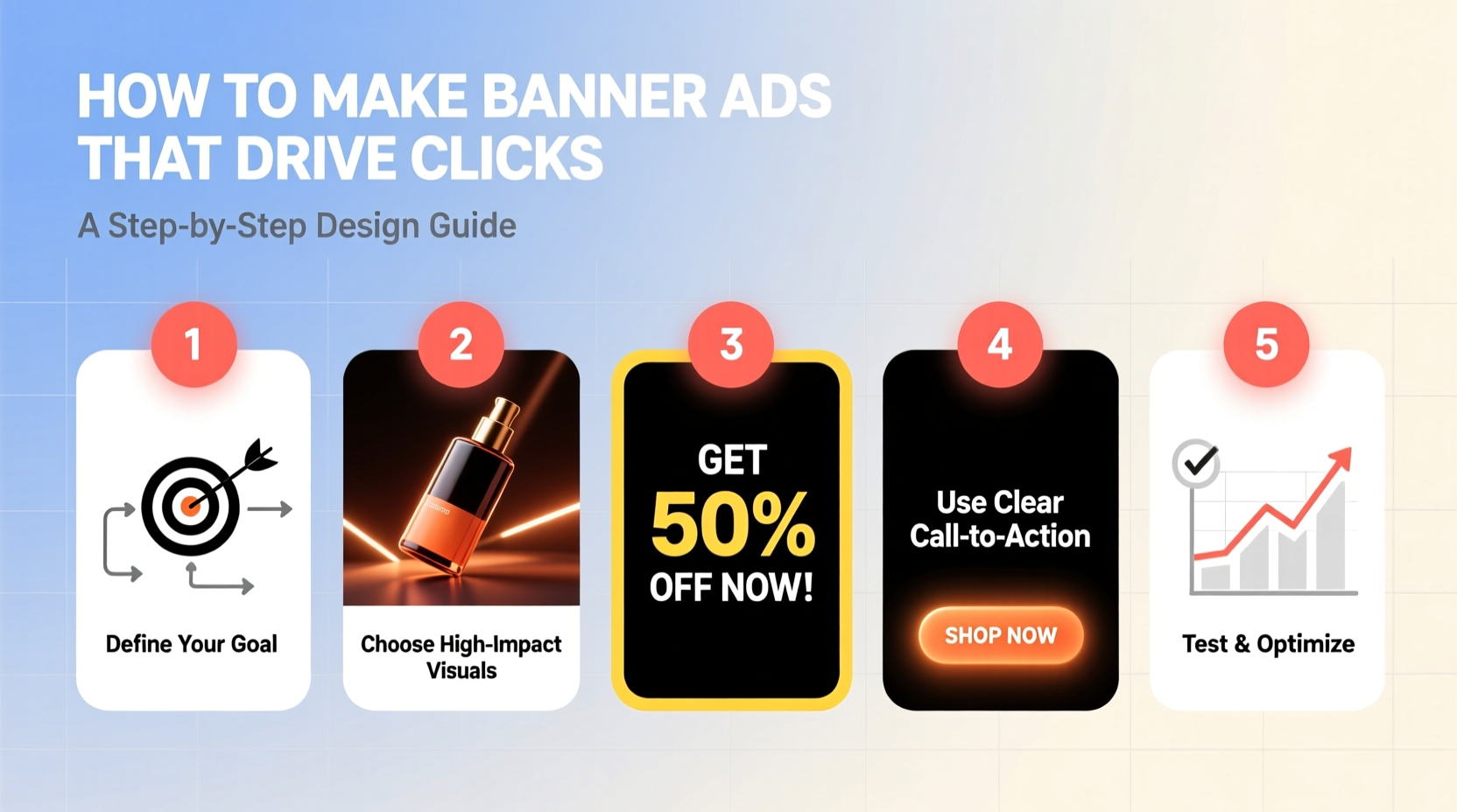
Step-by-Step Design Process for High-Performing Banners
Creating a click-driving banner isn’t guesswork. Follow this structured workflow to maximize impact at each stage.
- Define Your Objective: Are you driving traffic, promoting a sale, or collecting leads? The goal shapes every design decision.
- Know Your Audience: Who are they? What problems do they have? Tailor tone, imagery, and offer accordingly.
- Craft a Killer Headline (5–8 Words Max): It should state a clear benefit or provoke curiosity without being clickbaity.
- Select Supporting Visuals: Use authentic, high-contrast images or illustrations that align with the message.
- Design for Hierarchy: Guide the eye from headline → visual → CTA using size, color, and spacing.
- Optimize the Call-to-Action: Use action-oriented text like “Get Yours Now” instead of passive phrases like “Learn More.”
- Test Responsiveness: Ensure readability and balance on mobile screens, where most impressions occur.
- A/B Test Variations: Run two versions with one changed element (e.g., button color or headline) to determine what converts best.
Visual Best Practices That Boost Engagement
Your design choices directly influence whether someone stops scrolling and clicks. Here are evidence-based guidelines to follow:
- Use high contrast between text and background. White text on dark blue performs better than gray on light beige.
- Limits colors to 3 max: One dominant, one accent, one neutral. Too many hues create visual chaos.
- Keep fonts legible. Sans-serif fonts like Open Sans or Montserrat work best at small sizes.
- Avoid clutter. Leave at least 30% negative space to prevent cognitive overload.
- Show real people when possible, especially smiling faces looking toward the CTA—this subtly guides attention.
| Do | Don't |
|---|---|
| Use bold, simple headlines with active verbs | Fill the space with paragraphs of text |
| Place CTA button in bottom-right corner (natural eye flow) | Hide the CTA behind icons or vague links |
| Feature product in use (e.g., someone wearing headphones) | Use stock photos with fake smiles and unnatural poses |
| Match brand colors and tone consistently | Mix multiple font styles or sizes haphazardly |
Real Example: How a SaaS Company Doubled Their CTR
A mid-sized project management tool was running display ads with a flat 0.35% click-through rate (CTR). After analyzing performance, their team revised the banner strategy using behavioral insights.
They replaced a generic image of their dashboard with a photo of a stressed remote worker at a cluttered desk, overlaid with the headline: “Stop Missing Deadlines.” The CTA read “Automate Your Tasks Free for 14 Days.”
By focusing on emotional pain points and offering a time-bound solution, the new creative increased CTR to 0.78% within three weeks—nearly doubling engagement without increasing budget.
The lesson? Empathy beats polish. When users see themselves in the ad, they’re far more likely to act.
Essential Banner Ad Checklist Before Launch
Before publishing, run through this checklist to ensure your banner meets conversion standards:
- ✅ Headline communicates a clear benefit in under 5 seconds
- ✅ Primary message fits within standard sizes (e.g., 300x250, 728x90)
- ✅ CTA stands out visually (button format, contrasting color)
- ✅ Brand logo is visible but not dominant
- ✅ Text is readable on mobile (minimum 14px font size)
- ✅ File size under 150KB to ensure fast loading
- ✅ No unnecessary animations or distracting transitions
- ✅ Includes a sense of urgency or exclusivity (e.g., “Limited Offer”)
Frequently Asked Questions
How big should the CTA button be?
The CTA should occupy roughly 10–15% of the banner area and be large enough to tap easily on mobile—minimum 44x44 pixels. Use padding and bold text to enhance visibility.
Is animation helpful in banner ads?
When used sparingly, animation can draw attention. However, excessive motion increases bounce rates. Stick to subtle transitions—like a color shift on hover or a two-frame sequence showing before/after—and never autoplay sound.
What’s the ideal length for a banner headline?
Between 5 and 8 words. Longer messages get truncated or ignored. Focus on punchy phrases like “Save 50% Today Only” or “Join 10,000+ Happy Users.”
Final Thoughts: Design With Intent, Not Decoration
A successful banner ad doesn’t rely on flashy graphics or trendy effects. It succeeds because it speaks clearly, resonates emotionally, and removes friction between seeing and acting. Every pixel should serve a strategic purpose—whether it’s guiding the eye, reinforcing trust, or reducing hesitation.
Start small: pick one underperforming campaign, apply these principles, and test rigorously. Track not just clicks, but downstream actions like sign-ups or purchases. Over time, refine based on data, not assumptions.


 浙公网安备
33010002000092号
浙公网安备
33010002000092号 浙B2-20120091-4
Comments
No comments yet. Why don't you start the discussion?