
Small text is everywhere—captions, footnotes, legal disclaimers, interface labels—but when not handled properly, it can sacrifice legibility for space. The goal isn’t just to shrink text, but to do so intelligently. Whether you're designing a website, formatting a document, or adjusting mobile app typography, maintaining clarity at smaller sizes requires deliberate choices in font selection, spacing, color, and structure. This guide walks through proven techniques to use small fonts effectively without compromising user experience.
Choose the Right Font for Small Sizes
Not all typefaces perform well at reduced sizes. Some become indistinct, especially on lower-resolution screens. Sans-serif fonts like Helvetica, Inter, or Roboto are generally more legible at small scales due to their clean lines and open letterforms. Avoid overly decorative or thin-weight fonts, which can disappear or blur when scaled down.
Consider x-height—the height of lowercase letters like “x”—as a key indicator of readability. Fonts with larger x-heights (e.g., Open Sans) tend to appear clearer even when small because they provide more visual mass within each character.
Adjust Spacing to Improve Readability
Reducing font size often leads to cramped text if line height and letter spacing aren't adjusted accordingly. Proper spacing prevents characters from visually merging, especially in dense blocks like fine print or data tables.
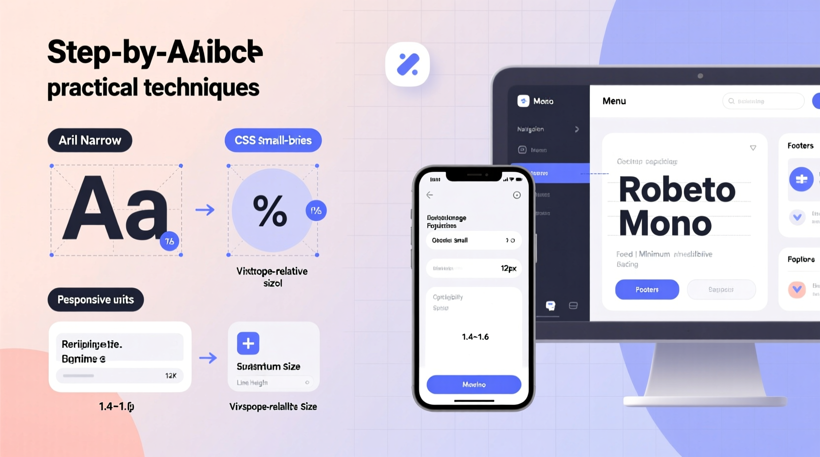
- Line height (leading): Use a line height of 1.3 to 1.5 times the font size for small text. For example, with a 12px font, set line height to 16px (1.33).
- Letter spacing (tracking): Slightly increase spacing between letters—0.5px to 1px—for uppercase or condensed text to avoid crowding.
- Word spacing: Ensure default word spacing isn’t compressed; narrow gaps make word boundaries harder to detect.
“Typography is not just about choosing a font—it’s about crafting readable space.” — Erik Spiekermann, Typographer & Author
Use CSS and HTML for Web-Based Text Resizing
On websites, flexibility and accessibility are paramount. Hardcoding pixel values limits adaptability across devices. Instead, leverage relative units that scale with user preferences and screen sizes.
| Unit | Best Use Case | Accessibility Benefit |
|---|---|---|
| em | Nested elements (relative to parent) | Scales with inherited font size |
| rem | Global text sizing (relative to root) | Honors user’s browser font settings |
| vw / vh | Responsive headers or dynamic scaling | Adapts to viewport dimensions |
To set small but readable body copy using rem units:
body {
  font-size: 16px;
}

.small-text {
  font-size: 0.875rem; /* ~14px */
  line-height: 1.4;
  letter-spacing: 0.2px;
}
This ensures consistency while allowing users who increase default font size in their browser settings to still benefit from proper scaling.
Step-by-Step Guide: Styling Small Text in Digital Documents
When working in word processors or design tools like Microsoft Word, Google Docs, or Adobe InDesign, follow this sequence to optimize small text:
- Select a legible typeface: Choose a clean sans-serif or highly legible serif (e.g., Georgia for print).
- Set font size: Use 10–12pt for printed footnotes or captions; never go below 8pt unless absolutely necessary.
- Increase contrast: Use black or dark gray text on white background. Avoid light gray on white.
- Add spacing: Adjust paragraph spacing before/after to separate small text blocks from main content.
- Test print or preview: View output at actual size to assess readability.
Real Example: Improving a Mobile App Interface
A fintech startup noticed high drop-off rates during account verification. Usability testing revealed users missed critical instructions displayed in 11px light gray text beneath form fields. Although space-constrained, the team revised the design:
- Increased font size to 12px using a system font (San Francisco on iOS, Roboto on Android).
- Changed text color from #CCCCCC to #666666 for better contrast.
- Added 4px of padding above and below the helper text.
Within two weeks, error submission rates dropped by 34%, confirming that even subtle typographic improvements significantly impact comprehension.
Common Mistakes to Avoid with Small Text
Even experienced designers sometimes fall into traps that undermine readability. Watch out for these pitfalls:
- Using low-contrast colors: Light gray (#EEEEEE) on white fails accessibility standards (WCAG AA/AAA).
- Over-compressing line height: Setting line height to 1.0 or less causes visual crowding.
- Ignoring zoom behavior: Fixed pixel sizes may not scale properly when users zoom in.
- Applying small text to long paragraphs: Reserve small fonts for short annotations, not extended reading.
“Accessible design means planning for the smallest text to be read under the least ideal conditions.” — Sarah Higley, UX Accessibility Consultant
Checklist: Optimizing Small Text Across Platforms
Before publishing any content with reduced font sizes, run through this checklist:
- ✅ Font is legible at intended size (test on device/screen)
- ✅ Font size is no smaller than 10pt (print) or 12px (web)
- ✅ Line height is at least 1.3× font size
- ✅ Text color has sufficient contrast (minimum 4.5:1 against background)
- ✅ Letter spacing is slightly increased for all-caps or narrow fonts
- ✅ No italics or bold overuse, which reduce clarity at small sizes
- ✅ Content hierarchy is preserved—small text should support, not dominate
Frequently Asked Questions
Can I use small fonts for body text?
Generally not recommended. Body text should be at least 16px on screens for comfortable reading. Small fonts (below 14px) are best reserved for captions, labels, footnotes, or metadata.
What’s the minimum readable font size?
For digital displays, 12px is often the practical minimum for Latin scripts. For printed materials, 8pt may be acceptable in emergencies, but 10pt is safer. Always consider audience—older readers benefit from larger sizes.
How do I make small text accessible?
Ensure high color contrast, use relative units (rem/em), allow pinch-zoom on mobile, and avoid placing essential information only in small text. Provide alternative access points when possible, such as tooltips or expandable sections.
Final Thoughts and Action Steps
Small text doesn’t have to mean poor usability. With thoughtful selection of fonts, spacing, and styling techniques, you can maintain both aesthetic efficiency and functional clarity. The key is balancing brevity with accessibility—designing not just for how something looks, but how well it communicates.
Start today by auditing one piece of content that uses small text: a disclaimer, a mobile label, or a footnote. Apply the principles covered here—adjust spacing, verify contrast, test legibility—and observe how even minor changes improve comprehension. Typography is invisible when done poorly, but empowering when done right.


 浙公网安备
33010002000092号
浙公网安备
33010002000092号 浙B2-20120091-4
Comments
No comments yet. Why don't you start the discussion?