Every time you unlock your phone, you’re greeted by your wallpaper. It’s the backdrop of your digital life—personal, expressive, and constantly in view. Yet most people settle for generic stock images or overused templates. Creating a custom wallpaper tailored to your device isn’t just about aesthetics; it’s about ensuring clarity, proper alignment, and visual harmony across different screen sizes and aspect ratios.
The challenge lies not in designing something beautiful, but in making it fit seamlessly on any lock screen—whether it's an iPhone 15 Pro Max, a Samsung Galaxy S24 Ultra, or a mid-range Android device. A poorly sized image can appear stretched, cropped awkwardly, or lose critical details. The solution? Designing with precision, using the right tools, and understanding the technical nuances behind screen resolutions and safe zones.
This guide walks through the complete process of creating a personalized wallpaper that looks sharp, fits perfectly, and adapts gracefully across devices—even if you're not a designer.
Understanding Screen Resolutions and Aspect Ratios
Not all phones have the same screen dimensions. Modern smartphones range from compact 5.4-inch displays to expansive 6.9-inch panels, each with unique resolution and aspect ratio. These differences affect how your wallpaper appears when set as a lock screen background.
For example, an iPhone 13 Mini has a resolution of 2340 x 1080 pixels (aspect ratio ~19.5:9), while the iPhone 15 Pro Max runs at 2796 x 1290 (~19.5:9). Meanwhile, many Android phones like the Google Pixel 7 use 2400 x 1080 (~20:9). Although these ratios are similar, they aren’t identical. A one-size-fits-all approach often leads to unwanted cropping or distortion.
To design effectively, start by identifying common target resolutions. Most modern smartphones fall within these ranges:
| Device Type | Average Resolution | Aspect Ratio | Safe Zone Margin |
|---|---|---|---|
| iOS (iPhone 14/15 series) | 2556 x 1179 | 19.5:9 | Top 120px, Bottom 80px |
| Android (Samsung, Pixel) | 2400 x 1080 | 20:9 | Top 100px, Bottom 60px |
| Foldable Phones (Galaxy Z Fold) | 2160 x 1812 (folded) | ~11:9 (folded) | Dynamic layout required |
| Universal Target Size | 2880 x 1440 | 20:10 (optimized) | Use center-safe composition |
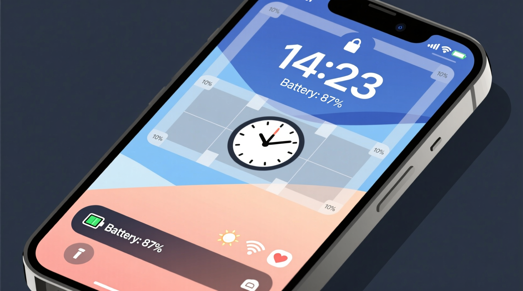
A “safe zone” refers to the central area of the wallpaper that remains fully visible without being obscured by status bars, notches, or lock screen widgets. Critical design elements—like faces, text, or logos—should stay within this region to avoid being cut off.
“Designing for mobile means designing for uncertainty. Always assume part of your image will be hidden.” — Lena Tran, Mobile UX Designer at Studio Nova
Step-by-Step Guide to Creating Your Custom Wallpaper
Follow this structured workflow to produce a high-quality, universally compatible wallpaper.
- Choose Your Base Image or Concept: Start with a photo you’ve taken, a digital illustration, or a collage idea. Ensure it has emotional or personal significance—this is your canvas.
- Select a Design Tool: Use free or professional software:
- Canva – beginner-friendly with preset phone wallpaper templates
- Adobe Photoshop – full control over layers, masks, and resolution
- GIMP – open-source alternative to Photoshop
- Figma – excellent for vector-based designs and layout grids
- Set Canvas Dimensions: Create a new project at 2880 x 1440 pixels (20:10 ratio). This resolution exceeds most current screens and allows flexibility during export.
- Enable Grids and Guides: Place vertical guides at 15% and 85% width, and horizontal guides at 10% and 90% height. This defines the core safe zone where key visuals should reside.
- Add Your Content: Import your base image. Scale it to fill the canvas, then adjust positioning so focal points align with the center third. Avoid placing essential details near edges.
- Enhance with Text or Overlays (Optional): Add motivational quotes, dates, or minimalist patterns. Use semi-transparent layers to prevent visual clutter.
- Apply Filters Thoughtfully: Subtle blur, desaturation, or vignettes can draw attention to the center. Don’t overdo effects—your wallpaper should complement, not distract.
- Export for Multiple Devices: Save your file in PNG format for transparency support, or JPEG (quality 90–100%) for smaller size. Also generate versions at 2400 x 1080 and 2556 x 1179 for specific testing.
Optimizing for Real-World Use: Do’s and Don’ts
Even a visually stunning wallpaper can fail in practice if usability is ignored. Consider how your wallpaper interacts with interface elements like time, notifications, and widgets.
| Do | Don't |
|---|---|
| Use dark tones or gradients in top third to improve time readability | Place bright white text or highlights near the clock area |
| Incorporate symmetry or radial balance to guide the eye | Crowd the center with too many overlapping elements |
| Test your wallpaper with actual lock screen overlays | Assume what looks good in editing software will look good on-device |
| Leave breathing room around focal subjects | Stretch low-resolution images beyond their native size |
| Save source files with layers intact for future edits | Delete original assets after final export |
One overlooked factor is dynamic island and punch-hole compatibility. iPhones since the 14 Pro feature a pill-shaped cutout, while many Androids have circular front cameras. Position important visuals away from the upper center unless intentionally framing around the notch.
Real Example: Designing a Travel-Inspired Lock Screen
Sophie, a freelance photographer based in Lisbon, wanted a wallpaper that reminded her of her favorite trip to Kyoto. She had a beautiful cherry blossom photo but noticed that when uploaded directly to her iPhone, the delicate branches were cropped asymmetrically, and the soft pink hues clashed with white notification banners.
She followed these steps:
- Opened the image in Canva using the “iPhone Wallpaper” template (2556 x 1179).
- Duplicated the background layer and applied a subtle gradient mask from dark gray to transparent at the top 25%.
- Added a thin black stroke around the time display area to increase contrast.
- Inserted a small kanji character (“美” meaning beauty) in the lower-right corner, slightly faded.
- Exported in PNG format and tested on both her iPhone and her partner’s Pixel 7.
The result was a harmonious blend of memory and function. The blossoms remained visible, the time stood out clearly, and the overall mood stayed serene. By adjusting for real-world constraints, Sophie transformed a simple photo into a meaningful, functional artwork.
Essential Checklist Before Finalizing
Before setting your wallpaper live, run through this verification list:
- ✅ Canvas size is at least 2400 x 1080 pixels (preferably 2880 x 1440)
- ✅ Key visual elements are centered and within the safe zone
- ✅ Text (if any) is legible against varying backgrounds
- ✅ File size is under 10 MB to prevent lag
- ✅ Exported in high quality (JPEG 90–100% or lossless PNG)
- ✅ Tested on at least two different phone models (iOS and Android)
- ✅ Original layered file saved for future modifications
Frequently Asked Questions
Can I use the same wallpaper for both lock screen and home screen?
Yes, but be cautious. Many phones treat these screens differently—especially iPhones, which apply more zoom to the lock screen. Design with extra margin on all sides to account for this shift. Alternatively, create two slightly adjusted versions: one optimized for lock screen focus, another for app icon visibility.
Why does my wallpaper look blurry even though I used a high-res image?
This usually happens due to improper scaling or compression. Ensure your image is not being upscaled beyond its original resolution. Also, avoid repeatedly saving JPEGs, as each save degrades quality. Work in PNG until the final export, and compress only once.
How do I make a wallpaper that works in both portrait and landscape mode?
Focus on symmetrical or panoramic compositions. Center dominant elements and avoid strong directional lines. For best results, test your wallpaper by rotating your phone. Some apps like Walli or Backdrops offer preview modes for orientation changes.
Making It Personal, Making It Last
A truly great wallpaper doesn’t just look good—it feels like an extension of who you are. Whether it’s a childhood photo, a favorite quote rendered in elegant typography, or an abstract piece you created digitally, the value comes from intentionality. When you take the time to tailor it to your device’s display, you elevate it from decoration to daily inspiration.
The process may seem technical at first, but with a few rounds of practice, selecting canvas sizes, adjusting safe zones, and exporting variants becomes second nature. You’ll stop scrolling through generic galleries and start seeing your phone as a frame for your creativity.
Start today: pick one photo, open a design tool, and craft a wallpaper that fits not just your screen, but your life.


 浙公网安备
33010002000092号
浙公网安备
33010002000092号 浙B2-20120091-4
Comments
No comments yet. Why don't you start the discussion?