
Mixing prints is one of the most expressive tools in a modern wardrobe, yet many avoid it out of fear of appearing mismatched or overly busy. The truth is, when done with intention, combining patterns elevates your style from predictable to polished and dynamic. It’s not about luck—it’s about understanding proportion, color theory, scale, and cohesion. With a few guiding principles, anyone can layer florals with stripes, plaids with geometrics, or animal prints with abstract designs without veering into sartorial chaos.
Fashion insiders have long embraced print mixing as a signature move. From Diane von Fürstenberg’s bold jersey wrap dresses layered over printed blouses to street-style stars pairing leopard loafers with gingham skirts, the technique signals confidence and individuality. But behind every striking outfit is a deliberate structure—rules that allow creativity to flourish without tipping into disarray.
Understand Print Scale and Proportion
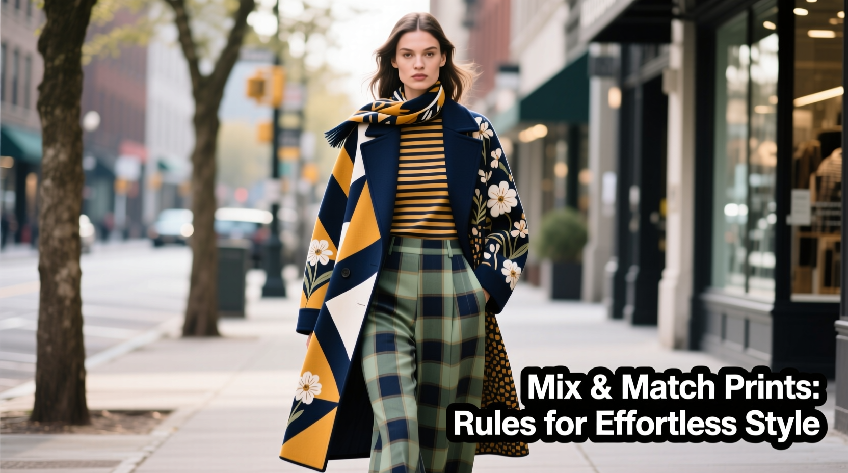
The foundation of successful print mixing lies in balancing scale. When two large-scale patterns compete—such as oversized florals with wide pinstripes—they clash visually, creating a jarring effect. Instead, combine prints of differing sizes: a dominant large pattern with a smaller, subtler one.
For example, wear a maxi floral dress and layer it with a fine-striped cardigan. The eye focuses on the larger print while the smaller one adds texture without overwhelming. This contrast creates depth and visual interest rather than noise.
A common mistake is assuming all prints must be equally bold. In reality, restraint enhances impact. If you’re wearing a vibrant tropical leaf print top, choose a bottom with a micro-check or subtle houndstooth. The difference in scale allows each piece to breathe and gives your ensemble room to feel intentional.
Harmonize Through a Unified Color Palette
Color is the invisible thread that ties mixed prints together. Even wildly different patterns can coexist if they share at least one consistent hue. This shared color acts as a visual bridge, guiding the eye smoothly from one garment to the next.
Suppose you’re pairing a cobalt blue and white gingham shirt with a skirt featuring navy polka dots on a cream background. The repetition of blue connects the pieces, making the combination feel cohesive. The same principle applies when introducing neutrals—black, white, beige, or gray can serve as grounding tones that allow bolder patterns to shine without clashing.
“Color harmony is 80% of what makes print mixing work. Without it, even perfectly scaled patterns fall apart.” — Lena Torres, Stylist & Creative Director at Mode Studio
To test compatibility, lay your garments side by side in natural light. Do they share a base tone? Is there a recurring accent shade? If not, consider swapping one item or adding an accessory—like a scarf or belt—in a unifying color.
Use a Neutral Base for Bold Combinations
When experimenting with high-contrast prints—say, zebra stripes and tribal motifs—introduce a neutral third piece to stabilize the look. A black turtleneck under a patterned blazer or beige trousers beneath a graphic blouse can act as a buffer, preventing sensory overload.
This doesn’t mean playing it safe. Neutrals aren’t dull; they’re strategic. Think of them as the silence between musical notes—the pause that makes the melody meaningful.
Pair Different Pattern Types Strategically
Not all prints are created equal. Understanding the categories of patterns—and how they interact—is essential for balanced styling.
| Pattern Type | Characteristics | Best Paired With |
|---|---|---|
| Floral | Organic, flowing, often asymmetrical | Stripes, solids, small geometrics |
| Stripes | Linear, structured, directional | Checks, animal prints, abstract |
| Plaid/Check | Grid-based, symmetrical | Solids, florals, small dots |
| Animal Print | Bold, textured, nature-inspired | Neutrals, monochrome, simple geometrics |
| Geometric | Angular, repetitive shapes | Organic prints (e.g., watercolor florals) |
Successful combinations often involve contrasting types: pairing structured with fluid, rigid with soft. For instance, a sharply tailored pinstripe blazer worn over a loosely printed bohemian dress introduces tension that feels dynamic, not discordant.
Real Example: The Office-to-Cocktails Transition
Claire, a marketing executive in Chicago, wanted to refresh her workwear without sacrificing professionalism. She started with a navy-and-white windowpane blazer—a subtle check pattern. Instead of pairing it with a plain blouse, she chose a silk camisole with a delicate rose print in navy, cream, and blush. To ground the look, she added high-waisted charcoal trousers (solid) and nude heels.
The result? A polished ensemble that drew compliments during client meetings and seamlessly transitioned to after-work drinks. The shared navy hue unified the prints, while the scale difference ensured clarity. Claire later added a leopard-print clutch for evening events, keeping the rest of the outfit minimal to avoid overcrowding.
Her rule: “One bold print, one subtle pattern, one solid anchor.”
Follow a Step-by-Step Mixing Process
Approach print mixing methodically. Use this five-step guide to build confidence and consistency:
- Choose a dominant print. Decide which garment will be the focal point—this is usually the largest or boldest pattern.
- Select a secondary print with a different scale. Ensure it’s noticeably smaller or simpler in design.
- Confirm a shared color. Verify that both pieces include at least one matching or complementary hue.
- Add a solid neutral. Introduce a third piece—jacket, pants, or shoes—that grounds the look.
- Accessories with purpose. Use bags, belts, or jewelry in one of the print colors to reinforce cohesion.
This process prevents overwhelm and ensures balance. Over time, you’ll internalize these steps and begin improvising with greater ease.
Checklist: Before You Wear Your Mixed Prints
- ✅ One print is clearly dominant in size or intensity
- ✅ Patterns differ in type (e.g., floral + stripe)
- ✅ At least one color appears in both prints
- ✅ A solid-colored piece anchors the outfit
- ✅ Accessories echo a hue from one of the prints
- ✅ The overall look feels intentional, not accidental
Avoid Common Pitfalls
Even seasoned fashion lovers stumble when mixing prints. Awareness of frequent missteps helps prevent them:
- Matching prints too closely: Wearing two nearly identical florals in slightly different scales can look like a wardrobe malfunction, not a styling choice.
- Overloading the upper and lower body: A striped top with a plaid skirt and polka-dot shoes spreads visual weight too evenly, leaving no focal point.
- Ignoring fabric weight and drape: Combining stiff, structured fabrics with flimsy ones can make an outfit feel disjointed, regardless of print harmony.
- Skipping tailoring: Ill-fitting clothes undermine even the most thoughtful print combinations. Fit always matters.
When in doubt, simplify. Remove one patterned layer and replace it with a solid. You can always add complexity back once the foundation feels secure.
“The best-dressed people aren’t afraid of risk—but they respect proportion. Chaos is never stylish; controlled contrast is.” — Marcus Reed, Fashion Editor at *Vogue Living*
FAQ: Common Questions About Print Mixing
Can I mix more than two prints?
Yes, but only if you follow strict rules. Limit yourself to three patterns maximum, ensure varied scales, and maintain a unifying color. For example: a small polka dot top, medium floral skirt, and large-scale scarf—all in shades of red and white. Keep accessories minimal.
Is it okay to mix similar patterns, like two different florals?
Only if they differ significantly in scale and color story. Pair a dark, vintage-inspired rose print with a bright, abstract watercolor floral. If they’re too alike, they’ll fight for attention instead of complementing each other.
What if I’m short or petite? Will bold prints overwhelm me?
Not if you manage scale wisely. Petite figures can wear bold prints—just keep the largest pattern on a fitted piece (like a sheath dress) rather than something loose and voluminous. Pair with a smaller-scale top or jacket to maintain balance.
Build Confidence Through Practice
Like any skill, mastering print mixing requires experimentation. Start small: try a striped tee with a floral jacket. Then progress to bolder combinations. Take photos of your outfits to assess how the elements interact. Over time, you’ll develop an instinct for what works.
Remember, fashion isn’t about perfection—it’s about expression. Rules exist to guide, not restrict. Once you understand them, you’re free to bend or break them with purpose. A leopard-print coat over a navy-and-white nautical dress might seem daring, but with shared navy accents and a solid trench underneath, it becomes a statement of sophistication.
The goal isn’t to avoid standing out—it’s to stand out with intention. When your prints are mixed thoughtfully, people won’t wonder what you’re wearing. They’ll remember how you made them feel.


 浙公网安备
33010002000092号
浙公网安备
33010002000092号 浙B2-20120091-4
Comments
No comments yet. Why don't you start the discussion?