
Mixing bold prints can elevate an outfit from predictable to fashion-forward. When done well, combining patterns like stripes, florals, animal prints, and geometrics adds depth, personality, and visual interest. However, the fear of clashing often keeps many from experimenting. The truth is, successful print mixing isn’t about luck—it’s about strategy. With a few foundational principles and some thoughtful coordination, anyone can master the art of pairing bold patterns confidently and cohesively.
Understand the Core Principles of Print Mixing
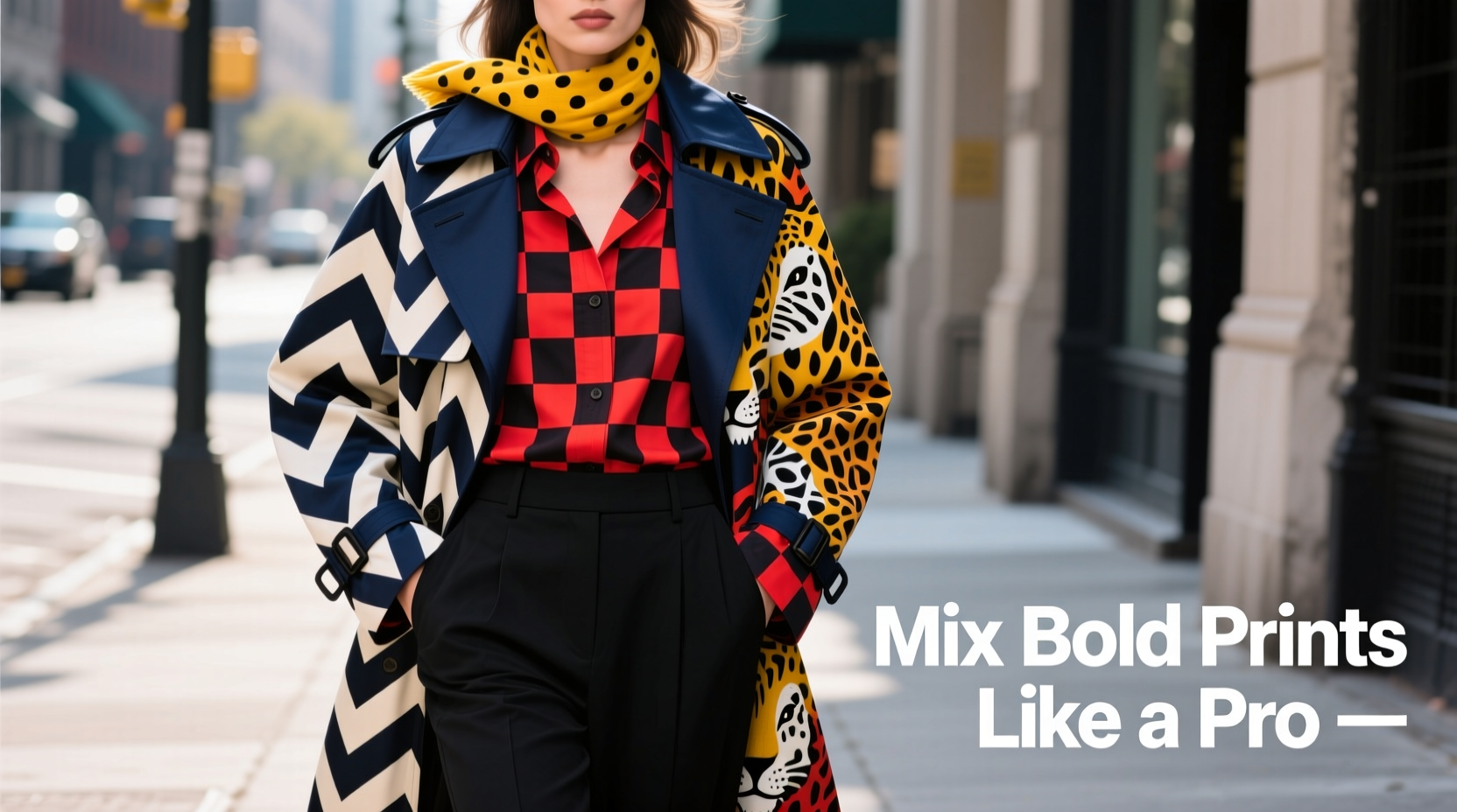
The key to avoiding clashes lies in understanding what makes patterns work—or not work—together. It’s not just about color or scale; it’s about harmony through intention. Three primary factors govern whether two prints will complement each other: scale, color palette, and pattern type.
Scale refers to the size of the print—small, medium, or large. Combining different scales prevents visual competition. For example, pairing a small polka dot top with wide pinstripe pants creates balance because one print doesn't overpower the other.
Color is equally critical. Even if two patterns are wildly different in design, they’ll feel cohesive if they share at least one common hue. This shared color acts as a bridge between otherwise contrasting elements. A red floral blouse and a navy-and-red geometric skirt may seem unrelated at first glance, but the red thread ties them together seamlessly.
Pattern type determines contrast. Pairing two similar types—like two busy florals—can overwhelm. Instead, contrast works best: a structured checkered blazer over a swirling abstract dress, or a leopard-print scarf with a crisp striped shirt.
Step-by-Step Guide to Confidently Mix Bold Prints
Confidence in print mixing comes from process, not guesswork. Follow this five-step method to build coordinated, eye-catching ensembles every time.
- Choose a dominant print. Start with one bold piece that sets the tone—this could be a floral dress, a zebra-print jacket, or a vibrant paisley shirt. This becomes your outfit’s centerpiece.
- Select a supporting print with a different scale. If your dominant print is large (e.g., oversized florals), pair it with a smaller-scale pattern (like micro-checks or fine stripes). This creates visual hierarchy.
- Match at least one color across both pieces. Pull out a secondary hue from your main print and ensure it appears in the second pattern. Use accessories like scarves or shoes to reinforce the connection if needed.
- Vary the pattern types. Avoid pairing two organic prints (floral + animal) or two rigid ones (stripes + plaids) unless you're experienced. Contrast increases sophistication—try a geometric bottom with a watercolor-style top.
- Break up prints with solids or textures. Insert a solid-colored belt, jacket, or bag between two patterned pieces to give the eye a resting point and reduce visual noise.
Real Example: Weekend Brunch Outfit
Sophie wanted to wear her favorite emerald green tropical leaf print jumpsuit but felt it was too loud on its own. She layered a black-and-emerald windowpane plaid blazer over it. The plaid’s small scale contrasted with the large leaves, and the shared emerald created cohesion. To finish, she added black ankle boots and a tan crossbody bag. The result? A bold yet balanced look that turned heads without feeling chaotic.
Do’s and Don’ts of Print Mixing
| Do’s | Don’ts |
|---|---|
| Do mix one large-scale print with a smaller one | Don’t pair two large, busy prints (e.g., big florals + wide stripes) |
| Do use a shared color as a unifying element | Don’t ignore color temperature—warm and cool tones can clash even if hues match |
| Do contrast pattern styles (geometric + organic) | Don’t over-accessorize—let the prints be the focus |
| Do test combinations in natural light before finalizing | Don’t assume all neutrals go together—black and navy can feel disjointed without transition |
| Do start with one printed piece and add subtle patterned accessories | Don’t neglect proportion—longer printed layers should generally be less busy than fitted ones |
Expert Insight: What Top Stylists Recommend
Professional stylists emphasize intentionality over randomness. According to Maya Thompson, personal stylist for several editorial publications:
“People think print mixing is risky, but it’s actually safer than wearing all solids. Patterns provide built-in structure. The mistake is treating them like afterthoughts. Choose your hero piece first, then build around it with purpose.” — Maya Thompson, Fashion Stylist & Creative Director
She also advises clients to “edit ruthlessly.” If an outfit feels off, remove one element—even if it’s your favorite. Sometimes, less really is more, especially when dealing with high-contrast visuals.
Print Mixing Checklist
Before stepping out in a multi-pattern ensemble, run through this checklist to ensure cohesion:
- ✅ One print dominates; the other supports
- ✅ Scales are intentionally different (one large, one small)
- ✅ At least one color is shared between both patterns
- ✅ Pattern types contrast (e.g., stripe + floral, not floral + paisley)
- ✅ There’s a solid or neutral break (belt, bag, shoes, or outerwear)
- ✅ The overall look feels balanced, not overwhelming
- ✅ You’ve checked the outfit in daylight or full-spectrum lighting
Advanced Techniques for Seasoned Style Enthusiasts
Once you’ve mastered the basics, you can experiment with bolder combinations. These strategies push boundaries while maintaining elegance.
Triple-layer printing: This involves combining three patterned pieces—such as a striped top, floral skirt, and houndstooth blazer. Success depends on strict adherence to color unity and scale variation. All three pieces should share a core color, and their scales should follow a clear progression (small → medium → large).
Monochromatic print layering: Try mixing different patterns in the same color family. A deep burgundy snake-print top with wine-toned pinstripe trousers and a maroon lace camisole underneath creates richness without chaos. Texture plays a bigger role here—satin, wool, and knit help differentiate the layers.
Clashing-on-purpose (controlled dissonance): Some designers intentionally pair jarring prints for avant-garde effect. This requires confidence and context. On a runway, a patchwork of tartan, cheetah, and scribble prints might read as artistic. In daily life, limit this to one “rule-breaking” piece per outfit—like a neon zigzag scarf with a classic gingham dress.
“In fashion, tension creates interest. The goal isn’t always harmony—it’s storytelling. A slightly off-kilter print combo can express rebellion, creativity, or humor.” — Julian Reed, Runway Stylist & Educator
Frequently Asked Questions
Can I mix floral and animal print?
Yes, but carefully. Both are organic, flowing patterns, so pairing them risks visual muddiness. To succeed, make one much smaller in scale than the other and ensure a strong color link. For instance, a leopard-print scarf (small accent) over a bold red rose dress works because the gold undertones in the leopard echo the warm reds in the flowers.
What if I want to mix prints but don’t want to look ‘too much’?
Start subtly. Wear a printed shirt under a solid sweater with only the collar and cuffs visible. Or choose a patterned skirt with a tucked-in solid blouse, then add a printed scarf. Gradual exposure builds confidence. You can also opt for tonal prints—two patterns in similar shades of blue or gray—that blend more quietly.
Do rules change for men mixing prints?
The principles remain the same, though men’s fashion traditionally uses fewer bold prints. A classic example: a subtle striped dress shirt under a windowpane check suit. Modern menswear increasingly embraces bolder combinations—think a paisley tie with a micro-dot pocket square. The key is proportion: keep busier prints closer to the face (ties, shirts) and quieter ones on the lower half (pants, overcoats).
Final Thoughts: Own Your Style with Confidence
Mixing bold prints isn’t about following rigid formulas—it’s about developing an eye for balance and expressing individuality. Every great style icon, from Iris Apfel to Harry Styles, has used pattern play to communicate confidence and creativity. The most memorable looks aren’t those that play it safe, but the ones that take thoughtful risks.
Begin with one rule, like matching colors or contrasting scales, and practice until it feels intuitive. Over time, you’ll develop a personal rhythm—knowing when to step back and when to lean in. Fashion is not about perfection; it’s about presence. When you wear an outfit that reflects your courage and curiosity, people notice—not because the clothes are loud, but because you are seen.


 浙公网安备
33010002000092号
浙公网安备
33010002000092号 浙B2-20120091-4
Comments
No comments yet. Why don't you start the discussion?