
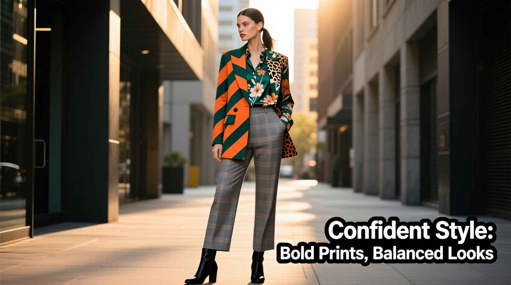
Mixing bold prints can elevate an outfit from predictable to fashion-forward. When done well, combining patterns like stripes, florals, animal prints, or geometrics adds depth, personality, and visual intrigue. But when executed poorly, the result can resemble a carnival costume rather than a curated ensemble. The key lies not in avoiding bold prints altogether, but in understanding how to harmonize them with intention. This guide breaks down the principles of successful print mixing—using color, scale, proportion, and cohesion—to help you wear multiple bold patterns confidently and cohesively.
Understand the Psychology of Pattern Perception
The human eye processes patterned clothing differently than solid colors. Multiple bold prints compete for attention, which can create visual chaos if there’s no underlying structure. Designers and stylists rely on psychological cues—such as repetition, contrast, and rhythm—to guide the viewer’s gaze and maintain balance.
When two large-scale patterns clash without shared elements, the brain struggles to make sense of the composition. That’s why a leopard-print top paired with plaid pants might feel overwhelming unless they share a unifying factor—like a common color or similar tone. The goal isn’t to eliminate contrast, but to manage it intelligently.
“Print mixing is not about randomness—it’s about creating rhythm through repetition and contrast.” — Lena Moretti, Fashion Stylist & Creative Director at Studio Threadline
Choose a Dominant Print and Supportive Partner
A foundational rule in successful print pairing is designating one pattern as dominant and the other as secondary. This prevents visual competition and gives your outfit a clear focal point.
The dominant print should be larger in scale or more intricate—think oversized florals, dramatic animal prints, or vibrant abstract designs. The supporting print should be smaller, simpler, or tonally aligned. For example:
- Dominant: A wide-striped blazer in red and navy
- Supporting: A micro-checkered shirt in navy and white
Even though both are bold, the difference in scale ensures one doesn’t overpower the other entirely. The smaller checkered shirt recedes slightly, allowing the blazer to lead while still contributing texture.
Anchor Prints with a Shared Color Palette
Color is the most powerful tool for unifying disparate prints. Even wildly different patterns can coexist if they share at least one consistent hue. This creates a thread of continuity that ties the outfit together.
For instance, pairing a teal-and-gold paisley blouse with black-and-teal geometric trousers works because teal appears in both pieces. The shared color acts as a bridge, making the combination feel intentional rather than accidental.
To apply this effectively:
- Identify the base color of your dominant print (e.g., navy in a floral dress).
- Select a secondary print where that same color appears—either prominently or subtly.
- Use accessories or footwear in the shared color to reinforce cohesion.
Avoid relying solely on black, white, or gray as “neutral” connectors unless the overall palette is monochrome. While these tones are versatile, overuse can dull the vibrancy of bold prints.
Color Coordination Table: Do’s and Don’ts
| Scenario | Do | Don’t |
|---|---|---|
| Floral skirt + striped top | Pick a stripe that includes one dominant flower color | Choose stripes in clashing, unrelated hues |
| Animal print jacket + polka dot dress | Match the undertone (warm brown base) | Mix warm leopard with cool blue polka dots |
| Geometric pants + abstract blouse | Align one accent color across both | Use completely mismatched color families |
Balance Scale and Density
Scale refers to the size of the pattern relative to the garment and the wearer’s frame. Mixing prints of drastically different scales can work—if balanced correctly.
Consider this principle: pair a large-scale print with a small- or medium-scale counterpart. Avoid combining two large, dense patterns (e.g., giant florals with oversized checks), as they tend to vibrate against each other and overwhelm the silhouette.
For example:
- Successful: A maxi floral skirt (large scale) with a fine pinstripe blouse (small scale)
- Problematic: A bold tribal print jacket with wide horizontal stripes on pants
Density matters too. A tightly packed chevron carries more visual weight than a sparse gingham. If both prints are high-density, even with differing scales, the effect may still feel cluttered.
Use Texture and Proportion to Your Advantage
Not all bold prints need to be loud in color. Introducing textural variation allows you to mix visually strong patterns without increasing chromatic noise.
For example, a matte crocodile-embossed leather skirt pairs surprisingly well with a glossy silk herringbone top. Though both have prominent textures (and thus “print-like” presence), their differing finishes create contrast without clashing colors.
Proportion also plays a critical role. Wearing a boldly printed top with solid dark pants keeps the look anchored. Conversely, a printed bottom paired with a solid top shifts focus downward—ideal for balancing broader shoulders or emphasizing leg length.
In full-patterned ensembles, consider breaking up the outfit with structured outerwear. A tailored trench coat in beige over a striped turtleneck and floral midi skirt provides breathing room for the eyes while maintaining stylistic flair.
Step-by-Step Guide to Mixing Bold Prints
Follow this five-step process the next time you want to experiment with print layering:
- Start with one statement piece. Choose a garment with a bold print you love—a floral blazer, zigzag pants, or graphic dress.
- Find a secondary print with a shared color. Check your wardrobe for patterns that include at least one hue from your first piece.
- Vary the scale. Ensure the second print is noticeably smaller or larger to avoid visual conflict. <4> Add a solid buffer if needed. Insert a neutral layer (white tee, black belt, camel coat) between prints to reduce intensity.
- Finish with cohesive accessories. Shoes, bag, or jewelry in one of the shared colors unify the look.
This methodical approach removes guesswork and builds confidence through repetition. Over time, you’ll develop an instinct for what works—even before trying things on.
Real Example: From Clashing to Cohesive
Sophie, a marketing consultant in her early 30s, loved bold fashion but often felt her outfits looked “too much.” She once wore a bright pink zebra-print top with electric blue tartan pants. While both pieces were favorites, together they created sensory overload.
After consulting a personal stylist, she revised the look using three key adjustments:
- Swapped the pink zebra top for a version in black-and-beige—aligning better with the blue-and-black tartan.
- Added a charcoal-gray vest to separate the two prints visually.
- Chose black ankle boots and a matching clutch to ground the outfit.
The revised ensemble maintained boldness but gained sophistication. Colleagues complimented her “designer-level styling,” unaware it was achieved through simple alignment principles.
Print Pairing Checklist
Before stepping out in a mixed-print outfit, run through this checklist:
- ✅ One print is clearly dominant in scale or complexity
- ✅ At least one color is shared between both patterns
- ✅ Scales differ significantly (large + small, not large + large)
- ✅ Outfit includes a solid-color element (top, bottom, layer, or accessory)
- ✅ Tonal harmony exists (warm with warm, cool with cool)
- ✅ Silhouette balances volume and proportion
If all boxes are checked, you’re likely wearing a thoughtfully styled ensemble—not a chaotic collision of patterns.
Frequently Asked Questions
Can I mix more than two bold prints?
Yes, but only with extreme caution. Three bold prints require meticulous coordination—one dominant, one secondary, and one very subtle (e.g., a pocket square or scarf). Most successful trios include variations of the same pattern family (e.g., different scales of stripes) or rely heavily on a unified color story.
What if my prints don’t share any colors?
If there’s no natural color overlap, introduce a third piece—a solid-colored belt, bag, or jacket—that bridges the gap. For example, a yellow floral skirt and purple geometric top can be tied together with a mustard cardigan worn open.
Are some print combinations always off-limits?
There are no absolute rules, but certain pairings are inherently harder to pull off. Examples include large florals with busy plaids, or neon animal prints with metallic geometrics. These combinations demand flawless execution and a strong sense of personal style. Beginners should start with easier duos—like stripes with checks or small polka dots with subtle animal motifs.
Mastering Confidence Through Experimentation
The fear of looking like a “walking rainbow” often stems not from the clothes themselves, but from uncertainty in execution. Bold prints aren’t the problem—lack of cohesion is. By applying principles of color unity, scale contrast, and strategic layering, you transform potential chaos into curated artistry.
Remember, fashion is not about perfection—it’s about expression. Some of the most iconic looks in history broke conventional rules, but did so with purpose. Whether you're wearing zebra stripes with vintage paisley or clashing ikat with nautical stripes, do it with intention, balance, and self-assurance.


 浙公网安备
33010002000092号
浙公网安备
33010002000092号 浙B2-20120091-4
Comments
No comments yet. Why don't you start the discussion?