
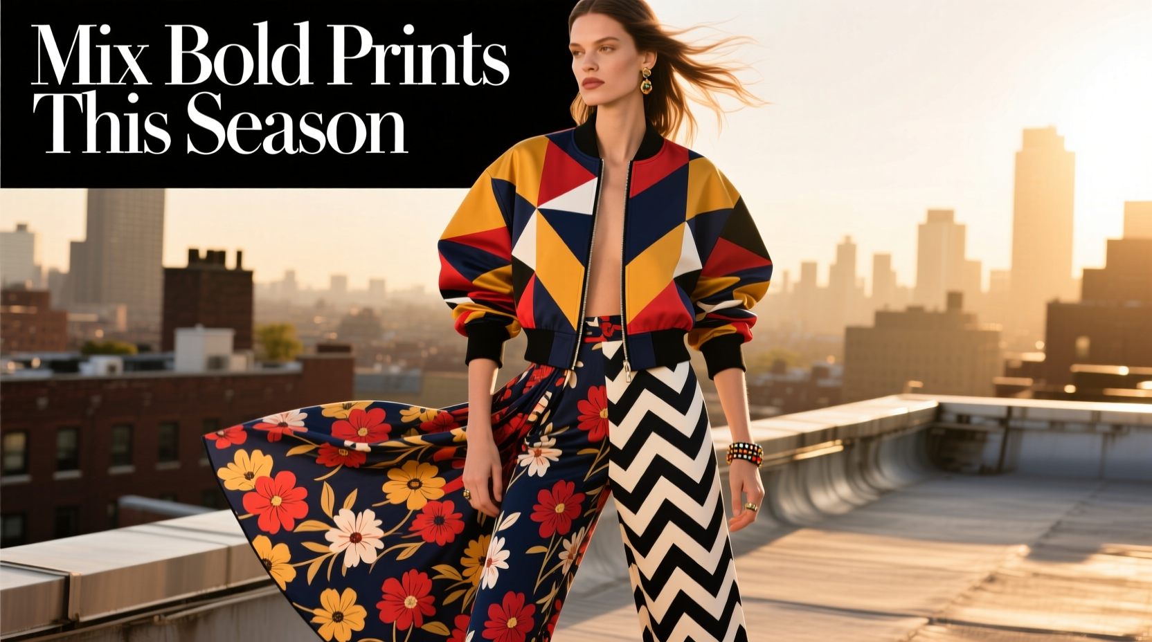
Pattern mixing has evolved from a fashion risk into a hallmark of personal style. This season, designers are embracing maximalism with confidence—think zebra stripes layered over geometric florals, abstract checks paired with tropical motifs, and painterly paisleys dancing beside structured pinstripes. Yet, for many, the fear of clashing remains a barrier to experimentation. The truth is, mixing bold prints doesn’t require luck—it requires strategy. With the right approach, you can combine vibrant patterns in ways that feel intentional, harmonious, and undeniably chic.
The key lies not in avoiding contrast, but in mastering balance. Bold doesn’t have to mean chaotic. When grounded in principles of color, scale, proportion, and theme, pattern mixing becomes an art form—one that elevates your wardrobe and expresses individuality. Whether you're styling a head-to-toe look or simply pairing a printed blouse with patterned trousers, these techniques will help you create cohesive ensembles that command attention for all the right reasons.
Start with a Unifying Color Palette
One of the most effective ways to prevent clashing is to anchor your look with shared colors. Even wildly different patterns can coexist if they share at least one dominant or accent hue. For instance, a cobalt blue leopard print top can pair seamlessly with navy and white striped pants when both pieces include varying shades of blue.
Think of your outfit as a painting: the color palette sets the mood. Limit your base palette to three main colors—one neutral (like black, white, beige, or gray) and two bolder tones. Then ensure each pattern incorporates at least one of those hues. This creates visual continuity, even when the designs themselves are unrelated.
Avoid choosing prints where the colors directly oppose each other on the color wheel unless intentionally going for high contrast. While red and green may work during the holidays, they rarely blend well in everyday wear unless softened through tone variation (e.g., burgundy and sage).
Play with Scale and Proportion
Mixing patterns of drastically different scales reduces visual competition. A large-scale floral jacket pairs effortlessly with fine pinstripe trousers because the eye processes them at different levels. The brain doesn’t perceive them as “fighting” for attention—they occupy separate visual spaces.
Consider this rule of thumb: pair one large print with one small or medium print. Avoid combining two oversized patterns (like giant polka dots with wide stripes), which can overwhelm the frame. Similarly, two tiny prints (micro-checks and mini-dots) often blur together and lose definition.
Proportion also applies to garment placement. Wearing a bold, large-print blazer over a subtly patterned dress works because the larger pattern dominates the upper body, while the smaller one supports it below. Reversing that—say, loud pants with a busy top—can fragment the silhouette unless carefully balanced.
| Print Combination | Recommended? | Why |
|---|---|---|
| Large floral + micro-gingham | Yes | Different scales create harmony |
| Wide stripes + big animal print | No | Both dominate; risk of clash |
| Paisley shirt + herringbone blazer | Yes (if same color family) | Textural contrast with tonal unity |
| Geometric print skirt + abstract top | Yes (with neutral accessories) | Abstract softens rigid geometry |
Choose Patterns with a Shared Theme or Mood
Thematic cohesion is a subtle but powerful tool. Prints that belong to the same “family” or evoke similar emotions tend to complement each other, even if their shapes differ. For example, tropical leaf prints and batik-inspired designs both fall under the “global” or “bohemian” category, making them natural partners.
This principle allows you to mix seemingly disparate patterns under a common narrative. Consider:
- Nature-inspired: Florals, leaves, animal prints, watercolor landscapes
- Urban/Architectural: Pinstripes, grids, checkerboards, abstract geometrics
- Retro/Vintage: Polka dots, mod shapes, 70s swirls, psychedelic motifs
When combining across themes, proceed with caution. Pairing a delicate ditsy floral skirt with a grunge-style plaid shirt might feel disjointed unless tied together by texture (e.g., both in cotton) or color (e.g., mustard yellow accents).
“Successful pattern mixing isn’t about matching—it’s about storytelling. Each print should contribute to the same visual sentence.” — Lena Moretti, Fashion Stylist & Creative Director at *Verve Studio*
Step-by-Step Guide to Building a Mixed-Print Outfit
Confidence grows with practice. Follow this five-step process to build a bold yet balanced ensemble:
- Choose a Base Pattern: Start with one printed piece you love—perhaps a floral midi dress or striped trousers. This will be your foundation.
- Select a Secondary Print: Pick a second pattern that shares at least one color with the first. Ensure the scale differs significantly (e.g., large vs. small).
- Add a Unifying Element: Introduce a solid-color item (cardigan, blazer, or footwear) in a hue present in both prints to tie them together.
- Balance the Visual Weight: Place the boldest print on the part of the body you want to highlight. If wearing statement pants, keep the top simpler in print density.
- Refine with Accessories: Neutral shoes, a minimalist bag, or delicate jewelry can ground the look and prevent overload.
Try this combination: A violet-and-white abstract printed blouse (large scale) paired with narrow black-and-violet pinstripe trousers (small scale). Add a deep plum blazer and nude pumps. The shared violet hue connects the prints, the scale contrast prevents competition, and the solid blazer offers breathing room.
Common Mistakes to Avoid
Even seasoned fashion lovers can misstep when mixing prints. Watch out for these pitfalls:
- Overloading the torso: Wearing a busy top and bold jacket simultaneously can make the upper body look cluttered. Opt for one dominant upper-layer print.
- Ignoring fabric weight: Heavy jacquard with sheer georgette might clash texturally, even if colors align. Stick to compatible materials (e.g., cotton with cotton, silk with silk).
- Forgetting negative space: Patterns need room to breathe. If both garments are 100% covered in dense design, the outfit feels oppressive. Include some solid areas or open space (like a V-neckline).
- Mixing too many pattern types: Three or more distinct prints rarely work unless you’re a professional stylist. Stick to two, max.
Real-Life Example: From Office to Evening
Sophie, a 34-year-old graphic designer, wanted to wear her new emerald green snake-print blazer to a client meeting, but didn’t want to look overdressed. She paired it with a subtle pale pink micro-check blouse and tailored charcoal gray trousers featuring a faint pinstripe. Her shoes—a solid oxblood loafer—picked up a tertiary red tone visible in the reptile print’s undertones.
The result? A polished, creative look that felt professional yet expressive. The blazer made a statement, while the smaller, cooler-toned patterns balanced it. After work, she swapped the blouse for a sequined camisole in rose gold and added drop earrings, transforming the outfit for dinner. The consistency of the blazer and trousers created continuity, while changing one element shifted the mood entirely.
Sophie’s success came from respecting scale (large animal print vs. micro-check), sharing color (green and red undertones), and maintaining a cohesive theme (modern, slightly edgy sophistication).
Print Mixing Checklist
Before stepping out in a mixed-print ensemble, run through this checklist:
- ✅ At least one color is shared between both patterns
- ✅ One print is significantly larger or smaller than the other
- ✅ The overall vibe (e.g., boho, modern, retro) is consistent
- ✅ There’s a solid-color element (outerwear, shoes, or bag) to anchor the look
- ✅ The outfit isn’t overloaded—only two main patterns are used
- ✅ Fabrics complement each other in weight and drape
- ✅ You feel confident and comfortable
Frequently Asked Questions
Can I mix stripes and florals?
Absolutely—but choose wisely. Pair a bold floral skirt with thin pin-striped blazer, ensuring they share a color. Avoid thick horizontal stripes with large center-florals, as both compete for dominance. Vertical pinstripes with scattered florals tend to work best.
Is it okay to mix animal prints?
Yes, and it’s trending this season. Leopard and zebra can coexist if scaled differently and linked by color. For example, a caramel leopard print scarf with black-and-white zebra heels works because the neutral base unifies them. Add a solid camel coat to soften the transition.
How do I know if two prints clash?
If your eye doesn’t know where to land, or if the outfit feels “noisy,” it’s likely clashing. Step back and assess: Are the colors fighting? Is everything equally loud? Introduce a neutral break or simplify one element. Trust your instinct—if you feel uneasy, the outfit probably needs editing.
Final Thoughts: Own Your Style with Confidence
Mixing bold prints isn’t about following rigid rules—it’s about understanding the language of design so you can break conventions thoughtfully. This season invites audacity, creativity, and self-expression. With a grasp of color harmony, scale variation, and thematic alignment, you’re equipped to experiment boldly.
Start small: try a printed scarf with patterned trousers, or a bold skirt under a subtly striped sweater. As your eye sharpens, so will your confidence. Remember, fashion is not about perfection—it’s about presence. When you wear a look that feels authentic and intentional, people respond to the energy behind it, not just the clothes.


 浙公网安备
33010002000092号
浙公网安备
33010002000092号 浙B2-20120091-4
Comments
No comments yet. Why don't you start the discussion?