
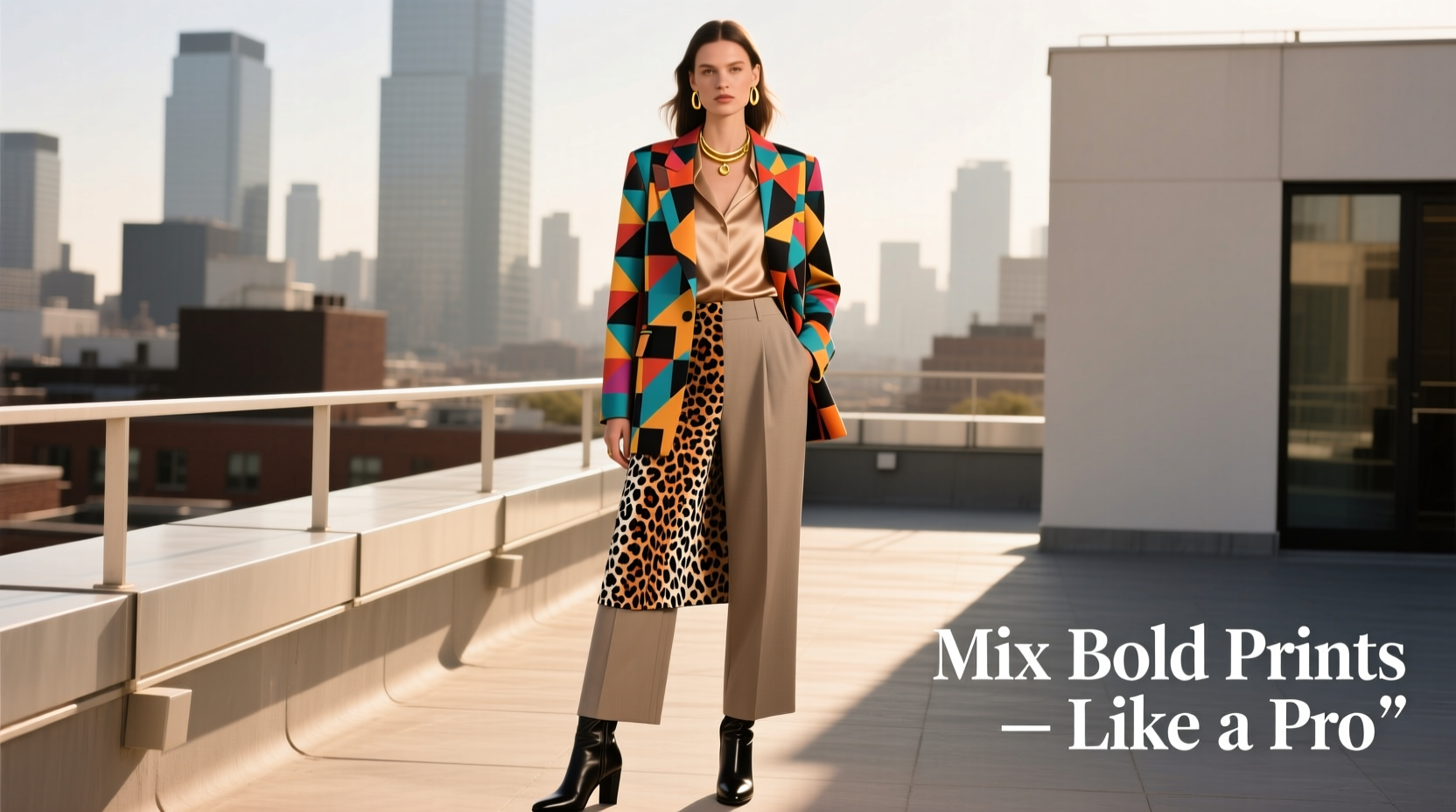
Mixing bold prints is one of the most daring yet rewarding moves in fashion. Done well, it projects confidence, creativity, and a keen eye for style. Done poorly, it can appear overwhelming or disjointed. The key isn’t avoiding risk—it’s understanding the rules so you can break them with intention. This guide breaks down the principles, techniques, and practical steps that allow you to combine vibrant patterns like stripes, florals, animal prints, and geometrics without descending into sartorial chaos.
Understand the Foundation: What Makes Prints Work Together?
The secret to successful print mixing lies not in randomness but in harmony. Even the boldest combinations rely on underlying balance—through color, scale, theme, or proportion. When two prints share at least one unifying element, they stop competing and start conversing.
Harmony doesn’t mean sameness. In fact, contrast is essential. A leopard print blouse paired with pinstripe trousers creates visual interest because of their differences—but if both pieces pull from a shared neutral palette (like black, beige, and tan), the look remains cohesive.
Color as the Glue
Color is the most powerful unifier in print mixing. Two wildly different patterns—a tribal motif and a polka dot, for example—can coexist beautifully if they share a common hue. That shared color becomes the visual thread tying the outfit together.
For instance, a cobalt blue floral skirt can pair seamlessly with an emerald green and cobalt striped top, because the blue links the two. The result? Dynamic, but not disorganized.
Scale Matters: Play with Proportion
Another critical factor is the size—or scale—of the prints. Wearing two large-scale patterns together often overwhelms the eye. Instead, pair a large print with a smaller or medium-scale one. This creates rhythm and prevents visual clutter.
Think of it like music: a bold floral jacket (large scale) over a fine gingham shirt (small scale) gives the eye places to rest while still delivering impact.
Choose Your Print Pairings Wisely
Not all prints are created equal when it comes to compatibility. Some combinations naturally complement each other; others require more finesse. Below is a breakdown of common bold prints and how to pair them effectively.
| Print Type | Best Paired With | Avoid Pairing With |
|---|---|---|
| Animal Print (Leopard, Snake) | Solids, Pinstripes, Geometrics | Other animal prints (unless tonal) |
| Floral (Large or Small) | Stripes, Polka Dots, Gingham | Dense abstracts or busy geometrics |
| Stripes (Pinstripe, Wide) | Checks, Florals, Solids | Bold diagonals or clashing directions |
| Geometric (Tribal, Aztec) | Tonal solids, subtle textures | Other high-contrast geometrics |
| Polka Dots | Stripes, Florals, Animal Prints | Micro-dots with macro-dots (same color) |
Notice a trend? Successful pairings often involve contrast in style but cohesion in color or tone. For example, pairing a leopard print scarf (organic, wild) with a crisp pinstripe blazer (structured, linear) plays with juxtaposition while maintaining elegance through shared neutrals.
Step-by-Step Guide to Mixing Bold Prints
Confidently combining prints doesn’t have to be guesswork. Follow this five-step process to build balanced, eye-catching ensembles.
- Start with a Base Print: Choose one dominant print—the centerpiece of your look. This could be a dress, jacket, or pair of pants. Make sure it’s a print you love and feel confident in.
- Select a Secondary Print: Pick a second pattern that shares at least one color with the base. Ensure the scale differs significantly—pair large with small, not large with large.
- Control the Proportion: Limit bold print exposure to two main pieces. Use solid-color accessories, shoes, or outer layers to ground the look. For example, wear a floral top and striped skirt, but add a black blazer and nude heels.
- Use Neutrals as Buffers: Incorporate neutral tones (black, white, beige, gray) in between prints. A white turtleneck under a plaid blazer and zebra-print trousers separates the patterns and adds breathing room.
- Refine with Accessories: Finish with minimal accessories in coordinating hues. Avoid adding another competing print unless it’s subtle, like a textured clutch or tonal embroidery.
Real Example: A Weekend Look That Works
Consider Sarah, a creative director who wants to make a statement at a gallery opening. She chooses a deep red and black leopard print midi skirt as her standout piece. To avoid overpowering the look, she pairs it with a black-and-white pinstripe button-up shirt. The black ties the two together, and the linear structure of the stripes contrasts nicely with the organic swirl of the animal print.
To balance the bold lower half, she adds a tailored black blazer—solid, structured, and grounding. Her shoes are classic black ankle boots, and her bag is a deep burgundy crossbody that echoes the red in the skirt without introducing a new print.
The result? A look that’s dynamic, intentional, and far from chaotic. Each piece has a role: the skirt commands attention, the shirt adds texture and contrast, and the outerwear brings sophistication.
Expert Insight: What Designers Say About Print Mixing
Fashion stylists and designers emphasize intentionality when combining patterns. As renowned stylist Marcus Reed explains:
“Print mixing isn’t about throwing bold pieces together—it’s about creating dialogue between them. When you see someone who mixes prints flawlessly, it looks effortless. But behind that ease is careful consideration of color, proportion, and personal expression.” — Marcus Reed, Fashion Stylist & Creative Director
Reed recommends starting with what he calls the “one hero, one harmony” rule: let one print be the star, and ensure the second supports it through color or context. He also stresses the importance of fit and tailoring—no matter how well the prints work together, ill-fitting clothes will undermine the entire ensemble.
Checklist: Print-Mixing Success Formula
Before stepping out in your bold combination, run through this checklist to ensure cohesion:
- ✅ One print is clearly dominant (in size or placement)
- ✅ Both prints share at least one core color
- ✅ Print scales are intentionally different (large + small)
- ✅ At least one solid neutral layer is included (jacket, top, or bottom)
- ✅ Shoes and accessories are simple and complementary
- ✅ The overall look feels balanced, not top-heavy or cluttered
- ✅ You feel confident wearing it
This checklist acts as a reality check. If you’re hesitating about a combination, go through each point. Often, the issue lies in missing just one element—like forgetting to include a neutral buffer or pairing two large-scale prints.
Common Mistakes to Avoid
Even experienced fashion lovers stumble when mixing prints. Here are the most frequent errors—and how to fix them.
- Matching Prints Too Closely: Wearing two similar prints (e.g., two different floral dresses) can look like a wardrobe malfunction. Instead, aim for contrast in style or scale.
- Ignoring Body Proportions: A full printed suit paired with a busy shirt can overwhelm a petite frame. Consider your silhouette—sometimes, print placement matters more than variety.
- Over-Accessorizing: Adding a patterned scarf, printed bag, and multicolored shoes to an already bold outfit creates sensory overload. Stick to one focal point.
- Clashing Color Temperatures: Combining warm-toned prints (reds, oranges) with cool-toned ones (blues, purples) without a bridge color can create disharmony. Use a neutral or metallic (gold, silver) to mediate.
- Forgetting the Occasion: A boardroom meeting may not welcome a neon geometric blazer with zigzag trousers. Adapt print intensity to the setting.
FAQ: Common Questions About Mixing Bold Prints
Can I mix more than two bold prints?
Yes, but only if you're highly intentional. Limit additional prints to accessories (like a pocket square or headband) and ensure all share a unifying color or theme. Three major printed garments usually cross into chaotic territory unless expertly styled.
What if I’m short or curvy? Does print mixing still work?
Absolutely. Focus on vertical continuity—aligning colors from top to bottom—to elongate the frame. For example, a printed top and matching-hue bottom (even with different patterns) create a streamlined effect. Avoid horizontal clashes that cut the body visually.
Is there a safe way to practice print mixing?
Start small. Try a printed scarf with a patterned jacket, or wear bold socks with a printed shirt and solid pants. These low-risk experiments build confidence before committing to full-on print layering.
Conclusion: Own Your Style with Confidence
Mixing bold prints isn’t about following rigid rules—it’s about understanding the language of design so you can speak it fluently. With attention to color, scale, proportion, and personal expression, you can turn what might seem chaotic into a compelling fashion statement.
The most stylish people aren’t those who avoid risk, but those who embrace it with purpose. Next time you reach for that leopard blazer or vibrant floral dress, ask not “Will this clash?” but “How can I make this conversation between patterns sing?”


 浙公网安备
33010002000092号
浙公网安备
33010002000092号 浙B2-20120091-4
Comments
No comments yet. Why don't you start the discussion?