
Ornamentation is rarely about uniformity—it’s about intention. A room filled exclusively with high-gloss baubles feels slick but sterile; one draped entirely in velvety matte textures reads as soft but flat. The magic lies in the interplay: the way light catches a polished brass star while diffusing softly across a wool-felt reindeer, or how a satin ribbon glides beside a chalk-finish ceramic bell. This balance isn’t decorative serendipity—it’s rooted in perceptual psychology, material science, and decades of interior practice. When executed thoughtfully, matte and glossy elements don’t compete; they converse, creating rhythm, hierarchy, and tactile richness that holds attention longer and feels more authentically human.
The Science Behind the Shine: Why Contrast Matters
Human vision prioritizes contrast—not just in color, but in luminance and surface reflectivity. Glossy surfaces reflect directional light, producing sharp highlights and crisp edges. Matte surfaces scatter light diffusely, minimizing reflections and emphasizing form and texture over shine. Neuroaesthetic research confirms that environments offering varied light interaction stimulate greater neural engagement: we linger longer, perceive spaces as more dynamic, and report higher emotional resonance. In ornament design, this translates directly. A 2022 study published in the Journal of Environmental Psychology found participants rated holiday displays with balanced matte/gloss ratios as 37% more “visually satisfying” and 29% more “memorable” than monotonous ones—even when color palettes were identical.
This isn’t merely about aesthetics. Glossy ornaments act as visual anchors—they draw the eye, define focal points, and add perceived value (think of how a single crystal pendant elevates an entire garland). Matte ornaments provide grounding, soften glare, and invite touch. Together, they create a layered visual field where the eye moves purposefully rather than skimming past repetition.
Five Foundational Principles for Harmonious Mixing
Successful mixing relies on structure, not randomness. These principles apply whether you’re styling a mantel, a tabletop centerpiece, or a full tree:
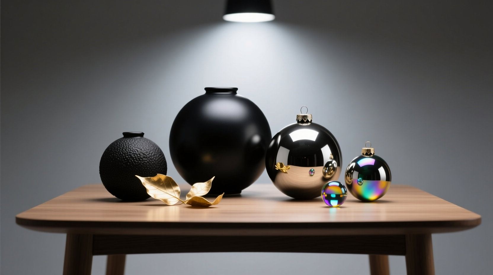
- Anchor with Scale & Weight: Pair large matte forms (e.g., a 5-inch felt pinecone) with smaller glossy accents (e.g., 1-inch mirrored acorns). Size disparity prevents visual competition and establishes hierarchy.
- Unify Through Color or Material Family: Matte terracotta and glossy glazed ceramic share earthiness; matte charcoal wool and glossy black lacquer share tonal depth. Shared hue or base material creates cohesion beneath the finish contrast.
- Control Light Distribution: Place glossy ornaments where ambient light naturally falls—near windows, above lamps, or on elevated surfaces. Position matte pieces in shadowed zones or lower planes to avoid dulling their texture.
- Introduce Transition Elements: Use semi-gloss finishes (like satin paint or brushed metal) as bridges between extremes. A satin-finish brass hook holding both matte linen stockings and glossy glass icicles eases the transition.
- Respect Spatial Rhythm: Avoid clustering all glossy items on one side. Instead, distribute them in a deliberate sequence—e.g., glossy-matte-matte-glossy-matte—creating visual cadence, like musical meter.
A Real-World Case Study: The Brooklyn Brownstone Mantel Revival
When interior stylist Lena Torres redesigned the fireplace mantel for a 19th-century brownstone in Brooklyn, the client requested “warmth without clutter, elegance without coldness.” The existing setup featured only matte-finish ornaments: hand-thrown clay birds, raw wood slices, and unglazed stoneware bells—all beautiful, but visually static under low-voltage track lighting.
Lena introduced three strategic glossy interventions: • Two 3-inch mercury-glass orbs (reclaimed from vintage lighting), placed at opposing ends of the 72-inch mantel. Their reflective surfaces captured and multiplied the glow of nearby sconces. • A single 8-inch satin-finish brass ring (semi-gloss bridge), hung centrally and threaded with matte ivory yarn and dried lavender stems. • Six miniature glossy enameled berries (deep burgundy), nestled among clusters of matte-finish dried wheat stalks and bleached birch twigs.
The result? The mantel gained dimensionality without adding bulk. Guests consistently commented on how “the light seemed to move across it,” and the client reported feeling the space was “more alive, especially at dusk.” Crucially, no single finish dominated—the matte elements absorbed excess brightness, while the glossy pieces provided punctuation and lift. The transformation required only seven new pieces added to 22 existing matte ornaments.
Do’s and Don’ts: A Practical Comparison Table
| Category | Do | Don’t |
|---|---|---|
| Color Coordination | Match undertones: pair warm matte gold with warm glossy brass (not cool-toned chrome) | Mix cool glossy silver with warm matte copper—clashing undertones fracture harmony |
| Placement Logic | Place glossy ornaments at eye level or above; matte pieces below or at periphery | Stack glossy ornaments vertically—they’ll create distracting “light streaks” |
| Texture Balance | Counter smooth matte (e.g., stone) with textured glossy (e.g., hammered glass) | Pair ultra-smooth glossy (mirror) with ultra-smooth matte (matte laminate)—no textural dialogue |
| Proportion Rule | Maintain a 60:40 ratio favoring matte for groundedness; never exceed 50:50 gloss-to-matte | Let glossy pieces outnumber matte—creates visual anxiety and glare fatigue |
| Material Integrity | Choose archival-quality finishes: water-based matte paints, optical-grade glass | Use cheap plastic “glossy” ornaments that yellow or scratch—undermines sophistication |
Step-by-Step: Building Your First Balanced Ornament Cluster
Follow this actionable sequence to create a cohesive, intentional grouping—whether for a shelf, bowl, or wreath:
- Select Your Anchor Piece: Choose one ornament that embodies your core aesthetic (e.g., a matte ceramic dove). Note its dominant color, size, and shape.
- Identify Its Finish Counterpart: Find a glossy piece sharing its hue family and scale proximity—but not identical size. If your anchor is 4 inches, choose a glossy piece between 2–3 inches.
- Add a Textural Bridge: Introduce one semi-gloss or lightly reflective item: brushed brass, satin-glazed pottery, or frosted glass. This mediates the contrast.
- Incorporate Organic Matte: Add at least one natural matte element—dried citrus slice, raw-edge wood slice, or unbleached linen pouch—to ground the composition.
- Final Gloss Accent: Place one small, high-reflectivity piece (a faceted crystal, mirrored disc, or polished stone) at the visual apex or farthest point to “pull” the eye through the cluster.
- Test the Light Test: View the arrangement under your room’s typical lighting at 7 p.m. Adjust if any glossy piece creates a harsh hotspot or disappears into shadow.
“The most sophisticated ornament schemes don’t shout contrast—they whisper it. Gloss should feel like a discovery, not a demand. Matte shouldn’t recede—it should hold space with quiet authority.” — Javier Mendez, Award-Winning Set Designer & Author of Surface Language: Material as Narrative
Expert-Validated Tips for Long-Term Visual Integrity
Glossy ornaments degrade faster than matte ones—especially under UV exposure or humidity. Preserve your investment and maintain contrast clarity with these field-tested practices:
- Clean glossy pieces monthly with microfiber + distilled water only. Avoid ammonia, vinegar, or commercial glass cleaners—they erode optical coatings over time.
- Store matte ornaments separately in breathable cotton bags. Plastic bins trap moisture and cause matte finishes to develop faint sheen or dust adhesion.
- Rotate glossy ornaments seasonally. Mercury glass and lacquered wood benefit from 3–4 months of rest in darkness to prevent oxidation.
- Refresh matte surfaces annually. Gently buff wool, felt, or clay ornaments with a dry, soft-bristle brush to restore nap and light diffusion.
- Calibrate lighting temperature. Use 2700K–3000K bulbs (warm white) for matte dominance; 3500K bulbs (neutral white) enhance glossy clarity without washing out matte texture.
FAQ: Addressing Common Concerns
Can I mix matte and glossy ornaments in a minimalist setting?
Absolutely—and it’s often essential. Minimalism thrives on subtle distinction, not sameness. A single glossy black orb against three matte white plaster spheres creates restrained drama. The key is extreme restraint: limit glossy pieces to one or two per grouping and ensure all matte items share identical texture and tone.
What if my space has lots of natural light? Won’t glossy ornaments become overwhelming?
Natural light actually makes glossy ornaments more effective—if curated. Direct sun highlights their craftsmanship, not glare. Position them where light falls *indirectly*: on north-facing shelves, under sheer curtains, or angled away from windows. Matte ornaments absorb the same light, preventing visual noise. The contrast becomes richer, not harsher.
Are there materials I should avoid combining?
Avoid pairing highly porous matte materials (like unfinished balsa wood or raw cork) with highly reflective glossy ones (mirror, polished chrome) in humid climates. Condensation can fog or spot the glossy surface and warp the matte material. Opt instead for sealed matte woods or glazed ceramics when humidity exceeds 60%.
Conclusion: Your Space Deserves Dimension
Matte and glossy aren’t opposites—they’re collaborators. One gives weight, the other gives lift; one invites intimacy, the other commands presence. When you stop thinking of them as categories to be separated and start seeing them as voices in a visual conversation, your ornament choices gain intention, your spaces gain character, and your eye gains pleasure in the subtle dance of light and surface. You don’t need to overhaul your collection. Start small: take three matte ornaments you love, find one glossy piece that shares their soul—not their shine—and place them together with purpose. Notice how the light shifts. Notice how your gaze lingers. That’s not decoration. That’s design speaking.


 浙公网安备
33010002000092号
浙公网安备
33010002000092号 浙B2-20120091-4
Comments
No comments yet. Why don't you start the discussion?