
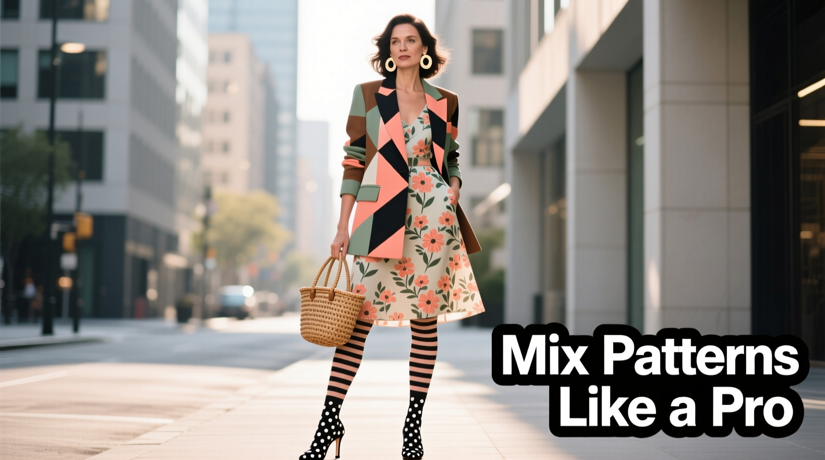
Mixing patterns is one of the most expressive tools in modern fashion, yet it remains intimidating for many. Done well, a bold clash of stripes, florals, and geometrics can elevate an outfit from predictable to unforgettable. Done poorly, it risks appearing chaotic or costumey. The key isn’t avoiding patterns—it’s mastering the principles that turn visual noise into harmony. With thoughtful coordination of color, scale, proportion, and confidence, anyone can wear mixed prints with intention and flair.
Understand the Fundamentals of Pattern Mixing
Pattern mixing isn’t random; it follows design principles used in art and interior decor. At its core, successful pattern pairing balances contrast with cohesion. You need enough difference to create interest, but enough unity to feel intentional.
The three foundational elements are:
- Color Harmony: Patterns should share at least one common color to anchor the look.
- Scale Variation: Combine large, medium, and small-scale prints to avoid visual competition.
- Contrast in Style: Pair structured patterns (like pinstripes) with organic ones (like watercolor florals) for dynamic balance.
When these elements align, even seemingly opposing prints can coexist elegantly. For instance, a micro-checkered shirt paired with wide-windowpane trousers works because the scales differ significantly, and they often share neutral tones like navy or gray.
Choose Your Anchor Piece First
Every successful pattern combination needs a foundation. Choose one item as your “anchor”—typically the largest garment like a dress, blazer, or pants—and build outward from there. This piece sets the tone for color, mood, and complexity.
For example, if you're wearing a floral midi skirt with bold reds and soft creams, use those hues as your guide when selecting a top. A striped blouse featuring red lines on a cream background will echo the skirt’s palette while introducing a new texture through the linear pattern.
Avoid anchoring with two equally busy pieces. If both your shirt and jacket are high-contrast geometrics, the eye has nowhere to rest. Instead, let one item dominate and keep others supporting.
Follow the 60-30-10 Rule for Visual Weight
This classic design principle allocates visual space intentionally:
- 60% Dominant Pattern or Solid: Usually the bottom or outer layer (e.g., pants or coat).
- 30% Secondary Pattern: A complementary print (e.g., a shirt or sweater).
- 10% Accent Pattern: Small details like scarves, socks, or handbags.
Applying this rule prevents sensory overload. Imagine a navy houndstooth blazer (60%), a pale pink gingham shirt (30%), and polka-dot silk pocket square (10%). The outfit feels layered, not cluttered.
Master Scale and Proportion
One of the most common mistakes in pattern mixing is pairing two prints of similar size. When two medium-scale patterns compete—say, mid-sized florals with medium checks—the result is visual static. To avoid this, vary the scale dramatically.
| Pattern Type | Small Scale Example | Large Scale Example |
|---|---|---|
| Floral | Dainty rose sprigs on a blouse | Jungle-print maxi dress |
| Stripes | Pinstripe suit | Broad nautical stripes on a sweater |
| Geometric | Tiny argyle knit vest | Oversized chevron pencil skirt |
| Abstract | Subtle marbled tie | Bold painterly coat |
Pairing a small-scale print with a large one creates rhythm. The eye moves naturally between them, appreciating each without strain. Try a finely dotted scarf with a broad plaid coat, or a micro-check shirt under a macro-floral cardigan.
Use Neutrals and Solids as Buffers
You don’t always need multiple patterns to \"mix.\" Sometimes, the best way to integrate a bold print is by balancing it with solids or neutral textures. A black turtleneck under a paisley-patterned blazer grounds the look and gives the eye a resting point.
Neutrals like beige, charcoal, ivory, or deep brown act as visual “pauses.” They allow complex patterns to shine without overwhelming the ensemble. Consider layering a camel trench over a striped tee and leopard-print loafers—the trench serves as a unifying neutral bridge.
Likewise, textured solids—such as ribbed knits, suede, or tweed—add depth without competing visually. A herringbone wool skirt may technically be a pattern, but its muted tonality behaves like a solid when paired with bolder prints.
Case Study: Olivia’s Work-to-Weekend Transition
Olivia, a graphic designer in Portland, wanted to express her creativity at work without sacrificing professionalism. She started with a navy pinstripe blazer (structured, formal). For contrast, she paired it with a rust-colored blouse featuring abstract brushstroke prints (organic, artistic). To ground the look, she chose tailored charcoal trousers—a solid neutral.
The shared navy in the blazer and blouse tied the colors together, while the scale difference (fine lines vs. sweeping strokes) created movement. Her accessories were minimal: gold hoops and a cognac leather tote. The result? A polished yet personal outfit that drew compliments without distracting from her presence.
This approach allowed Olivia to break monotony in her office wardrobe while maintaining credibility. She later adapted the formula for weekends—swapping the trousers for denim and adding a bandana with tiny stars.
Follow a Step-by-Step Mixing Process
Confidence grows with practice. Use this five-step method to experiment safely and build skill over time.
- Start with a Base Color Palette: Pick 2–3 core colors. Stick to one dominant, one secondary, and optionally an accent.
- Select One Bold Pattern: Choose a statement piece (e.g., floral skirt or striped shirt).
- Add a Contrasting Pattern: Ensure it differs in scale and style. If the first is floral, try stripes or animal print.
- Incorporate a Neutral Layer: Add a solid jacket, belt, or shoes in a shared hue.
- Refine with Accessories: Introduce a third pattern only through small items—scarf, socks, or earrings.
After assembling the outfit, step back and assess. Does one piece overpower the others? Can you identify a clear focal point? If everything feels equally loud, simplify. Remove the smallest pattern or swap a print for a solid.
Checklist: Before You Wear It
- ✅ Do the patterns share at least one common color?
- ✅ Is there a clear difference in scale between prints?
- ✅ Have I included a neutral or solid to balance the look?
- ✅ Is there a visual anchor, or does everything compete?
- ✅ Does the outfit reflect my personal style and comfort level?
Expert Insights: What Designers Say About Print Clashing
Fashion stylists and designers have long championed intentional pattern mixing as a sign of sartorial maturity.
“Pattern mixing separates the followers from the innovators. It’s not about rules—it’s about rhythm. When two prints ‘dance’ together, you know it instantly.” — Marcus Bell, Fashion Stylist & Creative Director at *Verve Studio*
“The biggest mistake? Fear. People think they need permission to wear a zebra-striped coat with polka-dot pants. They do—but only if the colors connect and the proportions make sense.” — Lena Tran, Menswear Designer at *Urban Weave Co.*
These insights reinforce that confidence plays as big a role as technique. Once you understand the mechanics, trust your instincts. If an outfit feels right, it likely reads right to others too.
Avoid Common Pitfalls
Even seasoned fashion lovers stumble. Here are frequent missteps and how to correct them:
| Don’t | Why It Fails | Do Instead |
|---|---|---|
| Mix two large-scale, high-contrast patterns | Creates visual chaos; no focal point | Pair one large print with a small-scale or solid |
| Use clashing color families (e.g., neon green + deep purple) | Lacks harmony; feels accidental | Stick to analogous or monochromatic schemes |
| Wear patterned layers head-to-toe with no breaks | Overwhelms the eye | Add a solid belt, jacket, or bag to segment the look |
| Ignore fit and silhouette | Even perfect patterns fail on ill-fitting clothes | Ensure garments fit well and flatter your shape |
Remember, fashion is communication. A mismatched outfit sends confusion. A thoughtfully mixed one signals intentionality and self-awareness.
FAQ: Common Questions About Pattern Mixing
Can I mix more than two patterns?
Yes, but only if you maintain control. Use the 60-30-10 rule and ensure all prints share a unifying element—usually color. For example, a gingham shirt, houndstooth blazer, and striped tie can work if all incorporate navy blue.
Is it okay to mix patterns in professional settings?
Absolutely—just keep the contrasts subtle. Try a subtle windowpane suit with a micro-dotted tie, or a pinstripe blouse under a herringbone cardigan. Avoid loud combinations unless your workplace culture encourages creative expression.
What if I’m petite or curvy? Does pattern mixing still work?
It does, with adjustments. Petite figures benefit from smaller-scale patterns to avoid being overwhelmed. Curvy individuals can use vertical stripes or diagonal prints to elongate the silhouette. Always prioritize fit—proportion matters more than trend.
Conclusion: Own Your Style with Confidence
Mixing patterns isn’t about following rigid rules—it’s about developing an eye for balance, contrast, and personal expression. The most stylish people aren’t those who never make mistakes, but those who wear their choices with conviction. Begin modestly: pair a striped tee with a floral scarf. Then gradually expand your range as your confidence grows.
With attention to color, scale, and structure, what once seemed like fashion chaos becomes a language of its own—one that speaks of creativity, awareness, and individuality. Don’t wait for permission. Experiment, evaluate, and refine. Your unique style is worth the effort.


 浙公网安备
33010002000092号
浙公网安备
33010002000092号 浙B2-20120091-4
Comments
No comments yet. Why don't you start the discussion?