
Mixing patterns can elevate an outfit from predictable to polished with personality. Done well, it signals confidence and a keen eye for style. Done poorly, it risks appearing haphazard or overwhelming. The key isn’t avoiding pattern play—it’s mastering the balance between contrast, scale, color, and context. Far from being a fashion faux pas, thoughtful pattern mixing is a hallmark of advanced personal style. This guide breaks down the principles, techniques, and real-world applications that allow you to combine prints with intention, not guesswork.
Understand the Core Principles of Pattern Mixing
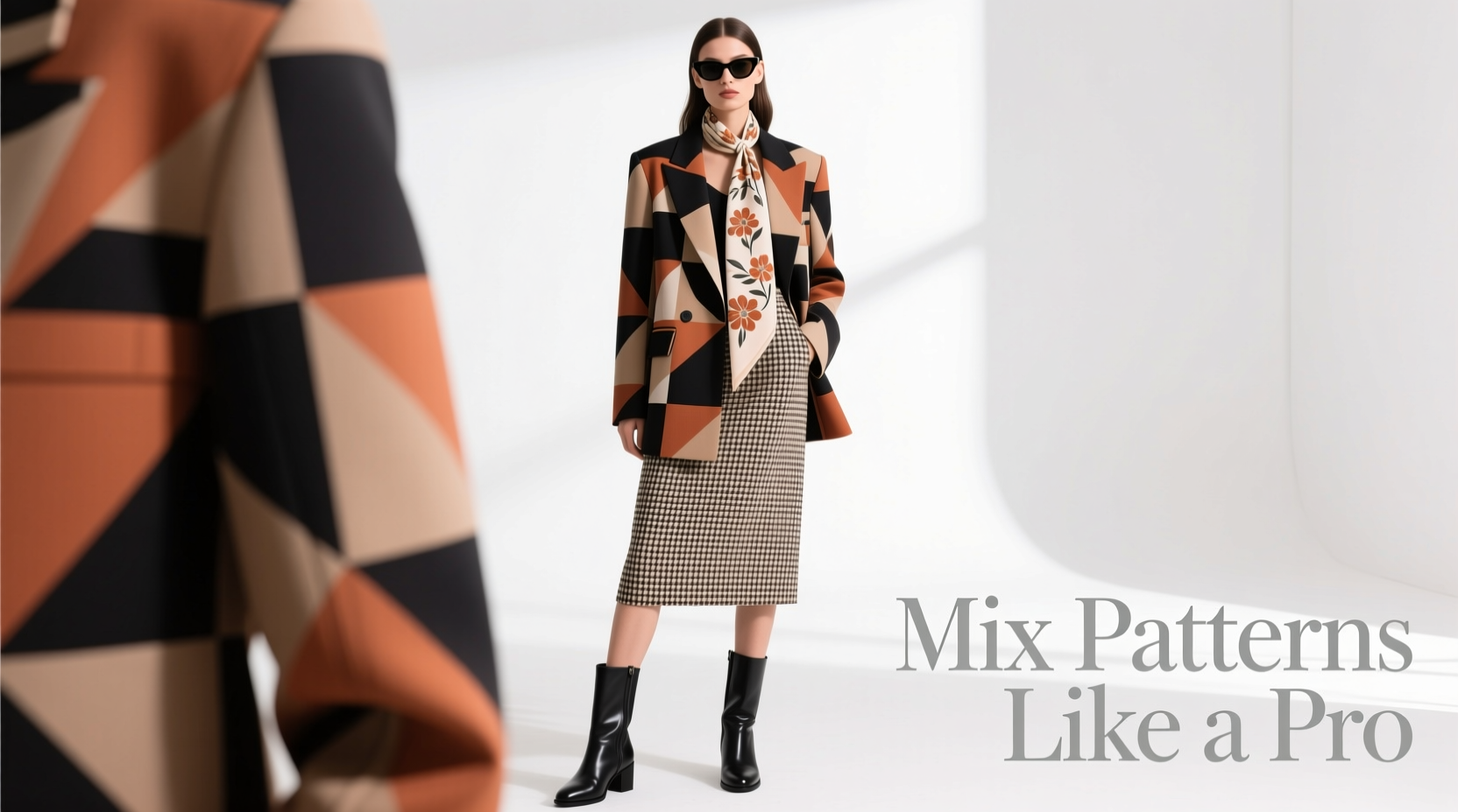
Before combining stripes with florals or checks with animal prints, it helps to understand the foundational elements that govern visual harmony. These are not rigid rules, but guiding principles that create cohesion even in bold combinations.
- Scale variation: Pair one large-scale pattern with a smaller one. A bold floral blazer over a micro-check shirt creates contrast without competition.
- Color coordination: Shared hues anchor disparate patterns. Even if the designs differ, using a consistent color palette ties them together.
- Pattern type diversity: Combine different kinds of patterns—geometric with organic, structured with abstract—to avoid visual redundancy.
- Neutral grounding: Use solid neutrals (black, white, beige, navy) as buffers between busy prints to give the eye a resting point.
The Role of Color in Harmonizing Prints
Color is often the invisible thread that holds mixed patterns together. Two wildly different prints can coexist beautifully if they share at least one common color. This doesn’t mean matching exactly—think tonal harmony rather than duplication.
For example, a navy-and-white gingham shirt can pair seamlessly with rust-hued paisley trousers if the shirt’s collar has a rust trim or the shoes echo the rust tone. The shared color becomes a visual cue, signaling intentionality.
Consider using a color wheel when planning outfits. Analogous colors (next to each other on the wheel) create subtle blends, while complementary colors (opposites) generate dynamic contrast. Both work—depending on the energy you want to convey.
“Color is the first language of clothing. If two patterns speak the same color story, they’ll never clash.” — Lila Monroe, Fashion Stylist & Creative Director at Mode Collective
A Practical Guide to Matching Common Patterns
Not all pattern combinations are created equal. Some pairings are naturally harmonious; others require careful handling. Below is a reference table outlining which patterns typically work well together—and how to make them work.
| Pattern 1 | Pattern 2 | How to Style It | Pro Tip |
|---|---|---|---|
| Stripes (navy/white) | Paisley (burgundy/gold) | Wear striped shirt under a paisley tie or pocket square | Use a navy blazer to unify both pieces |
| Floral (multicolor) | Solid with print accent | Pair floral dress with a geometric-patterned cardigan in one of the flower’s tones | Let the dress be the star; accessories echo, don’t compete |
| Plaid (red/black) | Animal print (leopard) | Red plaid shirt with leopard-print boots or bag | Ensure the red appears in the animal print for cohesion |
| Polka dots | Thin pinstripes | Dotted blouse tucked into pinstripe trousers | Keep dot size small and stripe narrow to avoid visual noise |
| Chevron | Abstract watercolor | Chevron skirt with watercolor-print top | Stick to monochrome or earth tones to keep it elegant |
This table isn’t exhaustive, but it illustrates a broader truth: successful pattern mixing relies more on thoughtful execution than strict compatibility. The goal is not perfection, but balance.
Step-by-Step: How to Build a Pattern-Mixed Outfit
Approach pattern mixing like assembling a recipe—each ingredient must serve a purpose. Follow this five-step process to build a cohesive, stylish look.
- Choose a dominant pattern. Start with the bolder or larger print—this will set the tone. For instance, a vibrant floral dress or a checkered blazer.
- Select a secondary pattern that shares a color. Find a piece with a different design but at least one overlapping hue. A striped tie with blue that matches a blue stripe in your shirt works here.
- Vary the scale. If your main item has a large motif, go smaller on the secondary. Tiny polka dots with a big floral jacket prevent sensory overload.
- Add a neutral buffer. Introduce a solid-colored layer—like a beige trench coat or black belt—that separates the patterns and gives the eye a break.
- Finish with intentional accessories. Shoes, bags, or jewelry should either echo one of the colors or remain neutral. Avoid adding a third pattern unless it’s very subtle, like textured leather with faint embossing.
Real-Life Example: From Office to Evening
Consider Sarah, a marketing consultant preparing for a client presentation followed by dinner with friends. Her goal: appear professional yet fashion-forward without changing clothes.
She starts with a tailored navy pinstripe blazer—a classic, structured pattern. Underneath, she wears a silk blouse with a soft, abstract watercolor print in navy, blush, and gold. The shared navy links the two patterns, while the scale difference keeps them distinct.
For her bottom, she chooses high-waisted cream trousers—solid and neutral, acting as a visual breather. She adds nude heels and a structured gold-tone clutch. The result? A look that reads as polished and intentional, not cluttered.
After work, she swaps the blazer for a leopard-print moto jacket—adding edge. Because the leopard includes navy and gold, it complements rather than conflicts. The outfit transitions seamlessly, proving that layered pattern mixing can be both functional and expressive.
Common Mistakes and How to Avoid Them
Even seasoned fashion lovers misstep when mixing prints. Awareness of these pitfalls can save an otherwise strong look.
- Matching patterns too closely: Wearing two similar plaids or stripes in slightly different scales can look like a wardrobe malfunction, not a styling choice.
- Ignoring proportion: Combining large-scale prints on top and bottom overwhelms the frame. One bold piece is enough.
- Over-accessorizing: Adding a patterned scarf, socks, and bag to an already busy outfit dilutes focus and creates visual fatigue.
- Forgetting the setting: A boardroom demands subtler mixing than a weekend brunch. Context shapes how far you can push contrast.
“Confidence sells the outfit. If you wear mixed patterns like you meant to, people will assume you did—even if you’re secretly nervous.” — Marcus Tran, Menswear Stylist & Contributor, *Vogue Hommes*
Checklist: Your Pattern-Mixing Game Plan
Before stepping out in a multi-print ensemble, run through this checklist to ensure cohesion and confidence.
- ✅ One pattern is clearly dominant
- ✅ At least one color is shared between the patterns
- ✅ Scales are varied (one large, one small)
- ✅ A neutral layer (jacket, pants, or shoes) balances the look
- ✅ Accessories support, not compete with, the outfit
- ✅ The overall vibe fits the occasion (professional, casual, creative)
- ✅ You feel good wearing it—no second-guessing
Frequently Asked Questions
Can I mix patterns in formal settings?
Absolutely—but with restraint. A subtly patterned dress shirt with a micro-check suit is a classic example. Stick to tonal variations and traditional pairings like stripes with solids or small checks. Avoid loud contrasts in conservative environments.
Is it okay to mix more than two patterns?
Yes, but only if done strategically. Limit yourself to three elements maximum, and ensure one is significantly more subdued—like a textured knit sweater or a matte-finish accessory. Think of it as a visual hierarchy: one lead, one supporting actor, and one background role.
What if I’m short or petite? Won’t patterns overwhelm me?
Size shouldn’t limit style. Petite individuals can wear patterns effectively by keeping busier prints closer to the face (like a printed blouse) and opting for vertical motifs (pinstripes, elongated florals) that create length. Avoid oversized prints that swallow the frame.
Mastering the Art of Intentional Contrast
Ultimately, mixing patterns isn’t about following formulas—it’s about cultivating a sense of rhythm in your wardrobe. Like a well-composed photograph or a balanced interior design scheme, fashion thrives on contrast grounded in unity.
The most stylish people aren’t those who avoid risk, but those who take it with purpose. They know that a striped turtleneck under a houndstooth coat works because the black base connects them. They choose a floral scarf with a gingham shirt because the red in the flowers picks up the red thread in the weave.
Start small. Try a striped tie with a windowpane suit. Then experiment with a printed shirt beneath a cable-knit sweater with subtle flecks of color. Each step builds intuition. Over time, what once felt risky becomes instinctive.


 浙公网安备
33010002000092号
浙公网安备
33010002000092号 浙B2-20120091-4
Comments
No comments yet. Why don't you start the discussion?