
Mixing patterns in home decor can transform a space from predictable to dynamic. When done well, it adds depth, personality, and visual interest. But when executed poorly, the result is chaos—a room that feels disjointed, overwhelming, or simply off. The secret isn’t avoiding patterns altogether; it’s learning how to combine them with intention. With the right balance of color, scale, texture, and rhythm, you can layer florals, geometrics, stripes, and more into a cohesive, stylish whole.
This guide breaks down the principles of successful pattern mixing, offering practical strategies, real-life applications, and expert-backed rules to help you design with confidence. Whether you're refreshing a living room, styling a bedroom, or reimagining an entryway, these techniques will keep your aesthetic harmonious—not haphazard.
Understand the Role of Color in Pattern Harmony
Color is the invisible thread that ties patterns together. Even if two prints differ in shape and scale, they’ll feel related if they share a common color palette. The key is selecting a base color scheme and sticking to it across all patterned elements.
Begin by choosing a dominant neutral—such as beige, gray, navy, or charcoal—that will serve as the backbone of the room. Then, select two to three accent colors to repeat throughout your fabrics, wallpapers, and accessories. These don’t need to be used equally, but they should appear in multiple places to create visual continuity.
For example, if your sofa throw pillow features mustard yellow, deep teal, and rust, incorporate those same tones in a curtain print, a side chair fabric, or even painted trim. This repetition creates cohesion, making each pattern feel like part of a larger story rather than a random addition.
“Color is the first language of pattern mixing. If your hues sing in harmony, your prints will follow.” — Lena Torres, Interior Stylist & Author of *Pattern Play*
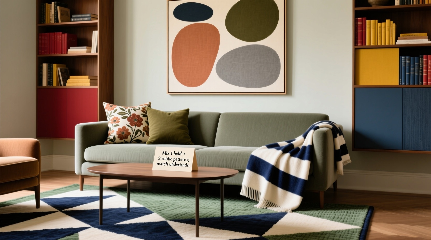
Balance Scale and Proportion for Visual Rhythm
One of the most common mistakes in pattern mixing is using prints of similar size. When everything is large-scale or small-scale, the eye struggles to focus, resulting in visual fatigue. Instead, vary the scale deliberately to create rhythm and hierarchy.
Think of pattern scale in terms of musical notes: large prints are bold statements (like bass), medium prints are supporting melodies, and small prints are high-pitched accents. A balanced composition uses all three.
A good rule is the **70-20-10 principle**:
- 70% Dominant Pattern: Usually the largest or most neutral print, such as a subtle stripe or tone-on-tone geometric on curtains or upholstery.
- 20% Secondary Pattern: Medium-scale design, like a classic toile or mid-sized floral on a loveseat or area rug.
- 10% Accent Pattern: A bolder or finer print—perhaps a tiny polka dot or intricate ikat—used sparingly on pillows, lamps, or artwork.
This distribution ensures no single pattern overwhelms the space while still allowing one or two to stand out.
Real Example: The Eclectic Living Room Makeover
In a recent project, designer Mira Chen transformed a beige, lifeless living room in a Brooklyn brownstone. The client wanted “more energy” without “looking like a thrift store explosion.” Mira began with a large-scale navy-and-cream trellis wallpaper on one accent wall. She then introduced a medium-scale olive-and-cream floral on the sectional sofa. For contrast, she added a pair of small-scale striped dining chairs in mustard and white near the window.
The unifying factor? All three patterns shared cream as a base and were grounded by a jute rug with subtle tonal variation. The result was lively yet balanced—visitors often commented on the “effortless” mix, unaware of the careful planning behind it.
Combine Different Pattern Types Strategically
Patterns fall into broad categories: florals, geometrics, organic (like animal prints or marbled textures), and linear (stripes, checks, etc.). Mixing across types prevents monotony, but requires thoughtful pairing.
Here’s a breakdown of effective combinations:
| Pattern Pairing | Why It Works | Pro Tip |
|---|---|---|
| Floral + Stripe | Classic contrast—organic meets structured | Use the same color in both to tie them together |
| Geometric + Organic (e.g., chevron + leopard) | Edgy yet balanced tension | Keep one pattern muted to avoid overload |
| Toile + Plaid | Traditional charm with rustic warmth | Anchor with vintage furniture for authenticity |
| Paisley + Houndstooth | Retro sophistication | Limited to formal spaces like studies or libraries |
Avoid pairing two highly complex patterns—like a busy paisley with a dense damask—unless separated by solid buffers (such as a neutral ottoman or plain curtain panel). Simpler patterns can carry more visual weight when combined with intricate ones.
Use Texture and Solids as Balancing Tools
Not every surface needs a print. In fact, solids and textured neutrals are essential for giving the eye a place to rest. Think of them as the “silence between the notes” in a musical composition.
Incorporate solid-colored textiles in materials like linen, wool, bouclé, or velvet. These add tactile richness without competing visually. A nubby wool throw on a patterned sofa or a smooth leather armchair beside a busy rug can ground the space and prevent sensory overload.
Additionally, consider using textured solids—such as ribbed weaves, embossed fabrics, or basket-weave baskets—as transitional elements between patterned pieces. They bridge the gap between flat prints and bold graphics, adding depth without introducing another competing design.
Walls and floors also play a role. If your upholstery and drapery are heavily patterned, opt for a solid wall color or a subtle textured paint finish. Likewise, hardwood or neutral tile flooring provides a stable foundation under vibrant rugs.
Step-by-Step Guide: Building a Pattern-Layered Space
Follow this sequence to build a layered, non-clashing environment:
- Choose a base palette: Pick 1–2 neutrals and 2–3 accent colors.
- Select a hero pattern: Start with one statement piece (e.g., a rug or headboard).
- Add a secondary pattern: Choose a different type but matching color family (e.g., stripe with floral).
- Introduce a small-scale accent: Use on cushions, lampshades, or artwork.
- Insert solids and textures: Include at least two solid elements in coordinating hues.
- Edit ruthlessly: Remove any piece that feels redundant or overwhelming.
- Step back and assess: View the room from the doorway. Does it feel unified? Adjust as needed.
This methodical approach removes guesswork and builds confidence in your choices.
Common Mistakes and How to Avoid Them
Even experienced decorators misstep. Here are frequent errors—and how to fix them:
- Mistake: Using too many dominant patterns.
Solution: Designate only one “star” print per room. - Mistake: Ignoring lighting. Dark rooms amplify busy patterns.
Solution: Opt for lighter, airier prints in low-light spaces. - Mistake: Forgetting flow between rooms.
Solution: Repeat at least one color or pattern motif in adjacent areas for continuity. - Mistake: Overcommitting to a trend.
Solution: Use trendy patterns (like micro-checks or retro waves) in temporary items like pillows or art, not permanent fixtures.
“The most elegant interiors aren’t devoid of risk—they’re just well edited. Know when to stop.” — Rafael Mendez, Award-Winning Interior Architect
FAQ: Your Pattern-Mixing Questions Answered
Can I mix patterns in a small space?
Absolutely—but be strategic. Use smaller-scale prints to avoid overwhelming the room. Vertical stripes on curtains can heighten ceilings, while a single bold pillow in a repeating color can anchor the look. Always include solid surfaces to maintain openness.
How do I know if two patterns go together?
Lay them side by side in natural light. If the colors complement and the scales contrast (not compete), they likely work. Take a photo and view it in black and white—if the contrast reads clearly, the combination has visual balance.
Is it okay to mix vintage and modern patterns?
Yes, and it’s often striking. Pair a 1950s botanical print with a contemporary zigzag throw, but unify them with a shared color or material (like walnut furniture or brass accents). The juxtaposition tells a richer design story.
Final Checklist: Pattern Mixing Success
Before finalizing your design, run through this checklist:
- ✅ All patterns share at least one common color.
- ✅ Scales are varied—large, medium, and small represented.
- ✅ At least two solid or textured neutral elements are present.
- ✅ One pattern acts as the focal point; others support it.
- ✅ Lighting conditions have been considered (bright vs. dim rooms).
- ✅ The overall effect feels intentional, not accidental.
Conclusion: Embrace Boldness with Confidence
Mixing patterns isn’t about playing it safe—it’s about designing with intention and joy. When guided by color unity, scale variation, and thoughtful editing, even the boldest combinations can feel elegant and inviting. You don’t need a decorator’s eye to get it right; you just need a clear framework and the courage to experiment.
Start small: swap out a solid pillow for a patterned one, or layer a striped blanket over a floral duvet. Observe how it changes the room. Refine, adjust, and grow bolder with each step. Great interiors aren’t born perfect—they evolve through curiosity and care.


 浙公网安备
33010002000092号
浙公网安备
33010002000092号 浙B2-20120091-4
Comments
No comments yet. Why don't you start the discussion?