
Pattern mixing is one of the most expressive tools in fashion, yet many avoid it out of fear their outfit will look chaotic. The truth? Clashing prints aren’t inevitable—they’re preventable. With a clear understanding of color theory, pattern scale, and intentional styling, anyone can layer stripes with florals, plaids with geometrics, or polka dots with animal prints—confidently and cohesively. It’s not about luck; it’s about strategy. Done well, mixed patterns elevate your look from predictable to polished, adding depth, personality, and visual intrigue.
Understand the Foundations of Pattern Harmony
The key to successful pattern mixing lies in controlling variables. When two or more prints compete on color, scale, and motif, they create visual noise. Reduce that noise by aligning at least two foundational elements across all pieces: color palette, pattern size, or theme. This creates cohesion even when the designs differ.
Start by selecting a dominant print—a bold floral shirt, for example—as your anchor. Then build around it using secondary patterns that share either a base color or a design rhythm. For instance, if your floral shirt features navy, rust, and cream, pair it with rust-hued pinstripe trousers or a navy-and-cream striped scarf. The shared colors act as a bridge, making disparate prints feel intentional rather than accidental.
Balance Scale and Proportion Strategically
One of the most common mistakes in pattern mixing is pairing two large-scale prints. A giant floral jacket over wide-striped pants overwhelms the eye. Instead, combine patterns of contrasting sizes: one dominant (large), one supporting (small or medium). This creates hierarchy and prevents visual competition.
A useful rule is the 70/30 principle: let one pattern dominate 70% of the outfit, while the other occupies no more than 30%. For example, wear a large-scale printed dress (70%) with a delicate polka-dot cardigan (30%), or a bold geometric blazer (70%) over a subtly striped blouse (30%). This distribution allows each print to breathe.
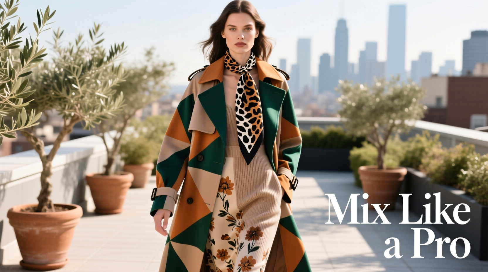
When working with accessories, keep them smaller in scale. A micro-check scarf complements a macro-floral skirt far better than another oversized print would.
“Great pattern mixing isn’t about avoiding conflict—it’s about orchestrating contrast with control.” — Lena Moretti, Stylist & Creative Director at Vogue Italia
Follow a Step-by-Step Mixing Framework
Mixing patterns doesn’t have to be guesswork. Follow this five-step process to build balanced, stylish ensembles every time:
- Choose a dominant print: Pick the boldest or most colorful piece as your starting point.
- Extract 2–3 core colors: Use these as your unifying palette across the outfit.
- Select a secondary pattern: Ensure it shares at least one color with the first and differs in scale.
- Adjust for formality and context: Match the vibe—casual stripes with casual checks, not formal brocade.
- Test in natural light: Step outside or near a window. Does anything vibrate or clash? Adjust accordingly.
This methodical approach removes randomness and builds confidence. Over time, you’ll intuitively recognize compatible combinations.
Use Color as Your Secret Weapon
Color consistency is the single most effective tool for preventing clashes. Even wildly different patterns—say, a tribal print and a gingham check—can work together if they live within the same tonal family.
Neutral-based palettes are especially forgiving. Black, white, navy, gray, and beige serve as excellent backdrops for mixing bolder prints. Try a black-and-white zebra-print top with navy pinstripe pants—the shared dark tones create unity despite differing motifs.
For those venturing into color, stick to analogous hues (colors adjacent on the color wheel, like blue and green) or monochromatic schemes (different shades of the same color). These naturally harmonize. Complementary colors (opposites on the wheel, like red and green) can work but require careful balancing—use one as a dominant tone and the other as an accent.
| Color Strategy | Example Combination | Why It Works |
|---|---|---|
| Monochromatic | Navy floral shirt + navy micro-check blazer | Same base color anchors diverse scales |
| Analogous | Olive plaid skirt + rust polka-dot blouse | Adjacent warm earth tones blend smoothly |
| Neutral Bridge | Black-and-white stripe top + leopard print skirt | Shared black grounding prevents chaos |
| Complementary (Accent Only) | Teal geometric dress + coral dotted scarf (small area) | Vibrant contrast controlled by scale and proportion |
Master Common Pattern Pairings That Work
Not all pattern combinations are equally easy. Some pairings have stood the test of time because they naturally complement each other. Familiarize yourself with these reliable duos before experimenting with more daring mixes.
- Stripes + Checks: Both linear and structured, they share a rhythmic geometry. Try navy pinstripes with a red-and-black tartan scarf.
- Florals + Dots: Soft and playful, especially when scaled differently. A large rose print dress pairs beautifully with a tiny polka-dot belt.
- Animal Print + Geometrics: Leopard or snake print adds wild texture that contrasts elegantly with clean lines. Pair a snakeskin clutch with a houndstooth coat.
- Plaids + Tonal Textures: Mix a subtle herringbone sweater with a bolder windowpane suit—same color family, different pattern type.
Avoid combining three or more busy patterns unless you're highly experienced. Stick to two-pattern max for everyday wear. Save triple-layered prints for editorial or creative settings where boldness is expected.
Real Example: From Clashing to Cohesive
Take Sarah, a marketing executive who loved bold prints but often felt her outfits looked “too much.” She once wore a vibrant tropical floral blouse with wide orange-and-teal stripes on her trousers. In photos, the colors vibrated against each other, creating discomfort rather than charm.
Her stylist advised a simple fix: replace the striped pants with solid teal wide-leg trousers. The floral blouse remained the star, now grounded by a calm, color-matched base. For added pattern interest, she added a small black-and-orange polka-dot scarf—echoing two secondary colors from the blouse without overwhelming the silhouette.
The result? A dynamic yet balanced outfit that expressed her personality while maintaining professionalism. The lesson: sometimes, less competing pattern equals greater impact.
Checklist: Your Pre-Outfit Pattern Mix Review
Before stepping out, run through this checklist to ensure your mixed patterns work in harmony:
- ✅ One dominant print clearly stands out
- ✅ At least one color is shared between all patterned pieces
- ✅ Patterns differ significantly in scale (one large, one small)
- ✅ The overall mood (casual, formal, playful) is consistent
- ✅ No more than two major patterns are used
- ✅ A solid-color accessory or layer breaks up busy zones (optional but helpful)
- ✅ Viewed in natural light, the combination doesn’t cause visual vibration
Use this as a quick reference until the principles become second nature.
Common Mistakes and How to Avoid Them
Even seasoned dressers stumble when mixing patterns. Here are frequent pitfalls and how to correct them:
- Mistake: Matching exact prints – Wearing the same floral on top and bottom looks costumey. Solution: Vary scale or color within the same motif.
- Mistake: Ignoring background color – Two florals may seem compatible until you notice one has a pink base and the other yellow. Solution: Always assess the ground color first.
- Mistake: Over-accessorizing – Adding a patterned bag, scarf, and shoes to a printed outfit creates overload. Solution: Limit patterned accessories to one, preferably small-scale.
- Mistake: Forcing trends – Just because animal print is “in” doesn’t mean it pairs with your existing striped dress. Solution: Let intention guide trend adoption.
“The best-dressed people don’t follow rules blindly—they understand them so they can break them intelligently.” — Carlos Mendez, Fashion Editor at GQ Style
Frequently Asked Questions
Can I mix vertical stripes with horizontal ones?
Yes, but with caution. Vertical and horizontal stripes can create a distracting grid effect. To avoid this, vary the thickness—one thick horizontal stripe paired with thin verticals works better than two bold sets. Alternatively, separate them with a solid band (like a belt or jacket) to break the intersection.
Is it okay to mix patterns in formal wear?
Absolutely. Formal pattern mixing is classic in men’s suiting—think a pinstripe suit with a micro-check shirt and a diagonal-stripe tie. The key is subtlety: use tonal variations, conservative scales, and high-quality fabrics. For women, a solid silk blouse under a houndstooth blazer with a dotted silk scarf achieves similar polish.
How do I know if two patterns clash?
Stand six feet away from a mirror. If your eyes dart uncontrollably or the outfit seems to “buzz,” there’s likely a clash. Also, take a photo in natural light—if colors appear to vibrate or fight for attention, adjust one element. Trust your instinct: if it feels off, it probably is.
Final Thoughts: Confidence Is the Ultimate Accessory
Learning how to mix patterns without clashing isn’t just about technical skill—it’s about cultivating confidence. Once you understand the principles of color, scale, and balance, the rest becomes intuitive. Start small: pair a striped tee with checked shorts. Then experiment—add a floral scarf, swap in a leopard shoe. Each step builds your visual vocabulary.
Remember, fashion isn’t about perfection. It’s about expression. Even the pros occasionally push too far—what matters is how you carry it. Stand tall, own your choices, and let your outfit reflect your individuality. The most stylish people aren’t those who never clash, but those who make every choice with purpose.


 浙公网安备
33010002000092号
浙公网安备
33010002000092号 浙B2-20120091-4
Comments
No comments yet. Why don't you start the discussion?