
Mixing patterns can elevate an outfit from predictable to polished and expressive. Done well, it signals confidence and a keen eye for style. But when mismatched carelessly, it risks looking chaotic or unintentional. The key lies not in avoiding patterns altogether but in mastering the principles that allow florals, stripes, plaids, and geometrics to coexist harmoniously. With thoughtful coordination of color, scale, and proportion, anyone can blend prints with precision and flair.
Understand the Role of Color in Pattern Harmony
Color is the most powerful unifier when combining different prints. Even if two patterns differ drastically in shape and structure, they can still feel cohesive if they share a consistent color palette. When selecting pieces, identify one dominant hue that appears across both items. This acts as a visual anchor, guiding the eye smoothly from one pattern to the next.
For example, pairing a navy-and-white striped shirt with a burgundy-and-navy floral blazer works because navy ties them together. The shared tone creates continuity, while the contrasting patterns add interest. Limit your overall color scheme to three main shades: a neutral base (like black, white, beige, or gray), a primary accent, and a secondary pop. This keeps the look balanced rather than overwhelming.
Balance Scale and Proportion Strategically
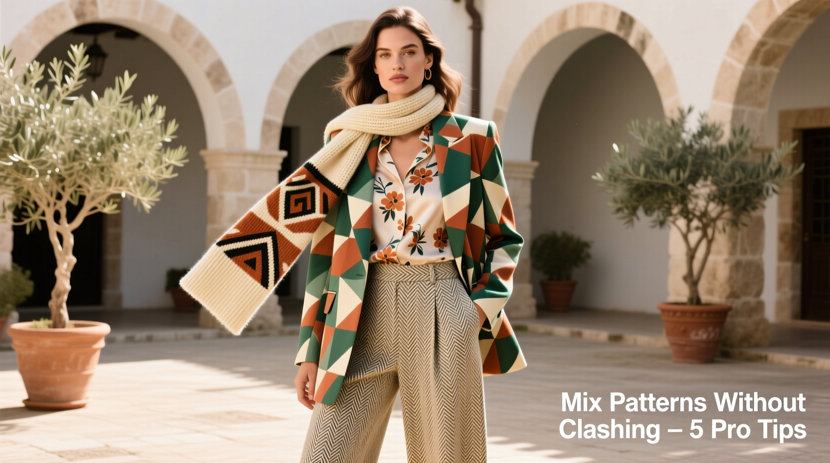
The size—or scale—of a pattern plays a critical role in how it interacts with others. A common mistake is pairing two large-scale prints, which compete for attention and create visual noise. Instead, combine patterns of differing scales: one bold and dominant, the other smaller and more subdued.
Think of it as creating a hierarchy. For instance, wear wide pinstripe trousers with a shirt featuring tiny polka dots. The larger stripe commands presence, while the smaller dot recedes slightly, offering texture without conflict. Alternatively, pair a micro-checkered blouse with a bold animal-print skirt—the contrast in scale allows each piece to shine without stepping on the other’s toes.
Avoid matching small with small unless they are tonal variations of the same print family. Tiny florals with tiny gingham may blur into a muddy effect unless clearly differentiated by color or spacing.
Step-by-Step Guide to Mixing Scales Effectively
- Choose a dominant garment with a large or medium-scale pattern (e.g., houndstooth coat).
- Select a secondary piece with a significantly smaller pattern (e.g., fine pinstripe shirt).
- Ensure at least one color overlaps between both items.
- Add solid-color accessories to ground the look (e.g., black loafers, tan handbag).
- Step back and assess: Does one pattern dominate appropriately? Is there enough contrast?
Leverage Neutral Foundations and Solids
One of the safest and most effective ways to introduce pattern mixing is through layering with solids. Use neutral-toned solid garments as buffers between competing prints. A camel trench coat over a plaid shirt and striped tee softens the transition between patterns and adds sophistication.
Solids also serve as breathing room for the eye. Try wearing a printed dress with a solid blazer, then adding patterned tights or socks. The outer layer simplifies the silhouette, while the lower half introduces playful contrast. This method works especially well in professional settings where subtlety is valued.
When in doubt, build your outfit around a single statement pattern and support it with solids in complementary tones. Then, gradually introduce a second subtle print once you’re comfortable with the balance.
Combine Complementary Pattern Types
Not all patterns clash equally. Some naturally complement each other due to their structural relationship. By understanding basic print categories, you can make intentional pairings that feel dynamic yet controlled.
Common pattern families include:
- Stripes: Classic and linear; work well with almost any other print when colors align.
- Florals: Organic and flowing; pair beautifully with checks or geometrics for contrast.
- Plaids & Checks: Structured and angular; balance softer prints like watercolor motifs.
- Geometrics: Bold shapes (dots, triangles, zigzags); best paired with simpler designs.
- Animal Prints: Leopard, snake, etc.; function as neutrals in the right context and mix surprisingly well with florals or stripes.
A timeless combination is stripes with checks—both have strong lines but differ in rhythm, allowing them to interlock visually. Another winning duo is small polka dots with a large floral, where the dots act almost like negative space within the bolder design.
“Pattern mixing isn’t about rules—it’s about rhythm. If the colors sing together and the scales dance in harmony, you’ve got a look.” — Marcus Reed, Fashion Stylist & Creative Director at *Style Edit Magazine*
Do’s and Don’ts of Pattern Pairing
| Pattern Combination | Do | Don't |
|---|---|---|
| Stripes + Florals | Match a color from the floral in the stripe; use small florals with wide stripes | Avoid pairing both large-scale versions; don’t let colors clash (e.g., orange stripes with purple flowers) |
| Plaid + Check | Use varying scales (e.g., windowpane coat over gingham shirt); keep colors muted | Don’t wear two busy plaids together; avoid neon checks with earth-tone plaids |
| Polka Dots + Geometric | Use dots as background texture; align dot color with geometric accent | Never match dot size to geometric size—they’ll fight for dominance |
| Animal Print + Anything | Treat leopard like a neutral; pair with monochrome outfits or soft pastel prints | Don’t wear multiple animal prints together (zebra + leopard = chaos) |
Real-Life Example: Building a Confident Print-Layered Outfit
Sophie, a graphic designer in her early 30s, wanted to move beyond safe neutrals and express more personality through her wardrobe. She owned a bold navy-and-crimson floral midi dress but rarely wore it, fearing it was “too much.” After learning about pattern mixing, she experimented.
She layered the dress with a finely striped charcoal-gray cardigan—choosing one that included a hint of crimson in its weave. Then, she added black ankle boots and a structured beige tote. Finally, she slipped on sheer black tights with a subtle herringbone texture. From a distance, the tights read as solid, but up close, they added depth.
The result? A layered, intentional look that drew compliments at her office. The floral remained the focal point, the stripe provided contrast without competition, and the textured tights bridged the gap between bold top and dark footwear. Sophie now mixes patterns regularly, using this formula as her foundation.
Essential Checklist for Successful Pattern Mixing
- ✅ Choose a unifying color present in both patterns
- ✅ Vary the scale—one large, one small
- ✅ Use solids as buffers (jackets, pants, or shoes)
- ✅ Stick to a maximum of three dominant colors
- ✅ Test the combo in natural light before finalizing
- ✅ Step back and assess balance—does one piece overpower the other?
- ✅ Limit yourself to two main patterns per outfit (accessories can add subtle third layers)
Frequently Asked Questions
Can I mix vertical and horizontal stripes?
Yes, but with caution. Vertical stripes elongate, while horizontal ones widen. To avoid distorting proportions, break them with a solid-colored waistband, belt, or jacket. For example, wear horizontal-striped pants with a solid top and a vertically striped blazer open in front. The outer layer bridges the directional contrast.
Is it okay to mix more than two patterns?
Advanced stylists can incorporate three patterns, but only if one is very subtle (like a textured fabric or faint grid) and all share a cohesive color story. For instance, a pinstripe suit, floral shirt, and paisley tie can work in formal menswear—if every element includes navy and white. Otherwise, stick to two for clarity.
Are some patterns off-limits for certain body types?
No pattern is universally unflattering. What matters is proportion and placement. Larger prints can be bold and empowering when worn intentionally. If you're concerned about volume, place bolder patterns where you want emphasis (e.g., a printed top draws eyes upward). Smaller, denser patterns can add texture without adding visual weight.
Mastering Confidence Through Style Experimentation
At its core, pattern mixing is less about rigid formulas and more about cultivating visual intuition. Every successful combination teaches you something new about contrast, rhythm, and personal expression. Mistakes are part of the process—what looks jarring in the dressing room might photograph beautifully, or vice versa.
The most stylish individuals aren’t those who follow trends perfectly, but those who wear their choices with conviction. When you mix patterns successfully, you signal more than fashion sense—you demonstrate creativity, risk-taking, and self-awareness. These qualities transcend clothing.
Begin with low-stakes experiments: a printed shirt under a subtly patterned sweater, or a scarf draped over a geometric dress. Take photos, observe how different combinations feel throughout the day, and refine based on what resonates with your lifestyle and identity.


 浙公网安备
33010002000092号
浙公网安备
33010002000092号 浙B2-20120091-4
Comments
No comments yet. Why don't you start the discussion?